Quantcast
Channel: Cloudinary Blog
Viewing all 601 articles
Browse latest View live

Generate Waveform Images from Audio with Cloudinary

$
0
0

This is a reposting of an article written by David Walsh. Check out his blog HERE!
I've been working a lot with visualizations lately, which is a far cry from your normal webpage element interaction coding; you need advanced geometry knowledge, render and performance knowledge, and much more. It's been a great learning experience but it can be challenging and isn't always an interest of all web developers. That's why we use apps and services specializing in complex tasks like Cloudinary: we need it done quickly and by a tool written by an expert.

While my previous experiments have been with images (Image Optimization, Remove Photo Backgrounds, and Automatic Image Tagging), Cloudinary also has the ability to manipulate video and audio files, as well as optimize delivery. This next experiment will mix imagery and media: we'll generate waveform images from an audio file!

Step 1: Upload the File

The first step is uploading the media file to Cloudinary, which you can automate with code or manually do so within the Cloudinary control panel. Let's presume the file is up on Cloudinary.

Step 2: Generate Image

You can use any number of languages to interact with Cloudinary's API but for the sake of this experiment we'll use Node.js and JavaScript. And the JavaScript required to generate and retrieve the basic waveform image? Much less than you think:

var result = cloudinary.image("Lights_qh6vve.png", {
	height: 200,
	width: 500,
	flags: "waveform",
	resource_type: "video"
});

So what exactly happens with the code above? Let's go through it:

  • The first argument, Lights_qh6vve.png, is the name of the uploaded MP3 file, replacing .mp3 with .png
  • The second argument provides the desired image settings, customizing height and width of generated image...
  • ...while flags: waveform and resource_type: video let Cloudinary know you want to generate the waveform image

The result is an img tag:

<img src='https://res.cloudinary.com/david-wash-blog/video/upload/fl_waveform,h_200,w_500/Lights_qh6vve.png' height='200' width='500'/>

..which looks like:

Customizing the Image

Cloudinary provides flexibility in image generation so let's create a more customized waveform image. Let's play with the colors:

var result = cloudinary.image("Lights_qh6vve.png", {
	height: 200,
	width: 500,
	flags: "waveform",
	resource_type: "video",
	background: '#acd7e5',
	color: '#ffda7f'
});

These colors generate a waveform image that looks like this:

Next we can use offset properties to get just a snippet of the waveform image:

var result = cloudinary.image("Lights_qh6vve.png", {
	height: 200,
	width: 500,
	flags: "waveform",
	resource_type: "video",
	background: '#acd7e5',
	color: '#ffda7f',
	start_offset: 1, // in seconds
	end_offset: 240
});

Which gives us this sharp image:

This experimentation was a lot of fun, and proves waveform image creation is just another amazing function provided by Cloudinary. Cloudinary is (an awesome) one-stop shop for uploading manipulating and delivering images and video. If you need to manipulate image or simply think you may need to do so in the future, give Cloudinary a good look -- they will do more than you think!


David Walsh David Walsh is Senior Software Engineer at Mozilla, having worked extensively on the Mozilla Developer Network, Firefox OS TV, WebVR, internal tooling, and several other Mozilla efforts. He shares his knowledge on his blog at http://davidwalsh.name. You can also find him at @davidwalshblog on Twitter.

SEO-Friendly Images: Rank Higher on Google and Facebook

$
0
0

Facebook recently made an announcement that every person in digital marketing should pay attention to: The faster your website loads, the more likely it is to show up in Facebook’s news feeds. (News Feed FYI: Showing You Stories That Link to Faster Loading Webpages )

Reducing your page load times is probably already a priority for a number of reasons:

  • Higher rankings from search engines like Google (SEO benefits),
  • Improved user experiences on your site
  • Increased customer engagement
  • Higher conversion rates and sales

News about Facebook’s upcoming changes adds another reason to speed up your site: Increasing the ROI from your social marketing team’s efforts.

As marketers we work incredibly hard to gain loyal, happy customers. And then we work even harder to encourage that customer to be an advocate and bring us additional customers, spending an ever-increasing amount of time and money in social strategies and marketing efforts. Typically the highest value traffic is sourced when one customer trusts your brand enough to advocate on your behalf. You shouldn’t let something like your page load speed prevent other people from ever seeing that hard-earned “like” or “share.”

If you haven’t already, here is one quick tip to improve your page load speeds – optimize your images. Don’t believe me? Run your website through WebPageTest.org and then scroll down to the Content Breakdown section. (I ran this test on Vikings.com – hopefully they read this, improve their website performance, and then use the gained fan engagement to bring a Super Bowl trophy to Minnesota.)

Content Breakdown

In this example, 88 percent of the site’s weight are images – that’s no small percentage. Think about that for a second. A 50 percent reduction in image weight would reduce the overall page weight by close to half. If you’re looking for a place to start, for just about every brand out there, it could be a matter of tackling their image and video weights and load times.

Next, click on the Image Analysis tab. Now instead of theoretical improvements, you’re able to look at your page and analyze if image optimization truly would provide any gains.

Webspedtest

Note: Cloudinary has the ability to create SEO-friendly image URLs


The bottom line

A reduction in page weight like this could result in faster loading - by multiple seconds, depending on the site - which can translate into millions of dollars of increased revenue for an average, mid-sized retailer. Rather than re-hash all the research, here is a great article from the smart folks at Kiss Metrics on how page-load speed can impact revenue.

Now that we’ve identified an area for improvement, it’s time to implement. The good news is that it’s relatively straight-forward, quick and painless for IT teams to get Cloudinary in place and start down the road to reducing page weight and load time. The better news is that you can create a free account to try this out and prove its potential.

Bringing Women Who Code Together to Learn About Cloudinary

$
0
0

For the last few years I’ve been active as a member of the Silicon Valley chapter of Women Who Code, a nonprofit that encourages women in tech careers. I’ve loved being a part of it, meeting new people, working with mentors and going to meet-ups where I can learn skills or become more proficient in my iOS expertise.

So, when I joined Cloudinary as a developer support engineer in May 2017, I thought it would be great to host Women Who Code at our office and share how our service makes developers lives so much easier. In just a few short months that dream became a reality – we hosted our first such meet-up on August 24 at our headquarters here in Sunnyvale.

“Shirly
Shirly Leading the Course
“A
A Review of Cloudinary

About 30 developers – who had varying degrees of knowledge of iOS, Xcode and Swift – attended our meet-up. We started the evening off with dinner, drinks and networking, then got down to business. The Cloudinary team taught participants about the differences between images, and explained how we make it easier to manipulate images and optimize them for faster download.

“Robert
Robert Showing the Basics

After a quick tutorial by Robert Moseley our Director of Solutions Engineer, showing Cloudinary in action improving images and video on-the-fly, participants got hands-on experience building their own working iOS app that included Cloudinary-manipulated images.

Using Cloudinary in the sample app was so easy that we had time left over to show everyone how to do even more transformations and answer their questions. At the end of the evening, each participant departed with a goody bag, filled with fun swag, like a Rubik’s Cube, camera cover, fidget spinner, bottle opener and stickers.

In preparing our fun, educational presentation, our goal was to help developers learn about the importance of optimizing images, and the best ways to do it. I think we succeeded. Since the meet-up, we’ve gotten a lot of positive feedback. In fact, one participant was so inspired by Cloudinary’s ease of use and ability to speed up apps that he is completely updating his app using our service.

Given the success of our first meet-up, we hope to host other similar events in the future. Stay tuned!

Responsive Images Guide, Part 3: Variable Image Encoding

$
0
0

A hand adjusting two dials – one which switches between multiple FORMATs, and another which dials QUALITY up and down

Welcome to the latest edition of the Responsive Images Guide!

In part 1, I laid out the big idea: a responsive image is a variable image – which adjusts itself to fit variable contexts.

In part 2, we looked at the most common way that an image can do exactly that: scaling itself up and down to fit viewports of different sizes and screens with different densities.

Now, we turn our attention to a different axis of variability: variable image encoding.

What do I mean when I say, “variable encoding”? Two things:

  1. Delivering an image in different formats (depending on the end-user’s browser).
  2. Striking different quality/compression tradeoffs (depending on the end user’s screen, connection speed, data plan, and/or preferences)

Let’s tackle both of these, in turn.

Variable Formats

A file whose extension changes between JPG, PNG, GIF, SVG, WEBP, JP2, and JXR

There are many (many) different image formats, and new ones are being developed all of the time.

This varied, evolving landscape has vexed the <img> tag from the very start. To wit—

I'd like to propose a new, optional HTML tag:

IMG

Required argument is SRC="url".

[…]

Browsers should be afforded flexibility as to which image formats they support. Xbm and Xpm are good ones to support, for example. If a browser cannot interpret a given format, it can do whatever it wants instead (X Mosaic will pop up a default bitmap as a placeholder).

[…] I know this is hazy wrt image format, but I don't see an alternative than to just say ``let the browser do what it can'' and wait for the perfect solution to come along (MIME, someday, maybe).

Let me know what you think.........

Marc Andreessen (February 1993)

“Just let the browser do what it can”

Let’s tug on this historical thread a bit and see where it goes, shall we?

Mosaic 0.10, the browser that Marc and his team released just three weeks (!) after proposing IMG to the world, supported two formats: Gif and XBM.

Support for anything else wasn’t suggested until almost a year later.

Hello,

Is there a way to include Inlined image not in gif format?

Pini Albilia (January 1994)

This innocent, 13-word question ignited a firestorm of responses. Some of them clung tightly to the idea of hypertext:

The goal of WWW is to build a distributed, global, hypertext system; not to implement every "feature du jour" that comes along. The correct, and current, solution to this problem is to simply create a hypertext link to the object in question.

Tony Sanders (January 1994)

One response proved remarkably prescient:

As a (still learng) ) HTML programmer, could I just request one possible extension for a future version of Mosaic, and that's JPEG handling?

For a specific (but very useful) category of images, they're very useful, basically because they can be far smaller as long as you don't mind a few artefacts. [...] Since bandwidth will always lag behind storage, I think this is quite significant for the 'Web.

Andy Holyer (January 1994)

But the most important reply, for our purposes, came from a programmer working on Mosaic:

The advantage to using Gifs, however, is that the document will be viewable in all browsers that support inlined images. If you add a new format, the document will only be viewble by a very limited set of people... At least in terms of Mosaic, we have currently only agreed to support gifs and xbms on all three platforms...

Jon E. Mittlehauser

Sound familiar?

You can’t use—

—on the web, because if you do, a majority of your users won’t be able to see anything at all. And browsers have strong incentives to be extremely conservative about rocking this boat of stable, universal support for a small set of formats.

Tale as old as time – or at least, <img>.

And so, after two decades, there are only four image formats that enjoy usably-universal support: GIF, JPEG, PNG, and SVG.

“(MIME, someday, maybe)”

Must we limit ourselves to serving up these lowest-common-denominators?

No!

In 2017, we can serve different formats to different users, depending on what their browser can handle. We can, for instance, send a WebP to Chrome, a JPEG-2000 to Safari, and a JPEG-XR to Edge – and still fall back to a trusty ol’ JPEG in Firefox.

How? In one of two ways.

On the client, with <picture> and <source type>

The first (and newest!) way to serve up adaptable-format images is via the <picture> and <source> elements, using the type attribute. Jason Grigsby has a nice write up of the details; in short, we can give the browser a bunch of different URLs and mark them up with those MIME types that Mark referenced way back in 1993. The browser loads the first URL whose type it supports.

On the server, with Accept

There’s also a much older way to accomplish more or less the same thing, called Content negotiation.

If you’re writing markup, <picture>/<source type> pattern is a lot more work than plain old <img src>. You have to generate a bunch of different resources, decide an order of preference, and write out a bunch of extra HTML. Content negotiation says: let’s do all of that work on the server. The client can tell the server which formats it supports up front, via a list of MIME types in the Accept HTTP header. Then the server can do all of the hard work of generating and managing alternate resources, and deciding which ones to send to which clients.

Unless you’re as handy on the back-end as you are on the front-end, this can be difficult to set up yourself. But if you use an image hosting/delivery service like Cloudinary, it’s as easy as adding a few characters to your URL. For instance, this:

<img src="https://res.cloudinary.com/demo/f_auto/sample.jpg" alt="A bee on a flower." />

Delivers a WebP to Chrome, a JPEG-XR to Edge, and a JPEG to Safari and Firefox – all from the same src.

Whether you use multiple URLs in <picture>/<source type> blocks, or a single URL pointing to a smart host, the ability to serve up multiple, alternate formats is not only great for users – it’s also great for the web. The ability to fall back safely to older formats gives developers the ability to safely leap forward and use cutting edge formats before they’re supported in every browser. The next twenty years should be a lot more exciting than the last twenty, when it comes to image formats on the web.

Variable quality/compression

A file, getting progressively more artifacty/clear as the quality dials up and down.

So that’s variable, responsive, image formats, sorted.

What else about the way that images are encoded might we be able to adapt on the fly, in order to give each user the best-possible experience?

Many things! Image compression is complicated and encoders provide a multitude of options, toggles, and switches which let you determine the nitty-gritty details of how your image will be compressed. Most encoders also wrap those myriad settings up into one big, friendly, user-facing setting, called “quality.” A high–“quality” file will be nearly indistinguishable from the original, but will also be quite large, file-size-wise. A low-“quality” file may contain distracting artifacts, but it will weigh much less than a high-quality file would. A well-engineered website strikes a judicious balance, serving up images that look fairly good, and load fairly fast.

In the bad old days when I used to “Save for Web” all of my images by hand out of Photoshop, I had a lucky JPEG quality number: 72. At some point, I’d done some quick-and-dirty trial-and-error and determined that, for most images, “unacceptable” compression artifacts started to creep in when Photoshop’s quality was below 60, but “Save for Web” qualities over 80 or so provided diminishing returns. So for years, I exported everything at 72 and never really thought much more about it.

How low can you go?

Imagine my surprise when a hot new responsive image technique started making the rounds, advocating for a new go-to quality level: zero.

Turns out, JPEG’s compression artifacts aren’t as noticeable when they’re rendered at Hi-DPI, and when browsers scale 2x, highly-compressed images down to fit 1x screens, most of the artifacts get scaled/blurred away, too.

Before we had good, standard, ways to serve up images in multiple, alternate resolutions, compressive images provided a promising path forward. Unfortunately, even though they saved bytes over the wire, compressive images did nothing to save browsers from all of the work that they have to do after they’ve downloaded an over-sized image, namely: decoding, storing, and resizing it. Double turns out, sending high-resolution images to everyone, even if they’re highly-compressed and reasonably light, can lead to slow paint times, janky scrolls, thrashed memory and trashed battery-life on low-powered devices.

So, compressive images were not the one true responsive images solution. But they did teach us something: we can and should send lower-quality/higher-compression images to hi-DPI screens, where compression artifacts are less visible. “Compressive images” provided the first, concrete use case for variable-compression images, and it wasn’t long until lights started going off in people’s heads about a much, much bigger one.

Your next billion users

Ilya Grigorick summarizes it nicely in this article about the Save-Data Client Hint.

In short, billions (billions!) of internet-connected people pay dearly – with their time and money – for what we in the wealthy west consider small amounts of data. Most of the world still connects to the internet via 2G, and the income-adjusted cost of loading a few hundred kilobytes to a user in, say, Afghanistan is staggering. Thus, almost 9% of all page loads and 41% of those from India come from a browser that most westerners have never heard of: UC Browser, which re-compresses and optimizes sites on proxy servers, before sending them to users. And the vast majority of gains that UC Browser and other proxy browsers like it provide come from – you guessed it – re-compressing images.

So: why not cut out the middleman? Why not do that extra compression for users with constrained connections ourselves, on our own servers? What if we could dynamically dial our image quality/compression up and down, per-user, in response to connection speed and user preferences?

This is the promise of the Save-Data Client Hint. The hint is currently only emitted by Blink-based browsers, but that shouldn’t stop you from using it to implement responsively-compressed images today. If you don’t have the ability to implement support for it on the back end, you can craft your own proxy-of-a-sort on the front-end using Service Workers – or just point to an image hosting/delivery service like Cloudinary, which will smartly handle variable compression for you, automatically.

Variable encodings for variable contexts

So, to review:

  • A responsive image is a variable image that adapts to meet variable contexts.
  • The most important axis of variability, when it comes to responsive images, is resolution.
  • In this article, we looked at another: variable image encoding. Which is really an umbrella term for two (related) things: format-switching, based on which formats a given browser supports, and quality/compression-switching, based on a user’s screen resolution, connection, and/or preferences.

So, so far, we’ve looked at dynamically adapting images’ height, width, format, and quality. What else might we want to change about our images in order to respond to users’ particular contexts? Join us next time, when we’ll reach the final frontier of responsive image variability: variable image content.


  1. Allow me to close the loop on our JPEG support story. Marc left the Mosaic project in ’93 and founded Netscape in April of ’94. When Netscape Navigator was announced to the public in the fall of ’94, JPEG support was one of its three big headline features. Mosaic quickly followed suit, shipping JPEG support six months later. So when Microsoft licensed Mosaic’s code and used it as the foundation of Internet Explorer 1.0, released in August of 1995, it supported JPEGs, too. Thus, supported by both major browsers, JPEG became the standard format for photographic images on the web. Twenty-two years later, it still is.

How to Build a Simple Multipage PDF Viewer with Vue and Cloudinary

$
0
0

Temp cover

Cloudinary offers an interesting feature: The ability to generate images from the PDF files and pages. With Cloudinary, you can create thumbnail images of your documents for previewing purposes. It's useful when you don't want to grant user access to the content, but need to give them a sneak peek of what they're missing if they haven’t downloaded the PDF yet.

In this blog, we will share a hands-on example for building such solutions using Cloudinary. Here are the tools you’ll need:

  • Cloudinary: End to end image and video management service
  • Vue: Progressive JavaScript framework

Create a Vue Project

The best and easiest way to get started on a Vue project is via the command line tool. You can install it with npm using the following command:

npm install -g vue-cli

This installation exposes Vue commands to the CLI, which you could use to perform various tasks including creating a new Vue project. Here is the command that creates a new project:

vue init simple pdf-viewer

simple is the project template we prefer to use as our very simple example, while pdf-viewer is the name of the project we are creating.

This command creates a file, index.html with some simple markup. Feel free to empty this file and replace with the following:

<html>
<head>
  <title>Welcome to Vue</title>
  <link href="https://maxcdn.bootstrapcdn.com/bootstrap/3.3.7/css/bootstrap.min.css" rel="stylesheet" integrity="sha384-BVYiiSIFeK1dGmJRAkycuHAHRg32OmUcww7on3RYdg4Va+PmSTsz/K68vbdEjh4u" crossorigin="anonymous">
  <link rel="stylesheet" href="/style.css">
  <script src="https://unpkg.com/vue"></script>
</head>
<body>
  <div id="app">
    <div class="container">
      <h3 class="text-center" style="color:#fff">PDF Viewer</h3>
      <div class="row">
        <div class="col-md-6 col-md-offset-3" v-if="file">
          <img :src="preview" alt="" class="preview">
        </div>
      </div>
      <div class="row pages">
        <div class="col-md-4" v-for="page in pages">
          <img :src="page.url" alt="" class="img-responsive" @click="selectImage(page.page)">
        </div>
      </div>
      <div class="row upload" v-if="!file">
        <div class="col-md-offset-4 col-md-4">
          <button @click="openWidget()">Upload PDF</button>
        </div>
      </div>
    </div>
  </div>
  <script src="//widget.cloudinary.com/global/all.js" type="text/javascript"></script>
  <script src="/script.js"></script>
</body>
</html>
  • Most of our dependencies are included via content delivery networks (CDNs) including Bootstrap, Vue and Cloudinary JavaScript SDK. We also include a style.css and script.js files, which we will need to create.

  • There are three bootstrap-generated rows:

    • The first shows a large preview of the PDF pages and is only active when the file property on the Vue instance is not null. It has an image whose src attribute is bound to a preview property.
    • The second row displays a thumbnail of the PDF as images using a pages array on the Vue instance. When each of the images are clicked, the selectImage method is called to update the larger viewer.
    • Finally, the third contains a button to open the Cloudinary upload widget.

Before we start seeing the logic in action, create a ./style.css and update with the following basic CSS:

html, body, #app, .container {
  height: 100%;
}

.preview {
  margin-top: 40px;
}
img {
  display: block;
  margin: auto;
  border: #E1E1E1;
  box-shadow: 0px 3px 6px 0px rgba(0,0,0,0.3);
}

.upload {
  margin-top: 30%;
  margin-left: 14%;
}

button {
  color: #687DDB;
  padding: 10px 15px;
  border: #e1e1e1;
  background: #fff;
  border-radius: 4px;
}

#app {
  background: #687DDB;
}

.pages {
  margin-top: 20px
}

Image Uploads with Cloudinary Widget

Now that we have a platform, let's start uploading PDF files. First create the JavaScript file we included earlier. Next create a Vue instance and add a method for uploading images:

new Vue({
  el: '#app',
  methods: {
    openWidget(url) {
      window.cloudinary.openUploadWidget(
        {
          cloud_name: 'CLOUD_NAME',
          upload_preset: 'UPLOAD_PRESET',
          tags: ['pdf'],
          sources: [
            'local',
            'url',
          ]
        },
        (error, result) => {
          console.log(error, result);
        }
      );
    }
  }
});

When the button is clicked, the upload widget pops up and should look like this:

Upload button

UPLOAD WIDGET

The openUploadWidget method on the Cloudinary object takes a config and a callback method. The config must have at least a cloud name that is assigned on creating an account and an unsigned upload preset that can be generated from the settings dashboard.

The callback function gets triggered once the upload is successful and is passed a payload of the upload information.

Showing Preview & Thumbnails

Uploading a PDF file logs the result to the console. Hence, we need to start showing the PDF pages as image thumbnails on the view.

new Vue({
  el: '#app',
  data: {
    file: null,
    preview: null,
    pages: []
  },
  methods: {
    openWidget(url) {
      window.cloudinary.openUploadWidget(
        {
          cloud_name: 'christekh',
          upload_preset: 'qbojwl6e',
          tags: ['pdf'],
          sources: [
            'local',
            'url',
          ]
        },
        (error, result) => {
          console.log(error, result);
          this.file = result[0];
          this.preview = `https://res.cloudinary.com/christekh/image/upload/w_350,h_400,c_fill,pg_1/${this.file.public_id}.jpg`;
          for (let i = 1; i <= this.file.pages; i++) {
            this.pages.push(
              {
                url: `https://res.cloudinary.com/christekh/image/upload/w_200,h_250,c_fill,pg_${i}/${this.file.public_id}.jpg`,
                page: i
              }
            )
          }
        }
      );
    }
  }
});

Back to the callback function for the upload widget -- when an image is uploaded, we attempt to do two things:

  1. Set a property preview with a large preview of the image using Cloudinary's URL transformation feature. We set the width to 350, height to 400 and page to 1. To convert the PDF page to an image, we just add an image extension at the end of the URL (.jpg).
  2. Secondly, we create smaller images (200 x 250) of all the pages in the PDF and store all the image URLs in a pages array. This array is iterated over and displayed on the view.

Image of Preview and Pages

Lastly, we want to update the image preview when the thumbnails are clicked. We already have a bound selectImage method. Let's implement this method now:

selectImage(page) {
      this.preview = `https://res.cloudinary.com/christekh/image/upload/w_350,h_400,c_fill,pg_${page}/${this.file.public_id}.jpg`
    }

All it does is update the preview property by setting the page URL to the selected page. Of course the width and height will be 300 X 400 to match the dimensions of the previously previewed image.

Another good point to be aware of is you could improve the quality of the image using the dn transformation parameter:

https://res.cloudinary.com/christekh/image/upload/dn_50,w_350,h_400,c_fill,pg_${page}/${this.file.public_id}.jpg

To even get more strict with the PDF contents, you can use Cloudinary’s overlay feature to add watermarks to the images and protect the content. You can learn more about this feature from the docs provided by Cloudinary.

Conclusion

Cloudinary offers a lot more functionality for generating image previews and thumbnails from a PDF. Learn more about more about Cloudinary’s image manipulation capabilities, sign up for free to start using these features.

This was originally posted on VueJS Developers

Christian Nwamba Christian Nwamba (CodeBeast), is a JavaScript Preacher, Community Builder and Developer Evangelist. In his next life, Chris hopes to remain a computer programmer.

Our free plan quota just got much bigger... again!

$
0
0

Our Free Plan is BIGGER!

We know what it’s like being a start-up, and whether you're running a new venture, or part of a team in a large company - we want to make your life easier and your media shine. Our proposal? Kick off your project with a HUGE free plan, no strings attached.

As websites and apps evolve to be more media rich, managing and optimizing these images and videos becomes a more significant task for many developers and marketers. This is no easy feat, and one that Cloudinary was specifically built to solve.

This actually isn't the first time we're doing this. About three years ago we increased our quota in a similar manner. Recently we felt it was time to further expand our free tier, especially as video is becoming more dominant in the field. By expanding our free tier, you'll have the opportunity to do more, for less.

The free plan quota has been updated as follows:

  • Monthly image and video transformations have been raised by over 250% to 20,000.
  • Managed media storage has been raised by 500% to 10GB.
  • Media viewing bandwidth has been raised by 400% to 20GB.
  • Total images and videos have been raised by 400% to 300,000.

New Free Plan Limits

As part of this change, we’re also unifying our smaller paid tiers. Check out the updated plans in our pricing page. We will also update our PaaS add-on (Heroku, AWS Marketplace, etc.) plans to be aligned with our direct plans - we'll share more details about this in the coming weeks.

Our new expanded free plan is already available, sign up here to see how Cloudinary can help you do more for little or no cost at all. Hope you'll enjoy it :)

HostingAdvice: Cloudinary review

$
0
0

Cloudinary's Robert Moseley talked with HostingAdvice about how our platform has helped more than 200K customers get web apps to market faster. Check out a preview below and the full article here.

TLDR

Taking a Collaborative Approach to DAM: The Importance of Marketing and IT Synergy

$
0
0

There are a lot of cool and useful marketing technology and tools available today. As a part of the marketing team at Cloudinary, we must identify and recommend the solutions that will scale and optimize our ability to reach, and effectively engage with, our prospects. One of the most critical tools, perhaps, is a digital asset management (DAM) solution, which I discussed in an earlier article here.

Digital Asset Management (DAM) isn’t simply a storage solution or a way to consolidate and organize images and videos. In reality, it helps orchestrate unique customer experiences, at scale, across various channels. With DAM, you can manage your continually growing media library from a central hub, enabling various teams to categorize and organize files, collaborate more seamlessly, and monitor usage and performance. DAMs are designed to improve productivity across different teams within your company that need to use assets consistently across different channels – such as website, social media, eCommerce store, blogs, and share with partners and digital agencies.

While it may be marketing’s responsibility to evaluate and recommend a DAM solution at your company, ultimately the decision also depends on how easily this DAM will integrate with your current systems. That being said, it’s critical you work hand-in-hand with IT to ensure that the selected DAM solution can integrate and deliver even greater benefits to all facets of the business.

As you evaluate solutions for managing your digital assets, here are some points to consider:

  • Work Together Toward a Common Goal – Ultimately, IT, marketing and other departments within your company all share a common goal: in our case it’s optimizing the end-user experience. This singular focus needs to be front and center as technology is evaluated and implemented by all stakeholders.

  • Develop a Culture of Collaboration – In many companies, there may be a disconnect between IT and marketing, as each group works at a varying paces and has different objectives to meet. By educating employees and overcoming departmental stereotypes, a company can foster a more collaborative environment that supports the above-mentioned common goal.

  • Define the Need – Are you recommending a significant, long-term project that impacts core infrastructure, or is your DAM an application that can be easily implemented to address your needs today? Collaboration with IT can help you answer this question and develop a realistic timeline for deployment.

  • Avoid the Rube Goldberg Dilemma – In an effort to put digital media in some sort of order, marketing teams often patch together a mix of free and low-cost solutions, like Dropbox, Google Drive and Excel. While these applications may work initially, they will not scale to meet enterprise-level needs.

  • Balance Speed with IT Governance – The consumerization of technology has given marketing professionals more tools that they can quickly implement to address their changing needs. But these tools often bypass IT governance and introduce potential security concerns. By working closely with your company’s architecture experts, you can more quickly implement a cutting-edge technology while reducing the resistance that may arise from security or integration concerns, as well as the time it takes to define requirements and specifications, and test the solution extensively within the network.

  • Eliminate the Silos – Because DAM has historically been under the purview of marketing, it has tended to be siloed off from the rest of the company. However, C-level executives now understand the importance of DAM as a critical enterprise application for other departments, which requires it to be more fully integrated into other systems. IT will offer valuable insights into how your preferred DAM solution can integrate into these systems and work hand-in-hand to benefit the entire organizations.

Working with IT Delivers Results

When you work closely with IT to select and implement a DAM solution, you achieve more than simply ensuring digital assets are available across your organization. This marketing/IT partnership can:

  • Ensure wide adoption across organizations
  • Streamline internal operations
  • Improve team collaboration

How to Boost Email Marketing with Personalized Email Banners

$
0
0

Cover Image

TL;DR In our last article, we saw how Cloudinary is the perfect email image hosting solution for launching email marketing campaigns at scale. Today, we’ll explore this topic further, looking at how Cloudinary can create dynamic image banners that can be used to create highly personalized email marketing campaigns.


While email marketing is still a dominant channel to reach your customers, blindly sending generic emails doesn’t work well. Personalizing emails is key to a successful marketing campaign. This is where merge tags come in. Merge tags are one of the best features in email marketing. They enable us to send highly customized emails to our subscribers and eventually turn them into customers.

However, until now, most of us were restricted to personalize only the textual content in our email campaigns by using merge tags. In this article, we'll learn how to dynamically generate images using Cloudinary and merge tags. By the end of this tutorial, you’ll be able to create highly personalized email marketing campaigns with customized email banners, using nothing but the content from your merge tags and Cloudinary.

Before we get started, let’s quickly revisit the topic of merge tags and how to use them in our campaigns. If you’re familiar with merge tags, you can skip this section and jump to the next one.

What are Merge Tags?

Merge tags are placeholders of information used in email marketing campaigns. There are two steps to using a merge tag.

  1. You need to define the merge tag
  2. You need to have a data source for your merge tag (this is typically your email list)

One of the most famous examples of a merge tag is the |*FNAME*| tag, which is nothing but the first name of the person who you are emailing.

Take this email list for example:

Table 1: Sample Email List

The table without any entry represents what is known in technical terms, the schema. In other words, it’s an empty table with only the columns. It gives you a pretty good idea as to what data to enter into the table.

How Do We Identify Merge Tags?

The first row of each column is the identifier of that column. In the first column of Table 1, the first row reads “First Name”, which is the identifier for that column. The merge tag maps to this identifier.

Each column’s identifier can have its own merge tag, but we typically use the common ones, i.e. First Name, Last Name and some more.

Table 2: Merge Tags

By default, your email service provider would allocate the common merge tags to your email lists. Table 2 shows some of the most commonly used merge tags.

How do Merge Tags Work?

Merge tags are embedded in the body of the email. When sending the email, the ESP replaces the value of the merge tag for that particular email address, picked from the email list.

Take a look at this example, where we embed the |*FNAME*| merge tag in the email body:

Hi |*FNAME*|,

Thanks for subscribing to our newsletter. Here’s a copy of the ebook “Responsive Images with Cloudinary” we promised you.

Download Now

To your email marketing success,

Team ESP

Let’s assume that the email is being sent to mike@box.com.

When the actual email is sent, the merge tag points to the First Name field, whose value is replaced in the body of the email. (Refer Table 1)

The actual sent email would look something like this:

Hi Sam,

Thanks for subscribing to our newsletter. Here’s a copy of our ebook “Responsive Images with Cloudinary” we promised you.

Download now.

To your email marketing success,

Team ESP

Merge Tags in Subject Lines?

Merge tags enable us to use the word ‘Sam’ instead of a generic ‘Hi there’ or ‘Hello’. In fact, merge tags are pretty useful in crafting compelling email subject lines.

A generic email subject line for an ebook download would run:

Download your copy of Responsive Images with Cloudinary.

Sure, it'll get you some open rates. But with merge tags available, you can craft a more personalized subject line:

Sam - download your free copy of Responsive Images with Cloudinary.

However in your ESP, you would use the following code in your subject line:

|*FNAME*| - download your free copy of Responsive Images with Cloudinary.

Research has shown that the second option has higher open-rates. Personalizing emails helps a brand resonate with the reader. As a result, the reader feels more connected with the brand.

Where do Merge Tags Fall Short?

We know that merge tags enable us to send customized emails. However, it has only been linked to the text elements of the email. For example, the email body, the subject line or the recipient’s name. We weren’t able to generate customized images based on the content of the merge tags.

Cloudinary, on the other hand, is a platform built for on-the-fly image optimization and transformation. It makes perfect sense to connect the two pieces, which would enable us to create truly personalized email marketing campaigns.

For the remainder of this tutorial, we’ll learn how to use Cloudinary’s advanced image manipulation capabilities and the data from the merge tags, to craft highly customized images for our email marketing campaigns.

Use Case: Personalized Images in Email Marketing

Let’s take an example of a fictional SaaS company - HashMetrics - which operates a freemium business model. HashMetrics has two sets of active customers:

  1. People on the trial plan
  2. Paying customers

HashMetrics wants to run a promotional campaign, offering a flat 10 percent discount to paying customers, and a 20 percent discount to trial account customers.

For the purpose of simplicity, let’s assume that our HashMetric’s ESP has a similar dataset for the target email list, as shown in the table below:

Table 3: Sample email list with discount information for HashMetric’s promotional campaign

The available merge tags are:

Let’s see how we can generate a customized email banner using Cloudinary’s on-demand image transformation and optimization platform.

Here’s the email campaign with the merge tags:

Hey |*FNAME*|,

We hope HashMetrics is helping you keep track of your digital marketing campaigns.

Holidays are around the corner and we have a special gift for you - a flat |*DISCOUNT*| percent off on your next bill, no matter your subscription.

We hope you’re enjoying using HashMetrics as much as we enjoy building it.

If you ever have any questions, please feel free to reach out to us via email at support@hasmetrics.io or by simply tweeting your query to @hashmetrics.

To your marketing success,

Team HashMetrics

The only thing missing in the email is the merge tag for the discount value. Here’s how we can dynamically generate the image with Cloudinary.

We start with the base image:

Base image for a typical promotional email marketing campaign

We then apply the discount code to the image using Cloudinary’s on-the-fly image transformation capabilities. Let’s examine the following piece of code:

Ruby:
cl_image_tag("image1.png", :transformation=>[
  {:quality=>"auto", :flags=>"lossy"},
  {:overlay=>"text:OpenSans-ExtraBold.ttf_220_bold:10%25", :color=>"#815e3d", :y=>240, :crop=>"scale"},
  {:width=>400, :crop=>"scale"}
  ])
PHP:
cl_image_tag("image1.png", array("transformation"=>array(
  array("quality"=>"auto", "flags"=>"lossy"),
  array("overlay"=>"text:OpenSans-ExtraBold.ttf_220_bold:10%25", "color"=>"#815e3d", "y"=>240, "crop"=>"scale"),
  array("width"=>400, "crop"=>"scale")
  )))
Python:
CloudinaryImage("image1.png").image(transformation=[
  {"quality": "auto", "flags": "lossy"},
  {"overlay": "text:OpenSans-ExtraBold.ttf_220_bold:10%25", "color": "#815e3d", "y": 240, "crop": "scale"},
  {"width": 400, "crop": "scale"}
  ])
Node.js:
cloudinary.image("image1.png", {transformation: [
  {quality: "auto", flags: "lossy"},
  {overlay: "text:OpenSans-ExtraBold.ttf_220_bold:10%25", color: "#815e3d", y: 240, crop: "scale"},
  {width: 400, crop: "scale"}
  ]})
Java:
cloudinary.url().transformation(new Transformation()
  .quality("auto").flags("lossy").chain()
  .overlay("text:OpenSans-ExtraBold.ttf_220_bold:10%25").color("#815e3d").y(240).crop("scale").chain()
  .width(400).crop("scale")).imageTag("image1.png")
JS:
cl.imageTag('image1.png', {transformation: [
  {quality: "auto", flags: "lossy"},
  {overlay: "text:OpenSans-ExtraBold.ttf_220_bold:10%25", color: "#815e3d", y: 240, crop: "scale"},
  {width: 400, crop: "scale"}
  ]}).toHtml();
jQuery:
$.cloudinary.image("image1.png", {transformation: [
  {quality: "auto", flags: "lossy"},
  {overlay: "text:OpenSans-ExtraBold.ttf_220_bold:10%25", color: "#815e3d", y: 240, crop: "scale"},
  {width: 400, crop: "scale"}
  ]})
React:
<Image publicId="image1.png" >
  <Transformation quality="auto" flags="lossy" />
  <Transformation overlay="text:OpenSans-ExtraBold.ttf_220_bold:10%25" color="#815e3d" y="240" crop="scale" />
  <Transformation width="400" crop="scale" />
</Image>
Angular:
<cl-image public-id="image1.png" >
  <cl-transformation quality="auto" flags="lossy">
  </cl-transformation>
  <cl-transformation overlay="text:OpenSans-ExtraBold.ttf_220_bold:10%25" color="#815e3d" y="240" crop="scale">
  </cl-transformation>
  <cl-transformation width="400" crop="scale">
  </cl-transformation>
</cl-image>
.Net:
cloudinary.Api.UrlImgUp.Transform(new Transformation()
  .Quality("auto").Flags("lossy").Chain()
  .Overlay("text:OpenSans-ExtraBold.ttf_220_bold:10%25").Color("#815e3d").Y(240).Crop("scale").Chain()
  .Width(400).Crop("scale")).BuildImageTag("image1.png")
Android:
MediaManager.get().url().transformation(new Transformation()
  .quality("auto").flags("lossy").chain()
  .overlay("text:OpenSans-ExtraBold.ttf_220_bold:10%25").color("#815e3d").y(240).crop("scale").chain()
  .width(400).crop("scale")).generate("image1.png")

We’ve added the text 10% to the image. That’s the bit in the image URL that’s highlighted in bold. However, the text needs to be URL encoded, which means special characters get encoded in a URL.

  • Message: 10%
  • Actual URL encoded text: 10%25

Marketing would need to work closely with a developer to generate this URL. If you use Google Fonts, then you’re in luck - Cloudinary supports Google Fonts right out of the box!

Dynamically generated email promo banner using Cloudinary

The above image was generated by adding 10 as the URL parameter. We now take a step further to replace 10 with the merge tag used in our email campaign.

  • Our merge tag is: |*DISCOUNT*|
  • URL Encoded merge tag: |*DISCOUNT*|%25 (the %25 stands for the percentage symbol that should appear after the discount amount).

Thus, the new URL containing the merge tag would look something like this:

http://res.cloudinary.com/chriszak/image/upload/q_auto,f_auto,fl_lossy/c_scale,l_text:OpenSans-ExtraBold.ttf_220_bold:|*DISCOUNT*|%25,co_rgb:815e3d,y_240/w_400/image1.png

We then simply include it in our email campaign. Now the content of our email campaign is as follows:

http://res.cloudinary.com/chriszak/image/upload/q_auto,f_auto,fl_lossy/c_scale,l_text:OpenSans-ExtraBold.ttf_220_bold:|*DISCOUNT*|%25,co_rgb:815e3d,y_240/w_400/image1.png

Hey |*FNAME*|,

We hope HashMetrics is helping you keep track of your digital marketing campaigns.

Holidays are around the corner and we have a special gift for you - a flat |*DISCOUNT*| percent off on your next bill, no matter your subscription.

We hope you’re enjoying using HashMetrics as much as we enjoy building it.

If you ever have any questions, please feel free to reach out to us via email at support@hasmetrics.io or by simply tweeting your query to @hashmetrics.

To your marketing success,

Team HashMetrics

Once sent, each image would be generated on-the-fly based on the image URL, which is in turn, generated by the merge tag from the ESP.

Further Image Customization for Email Campaigns

HashMetics’ example is one of the many use cases possible using Cloudinary’s platform. Other examples include:

  • Adding an offer expiry date to a promo code
  • Embedding a name in the image

Let’s take a look at the code that’s used to generate these images.

Feedback Campaigns

A personalized banner for a feedback campaign

This images can be used in thank-you emails sent as a response to someone who leaves a feedback or completes a survey.

As you can see, the person’s name is embedded in the image. With Cloudinary, you can use the following code to dynamically generate these images from the base image:

http://res.cloudinary.com/chriszak/image/upload/q_auto,f_auto,fl_lossy/c_scale,l_text:Calibri.ttf_100_bold:Jonathan,co_rgb:002060,g_west,x_80/w_600/image2.png

Here’s a before and after version of the same image, showcasing Cloudinary’s on-demand transformation feature.

Example of an on-demand image transformation using Cloudinary

Promotional Campaigns

Another useful application of dynamically generated banners are offer banners. Similar to the example in our first use case (HashMetrics), we could add an offer expiration date to the discount code. This would strengthen the marketing message by using the classic FOMO or Fear of Missing Out technique.

Here’s an example:

Promotional Banner using the FOMO technique

Here’s the code to generate customized offer expiration text on the image:

http://res.cloudinary.com/chriszak/image/upload/q_auto,f_auto,fl_lossy/w_200,c_scale,l_text:Montserrat-Light.otf_100_bold:!*EXPIRES*!,co_rgb:ff8f7e,g_south,y_10/image3.png

Here’s a before and after version of the banners:

Example of an on-demand image transformation using Cloudinary

Summary

Here’s a quick look at the things we’ve covered in this tutorial:

  • Merge tags are extremely resourceful for personalizing email campaigns
  • Cloudinary can dynamically add text to specified regions on an image, by simply selecting the parameters in the image URL
  • The input for these dynamically generated images can come from merge tags, as defined in the ESP
  • Using Cloudinary’s on-demand image transformation capabilities, we can send highly personalized emails in our email marketing campaigns.

Conclusion

The past decade has seen business transform from vertical, exclusive practices to more horizontal, inclusive practices. Personalization is an important step toward a business’ success. Right from online ad campaigns, to SMS and emails sent - everything is personalized.

However, generating customized images for every email sent in an email marketing campaign requires enterprise-level marketing automation tools that cost several thousand dollars every month. With a bit of tweaking, you can achieve the similar results using Cloudinary and merge tags in your ESP.

Cloudinary’s on-the-fly image transformation capabilities open the door to numerous possibilities not only in email marketing, but overall marketing campaigns, as well.

Do you use Cloudinary in your email marketing campaigns? How? Let us know in the comments below!

Sourav Kundu Sourav Kundu is an avid marketer with a passion for all things digital. From email marketing to app re-engagement campaigns, he loves putting on multiple hats during the workday. He's available for consultation over Twitter or his website.

forLoop: Nigeria Event on Building for The Next Billion Users

$
0
0

TL;DR

Since Google shared their intent for the next billion internet users, some African developers thought this was pointing right at them and they needed to act fast. The mission to bring the next billion users from Africa to the internet kicked off a storm of enthusiasm. This community event turned into a success story and this is a summary of what happened.

forLoop Africa is a developer community that started as a small group in Lagos, Nigeria. It has grown into an independent developer network, spreading it wings to other regions of the country and even to other African countries. As of writing, the community already set out plans to get into 10 African countries in 2018


A cross section of the participants posing with Codebeast and the Cloudinary banner.

It was the day before Nigeria’s Independence Day. Software developers, engineers, community builders, developer evangelists and all other individuals in the broad sphere of tech had long awaited this day. With the stage set and the enthusiasm at its peak, there was no going back now. forLoop Nigeria was finally here!

As most of you might know already, forLoop Nigeria is Africa’s biggest tech community. Born out of the need for a vibrant ecosystem where like minds in and outside tech could meet to exchange ideas, draw inspiration and network in general. It was created by Ridwan Olalere in 2015. From its start as a homely meetup of about 30 techies, forLoop has become a “conference,” hosting up to 700 people and having sub-organizations in different parts of Nigeria as well as throughout Africa. Notable community builders who helped keep the forLoop dream alive include Imogie Mubarak (of blessed memory), Prosper Otemuyiwa, Ire Aderiokun, Christian Nwamba, Adewale Abati, Solomon Osadolor, Neo Ighodaro and Rotimi Okungbaye.

Ridwan Olalere, founder of forLoop.

Fast forward to the present. It was just a month since one of the four horsemen ― Google ― had visited Nigeria and emphasized the importance of building software that would solve the problems of the next billion users. It was clear that forLoop was staunchly in favor of this vision, hence the theme for its gathering: “Building for the next billion users.” It was no surprise that every speaker who had something to share with the audience had built his message on this theme. Common situations that affect the average software and hardware user were examined and discussed with possible solutions offered. Some of these problems include:

Product Design

Interface is everything to the next billion users. Part of what will make the average user love a product and give it an awesome review is the product’s ability to establish a connection with that user. This can only be achieved by implementing the best product design practices when creating a product. Speaking on product design was Ugo Ifezue, a Nigerian-based Toptal Designer. Ifezue made everyone understand the importance of quality product design, as well as common mistakes in design that should be avoided and best practices for UI designers to follow.

Ugo Ifezue walking everyone through the rules of product design

Progressive Web Apps and Accessibility

What’s your app to a billion users if they can’t use the product properly, mainly because of poor Internet connection. A huge part of what has been hindering market penetration in Africa is lack of quality and affordable Internet. ChristianCodebeastNwamba, a Cloudinary Developer Evangelist, came to the rescue on this one. With demos and illustrations, Nwamba showed everyone how Progressive Web Apps could have a huge impact on delivering content and services to the end users who dealt poor Internet access. Armed with a couple of awesome demos, Nwamba also explained how developers could use Progressive Web Apps along with Unstructured Supplementary Service Data (USSD) to ensure their apps and services get to the next billionth user.

Open Source

Open source simply means software for which the original source code is made freely available and may be redistributed and modified. Open source leads to innovation and ensures the continuity of many projects today. Having impact on the next billion users would need this continuity and it was no one other than the open sourcerer Adewale ‘Acekyd’ Abati who made it clear to everyone. In addition to talking about what is needed for the next billion users and showing everyone how open source was a great fit to their needs, Abati showed everyone open source projects that have changed the world, the core values of open source and how to build businesses around open source.

Acekyd making everyone understand the importance of open source

Innovation Pitch

After problems affecting the next billion users were discussed, it was time for startups and companies to talk about their products and services. Quite a number of startups came forward, some of which were:

Flutterwave

Flutterwave is a payment API that makes it easier for banks and businesses to process payments across Africa. It enables consumers to pay for things in their local currency, handling integration of banks and payment-service providers into its platform so businesses don’t have to go through the burden.

Omosalewa Falade, Flutterwave's tech strategist, speaking about the possibilities with Flutterwave

Africa’s Talking

With the use of Unstructured Supplementary Service Data (USSD), Africa’s Talking provides cloud-based scalable mobile technology systems that enable end users to interface directly with telecommunication service providers across Africa, providing the next billion users with high-quality connections that are cost effective for both small and large enterprises.

Graham Inghoko advocating for Africa's Talking while Prosper Otemuyiwa looks on

Cloudinary

A thousand words can be said with just one picture, image is everything and Cloudinary knew this from the very beginning. A market leader in providing cloud-based image management solutions, Cloudinary comes to the rescue when it’s time to provide image content for whatever you’re building. Added to the fact that it’s cost effective and scalable, it leaves startups with enough time to handle business logistics and other pressing concerns. Optimizing images in the cloud is an obvious enabler for the next billion users.

Codebeast keeping it real on stage with Cloudinary

Kudi

If we are going to reach the next billion users, we need to understand that the average old lady, who speaks only her native language may have a hard time typing on her smartphone. With that said, voice commands are the way to go. No one understands this like Kudi, an artificial intelligence chatbot that helps you with your finances. All you need to do is ask, because Kudi uses everyday conversational style to communicate with you. Transfering money, paying bills and getting airtime can be managed by Kudi and it learns more everyday as you communicate with it.

A developer evangelist from Kudi, talking about the importance of AI chatbots and how they can help while Prosper gazes on.

Material Palenight

In every crowd, certain individuals stand out and command attention, mainly because of their achievements. One of these individuals was Olaolu Olawuyi. Olawuyi, a 16-year-old Nigerian, had just graduated from high school. Ever since he was 11, he had always been fascinated about how software worked and with a strong inner drive and self motivation, he taught himself how to code. He had developed Material Palenight, a material-like theme for Visual Studio code. The theme was a success. So far it has had 11,000 installs and was even featured by Wes Bos on his podcast. Olawuyi’s story shows how far we can go if we really put our mind to what we want and never give up.

Olawuyi telling everyone his story while Prosper and Codebeast look on in awe.

Q & A sessions

Our very own "four horsemen"!

After the startups had finished their presentations, there was a lively question and answer session during which a group of panelists took questions from everyone. The panelists were well versed in their craft and included:

Aniedi Udo Obong: Google Developer Ecosystem Program Manager, Sub-Saharan Africa.

Aniedi taking questions from the audience while Prosper looks on.

Prosper Otemuyiwa: Developer Advocate and Technical Writer at Auth0

Prosper and Aniedi learning a thing or two from each other while educating the audience.

Babafemi Ogungbamila: Chief Information Officer at Interswitch Group

Babafemi telling everyone what to expect and how to weather the storm

Omosalewa Falade: Tech Strategist at Flutterwave

Omosalewa taking a question or two from the audience

The session proved to be very informative and inspirational. The panelists, armed with wealth of experience, and the audience, armed with a bevy of questions, were the perfect match. Everyone had a story to share and everyone left inspired. In the end it was totally worth it.

Conclusion

While everyone was having a good time networking, sharing ideas and creating priceless moments with their cameras, the day was gradually drawing to an end. Ridwan Olalere took time to thank everyone for being there and making an impact ― no matter how small ― to the goal of building for the next billion users. Everyone was then ushered outside where a group photo was taken and they all said their goodbyes to what was perhaps the largest meetup in Africa to date.

Credits

Event correspondence: Raphael Ugwu Photographers: Rotimi Okungbaye and Mohini Ufeli

Christian Nwamba Christian Nwamba (CodeBeast), is a JavaScript Preacher, Community Builder and Developer Evangelist. In his next life, Chris hopes to remain a computer programmer.

Addressing mobile challenges with the new Cloudinary SDK for Android

$
0
0

Cloudinary Android SDK v2.0

Developing applications for mobile consumption requires facing, and overcoming, some difficult challenges. Apps need to limit their RAM, CPU and battery usage while still performing the required tasks in a reasonable time frame. If too many background tasks are running, the mobile device can become sluggish, with the battery running out very quickly. Coordination with other apps is crucial to keep the device responsive and make the battery last longer.

Networks on mobile devices are also often unstable. Especially in some areas, disconnections are frequent and there are many switches between different network nodes, as well as slow network performance with a high percentage of packet loss. Apps need to be able to handle all the network issues, and if necessary, network activity needs to fail smoothly and resume when the network is available again, automatically if possible.

To support higher resolution mobile devices, the app backend needs to serve high-quality images and videos. Those resources take longer to download, and also consume more CPU and RAM to decode and then display on screen. On the other hand, for a low-resolution mobile device those are wasted resources, because you only need a low-quality resource. So you need to maintain a lot of different versions for each of your resources and then determine which one is most appropriate to serve to each mobile device.

With all that in mind, Cloudinary's latest version of the Android SDK lets you easily implement background upload functionality in your app to ensure the best user experience. If the user is doing something CPU, RAM or power intensive, the uploads can be paused so that the user experience doesn't suffer, and then continue when conditions are more favorable. And with Cloudinary's Dynamic URL feature, the delivered resource can be generated on the fly, eliminating the need to pre-generate all the various versions of your resources for different mobile devices.

The Cloudinary Android SDK v2.0

The Cloudinary SDK works on the principle that Android knows how to manage its own memory, CPU and power, and so relies on the operating system itself doing the prioritization of those limited hardware resources. All uploads are presented as requests to the operating system, which will schedule the uploads accordingly. The Cloudinary SDK hooks into Android's JobScheduler, which makes sure the mobile device works smoothly when running background uploads. If the mobile device is running an older version of Android that does not support the JobScheduler API, then the Cloudinary SDK transparently falls back to using the scheduling engine inside Google Play services.

All upload requests can be finely-tuned using the new policy mechanism, and the SDK can handle global callbacks, even when your app is down, or is running in the background.

Presenting the Cloudinary MediaManager

The Cloudinary Android SDK v2.0 provides you with the MediaManager class, with methods for configuring and handling all your media-related operations. Use the upload method to build your request, which is then dispatched to a background queue via the MediaManager's dispatch method.

MediaManager.get().upload(imageFile).dispatch();

The MediaManager's option method lets you include any upload parameters for Cloudinary, for example, adding the tag user_uploaded:

MediaManager.get().upload(imageFile)
   .option("tags", "user_uploaded")
   .dispatch();

While you are at it, you might want to specify some upload conditions in your request, such as how many times to retry after a recoverable error (e.g., network issues), to limit the upload to a wifi network, or only when the device is charging. The MediaManager's policy method lets you do just that, overriding the default values for that particular upload request:

MediaManager.get().upload(filePath)
   .policy(new UploadPolicy.Builder()
      .maxRetries(7)
      .requiresCharging(true)
      .networkPolicy(UploadPolicy.NetworkType.UNMETERED)
      .build())
   .dispatch();

Callbacks

Since all uploads are ultimately run asynchronously by the system, the MediaManager's callback method provides an easy way to hook into the upload's progress and provide specific code to run at each stage of the upload.

String requestId = MediaManager.get().upload(filePath)
   .callback(new UploadCallback() {
      @Override
      public void onProgress(String requestId, long bytes, long totalBytes) {
         Double progress = (double) bytes/totalBytes;
         // post progress to app UI (e.g. progress bar, notification)
      }
      @Override
      public void onSuccess(String requestId, Map resultData) {
      }
    ...
   })
   .dispatch();

This method of implementing callbacks won't suffice if your app is down or is running in the background. In this case, you would want to implement global callbacks for your app by registering a new service class that extends the provided ListenerService class. All upload request callbacks will be routed to your service, which implements the code to run at each stage of the upload.

public class MyClass extends ListenerService {
   @Override
   public void onProgress(String requestId, long bytes, long totalBytes) {
      Double progress = (double) bytes/totalBytes;
      // post progress to app UI (e.g. progress bar, notification)
   }
   @Override
   public void onSuccess(String requestId, Map resultData) {
   }
   ...
}

Not only upload

Once your media assets have been uploaded to Cloudinary, you can take advantage of Cloudinary's Dynamic URL feature to deliver your images and videos to your users. Dynamic URLs include instructions telling Cloudinary how to transform and optimize the asset on-the-fly, and then deliver it through a fast CDN to the end user for optimal user experience. There is no need to pre-generate all the different versions you may need for the various devices running your app.

Besides taking care of all your resource uploads directly to your Cloudinary account, the MediaManager class provides the url method to generate a URL string for accessing resources uploaded to your Cloudinary account:

MediaManager.get().url().generate("sample.jpg")
// returns: http://res.cloudinary.com/demo/image/upload/sample.jpg

You can also call the transformation method to include any transformation instructions in the generated URL:

Android:
MediaManager.get().url().transformation(new Transformation()
  .gravity("face").radius(75).border("10px_solid_grey").crop("crop").chain()
  .overlay("couple").width(170).height(150).radius("max").gravity("faces").border("3px_solid_black").crop("thumb").chain()
  .flags("layer_apply").gravity("north_east")).generate("woman2.jpg")
image cropped with face detection and given rounded corners and a grey border, with an overlay of the image of `couple` resized to an oval thumbnail with face detection and a black border added to the northeast corner

Summary

The new version of the Cloudinary SDK for Android is a major release that now makes it simple to include upload functionality in your mobile app, and let your users upload their media directly to your Cloudinary account. The SDK takes advantage of Android's built-in functionality when executing the uploads, to make sure that your users enjoy an uninterrupted experience while using your app. Integrating with Cloudinary to upload, manage, and deliver all your app resources is now easier than ever. Make sure you check out the Android integration documentation, and if you don't already have a Cloudinary account, you can sign up for free.

Which Image Compression Technique Looks Best to Human Eyes?

$
0
0

Here at Cloudinary, we provide a cloud-based tool that enables our users to compress images and video for their websites and apps. Our goal is to preserve the visual integrity of the content, but deliver the smallest file size to any device or browser to ultimately optimize website performance and end user satisfaction.

One of the hallmarks of the Cloudinary solution is the ability to automate many functions of image compression, so that developers don’t have to spend time tweaking each photo and making multiple copies of different sizes and resolutions to fit every possible scenario. Compression algorithms can be tricky because they’re trying to make changes that have the smallest visual impact, but different images can react differently to compression.

As we were developing the algorithm for our “q_auto” capabilities – which strikes a balance between visual quality and file size – we needed to test it to understand how the resulting images compared to the human eye. Enter Scale API.

Many image compression formats – like JPEG 2000 and JPEG XR – have been tweaked to score well on particular metrics, such as peak signal-to-noise ratio (PSNR). But these don’t always correlate with human perception on image quality.

We leveraged Scale API to compare pairs of images and give us perspective on which image was liked most by humans. With Scale API, we did a variety of tests, comparing several formats, including WebP, JPEG 2000, JPEG XR (lossy) Lepton (MozJPEG, recompressed with Lepton), FLIF, BPG, Daala, and PNG8 (pngquant+optipng). We also were able to get input on the difference between the uncompressed original image vs. a compressed version.

Scale API enabled us to create A/B comparisons that were viewed by human observers. We submitted over 4,000 image comparisons to Scale API, sending at least four independent Scale API requests for each pair of image. This resulted in at least eight actual human comparisons for each pair of images. The outcome of these comparisons were evaluated beside other perceptual metrics such as PSNR, Google’s Butteraugli, DSSIM (Structural (Dis)Similarity) and a new metric Cloudinary developed called SSIMULACRA (Structural SIMilarity Unveiling Local And Compression Related Artifacts).

The results showed that overall, PSNR is “correct” in only 67 percent of the cases. Butteraugli gets it right in 80 percent of the cases, and DSSIM in 82 percent of the cases. Our new metric, SSIMULACRA, agrees with human judgments in 87 percent of the cases. Looking just at the high-confidence human judgments, we found about 78 percent agreement for PSNR, 91 percent for both Butteraugli and DSSIM, and almost 98 percent agreement for SSIMULACRA. You can read more about SSIMULACRA and these results on the Cloudinary blog. Or if you want to give it a try: SSIMULACRA is free and open-source software!

The results of Scale API comparisons gave us useful data points to validate our metrics and provided more insights into the compression benchmarks we are running and the comparison of various image formats. And from these insights we were able to improve our visual perception metrics and fine-tune our “q_auto” functionality so we know how aggressively we can compress images.

Through this process we were impressed not only by the useful data points derived from the Scale API, but also the great support we got from the company and the product’s ease-of-use, all which came at a reasonable price.

This was originally posted on Scale API

Creating HTML5 Animations

$
0
0

cover image

HTML5 is the latest evolution of the HTML standard. It is bundled with a lot of new elements and attributes that makes semantics, connectivity, performance, device access, 2D/3D graphics, animation and styling better on the web.

With HTML5, animations can now be programmed in the browser. Users get to enjoy all sorts of animations powered by HTML5, CSS3 and JavaScript. Apart from providing elements, such as the video and audio tag, the canvas element is a part of HTML5 that enables building games and powerful animations.

Before we dive into how the HTML5 canvas element enables us to produce several types of animations, let’s take a look at how companion technologies -- CSS3 and JavaScript -- makes animations possible with some examples on the browser.

CSS3 Animation

CSS3 ships with the transformation and animation properties. The transition property tells the browser to compute intermediate frames between two states. There are about eight animation properties namely:

  • animation-name,
  • animation-duration,
  • animation-timing-function,
  • animation-delay,
  • animation-iteration-count,
  • animation-direction,
  • animation-fill-mode,
  • animation-play-state.

To make the animations play, the animation-duration property must always be specified.

In addition, it ships with keyframes, which is the foundation of CSS animations. Keyframes actually define what the animation looks like at each stage of its timeline. Keyframes and animation go hand in hand. Check out this example.

div {
  -webkit-animation-duration: 2s;
  animation-duration: 2s;
  -webkit-animation-name: SkrrrPaPaPum;
  animation-name: SkrrrPapaPum;
}

The animation name is SkrrrPapaPum, but then we define how the animation should look like with keyframes like so:

@keyframes SkrrrPapaPum {
  0% {
    transform: scale(0.1);
    opacity: 0;
  }
  60% {
    transform: scale(1.2);
    opacity: 1;
  }
  100% {
    transform: scale(1);
  }
}

You have the freedom to define your own style of animation using whatever properties within the keyframes scope.

Let’s take a look at some cool CSS3 animation examples.

  1. Rain The only HTML5 element used is the <section> element. Peek through the CSS.

    html{height:100%;}
    body {
    background:#0D343A;
    background:-webkit-gradient(linear,0% 0%,0% 100%, from(rgba(13,52,58,1) ), to(#000000)  );
    background: -moz-linear-gradient(top, rgba(13,52,58,1) 0%, rgba(0,0,0,1) 100%);
    overflow:hidden;}
    .drop {
    background:-webkit-gradient(linear,0% 0%,0% 100%, from(rgba(13,52,58,1) ), to(rgba(255,255,255,0.6))  );
    background: -moz-linear-gradient(top, rgba(13,52,58,1) 0%, rgba(255,255,255,.6) 100%);
    width:1px;
    height:89px;
    position: absolute;
    bottom:200px;
    -webkit-animation: fall .63s linear infinite;
    -moz-animation: fall .63s linear infinite;
    }
    /* animate the drops*/
    @-webkit-keyframes fall {
    to {margin-top:900px;}
    }
    @-moz-keyframes fall {
    to {margin-top:900px;}
    }

    The raindrops are gradient forms of drops that are animated to fall within a certain duration, and the directions are specified using the keyframes property.

    See the Pen CSS RAIN by raichu26 (@alemesre) on CodePen.

    The JavaScript has shown in the codepen above in collaboration of the CSS properties enable the creation of raindrops.

  2. Packman

    This Packman example by Kseso involves no JavaScript at all. Just plain HTML5 and CSS3. However, the example makes heavy use of the animation and keyframes properties to make a great animation example.

    See the Pen Packman by Kseso by Kseso (@Kseso) on CodePen.

  3. Twisty

    We are all quite familiar with the twisty animations. These are cool because after focusing your eyes on them you can see the same movement when looking away. In this particular twisty example, the CSS3 animation property has been put to work.

html {
  background: black;
  height: 100%;
  position: relative;
  overflow: hidden;
}

.container{
  height: 300px;
  width: 300px;
  position: absolute;
  top: 50%;
  left: 50%;
  margin: -150px 0 0 -150px;
}

.square{
  height: 94%;
  width: 94%;
  background: white;
  position: absolute;
  top: 50%;
  left: 50%;
  margin: -47% 0 0 -47%;
}

.black{ 
  background: black;  
  animation: rotate 10s infinite linear; 
}

@keyframes rotate{
  0%{ transform: rotate(0deg); }
    100%{ transform: rotate(360deg); }  
}

The animation and @keyframes property are the key players in this example. The square is made to rotate 360 degrees and the duration of the animation specified to be 10 seconds, and it continually repeats itself.

See the Pen Twisty by Mike King (@micjamking) on CodePen.

HTML5 Canvas Animations

The HTML5 Canvas element is used to draw graphics on the screen with the aid of JavaScript. A simple HTML5 canvas markup can be like so:

<canvas id="myCanvas" width="200" height="100"></canvas>

And then you must use JavaScript to draw any type of shape and animations you want to achieve. A simple shape can be drawn on the canvas like so:

var c = document.getElementById("myCanvas");
var ctx = c.getContext("2d");
ctx.moveTo(0,0);
ctx.lineTo(200,100);
ctx.stroke();

The animation model of our solar system crafted by the guys at MDN can be shown below:

See the Pen An animated solar system by Prosper Otemuyiwa (@unicodeveloper) on CodePen.

Now, let’s take a look at some cool and mind-blowing HTML5 Canvas animations.

  1. Canvas Waterfall

    See the Pen Canvas Waterfall by Jack Rugile (@jackrugile) on CodePen.

    Take a look at the JavaScript code in the codepen example above. There are a lot of computations going on. From checking if a canvas element exists to getting the 2D animation context to defining the logic for the transition of the waterfall particles to using the browser requestAnimationFrame and cancelAnimationFrame API.

    The requestAnimationFrame method provides a smoother and more efficient way for animating by calling the animation frame when the system is ready to paint the frame. The number of callbacks is usually 60 times per second and may be reduced to a lower rate when running in background tabs.

    Therefore, when creating animations, use this method instead of setTimeout or setInterval for visual updates. The window.requestAnimationFrame() method tells the browser that you wish to perform an animation and requests that the browser call a specified function to update an animation before the next repaint. The method takes an argument as a callback to be invoked before the repaint.

    Paul Irish wrote extensively about requestAnimationFrame . If the page is not visible to the user, requestAnimationFrame will make the animations stop.

    Check out another animation demo with requestAnimationFrame.

  2. Tearable Cloth

    I’m still in awe of this tearable cloth animation demo that was created with HTML5 Canvas and JavaScript. The demo allows a user to right-click and drag their mouse to tear the cloth. Check it out below:

    See the Pen Tearable Cloth by dissimulate (@dissimulate) on CodePen.

    Note: The requestAnimationFrame method I mentioned earlier was used here.

  3. Particles

    This demo reflects several multi-colored bubbling particles. The animation was created on the canvas element.

    See the Pen Particles by Elton Kamami (@eltonkamami) on CodePen.

  4. Real World Lightning Effect

    The power of HTML5 Canvas and JavaScript in producing real world lightning effect animation. Check out the source code. Very easy to understand.

    See the Pen Canvas Lightning WIP by Jack Rugile (@jackrugile) on CodePen.

SVG Animations

The HTML5 <svg> element is a container for SVG graphics. SVG is XML-based and you can attach JavaScript event handlers to elements within the <svg> element. All modern browsers support rendering SVG with enables you reach a majority of users online without compatibility issues.

SVG is resolution-independent and best suited for applications with large rendering areas, such as Google Maps. It is not suited for game applications. However, Canvas is resolution dependent. It has no support for event handlers and the text rendering capabilities are poor. Canvas is great for graphic-intensive games.

  1. Become a Traveller Today

    This is an amazing SVG animation created using SVG and CSS. The CSS animation properties were very useful in ensuring it is as good as it looks and moves.

    See the Pen SVG Animation by jjperezaguinaga (@jjperezaguinaga) on CodePen.

  2. Breaking Bad

    Breaking Bad series fans, this is for you. A beautiful combination of SVG, Canvas, CSS and JavaScript.

    See the Pen Breaking Bad by Tim Pietrusky (@TimPietrusky) on CodePen.

  3. Rainbow Rocket Man

    This is an animation of an astronaut ascending into space. SVG, CSS and JavaScript.

    See the Pen SVG Rainbow Rocket Man by Chris Gannon (@chrisgannon) on CodePen.

Conclusion

Before now, Flash was heavily used to make animations on the web. Butit was expensive to develop and deploy animations to the web. Now, HTML5 makes animations easily accessible and powerful. As we saw in the examples above, you can create very brilliant animations with the help of HTML5, CSS3 and JavaScript.

Go forth and animate!

How to Automate Image Moderation with Amazon Rekognition

$
0
0

Moderation with Rekognition

Allowing your users to upload their own images to your website can increase user engagement, retention and monetization. However, allowing your users to upload any image they want to, may lead to some of your users uploading inappropriate images to your application. These images may offend other users or even cause your site to violate standards or regulations.

If you have any ads appearing on your site, you also need to protect your advertiser's brands by ensuring that they don't appear alongside any adult content. Some advertising networks are very intolerant and blacklist any website that displays adult content, even if that content was submitted by users.

Cloudinary's image management solution already provides a manual moderation web interface and API to help do this efficiently. However, manual moderation is time consuming and is not instantaneous, and so we wanted to provide an additional option - automatic moderation of images as your users upload them.

Introducing the Amazon Rekognition AI Moderation add-on

Cloudinary provides an add-on for Amazon Rekognition's image moderation service based on deep learning algorithms, fully integrated into Cloudinary's image management and manipulation pipeline. With Amazon Rekognition's AI Moderation add-on, you can extend Cloudinary's powerful cloud-based image media library and delivery capabilities with automatic, artificial intelligence-based moderation of your photos. Protect your users from explicit and suggestive adult content in your user-uploaded images, making sure that no offensive photos are displayed to your web and mobile viewers.

Moderation with Rekognition

Enabling automatic image moderation by Amazon Rekognition

To request moderation while uploading an image, simply set the moderation upload API parameter to aws_rek:

Ruby:
Cloudinary::Uploader.upload("sample_image.jpg", 
  :moderation => "aws_rek")
PHP:
\Cloudinary\Uploader::upload("sample_image.jpg", 
  array("moderation" => "aws_rek"));
Python:
cloudinary.uploader.upload("sample_image.jpg",
  moderation = "aws_rek")
Node.js:
cloudinary.v2.uploader.upload("sample_image.jpg", 
  {moderation: "aws_rek"},
  function(error, result){console.log(result);});
Java:
cloudinary.uploader().upload("sample_image.jpg", 
  ObjectUtils.asMap("moderation", "aws_rek"));

The uploaded image is automatically sent to Amazon Rekognition for moderation: Amazon Rekognition assigns a moderation confidence score (0 - 100) indicating the chances that an image belongs to an offensive content category. The default moderation confidence level is 0.5 unless specifically overridden (see below), and all images classified by Amazon Rekognition with a value greater than the moderation confidence level are classified as 'rejected'. Otherwise, their status is set to 'approved', with all results included in the upload response.

This means that your user can be instantaneously alerted to the fact if their image was rejected, improving the end user experience (no waiting for approval or suddenly finding their image gone at a later date due to manual moderation). A rejected image is moved to a secondary backup repository, and is not automatically delivered. If you choose, you can manually review rejected images and mark them as approved if appropriate as described later in this article.

Fine-tuning the image moderation

The automatic moderation can be configured for different content categories, allowing you to fine-tune what kinds of images you deem acceptable or objectionable. By default, any image that Amazon Rekognition determines to be adult content with a confidence score of over 50% is automatically rejected. This minimum confidence score can be overridden for any of the categories with a new default value (see the documentation for a breakdown of the available categories). For example, to request moderation for the supermodel image, with the moderation confidence level set to 0.75 for the 'Female Swimwear or Underwear' sub-category, 0.6 for the 'Explicit Nudity' top-level category (overriding the default for all its child categories as well) and exclude the 'Revealing Clothes' category:

Ruby:
Cloudinary::Uploader.upload("supermodel.jpg", 
  :moderation => "aws_rek:female_underwear:0.75:explicit_nudity:0.6:revealing_clothes:ignore")
PHP:
\Cloudinary\Uploader::upload("supermodel.jpg", 
  array("moderation" => "aws_rek:female_underwear:0.75:explicit_nudity:0.6:revealing_clothes:ignore"));
Python:
cloudinary.uploader.upload("supermodel.jpg",
  moderation = "aws_rek:female_underwear:0.75:explicit_nudity:0.6:revealing_clothes:ignore")
Node.js:
cloudinary.v2.uploader.upload("supermodel.jpg", 
  {moderation: "aws_rek:female_underwear:0.75:explicit_nudity:0.6:revealing_clothes:ignore"},
  function(error, result){console.log(result);});
Java:
cloudinary.uploader().upload("supermodel.jpg", 
  ObjectUtils.asMap("moderation", "aws_rek:female_underwear:0.75:explicit_nudity:0.6:revealing_clothes:ignore"));

Manage moderated images

No matter how powerful and reliable an artificial intelligence algorithm is, it can never be 100% accurate, and in some cases of moderation, "accuracy" might be suggestive. Furthermore, you may configure your moderation tool to err on the conservative side, which may result in an occasional rejected image that may have been OK.

While the automated moderation minimizes efforts and provides instantaneous results, you may sometimes want to adjust the moderation status of a specific image manually.

You can also use the API or web interface to alter the automatic moderation decision. You can browse rejected or approved images, and then manually approve or reject them as needed. If you choose to approve a previously rejected image, the original version of the rejected image will be restored from backup, and if you choose to reject a previously approved image, cache invalidation will be performed for the image so it will be erased from all the CDN cache servers.

For more information, see the detailed documentation.

Moderation made easy

Moderating your user-generated images is important to protect your brand and keep your users and advertisers happy. With the Amazon Rekognition AI Moderation add-on, you can provide feedback within the upload stream and fine-tune the filters that you use to determine what kinds of images you deem acceptable or objectionable. Automated moderation can help you to improve photo sharing sites, forums, dating apps, content platforms for children, e-commerce platforms and marketplaces, and more.

The add-on is available with all Cloudinary plans, with a free tier for you to try it out. If you don't have a Cloudinary account yet, sign up for a free account here.

How to automatically tag images with Amazon Rekognition

$
0
0

Auto tagging with Rekognition

Knowledge is power. And if you allow your users to upload images, you also probably want to better understand what their images contain. Whether a photo is of a building, people, animals, celebrities, or a product, image processing and analysis can assist in further comprehension. The benefits of this knowledge can go beyond "merely" categorizing your content and making your image library searchable: drawing insights from user generated content can be very useful! What better way to learn more about your users than to analyze the images they upload and find out what they care about and then have the ability to display relevant content to them according to their interests or even match them with other users that share similar interests.

Analyzing the contents of a photograph would be a huge time sink if performed manually on a lot of images. Enter Amazon Rekognition, a service that uses deep neural network models to detect and tag thousands of people, objects and scenes in your images, and lets you easily build powerful visual search and discovery into your applications.

Cloudinary has integrated two Amazon Rekognition add-ons into its image management and manipulation pipeline: the Amazon Rekognition Auto Tagging add-on and the Amazon Rekognition Celebrity Detection add-on.

Customers are increasingly looking for innovative ways to generate more data around their media assets to derive actionable business insights. By using Amazon Rekognition, Cloudinary is bringing this technology closer to its clients so they can build their own unique experience.

- Ranju Das, Director of Amazon Rekognition, Amazon Web Services, Inc.

Amazon Rekognition: Categorization

The Amazon Rekognition Auto Tagging add-on can automatically identify what's in a photograph and returns a list of detected categories and the confidence score of each category. The add-on is very simple to use: just set the categorization parameter of Cloudinary's image upload API to aws_rek_tagging while uploading a new image or updating an existing image and the response will include a list of identified tags for the image.

For example, uploading the following picture of a puppy to Cloudinary and requesting categorization:

Ruby:
Cloudinary::Uploader.upload("cute_puppy.jpg", 
  :categorization => "aws_rek_tagging")
PHP:
\Cloudinary\Uploader::upload("cute_puppy.jpg", 
  array("categorization" => "aws_rek_tagging"));
Python:
cloudinary.uploader.upload("cute_puppy.jpg",
  categorization = "aws_rek_tagging")
Node.js:
cloudinary.v2.uploader.upload("cute_puppy.jpg", 
  {categorization: "aws_rek_tagging"},
  function(error, result){console.log(result);});
Java:
cloudinary.uploader().upload("cute_puppy.jpg", ObjectUtils.asMap(
  "categorization", "aws_rek_tagging"));

Ruby:
cl_image_tag("cute_puppy.jpg")
PHP:
cl_image_tag("cute_puppy.jpg")
Python:
CloudinaryImage("cute_puppy.jpg").image()
Node.js:
cloudinary.image("cute_puppy.jpg")
Java:
cloudinary.url().imageTag("cute_puppy.jpg")
JS:
cl.imageTag('cute_puppy.jpg').toHtml();
jQuery:
$.cloudinary.image("cute_puppy.jpg")
React:
<Image publicId="cute_puppy.jpg" >

</Image>
Angular:
<cl-image public-id="cute_puppy.jpg" >

</cl-image>
.Net:
cloudinary.Api.UrlImgUp.BuildImageTag("cute_puppy.jpg")
Android:
MediaManager.get().url().generate("cute_puppy.jpg")
image of a cute puppy

The upload response includes the various categories that were automatically detected in the uploaded photo together with the confidence level of the detected category. So Amazon Rekognition is 91% sure that the picture contains a puppy and is 82% sure that the breed is Newfoundland.

...
"info": {
  "categorization": {
    "aws_rek_tagging": {
      "status": "complete", 
      "data": [
        {"tag": "Animal", "confidence": 0.9117},
        {"tag": "Canine", "confidence": 0.9117}, 
        {"tag": "Dog", "confidence": 0.9117}, 
        {"tag": "Mammal", "confidence": 0.9117}, 
        {"tag": "Pet", "confidence": 0.9117}, 
        {"tag": "Puppy", "confidence": 0.9117}, 
        {"tag": "Newfoundland", "confidence": 0.8253}, 
        {"tag": "Husky", "confidence": 0.596}, 
        {"tag": "Adorable", "confidence": 0.5791} 
...

For more information on the Amazon Rekognition Auto Tagging add-on, see the documentation.

Amazon Rekognition: Celebrity Detection

The Amazon Rekognition Celebrity Detection add-on can automatically recognize thousands of celebrities in a wide range of categories, such as entertainment and media, sports, business, and politics. This add-on is also very simple to use: just set the detection parameter of Cloudinary's image upload API to aws_rek_face while uploading a new image or updating an existing image, and the response will include a list of identified celebrities for the image.

For example, uploading the following picture to Cloudinary and requesting detection:

Ruby:
Cloudinary::Uploader.upload("brangelina.jpg", 
  :detection => "aws_rek_face")
PHP:
\Cloudinary\Uploader::upload("brangelina.jpg", 
  array("detection" => "aws_rek_face"));
Python:
cloudinary.uploader.upload("brangelina.jpg",
  detection = "aws_rek_face")
Node.js:
cloudinary.v2.uploader.upload("brangelina.jpg", 
  {detection: "aws_rek_face"},
  function(error, result){console.log(result);});
Java:
cloudinary.uploader().upload("brangelina.jpg", ObjectUtils.asMap(
  "detection", "aws_rek_face"));

Ruby:
cl_image_tag("brangelina.jpg")
PHP:
cl_image_tag("brangelina.jpg")
Python:
CloudinaryImage("brangelina.jpg").image()
Node.js:
cloudinary.image("brangelina.jpg")
Java:
cloudinary.url().imageTag("brangelina.jpg")
JS:
cl.imageTag('brangelina.jpg').toHtml();
jQuery:
$.cloudinary.image("brangelina.jpg")
React:
<Image publicId="brangelina.jpg" >

</Image>
Angular:
<cl-image public-id="brangelina.jpg" >

</cl-image>
.Net:
cloudinary.Api.UrlImgUp.BuildImageTag("brangelina.jpg")
Android:
MediaManager.get().url().generate("brangelina.jpg")
brangelina

The upload response includes the various celebrities that were automatically detected in the uploaded photo together with the confidence level of the detected celebrity. So Amazon Rekognition is 100% sure that this is a picture of Brad Pitt and Angelina Jolie. The response also includes information about unrecognized faces detected in the image if relevant, and the results provide detailed data on each face's location, pose, orientation within the image, and facial landmarks.

{
...
"info": 
  {"detection": 
    {"aws_rek_face": 
      {"status": "complete",
       "data": 
        {"celebrity_faces": 
          [{ 
            "name": "Angelina Jolie",
            "match_confidence": 100.0
            "face":
             {"bounding_box":
               {"width"...
              },
              "landmarks":
               [{"type": "eyeLeft",
                 "x": ...
               }],
            ...
           },
                 ...
            "name": "Brad Pitt",
            "match_confidence": 100.0},
                 ...
        "unrecognized_faces": [ ],
         ...
}}}}}

For more information on the Amazon Rekognition Celebrity Detection add-on, see the documentation.

Automatically tagging images

Cloudinary allows you to tag uploaded images, where each image can be assigned one or more tags. You can also leverage the Amazon Rekognition add-ons to automatically assign tags to your images based on a minimum confidence score of identified categories/celebrities.

Simply add the auto_tagging parameter to the upload call and the image is automatically assigned resource tags based on the Amazon Rekognition detected categories/celebrities. The value of the auto_tagging parameter is the minimum confidence score of a detected celebrity that should be used for the automatically assigned resource tag. The value of the auto_tagging parameter is given as a decimal value between 0 and 1, where 1 represents 100%. Assigning these resource tags allows you to list and search images in your media library using Cloudinary's API and Web interface.

Note that the automatic tagging feature can be used with either of the Amazon Rekognition add-ons or with both together. The following example automatically tags an uploaded image with all detected categories and celebrities that have a confidence score of at least 70% (auto_tagging = 0.7).

Ruby:
Cloudinary::Uploader.upload("steve.jpg", 
  :detection => "aws_rek_face", 
  :categorization => "aws_rek_tagging",
  :auto_tagging => 0.7)
PHP:
\Cloudinary\Uploader::upload("steve.jpg", 
  array(
    "detection" => "aws_rek_face", 
    "categorization" => "aws_rek_tagging", 
    "auto_tagging" => 0.7));
Python:
cloudinary.uploader.upload("steve.jpg",
  detection = "aws_rek_face",
  categorization = "aws_rek_tagging",
  auto_tagging = 0.7)
Node.js:
cloudinary.v2.uploader.upload("steve.jpg", {
  detection: "aws_rek_face", 
  categorization: "aws_rek_tagging", 
  auto_tagging: 0.7},
  function(error, result){console.log(result);});
Java:
cloudinary.uploader().upload("steve.jpg", ObjectUtils.asMap(
  "detection", "aws_rek_face", 
  "categorization", "aws_rek_tagging",
  "auto_tagging", "0.7"));

Ruby:
cl_image_tag("steve.jpg")
PHP:
cl_image_tag("steve.jpg")
Python:
CloudinaryImage("steve.jpg").image()
Node.js:
cloudinary.image("steve.jpg")
Java:
cloudinary.url().imageTag("steve.jpg")
JS:
cl.imageTag('steve.jpg').toHtml();
jQuery:
$.cloudinary.image("steve.jpg")
React:
<Image publicId="steve.jpg" >

</Image>
Angular:
<cl-image public-id="steve.jpg" >

</cl-image>
.Net:
cloudinary.Api.UrlImgUp.BuildImageTag("steve.jpg")
Android:
MediaManager.get().url().generate("steve.jpg")
Steve Jobs

The response of the upload API call above returns the detected categories, the detected celebrities, and the automatically assigned tags.

{
   ...
  "tags": ["people","person","human","electronics","iphone","mobile phone","phone","Steve Jobs"]
  "info": {
    "detection": {
      "aws_rek_face": {
        "status": "complete",
        "data": [{
           "name": "Steve Jobs", 
           "match_confidence": 99.99,
            "face": {
              "bounding_box": {
                "width"...
             },
             "landmarks": [{
               "type": "eyeLeft",
                 "x": ...
               }],
            ...
           },
        "unrecognized_faces": [ ],
         ...
     }
     "categorization": {
       "aws_rek_tagging": {
         "status": "complete", 
         "data": [{
           "tag": "People", "confidence": 0.9925},
           "tag": "Person", "confidence": 0.9925},
           "tag": "Human", "confidence": 0.9924},
           "tag": "Electronics", "confidence": 0.7918},
           "tag": "Iphone", "confidence": 0.7918},
           "tag": "Mobile Phone", "confidence": 0.7918},
           "tag": "Phone", "confidence": 0.7918},
           "tag": "Computer", "confidence": 0.6756},
           "tag": "Tablet Computer", "confidence": 0.6756},
           "tag": "Face", "confidence": 0.5396},
           "tag": "Selfie", "confidence": 0.5396},
           "tag": "Cell Phone", "confidence": 0.5067}]}
      ...  
}

Summary

Understanding the images that your users upload can provide you with great insights, allow you to take actions such as creating dynamic content pages, and match content to user preferences. Cloudinary’s service together with the fully integrated Amazon Rekognition Auto Tagging and Amazon Rekognition Celebrity Detection add-ons provides developers with the powerful ability to enhance their image content management as well as increase their online users’ engagement and conversion.

The add-ons are available with all Cloudinary plans, and both add-ons have a free tier for you to try out. If you don't have a Cloudinary account yet, sign up for a free account here.

(Hugh Laurie photo credit to Fido)


How to Prevent WordPress from Generating Multiple Images

$
0
0

In this tutorial, we're going to learn how to prevent WordPress from generating multiple (resized) versions of an image. As of WordPress 4.8.1, with the default Twenty Seventeen theme, WordPress will generate six additional resized versions of a single image. I've tested it on a clean installation, and here's a screenshot to prove it.

WordPress 4.8.1, with the Twenty Seventeen theme, generating six resized versions for every image uploaded.

Generating this many images might negatively affect your WordPress host's performance. Specially while taking backups. How? Let me explain.

In the example above, we see that there's a 99.3 percent increase in the amount of storage used for uploading a single image. That's almost twice the size.

While most web hosts provide unlimited storage, this would significantly increase the backup size and duration.

Cloudinary users would know that one can directly obtain a resized version of an image using Cloudinary's image optimization features, simply by adding parameters in the image URL. But that's a story for another day.

Why Does WordPress Generate Multiple Resized Versions of each Image?

Good question! First, it's important to note that both WordPress and the active theme generates multiple resized versions of an uploaded image.

The smaller version of the image is served to a mobile device, the larger to a desktop device, and so on. The active theme might have custom post types, (a popular example being the portfolio), which could require certain fixed dimensions of the image.

Responsive images was introduced in WordPress 4.4. It scans the device's viewport and serves the optimal dimension of the image to the browser. This approach reduced the size of the image to be loaded, resulting in faster loading times and better user experience.

It's OK to Have Multiple Versions of Uploaded Images

Here's the situation - and I cannot stress this enough - the backup size/time issue described above is not that bad. Rather, for a regular WordPress blog, it is absolutely fine to have multiple versions of the uploaded images.

Here's why:

WordPress is an intricate system with a lot of moving parts. Removing a theme's default behavior (in our case, generating multiple versions of the behavior) might not be the best idea. It could result in broken images across your site - both in the desktop and mobile responsive versions - inadvertently hurting image SEO and hampering the user experience.

Therefore, it requires in-depth understanding of theme's functioning and experience in WordPress development. This tutorial should not be used by intermediate WordPress users on a live site.

Side Note: If you're like me and want to take things apart in preset to understand them - be my guest. But please use an experimental WordPress installation!

How to Prevent WordPress From Generating Multiple Image Versions

In order to prevent broken links, I've structured this tutorial in three phases.

  • Phase One: Identifying the images we could safely prevent from generating further

  • Phase Two: Committing the changes in two parts:

  • Part 1: Changing the core WordPress settings

  • Part 2: Editing the active theme's functions.php file

  • Phase Three: Looking at the methods one could use to delete the existing resized images.

Phase One: Identifying Images to be Removed

In this phase, we identify the images that can be safely removed, without breaking the website. As a reference, we'll use the same image uploaded in the beginning of this tutorial.

The first step is to prepare a list of all the post types you are currently using or might use in the future. You will need to identify the corresponding image sizes for each post type. For instance, if you plan to use the portfolio layout of a multipurpose theme, you should retain that image size. However, if you prevent WordPress from generating this particular image size, you might not notice it now. But the moment you use portfolio post type, you would see broken images.

Before you can proceed with this phase, you need to be absolutely certain about the dimensions of the image you want to use in your site.

Would This Affect Responsive Images?

As I mentioned earlier, WordPress' default responsive property enables you to serve different sizes of the same image, based on the visitor's viewport. In other words, a smaller image size would be served to a visitor from a mobile browser and a larger image size would be served to a visitor from the desktop browser.

Preventing WordPress from generating multiple images might have a negative impact on performance and user experience.

Size comparison of resized images in WordPress

Let's say you have prevented WordPress from generating any additional image sizes.

The smaller size of the image would never be generated, and only the original image would exist. In our case, the original image's size is 544KB. The same image would be served to a visitor from a mobile browser or a desktop browser.

Now let's say you did not prevent WordPress from generating additional image sizes. Different versions of the image would exist - including small, medium, large. Only in this case, the smaller sized version of the image would be served to the mobile browser. The size of the smaller image is 68KB, which is 87.5 percent smaller than the original image, which equates to an 87.5 percent bandwidth saving that would lead to a faster loading time and better user experience.

These savings are possible if you simply left WordPress alone to do its job!

Not to mention if you're using Cloudinary, you would easily be able to generate browser-dependent optimized images (in any resolution), simply by adding parameters to the image request URL. If you're a WordPress developer looking to implement a scalable, content delivery network- (CDN) powered, on-demand image transformation and optimization in your WordPress site, you should check out Cloudinary.

On the other hand, some multipurpose themes generate excessive number of images, which aren't really required at all times. One might only be using the homepage and the blog layout of a certain multipurpose theme. In such cases, you could identify the image sizes you need and safely do away with the ones you would not need.

What About Featured Images?

A blog post's featured image visually communicates the premise of the article, and increases click rate, readership and shareability. In other words, featured images are super important.

Based on your blog's homepage design, you might have a smaller sized version of the featured image used in the home page, or the blog pages. However, in the individual article view, you might be using a large version of the featured image. Most Medium-styled themes use this technique. In such a case, you might want to prevent WordPress from generating custom image sizes, except the featured image.

This is where things get tricky. Since we all use different WordPress themes, each theme will have its own unique code. It would be quite difficult for this tutorial to suggest a code change for each theme.

Sample code to create custom image sizes in WordPress. Credits: WPShout

Rather, it would be much simpler if we used the method outlined by this excellent article from WPShout. Read the bit under "Adding WordPress Custom Image Sizes in function.php" to create you own custom featured image sizes.

At the end of phase one, you have identified the images that you would want to remove, i.e. prevent WordPress from further generating these image sizes.

Phase Two: Preventing WordPress from Generating Custom Image Sizes

We'll divide this phase into two parts. In the first part, we'll look at changing the default WordPress settings. The second part will deal with modifying the theme's functions.php file.

Part One - Changing WordPress' Media Settings to Prevent Generation of Custom Images

This part is fairly simple.

1. Login to your WordPress dashboard and go to Settings > Media.

Default WordPress Image sizes

You'll see the default sizes WordPress resizes each image. To prevent WordPress from generating these image sizes, simple change the values to 0.

Preventing the WordPress core from generating multiple image sizes

Let's put this technique to test now. I'll upload another image in WordPress and check whether the images are being generated. The uploaded image is night shot of the NYC skyline, with a resolution of 5760x3840 (22 MP).

Let's see how many images are generated.

Before and after effect of preventing WordPress from generating resized images.

Yes, it works! You would notice that three images are not generated - exactly the ones that we disabled in the last step.

On a separate note, when this image is uploaded to Cloudinary, it can be retrieved in any resolution by simply changing a single parameter. When a browser requests an image, Cloudinary detects the browser type (Chrome, Firefox, etc) and serves the most optimized version of that image, which is supported by that bowser.

Part Two - Modifying the Theme's functions.php

Now let's look at changing the active theme's settings, in order to prevent it from generating additional images. Here it's important to reiterate that you should do this only if you are absolutely certain about how the active theme displays images in various posts and pages.

In our case, the Twenty Seventeen theme generates three custom images. After we disabled the WordPress core settings from generating resized images, there were three images that we still generated. This was done by the active theme. Depending on the theme, this number would vary. Most multipurpose themes use more than five custom image dimensions.

Custom image sizes generated by WordPress

How to Edit a WordPress Theme's functions.php from the WordPress Dashboard

Launch your WordPress dashboard, go to Appearance > Editor and click on Theme Functions, as shown in the screenshot below:

How to navigate to Theme Functions using the WordPress Editor

Next, we want to find all occurrences of the two functions and delete them. It's always a good practice to comment out a piece of code, rather than deleting it. This gives the developers a chance to investigate (in case something goes wrong) and makes it easier to revert the changes.

The first function we want to disable is the addimagesize() function. This function is used for generating additional images sizes by the theme. The second function we want to disable is called setpostthumbnail_size(). Doing this would stop your theme from generating post thumbnail size in WordPress.

We need to comment out all occurrences of these functions. To do this, simply use your browser's Find utility. Press Ctrl+F (or Cmd+F on a Mac) and type addimagesize. Your browser will highlight all occurrences of this text in the website.

Once you find these lines, add '//' at the beginning to comment them out.

Similarly, find all occurrences of setpost-thumbnailsize and turn them into comments.

The following screenshot highlights the same.

Commenting out the addimagesize() function in a theme's functions.php file

Once you've commented the lines, remember to save the settings.

How to save settings in the theme's functions.php file from the WordPress dashboard

In our example, the Twenty Seventeen theme did not use the setpostthmbnail_size() function. Upon disabling these functions, the additional images were not generated by WordPress.

Phase Three: Deleting Old Images

Depending on how long you've had your WordPress blog or the number of images uploaded, you could have multiple versions of each image in your media library. If you are certain about the image sizes you don't require, you can safely delete them.

There are a couple of ways of batch deleting images from WordPress.

Batch Deleting Images via SSH

This method works if you have SSH terminal access to your WordPress host. While most shared or managed WordPress hosts do not allow this process, it is the fastest one, provided you've used Linux/UNIX before. It uses the classic find and delete feature in the bash shell.

First, we'll navigate to the WordPress Media directory, i.e. /wp-content/uploads directory and execute the find and delete function.

We need know the (i) resolution and (ii) extension of the images we want to delete.

For example, to delete all the 100x100px JPG images, the command would be:

find . -name "*100x100.jpg" -type f -delete

This command would recursively delete all JPG images ending with 100x100 in the filename. Check out this helpful AskUbuntu answer for more info on the same.

We can repeat this process for each resolution we want to remove.

Batch Deleting Images via FTP

FTP is one of the easiest ways to batch delete files, albeit a bit time-consuming. Simply connect to your WordPress host using your preferred FTP client (we'll use FIleZilla in this tutorial).

Navigate to the public_html/wp-content/uploads directory.

From FileZilla's main menu, select Server > Search Remote Files.

In the new dialog box, fill in the following information, as shown in the screenshot below.

Recursively search and delete images in WordPress via FTP using FileZilla

  1. The Search directory should be the uploads folder

  2. You can add multiple parameters to the search query. In our case, we want to remove all images with 100x100 resolution. Hence, we've selected that the filename should contain the phrase 100x100. In case you wanted to delete only JPG files (optional), you could add another parameter, which mentions that the filename should end with jpg.

  3. Once the parameters are defined, click on Search

  4. FileZilla will query all the folders under the uploads directory and return the relevant results.

  5. Select the files, right-click and click on Delete.

That's it! Filezilla will delete all the files one-by-one.

Wrapping Up

Preventing WordPress from generating images is a delicate task, which, if done improperly, could lead to broken image links across your site. You might save a few minutes on the backup time, but you  run the risk of hampering the user experience. Remember, broken images indexed on Google might lead to lower SEO scores, which might affect your organic traffic and SERP ranking.

However, if you are absolutely certain about the image resolutions you want to use, you can prevent WordPress from generating additional/unwanted image sizes. There are two ways to do this. First you can change WordPress' default Media settings. The second step is to investigate the active theme's functions.php and commenting out the line of code that call the addimagesize() and setthumbnailpost_size() functions.

Finally, if you want to delete the existing images that you no longer wish to use, you can delete them via FTP or SSH. Phase three of this tutorial describes the matter in depth.

On a separate note, if you are running an image-heavy website, such as a photo-blog or a travel blog with user generated content, a dedicated image optimization and delivery solution would do wonders to your user experience.

Cloudinary is the perfect solution, thanks to it's on-the-fly image optimization and transformation capabilities. Plus its multi-tier content delivery network delivers images in the shortest time possible to your website visitors. Manually resizing and optimizing images are a thing of the past, thanks to Cloudinary's range of on-the-fly transformation features.

What are your thoughts on WordPress generating multiple image sizes? Did this tutorial change your mind about altering image sizes? Let us know in the comments below!

*Originally posted on Loud Techie

Cloudinary Offers Support for sonar Tool

$
0
0

Cloudinary is now supporting the sonar tool, an open source platform that aims to bring together best practices for web developers.

What is sonar?

sonar is a linting tool for the web that was developed out of Microsoft's Edge team. The code for the project was donated to the JS Foundation and development is open and looking for input from anyone in the web community, such as browser vendors, web experts and developers.

There are four primary goals for sonar:

  • Use the community to identify key web development best practices

  • Provide tools that help web developers write the best possible code

  • Help identify issues in existing code that do not adhere to current best practices

  • Promote community tools and services that drive web development best practices

Currently sonar supports jsdom, Chrome and Edge 15 web browsers, and expect to add support for Firefox soon. sonar is also integrating other best-in-class tools and services, such as aXe for accessibility and SSL Server Test for checking the certificate configuration.

Cloudinary Helps Assess Site Speed

sonar's scanner tool currently tests the following for web sites:

  1. Accessibility of the website to serve users with impairments or disabilities

  2. Interoperability with of the site with different browsers

  3. Performance for fast page load time

  4. Progressive Web Apps tests the interactions of the site with iOS touch icon and mobile software that supports the web app manifest file.   

  5. Security for various disallowed headers and vulnerabilities.

Cloudinary is providing some functionality under the Performance section of sonar scanner that was originally built for Cloudinary's website speed assessment tool. Specifically for sonar, Cloudinary is providing advanced algorithms that demonstrate how changes - such as image size, format, quality and encoding parameters - can deliver significant reductions in file size while maintaining perceived quality and ultimately making websites run faster in any browser.

The results will display/drill into each image that could benefit from an optimization and what the estimated compression savings could result in.

You can use this rule in the online site scan or via the command line as part of the latest version of sonar (0.12.2).

We are very excited to participate in the program with the sonar team. We hope all Cloudinary users and community members will visit the sonar project, and take a look to see just how valuable it could be in helping maintain best practices for web development. For more information about sonar, read through their blog post on the scanner tool here, check out their website, GitHub repo or follow them on Twitter at @narwhalnellie.

How to Improve Your Shopify’s Store Loading Times using Cloudinary

$
0
0

Having a commanding presence in e-commerce is very important for the average entrepreneur or merchant today. Building a brand for your business online can be tricky. It’s frustrating having HD images from your product photographer and not having the right tools to optimize the image size and delivery time without losing the quality of the image. This causes latency in your online stores and piles up bad experiences for your users, resulting in losing conversions and revenues.

It does not have to be that way ― with Shopify and Cloudinary, you are just one step away from having the perfect e-commerce store. In this article, you will learn the basics of creating your store with Shopify and integrating it with Cloudinary, so you can manage your images.

With Cloudinary managing your images, you are assured of optimized media content delivery which leads to improved performance, shorter website load times, and more conversion.

What is Shopify?

Shopify is an e-commerce platform that enables you to set up your own online shop. It supports uploading products and setting up payments and shipping, among other activities.

What is Cloudinary?

Cloudinary is a SaaS offering that provides solutions for image and video management, including server or client-side upload, a huge range of on-the-fly image and video manipulation options, quick CDN delivery, and powerful asset management options.

Cloudinary enables web and mobile developers to address all their media management needs with simple bits of code in their favorite programming languages or frameworks, leaving them free to focus primarily on their own product's value proposition.

Getting Started with Shopify

To create a Shopify platform, follow this step-by-step process:

1. Sign Up with Shopify

Visit Shopify and create an account using the signup form. Fill in the necessary details where required.

2. Start Setting Up Your Online Shop

After signing up, you will be directed to your store admin screen. From there, you can modify what your store looks like, upload products, set up payments and shipping.

3. Pick a Theme

You can choose a theme from Shopify’s theme store. Themes can be modified by editing their HTML and CSS files.

For a more detailed tutorial about how to build an online store with Shopify, check out this cool article here.

Integrating Cloudinary with your Store

What’s a store without descriptive images? What’s your product if you can’t successfully manipulate images to tell your audience a convincing story? Even if you already took care of having the best images, how frustrating it can be if these are loaded so slowly and your potential customers leave the store before becoming real customers. You can solve all these using Cloudinary. In addition to creating light-weight images that reduce the loading time of your page, Cloudinary’ offers other awesome features from which you can benefit..

To get our fetch URL, which we will need later, we’ll have to sign up for a free Cloudinary account:

Cloudinary also offers a dashboard where you can manage your media contents that are uploaded to your cloud. You can also apply transformations to these images via the Media Library page on the dashboard.

Bearing in mind that the integration is technical and requires editing our Shopify Theme code, let’s take the following steps to set up Cloudinary:

STEP 1: Edit your “settings_schema.json” file

On the homepage of your store, navigate to: Online Store > Themes > Actions > Edit Code > Config.

Open the settings_schema.json file:

In between the very first "[" and the "{", insert the following code into settings_schema.json. Then go to the next line and insert a comma right before the start of the next opening "{":

    {
      "name": "Cloudinary",
      "settings": [
        {
          "type": "paragraph",
          "content": "Load all your images leveraging Cloudinary's remote image Fetch for best page load performance."
        },
        {
          "type": "checkbox",
          "id": "enableCloudinary",
          "label": "Enable Cloudinary"
        },
        {
          "type": "text",
          "id": "cloudinaryUrl",
          "label": "Cloudinary Fetch URL",
          "info": "Your Cloudinary Fetch url containing your domain, cloud name, and global transformations to apply to all images (ex:
          `\/\/res.cloudinary.com\/myAcct\/image\/fetch\/q_auto,f_auto,fl_lossy\/`)."
        }
      ]
    }

STEP 2: Add a New “Snippet”

On your store’s homepage, navigate to: Online Store > Themes > Actions > Edit Code > Snippets.

Add a new snippet and name it cloudinary.liquid

Insert the following code into cloudinary.liquid and hit the Save button.

    {% if img %}
            {%if settings.enableCloudinary and settings.cloudinaryUrl != blank %}
        {% assign baseUrl = settings.cloudinaryUrl %}
        {%if img contains "?" %}
          {% assign imgUrl = img | split: "?" %}
          {% assign fetchQuery = "?" | append: imgUrl.last | url_encode %}
          {% assign fetchUrl = imgUrl.first | append: fetchQuery %}
        {% else %}
          {% assign fetchUrl = img %} 
        {% endif %}
        {%if transformation and transformation !=blank %}
          {% assign imgTransformation = transformation | append: '/|' | prepend:'|/' | replace        :'//','/' %}
          {% assign baseUrl = baseUrl | append: '/|' | append: transformation | replace:'fetch        //', 'fetch/' %}
        {% endif %}
        {% assign imgUrl = baseUrl | append: '/https:' | append:fetchUrl | replace: 'https:htt       p','http' | replace:'/|/','/' | replace:'//|','/' |
    replace:'/|','/' %}
        {{ imgUrl | img_tag: img_tag, img_class}}
      {% else %}
        {{img | img_tag: img_tag, img_class}}
      {% endif %}
    {% endif %}

STEP 3: Configure Your Cloudinary Settings

From the store homepage, navigate to: Online Store > Themes > Customize > General Settings

Click on the Cloudinary section

Tick the Enable Cloudinary checkbox

Insert the Cloudinary fetch URL, which is below the input box and hit the Save button

An example of the fetch URL would be something like the following:

//res.cloudinary.com/demo/image/fetch/q_auto,f_auto,fl_lossy

The demo parameter should be replaced with your Cloudinary cloud name.

You can read more about the auto property which applies global transformations to your images for optimization reasons

STEP 4: Update Your Section's Theme

On the store homepage, navigate to: Online Store > Themes > Actions> Edit Code > Sections

Click on the section or sections that you want to update.

    <!-- from feature-row.liquid -->

    <div class="page-width feature-row">
      {% capture image_layout %}
        <div class="feature-row__item">
          {% if section.settings.image != blank %}
          <!-- replace the commented out code using your `cloudinary.liquid` snippet  -->
          <!-- {% capture img_id %}FeatureRowImage-{{ section.id }}{% endcapture %}
            {% capture wrapper_id %}FeatureRowImageWrapper-{{ section.id }}{% endcapture %}
            {%- assign img_url = section.settings.image | img_url: '1x1' | replace: '_1x1.', '_{width}x.' -%}
            {% include 'image-style' with image: section.settings.image, width: 545, height: 545, small_style: true, wrapper_id: wrapper_id, img_id: img_id %}
            <div id="{{ wrapper_id }}" class="feature-row__image-wrapper js">
              <div style="padding-top:{{ 1 | divided_by: section.settings.image.aspect_ratio | times: 100}}%;">
                <img id="{{ img_id }}"
                     class="feature-row__image lazyload"
                     src="{{ section.settings.image | img_url: '200x200' }}"
                     data-src="{{ img_url }}"
                     data-widths="[180, 360, 540, 720, 900, 1080, 1296, 1512, 1728, 2048]"
                     data-aspectratio="{{ section.settings.image.aspect_ratio }}"
                     data-sizes="auto"
                     alt="{{ section.settings.image.alt | escape }}">
              </div>
            </div>

            <noscript>
              {{ section.settings.image | img_url: '600x600', scale: 2 | img_tag: section.settings.image.alt, 'feature-row__image' }}
            </noscript> -->

          {% else %}
            {{ 'image' | placeholder_svg_tag: 'placeholder-svg' }}
          {% endif %}
        </div>
      {% endcapture %}

      <div class="feature-row">
        {% if section.settings.layout == 'left' %}
          {{ image_layout }}
        {% endif %}

        <div class="feature-row__item feature-row__text feature-row__text--{{ section.settings.layout }}">
          {% if section.settings.title != blank %}
            <h2 class="h3">{{ section.settings.title | escape }}</h2>
          {% endif %}
          {% if section.settings.text != blank %}
            <div class="rte-setting featured-row__subtext">{{ section.settings.text }}</div>
          {% endif %}
          {% if section.settings.button_label != blank and section.settings.button_link != blank %}
            <a href="{{ section.settings.button_link }}" class="btn">
              {{ section.settings.button_label | escape }}
            </a>
          {% endif %}
        </div>

        {% if section.settings.layout == 'right' %}
          {{ image_layout }}
        {% endif %}
      </div>
    </div>

Remove the original image code. For example:

    {{section.settings.image | img_url: '600x600' | img_tag: section.settings.image.alt, 'feature-row__image' }}

Next, assign a new “img” variable to the Shopify CDN hosted image URL.

    {% assign img = section.settings.image | img_url: '600x600' %}

Then, include your Cloudinary snippet and pass the new img variable and optionally pass in additional Cloudinary transformations to further customize your images for your specific templates, in addition to any global transformations you may have configured:

{% include 'cloudinary', img:img, transformation: 'w_300,h_300,c_fill,g_auto', img_tag:
section.settings.image.alt, img_class: 'feature-row__image' %}

Congratulations! You're images are now loading through Cloudinary

Few Points to Take Away

  1. One click enable/disable of the Cloudinary integration - ideal for performance A/B testing on demand.
  2. The integration uses Cloudinary’s 3rd party proxy "Fetch" protocol so you can still use your Shopify media library as is and we'll import, manipulate and deliver all your images via Cloudinary automatically.
  3. You'll have access to both Global transformation settings (common transformations for all assets) as well as location specific / template specific transformation settings. The only downside is that you'll need to update your image references in your existing snippets / templates as shown in the integration guide. However, you also have full control to edit the integration to your needs using this version as a starting point.

Conclusion

Image optimization in websites is a very important feature that cannot be overlooked. The same can be said for online stores. Having a store that displays its content in the best possible way and display it immediately will not only speak well of your brand, but will play a huge role in dictating sales volume and other important factors in the long run. Some of these factors include customer acquisition rate, conversion rate, and whether or not they keep visiting your site after the first few experiences. For a more detailed overview on how to optimize images on your websites, you can check out this article by Prosper Otemuyiwa .

Image Optimization: Expert Roundup

$
0
0

Unoptimized images can be incredible bottlenecks that turn an otherwise well-built web page into a slow loading, bloated one. With the ever-increasing percentage of users on mobile devices, properly sizing and optimizing images to provide a good mobile experience is even more important.

When working with content creators:

  • Train the content creator on what type of image files to use in different situations. For example, PNG files should not be used for still photos (JPGs are the better choice), but they should be used for web graphics with transparency. PNG-8 can be used for graphics like logos with simple colors, resulting in a smaller file size than PNG-24 (see this table in Lara Hogan's "Designing for Performance" book).

  • If using Photoshop, make sure to crop the image where possible, then use the "Save for Web" feature for saving all images that will be used on the site. Within the "Save for Web" options, make sure to specify an appropriate image size and choose the desired image quality (60% is generally a good bet).

  • Provide guidelines for the content creator on maximum file size and dimensions for images that will be uploaded to the site.

  • Run the image through an optimizer like ImageOptim (OSX and Linux, free) or Caesium Image Compressor (Windows, free), or TinyPNG (online).

  • When possible, use SVG instead of PNGs for web graphics because the file size tends to be much smaller and they look crisp on all sizes of screens and devices.

  • Animated GIFs, if used, should be optimized as well (see this article).

Tips for developers:

  • Build in an image optimization tool. For a CMS, this can be done with an add-on that optimizes all newly added images, such as the EWWW Image Optimizer for WordPress. For a static site, this can be built into the build tooling for the site, for example: gulp-imageoptim.

  • Programmatically set maximum file size and dimensions for images that can be uploaded to the site if possible. This is built into CMS systems like WordPress and Drupal.

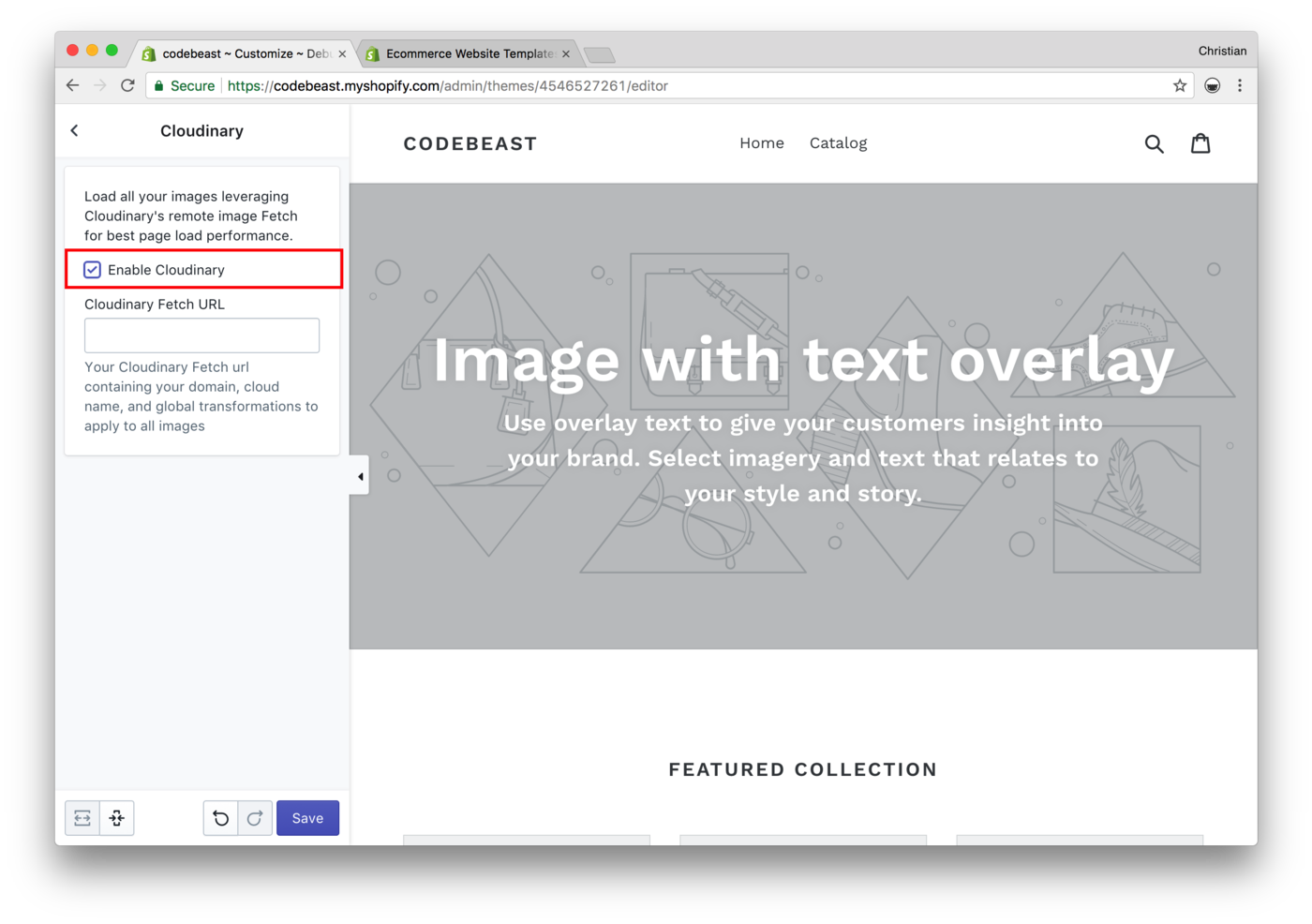
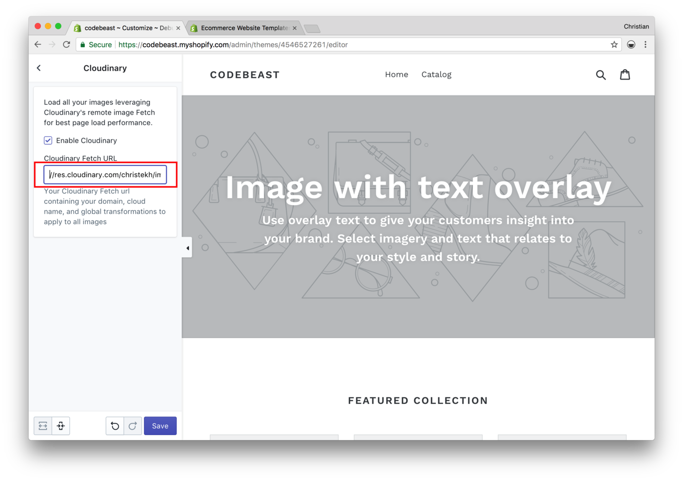
  • Use responsive images. The most straightforward way is to add the image 'srcset' and 'sizes' attributes to all images. Responsive image functionality is already built into some CMS systems, for example, WordPress uses Picturefill to ensure support of older browsers. Another approach is to use the <picture> element, for cases where you want to do art direction on a photo, with full control over what part of the image is shown at various screen sizes. Third-party tools like Cloudinary are another solution.

  • Audit the site regularly to make sure image best practices are being followed.

With proper training for content creators and the proper planning and implementation techniques completed up front by developers, images can be an asset and point of differentiation for a website or web app, instead of a frustrating bottleneck.

“Sheelah Sheelah Brennan, Web developer and owner of, Sheelahb.com

I optimize images as a part of my Magento speed optimization service. E-commerce sites powered by Magento are the complex catalogs with thousands of images. It is impossible to manually optimize every JPEGs or PNGs so I utilize a couple of automatic size reducing techniques.

I use gifsicle for GIFs, jpegtran for JPEGs and optipng for PNGs - these are command line utilities used as prebuilt packages for your OS. I use the following bash script to find every image and optimize it on the fly:

#!/bin/bash

find ./media -iname '*.gif' -exec sh -c 'gifsicle -b -O3 -o "{}.out" "{}"; mv "{}.out" "{}"' \;

find ./media -iname '*.png' -exec optipng -o5 -keep -preserve '{}' \;

find ./media -type f -iname '*jpg' -exec sh -c 'jpegtran -outfile "{}.out" -optimize "{}"; mv "{}.out" "{}"' \;

This script could be added to cron daemon to optimize the new images as they come in (see this post for more details).

The second technique I use is called the Google PageSpeed Module, a server extension which you can install either for Nginx or Apache. This tool optimizes images and caches them on the server. The configuration is simple:

ModPagespeedRewriteLevel CoreFilters

The CoreFiters filter includes image optimization as well as many other useful speed optimization tools (see https://modpagespeed.com/doc/configuration).

The third method I sometimes use to polish images that are already optimized by the first two techniques is to run the page through Google PageSpeed Insights, and then download the optimized image pack (you can find the download link at the bottom of your pagespeed report, see https://developers.google.com/speed/docs/insights/OptimizeImages). But even with the PageSpeed module installed, Google Insights can still squeeze a few kilobytes here and there. The third method requires a lot of manual work and patience, but it will pay off.

Contributed by Konstantin Gerasimov, CEO, goivvy.com


Amongst the many file formats out there, we're going to these three popular formats. It's might not be critical for a common user to know the exact difference between them, but it is more crucial when it comes to image optimization.

Here is our take on so-called optimized and progressive types of image files.

Optimized JPEG or optimized PNG (also called non-interlaced PNG) creates improved image files with smaller sizes. The browsers loads such files top-to-bottom while, and the image data arrives gradually. This provides the best compression for image files under 10K, which is usually preferable.

Progressive JPEG or progressive PNG (also called interlaced PNG) allows to display the low quality images before all the graphic info is loaded. The more information is loaded, the better the image quality. This format usually provides better compression for files over 10K.

After we have come to an understanding of which image format is better for different types of images on your e-commerce site, we'd like to touch on the way to compress all images on the site to reduce their size.

However, even if you choose the most appropriate format for your images, they still might be huge in size. The better quality an image has, the more it weighs. When you have thousands of pictures in your online store, even 10% image compression will substantially improve the page load speed.

Quoted from: http://promokit.eu/prestahop-blog/image-optimization-to-speed-up-your-site/ (edited)

Contributed by Kate Green, Promokit


Images are very important for web articles. For a great article, you need well optimized articles with proper keywords and attractive images. However, for a better user experience, images should be optimized. For example, if a visitor views your article and it's taking time to load the image, they might leave your site. Furthermore, search engines might rank you lower in search results.

You need to optimize your images. The thumb rule I follow is to use images that are less than 50kb in size, while maintaining the quality. Sometimes, I may go up to 60-70kb, but no more than that.

The tools which I like to use for image optimization are free and provide good results. After finding an image and editing it, I always compress it using compressor.io and then compress further using tinypng.com. I also use the Advanced Lazy Load WordPress plugin, which reduces the page load time and provides a great user experience.

For more details, see: Websites to Find Creative Commons Zero Images.

Contributed by Pawan Bahuguna, Owner, Tech2Blog


Image optimization may appear to be a bit complex, but with a few tricks, you'll master it in no time. When it comes to anything on the Internet, content may be king, but a picture is worth a thousand words. This is the reason why it is key that you optimize any images that you use on your website.

  • Image Quality: It's only logical that any image you choose to place on a website will be of the highest quality imaginable. But you'd be surprised at the amount of poor quality images you'll run across, on some of the most popular websites out there. The best way to approach this is to take an in-depth look at the image and check for clarity. After that you can check resolution vs. size to make sure the image quality is consistent for resizing.

  • Image Size: There are plenty of new plugins and tools that help automate image resizing. Where these tools are not employed, you can use Photoshop, Pixlr editor, or even basic paint to resize images. Be sure to always check constrain proportions so that your image quality stays intact.

  • Image Alignment: This is one of the most commonly overlooked of all image optimization elements. There are usually 3 main options to align images online: left, center, and right. You can align images this way and have them text-wrapped (left and right alignment is ideal for text wrapping). Center is typically used only to feature an image and have the text positioned above or below the image.

  • Image Title, Meta, and SEO: Recently, it has become mandatory for all images to be appropriately optimized for search engine ranking purposes. First, the title of your image should coincide with the page name, keyword, or post name that you are targeting. Additionally, you can caption the image with keywords or explain the picture in detail to the audience. It is a good idea to also incorporate subject and keyword phrases or terms in the alternate text option.

Search engines pick up images and rank them in their listings for those specific terms. This assists you in not only enhancing your content ranking in the serps, but it also boosts your ranking and traffic through those looking for particular images via keywords.

Contributed by Matt Hall, Owner, Scepter


One of the main reasons for increased page load times is images on the page!

How to do it right:

  • Progressive Image Loading: Your web page is not available for use until all the images (<img> tags) are loaded with an image from their src. So, first replace all your img tags with placeholders. The placeholders will be a blank area on your web page which will be replaced by the high-resolution images. Doing so will allow your web page to continue execution without hindering the loading of page. For any image that you need to show you must have two versions of it, one is of high resolution and other is of low resolution (max 1kb in size).

  • Host Images on a CDN: When the images are hosted on a CDN, it takes the load off our application. Also, when we make multiple requests, we get a cached copy, which is much faster.

  • Choose a Proper File Format: If the images are composed of simple geometric shapes, they are great candidates for the vector (SVG) format. Images with complex shapes, colors, and details ought to be saved in one of the raster formats (GIF, PNG or JPEG).

  • Use CSS Sprites: If there are many icon images on the page, combine them into one image and display them with plain CSS. This will eliminate the multiple requests for different icons as we are loading one single combined image.

How is it done wrong?

Most of the time, we need to use high resolution images to provide a good user experience. This results in slow page load on slow networks, which not only reduces user's interest but also affects the pagerank/crawling done by the search engines. We can reduce the quality of the images, but that doesn't solve it.

Here are some tips and tricks:

  • Most developers use a basic low-resolution placeholder, such as a loading icon, until the image gets loaded. This makes the UI dull and the user feels the site is slow.

  • Also, don't use only one master low-resolution image. Showing the same low-resolution image in 10 places until the page gets loaded makes for a bad user experience.

  • Create two separate versions (low and high resolution) of images and use a unique low-resolution version for each image.

  • Start the loading of the images after the page is fully loaded. This is relevant for blogging sites where user care more about content rather than the media attached to it.

  • Create multiple high-resolution versions of the image, such as one each for desktop, mobile, tablets, and render high-resolution images based on device.

  • Prefer vector formats: vector images are resolution and scale-independent, which makes them a perfect fit for the multi-device and high-resolution world.

Contributed by Ankur and his team at BoTree Technologies


Image optimization means making your images effective enough to be understood easily by search engines as well as users. Here, I'm not only talking about creating an attractive image that catches immediate user attention. Image optimization is more than that.

Let's say that you make an image compelling enough to catch a user's eye and understandable enough to deliver your message. But what about search engines? They are not humans like you and me. They are bots that won't see your image or its colors.

For example, I want to create an image of the sea under a blue sky during daytime. To make it readable for search engines, I'll use an Alt Tag with the name "Sea Under Blue Sky During Day Time":

<img src="/seaunderbluesky.jpg" alt="Sea Under Blue Sky during Day Time" />

Next, I'll give it a proper description to make it more recognizable:

<meta name="description" content="This photo is about blue sky, surface, horizon."/>

Plus, I'll take care of its uniqueness by adding the ".jpg" extension: seaunderbrightbluesky.jpg.

This is just a brief of how you can optimize your images to make them easily understandable by both search engines as well as users.

Contributed by Jimit Bagadiya, SocialPilot


When printing images in a book, there are a few specific requirements to consider for optimal results. First, while a minimum resolution of 150 ppi will most likely be satisfactory, 300 ppi is optimal. Images should also be saved in JPEG format with maximum quality settings. If you're able to apply a color-space, we recommend sRGB, as it most closely resembles the eventual print device.

Also, keep in mind that printed images usually print darker than they appear on a computer screen. For this reason, we recommend that you lighten each image and apply sharpening as a last step, prior to placing it into a book design. Following the information above will likely give you great print results, but if you need more information or are interested in soft-proofing your images, a good print provider will also have a color-management page on their website. Check out Blurb's color management resource center for more information.

Contributed by Estee Shechter, Blurb


An image is worth a thousand words, but it's also worth a boost in conversions. There is nothing worse than stretched, improperly sized, or inconsistent images. It's a dead giveaway to visitors that your site isn't professional and therefore not trustworthy.

When you visit a quality e-commerce site, their images and thumbnails always seem to line up in a nice grid, right? The trick is to maintain a consistent aspect ratio. That's the ratio of the width to the height of an image or screen. Maybe you're not up on your geometry, so I'll make it simple for you: you just need to make all of your product images square.

Maintaining the correct aspect ratio in Photoshop is surprisingly easy, just hold down the shift key down while cropping or making a selection to maintain an aspect ratio. The crop tool can also be set to to a square. Remember to keep your photo centered.

When saving images for the web, we need to strike a balance between file size and quality. For most images, the above settings when used in Adobe Photoshop CS5 will yield excellent quality within minimal file sizes. If you select "optimized" you may get a slightly smaller file size. Resist the temptation. We know that progressive JPEGs (while bigger) will appear to load faster to the user.

“Kurt Kurt Elster, MBA and owner of, Ethercycle

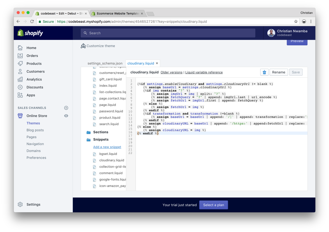
Our company deals a lot with video files. Our video converter tool is capable of converting any resolution videos and preparing them for website integration. Some corporate website owners prefer to host videos on their own servers instead of uploading them to YouTube or other video platform. So they must have a fast CDN to provide sufficient video buffering speed and cross-platform accessibility. I think a good cloud-based system like Cloudinary can help optimize your 'cost-quality' ratio.

As for technologies, I'm after HTML5. It's a new standard of web markup which has been already adopted by major content providers. Our stats show that since 2016, the conversion to HTML5 outperforms the conversion to Flash formats, which means that users also opt for this new progressive technology.

Contributed by Emily Cooper, Marketing VP, Freemake


When developing web stores, image enhancement is key. According to HTTP Archive, the average page size today is 2.9MB, while images are taking up over half of this size. Image enhancement is a must-have to adhere for reducing page size as well as page load time. This also influences Google rankings while increasing customer loyalty.

One of the key approaches for enhancement is proper use of formats. For example, when saving images in JPG format, you increase its original size. Moreover, you complicate things for the user, because JPG implies image artifacts that are noticeable in the text. Therefore, the format should be chosen according to content:

  • SVG is considered to be ideal for vector graphic, diagrams and graphs.

  • PNG is useful for various clipart and images with open areas.

  • JPG is a perfect solution for photos.

  • GIF is suitable for animated images.

Nowadays there are so many ways to perform image enhancement including online tools, extensions for your website, and applications. In most programs and tools, proprietary algorithms as well as add-in programs are used, for example, pngcrush, optipng, jpegtran, jpegoptim, or gifsicle. Besides, you should remember that operations are executed without deteriorating image quality.

“Denis Denis Guryanov, Frontend Developer at, BelVG

Image optimization is a deceptively complicated area. Where is the sweet spot between a fast site but one that runs with images of a high enough quality to capture visitors' imagination? Here are a few of my favorite techniques that can reduce your image size without negatively impacting your visitor experience:

  • Resize them: I've seen so many sites loading massive images just to resize them on the page.  Bloated 3000+ pixel image codes to appear as 250px wide, eating up bandwidth and slowing down the site. Figure out what the size of the image will display as on the page, and resize your images accordingly. This is by far the simplest and highest value of all image optimization to-dos.

  • Optimize Them: We're talking about optimizing the actual images to appear the same but be smaller in size. You can either use a tool such as TinyPNG, which strips out some of the image metadata and uses lossy compression to reduce the number of colors in the image. Nine times out of ten the resulting product looks exactly the same on a monitor or close enough. However, I tend to shy away from these tools as the one time in ten (more for some tools) is unacceptable and not worth the trade-off.

  • Use a Content Delivery Network (CDN): Your web server works hard for you every day processing all your pages, sending out emails (some anyway), hosting your cPanel and a ton more. Add serving all your images to the mix, and you'll be slowing down the entire system. A CDN hosts the images on servers dedicated to the single task of presenting them to the world. Most CDN providers also have multiple datacenters and serve the images from the one that is closest to your visitor.

  • SCRSET: A typical page would call an image with code similar to the following:

<img src="desktop-image.jpg" alt="Hopefully you have one.">

The problem with this is that the same image is being served for mobile devices and desktop. Basically, mobile devices are pulling in images that are generally larger than they need to be, thus slowing down the page load for the already slower device. A simple switch in the code to something like the following might help:

<img src="mobile-image.jpg" srcset="tablet-image.jpg 500w, desktop-image.jpg 1200w" alt="If you're using SRCSET this is probably done.">

In this case, the browser will make the calculations as to which image to use based on the resolution the device needs. Even if you had only two images, one for mobile and one for desktop, you'll be doing a great favor to your visitors.

Contributed by Dave Davies, CEO, Beanstalk Internet Marketing


To make GIF files smaller in size, there are two optimization methods:

  • Lossy compression: This removes some of the data from the original file. The result is a reduced file size, and reduced quality. The result image can become fuzzy and pixelated over time.

  • Lossless compression: This reserves all of the data from the original file. While the file size remains larger than than lossy compression, the image's quality does not degrade over time.

If those two methods aren't sufficient, GIF images can be converted to other file formats.

The easiest alternative for static GIF images is to convert them to PNGs. While the two formats are very similar in terms of choices for displaying simple graphics, PNG has the advantage for being able to compress to up to 25 percent smaller than an equivalent GIF file.

PNGs can be a great alternative for static GIFs while HTML5/MP4 that are considered more modern techniques, are more suited for alternatives to animated GIFs. Simple graphics such as lines or shapes can also be made using SVG or pure CSS. These are more robust and smaller in size.

Quoted from: https://www.eyerys.com/articles/how-optimize-gif-format-performance-and-knowing-alternatives

Contributed by Hafiz Rahman S., Eyerys


Image optimization is a crucial part of enhancing your web page's overall performance, but unfortunately, it is neglected by most web page owners. However difficult it may seem to a non-technical person, image optimization is quite easy to perform. Here are a few easy hacks to optimize the performance and quality of images on your website.

  • Image size and quality are two important factors in image optimization. Arriving at a point where you get the best image quality at the lowest possible file size is the key to image optimization. Images obtained from the web, or any other source, are often large in size and need to be compressed before uploading, to ensure the faster performance of your web page. It is important to choose the right file format and image compression tool to achieve this goal. The JPEG file format is the best for image compression as it uses both lossy and lossless optimization. GIFs are good for animated images. Everyday tools such as Adobe Photoshop or other freely available image editing tools can be used to compress the images.

  • Naming the image properly is a quick trick to optimize the performance of your image. Did you know that inserting a few keywords (separated by hyphens) into the image's file name can increase its visibility manifolds? However, refrain from adding too many keywords---three to five keywords in the image file name are adequate. Many people make the mistake of using abbreviations in the image name. Avoid this at all costs.

  • Make the alt text descriptive. It is a good idea to describe your image in the best possible manner (use 10 to 15 words), because Google considers alt text as a ranking factor. Also, alt text is identified by readers.

  • Image Captions cannot be ignored. Studies show that most people read the image captions first, and then decide whether they should read the rest of the content or not.

Contributed by Krishna Charan S.S., Senior Executive - SEM, Dot Com Infoway


One of Webflow's core values involves immersing the artist in the medium is an essential part of the design. With regard to responsive images, this means previewing the effects of srcset/sizes and intrinsic size in the designer, as you move nodes around and change styles. Intrinsic size can affect a layout in unexpected ways, so getting that feedback as soon as possible is important to the design process.

When it comes to finding the right balance to optimizing responsive variants, we apply lossless compression optimizations. We do breach into lossy optimizations but try to be careful about it by using perceptual image coders with high-quality settings. The variety of images we encounter is one reason, but ultimately we'd lean toward quality over reducing file size. We also rely on HTML5 standards to optimize page speed via prefetching.

By being wise about the gap between your breakpoints and responsive variant widths, you can also get a lot out of a simple browser cache for repeat visitors with differing window widths. I resize my browser window all the time, and wouldn't want variants so specific that I keep downloading slightly larger versions of the same image.

Quoted from: https://blog.ycombinator.com/how-to-use-responsive-images/

Contributed by Yoav Givati, Engineer, Webflow


Image Optimization Tips

Image optimization is a tricky business, and it can make the difference between a decent looking site and a truly beautiful one. Here are a few best practices for optimizing images for websites. These tips regard using Photoshop, ImageAlpha, and ImageOptim.

  • Photoshop allows you to "Save for Web" with the quality setting as low as possible (35-55%). This setting compresses your image, removing some of the image quality in the process. When saving for web, it's best to look at the preview window while adjusting the quality until you find a good balance between the image file size and quality. To smooth out and counteract the pixelation, you can add a bit of blur (0-.1), depending on the actual composition and detail of the photo.

  • Images with text require higher quality, because the text will appear pixilated before the rest of the image. I use 55% as my recommended starting point, and then you can try decreasing the quality until you have gone too far with the compression--then bump it back.

  • Images that have lots of solid colors (simple background gradients and graphics) can usually get away with a lower quality, as related to compression, because there is not a lot going on in the image. 35% is a good place to start.

  • Photographs of people and landscapes are somewhere in the middle, the key is to get the file size as small as possible without compromising image quality.

  • ImageAlpha is a free app that removes extra colors from your image. You simply drag your file into the app and reduce the number of colors (256, 128, 64, etc), which also reduces the file size. You can play with the settings and A/B test the image with various settings.

  • ImageOptim removes excess metadata from your file, sometimes reducing file size by as much as 15-20% without losing any image quality. I highly recommend this step as it is fast, easy, free, and does not compromise the image.

  • For full-screen images, you should shoot for less than 500k in file size. Ideally, a web page shouldn't be larger than 1-2MB to load quickly on mobile.

Dealing with Responsive Images

It's important that images are actually larger than the area they display in, because retina screens (such as in MacBooks, iMacs, iPads, and iPhones) contain twice the pixel information per inch. I develop for 2560px screens (27" iMac for example), so any image that should take up the entire screen should be at least 2560x1440 (16:9 ratio). Double that size if you want it to be retina-ready.

Any image that is inside of a column in the content area should be a standard ratio (3:2, 4:3, 1:1) and its size depends on the site width, for example, 1080px.

  • If you want an image to go "site width" it should be at least 1080px wide.

  • If you want the images to look stellar on retina screens you must double those sizes.

  • 1/1 column is 1080px (2160px retina)

  • 1/2 column is 540px (1080px retina)

  • 1/3 column is 360px (720px retina)

  • 1/4 column is 270px (540px retina)

  • 1/5 column is 216px (432px retina)

  • 1/6 column is 180px (360px retina)

  • A standard WordPress thumbnail is 150px (300px retina)

All of this is changeable and is dependent on the "site width" setting of your website.

Responsive Breakpoints

The size at which a website switches from a multiple column layout to a one-column layout is referred to as the column breakpoint. A standard column breakpoint is usually around 800px. Any image that you want to be the full width of the column breakpoint should be at least 800px wide.

Contributed by John F. Van Dinther, TwoHatsConsulting


When it comes to images, keep in mind that images dimensions are not the only thing that matters, but also the compression level. Two images with the same dimensions can have a very different weight, depending on how you compress them. I'll outline three compression methods:

  • Manual compression: If you aren't comfortable enough with Photoshop, ImageOptim can be used to compress a bunch of images on the fly. It will reduce the file size with lossless algorithms, so you won't lose in quality, and will also remove redundant image metadata. They also support the new Guetzli JPEG encoder, released in March 2017 by Google. If you want to integrate it with your website, there's also a web service available (but it isn't free). For Windows users, you can check out FileOptimizer.

  • Client-side compression:

  • ImageOptim, already mentioned for manual compression, can be used for client-side compression in the form of a Grunt plugin. After a quick setup, the plugin compresses all images located inside the images folders defined in your gruntfile. This solution is very efficient, but has one downside: if your platform frequently publishes content with images, you'll have to run Grunt at short intervals.

  • You can also leverage the Javascript Image Compression (JIC) library. By attaching this library to your images upload fields or WYSIWYG text area, your browser automatically compresses your 4MB image into a much smaller, web-friendly image. Combined with an image resizing library, we are getting closer to a fully automated image processing.

  • You can also combine both, by using Grunt for your general images, that are part of the look and feel, and JIC for user-uploaded content.

  • Server-side compression: The mod_pagespeed Apache module (also available for nginx and IIS) performs a bunch of server-side operations that serve your site's performance, such as minifying, compressing, concatenation of JavaScript and CSS files, better resource caching, deferred loading of assets, and of course image optimization and compression. Together with helping your PageSpeed Insights, you'll gain in page load time and automation. It won't replace all the optimization that you can do upfront, but it's a easy way to improve performance and reduce page size.

Contributed by Morgan Milet, Dropsolid(https://dropsolid.com)


There are two main reasons that image optimization tools are so popular. The first is related to usability improvement: You'll experience improved page load time after images on your page are optimized. The second is the fact that optimized images equal saving disk space.

Image optimization serves usability because the smaller the image, the faster the page load time for the user. Load speed is a factor that has a great impact both on usability and website optimization. In addition, you can save disk space if you upload optimized images to your website.

Supsystic's free version of the Photo Gallery plugin solves these issues by allowing you to optimize thumbnails, save backups of source files, compare the appearance of compressed and optimized files, and more. See our documentation for more details.

Contributed by Supsystic


An active site includes a maximum of 5-7 images in each of its blog posts. Optimizing 5-7 images a day is not a big issue. Here are some image optimization tips and tricks:

  • Select only PNG/JPEG image formats for better optimization.

  • Always add an image title, a description and alt text while uploading an image in WordPress.

  • Use high-end hosting for better image load speed.

  • Mention image credits if required, to avoid copyright issues.

Here are few recommended image optimization tools and technologies:

  • Compress your images using selected WordPress plugins (see our post on the subject).

  • I recommend the following free tools for image compression: TinyPNG, Compressor.io, Kraken Image Optimizer.

  • You can also use CDNs such as Cloudinary, MaxCDN, Amazon's AWS, and more.

To avoid mistakes:

  • Never upload an uncompressed image.

  • Do not over-compress your image with multiple tools that might damage image quality.

Contributed by Alok Rana, LoudTechie


In these times of large screen resolutions and massive full-screen images, image optimization is more important than ever. As a WordPress theme development company, we often stumble upon websites where images are being heavily scaled instead of displaying images with the optimal size and image dimensions. When selecting a WordPress theme, it's highly recommended to choose one that's displaying thumbnails that are sized correctly, without wasting valuable page load time on image scaling.

Another important aspect is to optimize images before you even upload the images to your website. It usually is disadvantageous to upload a portrait image, if your website is optimized for landscape images. For example if you're running an online magazine or news website, it would be recommended to optimize the size and image ratio before uploading the image to your site. This not only saves server space, but also helps avoid other image-related issues.

In addition, always make sure that the images on your website are compressed. Serving optimized and compressed images with less file size can speed up your website, save bandwidth. You usually won't lose image quality, at least not in a way that it's noticeable by the human eye.

Contributed by Michael Hebenstreit, MH Themes


The best tip I can provide is: Automate your image optimizations. If your optimizations can be offloaded to a service or build/deploy process, your server or your framework/CMS can use that. Use tools. Don't get stuck following rules that may not suit your current project.

If you're not using a service, there are three tools you can put in your toolbox:

  • MozJPEG for all your basic JPEG optimization needs. Typically MozJPEG's default settings provide big wins in file size. The easiest way to install this across many operating systems is through NPM.  

  • For PNG images, use PNGQuant and/or ZopfliPNG. If you don't want to lose any pixels (lossless compression), use only ZopfliPNG.

  • For Animated GIFs... well, don't use them. Use either a WebM or MP4 file converted with FFmpeg or an animated WebP image with mixed compression mode using Google's gif2webp. Additionally, you can use animated PNGs for compression on Safari and Firefox-based browsers.

  • Send or serve the appropriate image for each browser.

  • Animated images might be a pain point if you want good cross-browser support. Most Blink-based browsers support animated Webp images.

  • Firefox, Safari, and  Chrome (as of version 59) can use Animated PNGs. However, if you're sending anything other than an animated WebP to Chrome, you're sending more data than you actually need to. The Picture Element or Content Negotiation for WebP images is your best bet (see our post).

To wrap all these tools into a nice package, MacOS users can use Imageoptim. Windows users can use the above Node/NPM tools, or install them through Bash on Ubuntu or Windows.

Contributed by Cory Dowdy


Image optimization is one of those things that will always be a huge performance killer when it comes to websites. Unfortunately, this is something that users will always ignore or put off to the last minute. As someone who works in the web performance industry, I see bad practices on a daily basis. For example, users uploading full resolution-images that are 5+ MB, not utilizing a CDN to speed up distribution, or not sizing images down beforehand, which in turn leaves CSS to rescale them.

Here are a few quick tips I give people whenever I see unoptimized images slowing down their site:

  • Images need to be compressed. Whether you go lossy or lossless, it's important to pick one and roll with it. I personally recommend lossy for most users, as they will see the greatest speed increases. A lot of times images can be compressed by up to 60%+.

  • Compressing images doesn't have to be complicated. If you're using a tool like Photoshop or Affinity Photo, simply utilize the "save for web" feature and quality indicator bars when you save out a file. If you are using a CMS like WordPress, there are dozens of WordPress image optimization plugins that can automate the compression upon uploading to the media library.

  • Look into other file types which can further reduce the size of your images. I highly recommend utilizing both SVGs and WebP if you can. SVGs work great for logos and icons. WebP images, Google's image format, have been shown to be drastically smaller than both JPG and PNG.

  • Resize your images in a photo editing tool before uploading to your site, or utilize a plugin. If your web page is 800px wide and you upload a photo that is 1400px wide, CSS is going to have to scale it down to fit the page. This adds to your load time. I suggest also doing some research into responsive images (retina) as you will want to also take this into account when making your image size calculations.

  • CDNs are here for a reason, and they can drastically increase the load time of your optimized images by distributing them from servers closer to your users (which reduces latency). They can also help the performance of your entire site by ensuring that not only your images, but also your other assets, as they are delivered via a fast HTTP/2 connection with multiplexing, server push, etc.

There are numerous other things that can be done, such as lazy loading your images or using web fonts like Font Awesome in place of images on your site. In 2017, there should there are no more excuses for sites running slow due to large, unoptimized images. There is plenty of free information out there on how to get started.

Contributed by Brian Jackson, Director of Inbound Marketing, Kinsta


I like solving tricky programming problems ( think of them as Sudoku puzzles or clever logic problems). So I probably enjoy complex algorithms more than most developers. However, even I find some image compression algorithms daunting. I could probably cobble together a simple one if I had to, but fortunately, I don't. I work mostly in C# and Visual Basic these days, and the .NET framework that they use provides a reasonably nice image compression tool.

The System.Drawing.Image class provides a Save method that saves an image into a file. Optional parameters let you specify the file type (.bmp, .jpg, .png, and so forth) and a compression level. To specify the file type, loop through the array of encoders returned by the ImageCodecInfo.GetImageEncoders method until you find one with the right Multipurpose Internet Mail Extensions (MIME) type.

The following code shows a simple GetEncoderInfo method that returns an encoder for a MIME type.

// Return an ImageCodecInfo object for this mime type.

private ImageCodecInfo GetEncoderInfo(string mimeType)

{

   ImageCodecInfo[] encoders = ImageCodecInfo.GetImageEncoders();

   for (int i = 0; i <= encoders.Length; i++)

   {

       if (encoders[i].MimeType == mimeType) return encoders[i];

   }

   return null;

}

To set the compression level, create an EncoderParameters object. Give it a parameter of type System.Drawing.Imaging.Encoder.Quality with a value between 0 and 100. The value 0 provides high compression and low image quality. The value 100 provides high image quality and a large file (probably larger than the original file).

The following SaveJpg method uses the GetEncoderInfo method to save an image into a file with a specified compression level (I've skipped error handling to save space):

// Save the file with a specific compression level.

private void SaveJpg(Image image, string filename, long compression)

{

   EncoderParameters encoderParams = new EncoderParameters();

   encoderParams.Param[0] = new EncoderParameter(

       System.Drawing.Imaging.Encoder.Quality, compression);

   ImageCodecInfo codecInfo = GetEncoderInfo("image/jpeg");

   File.Delete(filename);

   image.Save(filename, codecInfo, encoderParams);

}

Now you can use this method to write a program that adjusts image compression. It's pretty fast, so you can even use a slider to try out different compression levels. Whenever the slider moves, save the image at the selected level in a temporary file and then display it. With a little experimentation, you can decide exactly how much compression you can get away with and still get an acceptable result.

Contributed by Rod Stephens, C# Helper


As an internet marketer, I frequently come across client websites that have unoptimized images. I generally run into the following issues:

  • Using larger images and then resizing them using CSS or image (width/height) attributes.

  • Using print quality images that are unoptimized for the web.

  • Not lazy loading images on pages that have too many images.

  • Using the wrong format of image, such as using PNG when JPEG would have resulted in a lower file size.

Here are some image optimization tips and tools:

  • As far as PNG images go, one of best compression tools I have come across is PNGQuant, a lossy compressor. It also works well with images that have an alpha channel providing the smallest possible file size along with high-fidelity transparency.

  • If you want even more compression, you further compress the image with PNGOutwin, a lossless compression software. In other words, it does not reduce the image quality.

  • When it comes to the web, it's always best to save PNG images as PNG8, which is a lossy image format that supports only 256 colors.

  • For JPEG, save the image using a lower-quality setting, somewhere around 80%-85%, and you can always go lower if the image isn't too blurry.

  • Most JPEG images also carry EXIF data, which add a little bulk to the image. In addition to removing EXIF data, saving the image as a progressive JPEG (for images larger than 10kb) reduces the overall size, and also helps the image load faster when connections are slow. You can also try reducing the chroma information to reduce the image size further. Photoshop's 'Save for Web' option allows you to play around with these options.

  • An open source program that I love using to optimize JPEG images is RIOT, which has a range of minute settings for maximum compression for while maintaining overall quality.

  • There are also a few open source options, such as mozjpeg by Mozilla and Guetzli by Google, which can reduce JEPG size by around 10% to 20%. But these need to be used through the command line (a GUI version isn't currently available).

Contributed by Mukesh, OrbitingWeb


Too many small business owners waste good money when it comes to trying to improve site performance. Image optimization is one way for site owners to improve performance without breaking the bank.

Some people assume that just because they use WordPress, their website is automatically SEO-optimized, and their images are too. There are many image optimization plugins available for WordPress, and if you're not using any of these, you're probably missing out on SEO and user experience.

Among the WordPress plugins, I recommend trying EWWW and imagify.io. These plugins have a variety of features such as  bulk image optimization, file type conversion, and automatic conversion of new uploads. Cloudinary's WordPress plugin is also great if you'd like to get optimized images hosted in the cloud for you. A lost second on the web can cost you big in the bottom line.

See our plugin comparison for more details.

Contributed by Pietro Saccomani, Founder, MobiLoud


Something that a lot of newcomers fail to understand when it comes to image optimization is the value of optimal resolution and quality. In a few image formats such as JPEG, which are lossy, some of the details are lost as a tradeoff for reduced size. In these cases, the lost details that are mostly irrelevant and would go unnoticed.

Another underestimated way to reduce size is picking the optimum resolution. Almost everyone knows that lowering the resolution reduces the size, but very few people understand how massive the difference in size is. This is because image size scales to the square of resolution dimensions.

All of these operations mentioned above can easily be achieved on the Unix command line using ImageMagick. To reduce the quality of an image (only for lossy image formats), run:

convert <input image location> -quality <quality desired (in precentage)> <output image location>

For example:

convert input-image.jpg -quality 55 output-image.jpg

To change the resolution of the image (also works on lossless formats):

convert <input image location> -resize <resolution> <output image location>

For example:

convert input-image.jpg -resize 1280x720 output-image.jpg

Mix and match quality reduction with resolution changes until you have an image with the detail you desire and the lowest possible size.

Contributed by Soham Kamani, Founder, sohamkamani.com


Traditionally, icons on a web page have been drawn using bitmaps, which are often stitched together to deliver faster over the wire. However, bitmaps do not scale well on different screen resolutions, and this is a problem for responsive web design.

Font icons have proved to be a great alternative. Another common alternative is to use SVG, which means drawing scalable vector graphics. While there has been a good amount of research about optimizing network performance of font icons or SVGs, I could not find data that talks about the performance of these icons after they have been sent and rendered on the browser.

I wanted to check which type of icon allows 60 frames per second. The test candidates are:

  • Font icons: A font file embedded in an HTML page using the <link> tag, where the icon was usually created using a class.

  • Inline SVG: SVG markup was used for the icon embedded into the web page.

  • Background SVG: The SVG was inserted as data:uri in a class that was applied to repeated elements on the web page.

The web page had each of these icons repeated multiple times, making the page long enough to scroll. Running each test multiple times, and watching trends for each of the 733+ icons should eliminate noise in the data. Basically, the performance order was, from best to worst: Font icons > background SVG > inline SVG.

From a pure performance perspective, font icons seem to perform the best. However, they cannot be manipulated like inline SVG icons, and are restricted to animating as a single unit. When using these recommendations on your site, they should be tested (using something like browser-perf).

Link to the full article: http://blog.nparashuram.com/2015/05/icons-font-inline-svg-or-background-svgs.html

Contributed by Parashum, Founder, blog.nparashuram.com/


There are several ways to optimize images for online use:

First, creating multiple image sizes is highly recommended. Often you only need to display a thumbnail of an image, which would not require the full size. In such a case, creating a thumbnail copy of the original image save you load time, especially when creating a image gallery.

Take the time to decide which image format suits your need. You often won't need the maximum quality or any transparency options. When you do need transparency and high quality, go with PNG. If you need to display larger images without transparency, go with JPG.

When creating images, you can always try to play around with the quality settings, especially for JPG. Just try see how an image looks with a lower quality setting before choosing best quality. The differences are usually hardly visible, especially for images with less complexity and less colors.

Contributed by codester


Videos don't necessarily have to be an impediment to improved web page performance. Here are some of the ways to optimize video files:

  • File size: A video's file size depends on the bitrate and other metadata attached to it. Data compression is one of the techniques to reduce the video file size without losing quality. FFmpeg, HandBrake, MPEG Streamclip are some of the compression tools that can be used to restructure the way pixel data is stored to make the final video optimized and lighter.

  • File format: Different video file types store data in different ways, which is why a WebM video is lighter than an MP4 video. In addition, the browser may support only a few of the available formats, so ensure you aren't embedding videos that require extra plugins. Modern browsers support HTML5 formats like MP4, WebM and Ogg, which are is recommended.

  • CDNs: CDNs can be used to stream video content so that it is available to the user instantaneously. Online Video Platform (OVP) providers offer services that handles video optimization to provide the user with seamless video streaming.

  • Video streaming: Several new technologies make use of Adaptive Bitrate Streaming over HTTP to enable streaming; some of these include MPEG-DASH, HTTP Live Streaming (HLS), HTTP Dynamic Streaming (HDS), and so on. All these protocols are designed to stream videos from a regular HTTP server, making specialized media delivery servers redundant. The video stream is broken into smaller chunks of different bitrates that are ready for playback; a device trying to view the video file can pick the data stream as needed based on the bandwidth available.

  • Optimizing page design for video: In addition to the format and data delivery of the video content, it's also important to optimize the web page design so that it doesn't hinder the user experience. Here are some points to consider when designing your website:

  • Optimizing for mobile devices: The video must re-adjust along with the responsive design of the website; it should also detect the device orientation and display the video accordingly.

  • Video size and placement: Using HTML or CSS to specify the exact width and height of the embedded video allows the browser to allocate the required bandwidth and avoid unnecessary overhead.

  • Deferring videos: Embedded videos that are configured to auto-play requires the page to make additional requests for files and resources needed for video playback, which might slow down the page significantly. Deferring videos from loading till after the initial page load has completed frees up bandwidth.

Multimedia content has become a necessity in engaging users and can improve conversion rates on your website. So there are more reasons to embed videos on your web page than there are disadvantages. There is no cost to performance if we optimize the page design, pick the right video format and utilize media delivery providers to handle video processing efficiently.

Contributed by Kameerath Kareem, Writer, catchpoint


When compressing your images, it's very important to make a proper balance between the image size and image quality. The quality of the image will decrease as the size decreases.

Here are a few different methods of optimizing/compressing your image size:

  • Optimizing images before uploading to the site: Optimizing your images before uploading them to your website may be time consuming, but it's the most effective of all methods.

  • Offline tools for reducing image size: No matter on which platform or operating system your machine runs, you will easily find a free or paid tool according to your preference. Some recommended offline tools are: Photoshop, GIMP, Trimage, ImageOptim (MAC utility), PNGGauntlet and RIOT (Windows).In RIOT, you can preview and compare your final results with the original image, is very useful.

  • Online tools for reducing image size: If you don't want to go through the hassle of downloading and installing the offline software on your computer, you can opt for online tools. Some recommended tools are: JPEGMini, PunyPNG, TinyPNG, Kraken.io.

  • Optimizing images after uploading to WordPress: There are various WordPress plugins available, however, this method is not as efficient as optimizing images before uploading them to your blog. Some of the most popular plugins are: Smush.it, EWWW Image Optimizer, CW Image Optimizer, Imsanity, Hammy. In fact, WordPress has a default JPEG image compression setting for images uploaded to the WordPress media gallery, which compresses by 90% of the original quality. There is no way to change this setting from the admin panel. Read our post explaining how to configure this setting.

With regards to image dimensions, the larger the dimensions the larger the image, which leads to slower page load. Don't depend on resizing the height and width of the images in your post editor, because the browser will still load the image with original dimensions and then resize it.

Therefore, you need to resize the image dimensions before uploading to your website. Check the content area width of your blog and resize images according to it. There are various tools for this purpose, such as PicResize, IrfanView, PicMonkey.

Contributed by Pankaj Kumar, WPBlogCafe


Whenever I start optimizing any website for performance, the biggest bottlenecks are non-optimized images, so I tend to start here. Luckily, it's easy to fix if you approach it systematically.

Here are three steps you should follow when preparing images for the web:

  1. Select the right image format: Broadly-supported image formats for the web are JPEG, PNG, and GIF. GIF is the only format that supports animations, but you should consider the <video> HTML tag and the WebM format for optimal performance. If you're displaying a still picture, this leaves you with the JPEG and PNG. The general rule of thumb is: Use PNG for illustrations, graphics, logos and all the images with only a few colors. Use JPEG for everything else: Pictures, Illustrations with gradients, and so on.

  2. Downsize the images before uploading them to your server: Before your downsize your images, you need to know how your images will be displayed on your website in terms of pixel dimensions. If your content container is 1200 pixels wide, you should downsize your images to be 1200 px wide. If you want to provide the optimal experience for users with retina screens, consider providing 2x image resolution, in our case 2400px (in this case, you should use the srcset and sizes attributes of the <img> HTML tag).

  3. Compress and optimize the images: The last step is to use an appropriate image compression algorithm to strip away as many bytes as possible. This one is the trickiest. It depends on your own preferences and it's the constant debate of what is more important to you: smaller file size or better quality?

Instead of leaving you here, I want to share a sweet spot that serves as a good starting point for JPEG images. When exporting the image from your desktop software (i.e. Photoshop), save the image at the quality set to 90/100. Then run it through one of the online image optimization tools.

If your CMS of choice is WordPress, you can rely on WordPress to handle at least steps 2 and 3. We've tested all leading solutions for WordPress in our 'Ultimate Guide to Image Optimization for WordPress' (more details).

Contributed by Primoz Cigler, ProteusThemes

Are your website images ready to embrace the iPhone X notch?

$
0
0

The announcement of the iPhone 8, 8 plus and the iPhone X at the iPhone 10th anniversary Apple event on 12th September 2017, came with a massive buzz.

The iPhone X (pronounced "iPhone 10") has a 5.8-inch super retina screen, which stands out amongst other Apples, giving the machine the tagline “it is all screen”. A resolution of 2436 x 1125 is also featured, making it the highest resolution iPhone to date.

Since the announcement, designers and prototypers have obviously been working in full gear to carve out products and designs to match the upcoming iPhone X.

That Notch

This is arguably one of the fascinating features of the iPhone X! (and the wonderful portrait above too). The Notch up top. Bold, elegant, has the flows around it and still fascinating, even though the guy in the portrait below doesn’t seem so thrilled.

One Notch to Rule All

We have to find a way to make him happy, how to make the notch really beautiful and useful for our images. Let’s do this with Cloudinary image transformation tools.

The iPhone X screen is unique in that the dark space (notch) that houses the camera and other sensors are actually part of the hard glass screen and content displayed flows around this notch. This is a very important aspect to consider in the UI/UX design of products to fit the all screen iPhone. In this article, we will discuss a way to fix your images, testing how it would look on the iPhone X.

spot the notch on top

How do you work with that screen?

Image management and manipulation can be done on-the-fly with Cloudinary. And when I say on-the-fly, that means that images are manipulated using dynamic delivery of their URLs!

Cloudinary also offers mobile-first image optimization for mobile design and the best part, it’s easy to use. These images are cached on the CDN and are immediately available upon request.

Cloudinary’s image management and manipulation service will be used in this article to simulate how images fit on the iPhone X screen. With this, you can test your images and products to see how well they fit on this new type of screenX.

Before we begin, let’s have a look at the sample image we will be manipulating.

Manipulate the image

To perform this test, you need the [this notch image].

iphone_x_notch overlay

Next, upload the image to be manipulated. In our case, we uploaded the overhead swimming pool image displayed above.

Now we need to apply the manipulation. Images in Cloudinary take the form of:

https://res.cloudinary.com/<cloud name>/image/upload/<transformation parameters>/<public ID>.<image format file extension>

So to adjust the swimming pool image, we use the URL below, and work on the <transformation parameters> portion: https://cloudinary-res.cloudinary.com/image/upload/ <transformation-parameters> /Spencer_Watson.jpg

Cloudinary offers lots of image URL manipulation parameters and they can be found here. For this test, we are going to be using quite a few parameters. The URL might look a bit scary at first, but scroll down a bit and we will walk you through the whole thing.:

Ruby:
cl_image_tag("spencer-watson-36.jpg", :transformation=>[
  {:if=>"ar_gt_1"},
  {:height=>562, :width=>1218, :crop=>"fill"},
  {:overlay=>"iphone_x_notch", :width=>325, :crop=>"scale"},
  {:angle=>90},
  {:angle=>"hflip"},
  {:flags=>"layer_apply", :gravity=>"west"},
  {:if=>"else"},
  {:height=>1218, :width=>562, :crop=>"fill"},
  {:gravity=>"north", :overlay=>"iphone_x_notch", :width=>325, :crop=>"scale"},
  {:if=>"end"},
  {:background=>"#000000", :radius=>54}
  ])
PHP:
cl_image_tag("spencer-watson-36.jpg", array("transformation"=>array(
  array("if"=>"ar_gt_1"),
  array("height"=>562, "width"=>1218, "crop"=>"fill"),
  array("overlay"=>"iphone_x_notch", "width"=>325, "crop"=>"scale"),
  array("angle"=>90),
  array("angle"=>"hflip"),
  array("flags"=>"layer_apply", "gravity"=>"west"),
  array("if"=>"else"),
  array("height"=>1218, "width"=>562, "crop"=>"fill"),
  array("gravity"=>"north", "overlay"=>"iphone_x_notch", "width"=>325, "crop"=>"scale"),
  array("if"=>"end"),
  array("background"=>"#000000", "radius"=>54)
  )))
Python:
CloudinaryImage("spencer-watson-36.jpg").image(transformation=[
  {"if": "ar_gt_1"},
  {"height": 562, "width": 1218, "crop": "fill"},
  {"overlay": "iphone_x_notch", "width": 325, "crop": "scale"},
  {"angle": 90},
  {"angle": "hflip"},
  {"flags": "layer_apply", "gravity": "west"},
  {"if": "else"},
  {"height": 1218, "width": 562, "crop": "fill"},
  {"gravity": "north", "overlay": "iphone_x_notch", "width": 325, "crop": "scale"},
  {"if": "end"},
  {"background": "#000000", "radius": 54}
  ])
Node.js:
cloudinary.image("spencer-watson-36.jpg", {transformation: [
  {if: "ar_gt_1"},
  {height: 562, width: 1218, crop: "fill"},
  {overlay: "iphone_x_notch", width: 325, crop: "scale"},
  {angle: 90},
  {angle: "hflip"},
  {flags: "layer_apply", gravity: "west"},
  {if: "else"},
  {height: 1218, width: 562, crop: "fill"},
  {gravity: "north", overlay: "iphone_x_notch", width: 325, crop: "scale"},
  {if: "end"},
  {background: "#000000", radius: 54}
  ]})
Java:
cloudinary.url().transformation(new Transformation()
  .if("ar_gt_1").chain()
  .height(562).width(1218).crop("fill").chain()
  .overlay("iphone_x_notch").width(325).crop("scale").chain()
  .angle(90).chain()
  .angle("hflip").chain()
  .flags("layer_apply").gravity("west").chain()
  .if("else").chain()
  .height(1218).width(562).crop("fill").chain()
  .gravity("north").overlay("iphone_x_notch").width(325).crop("scale").chain()
  .if("end").chain()
  .background("#000000").radius(54)).imageTag("spencer-watson-36.jpg")
JS:
cl.imageTag('spencer-watson-36.jpg', {transformation: [
  {if: "ar_gt_1"},
  {height: 562, width: 1218, crop: "fill"},
  {overlay: "iphone_x_notch", width: 325, crop: "scale"},
  {angle: 90},
  {angle: "hflip"},
  {flags: "layer_apply", gravity: "west"},
  {if: "else"},
  {height: 1218, width: 562, crop: "fill"},
  {gravity: "north", overlay: "iphone_x_notch", width: 325, crop: "scale"},
  {if: "end"},
  {background: "#000000", radius: 54}
  ]}).toHtml();
jQuery:
$.cloudinary.image("spencer-watson-36.jpg", {transformation: [
  {if: "ar_gt_1"},
  {height: 562, width: 1218, crop: "fill"},
  {overlay: "iphone_x_notch", width: 325, crop: "scale"},
  {angle: 90},
  {angle: "hflip"},
  {flags: "layer_apply", gravity: "west"},
  {if: "else"},
  {height: 1218, width: 562, crop: "fill"},
  {gravity: "north", overlay: "iphone_x_notch", width: 325, crop: "scale"},
  {if: "end"},
  {background: "#000000", radius: 54}
  ]})
React:
<Image publicId="spencer-watson-36.jpg" >
  <Transformation if="ar_gt_1" />
  <Transformation height="562" width="1218" crop="fill" />
  <Transformation overlay="iphone_x_notch" width="325" crop="scale" />
  <Transformation angle="90" />
  <Transformation angle="hflip" />
  <Transformation flags="layer_apply" gravity="west" />
  <Transformation if="else" />
  <Transformation height="1218" width="562" crop="fill" />
  <Transformation gravity="north" overlay="iphone_x_notch" width="325" crop="scale" />
  <Transformation if="end" />
  <Transformation background="#000000" radius="54" />
</Image>
Angular:
<cl-image public-id="spencer-watson-36.jpg" >
  <cl-transformation if="ar_gt_1">
  </cl-transformation>
  <cl-transformation height="562" width="1218" crop="fill">
  </cl-transformation>
  <cl-transformation overlay="iphone_x_notch" width="325" crop="scale">
  </cl-transformation>
  <cl-transformation angle="90">
  </cl-transformation>
  <cl-transformation angle="hflip">
  </cl-transformation>
  <cl-transformation flags="layer_apply" gravity="west">
  </cl-transformation>
  <cl-transformation if="else">
  </cl-transformation>
  <cl-transformation height="1218" width="562" crop="fill">
  </cl-transformation>
  <cl-transformation gravity="north" overlay="iphone_x_notch" width="325" crop="scale">
  </cl-transformation>
  <cl-transformation if="end">
  </cl-transformation>
  <cl-transformation background="#000000" radius="54">
  </cl-transformation>
</cl-image>
.Net:
cloudinary.Api.UrlImgUp.Transform(new Transformation()
  .If("ar_gt_1").Chain()
  .Height(562).Width(1218).Crop("fill").Chain()
  .Overlay("iphone_x_notch").Width(325).Crop("scale").Chain()
  .Angle(90).Chain()
  .Angle("hflip").Chain()
  .Flags("layer_apply").Gravity("west").Chain()
  .If("else").Chain()
  .Height(1218).Width(562).Crop("fill").Chain()
  .Gravity("north").Overlay("iphone_x_notch").Width(325).Crop("scale").Chain()
  .If("end").Chain()
  .Background("#000000").Radius(54)).BuildImageTag("spencer-watson-36.jpg")
Android:
MediaManager.get().url().transformation(new Transformation()
  .if("ar_gt_1").chain()
  .height(562).width(1218).crop("fill").chain()
  .overlay("iphone_x_notch").width(325).crop("scale").chain()
  .angle(90).chain()
  .angle("hflip").chain()
  .flags("layer_apply").gravity("west").chain()
  .if("else").chain()
  .height(1218).width(562).crop("fill").chain()
  .gravity("north").overlay("iphone_x_notch").width(325).crop("scale").chain()
  .if("end").chain()
  .background("#000000").radius(54)).generate("spencer-watson-36.jpg")
Transformation

Looking at the URL, you can see what it means:

  • if_ar_gt_1: If the aspect ratio of the image is greater than 1 (landscape):, c_fill,h_562,w_1218: resize the image to a height of 562 and a width of 1218 maintaining aspect ratio c_scale,l_iphone_x_notch,w_325: add the iphone_x_notch image as an overlay resized to a width of 325 (regardless of its aspect ratio) a_90/a_hflip: rotate the iphone_x_notch overlay by 90 degrees and do a horizontal mirror flip on it, g_west,fl_layer_apply: ensure the f the notch overlay is located on the far left of the parent image. End transformations to this layer.

  • if_else: But if the aspect ratio of the image is not greater than 1 (portrait): c_fill,h_1218,w_562: resize the image to a height of 1218 and a width of 562, maintaining aspect ratio c_scale,g_north,l_iphone_x_notch,w_325: add a layer of the iphonexnotch image resized to a width of 325 regardless of its aspect ratio and place it at the center-north of the parent image.

  • if_end: End the If statement.

  • b_rgb:000000,r_54: Apply a black background to the image and round the corners to a border radius of 54.

Let's take a look at this same transformation on another image, this time a landscape image. All you have to do is use the same conditional transformation URL with a different public ID:

Ruby:
cl_image_tag("country_sunset.jpg", :transformation=>[
  {:if=>"ar_gt_1"},
  {:height=>562, :width=>1218, :crop=>"fill"},
  {:overlay=>"iphone_x_notch", :width=>325, :crop=>"scale"},
  {:angle=>90},
  {:angle=>"hflip"},
  {:flags=>"layer_apply", :gravity=>"west"},
  {:if=>"else"},
  {:height=>1218, :width=>562, :crop=>"fill"},
  {:gravity=>"north", :overlay=>"iphone_x_notch", :width=>325},
  {:if=>"end"},
  {:background=>"#000000", :radius=>54}
  ])
PHP:
cl_image_tag("country_sunset.jpg", array("transformation"=>array(
  array("if"=>"ar_gt_1"),
  array("height"=>562, "width"=>1218, "crop"=>"fill"),
  array("overlay"=>"iphone_x_notch", "width"=>325, "crop"=>"scale"),
  array("angle"=>90),
  array("angle"=>"hflip"),
  array("flags"=>"layer_apply", "gravity"=>"west"),
  array("if"=>"else"),
  array("height"=>1218, "width"=>562, "crop"=>"fill"),
  array("gravity"=>"north", "overlay"=>"iphone_x_notch", "width"=>325),
  array("if"=>"end"),
  array("background"=>"#000000", "radius"=>54)
  )))
Python:
CloudinaryImage("country_sunset.jpg").image(transformation=[
  {"if": "ar_gt_1"},
  {"height": 562, "width": 1218, "crop": "fill"},
  {"overlay": "iphone_x_notch", "width": 325, "crop": "scale"},
  {"angle": 90},
  {"angle": "hflip"},
  {"flags": "layer_apply", "gravity": "west"},
  {"if": "else"},
  {"height": 1218, "width": 562, "crop": "fill"},
  {"gravity": "north", "overlay": "iphone_x_notch", "width": 325},
  {"if": "end"},
  {"background": "#000000", "radius": 54}
  ])
Node.js:
cloudinary.image("country_sunset.jpg", {transformation: [
  {if: "ar_gt_1"},
  {height: 562, width: 1218, crop: "fill"},
  {overlay: "iphone_x_notch", width: 325, crop: "scale"},
  {angle: 90},
  {angle: "hflip"},
  {flags: "layer_apply", gravity: "west"},
  {if: "else"},
  {height: 1218, width: 562, crop: "fill"},
  {gravity: "north", overlay: "iphone_x_notch", width: 325},
  {if: "end"},
  {background: "#000000", radius: 54}
  ]})
Java:
cloudinary.url().transformation(new Transformation()
  .if("ar_gt_1").chain()
  .height(562).width(1218).crop("fill").chain()
  .overlay("iphone_x_notch").width(325).crop("scale").chain()
  .angle(90).chain()
  .angle("hflip").chain()
  .flags("layer_apply").gravity("west").chain()
  .if("else").chain()
  .height(1218).width(562).crop("fill").chain()
  .gravity("north").overlay("iphone_x_notch").width(325).chain()
  .if("end").chain()
  .background("#000000").radius(54)).imageTag("country_sunset.jpg")
JS:
cl.imageTag('country_sunset.jpg', {transformation: [
  {if: "ar_gt_1"},
  {height: 562, width: 1218, crop: "fill"},
  {overlay: "iphone_x_notch", width: 325, crop: "scale"},
  {angle: 90},
  {angle: "hflip"},
  {flags: "layer_apply", gravity: "west"},
  {if: "else"},
  {height: 1218, width: 562, crop: "fill"},
  {gravity: "north", overlay: "iphone_x_notch", width: 325},
  {if: "end"},
  {background: "#000000", radius: 54}
  ]}).toHtml();
jQuery:
$.cloudinary.image("country_sunset.jpg", {transformation: [
  {if: "ar_gt_1"},
  {height: 562, width: 1218, crop: "fill"},
  {overlay: "iphone_x_notch", width: 325, crop: "scale"},
  {angle: 90},
  {angle: "hflip"},
  {flags: "layer_apply", gravity: "west"},
  {if: "else"},
  {height: 1218, width: 562, crop: "fill"},
  {gravity: "north", overlay: "iphone_x_notch", width: 325},
  {if: "end"},
  {background: "#000000", radius: 54}
  ]})
React:
<Image publicId="country_sunset.jpg" >
  <Transformation if="ar_gt_1" />
  <Transformation height="562" width="1218" crop="fill" />
  <Transformation overlay="iphone_x_notch" width="325" crop="scale" />
  <Transformation angle="90" />
  <Transformation angle="hflip" />
  <Transformation flags="layer_apply" gravity="west" />
  <Transformation if="else" />
  <Transformation height="1218" width="562" crop="fill" />
  <Transformation gravity="north" overlay="iphone_x_notch" width="325" />
  <Transformation if="end" />
  <Transformation background="#000000" radius="54" />
</Image>
Angular:
<cl-image public-id="country_sunset.jpg" >
  <cl-transformation if="ar_gt_1">
  </cl-transformation>
  <cl-transformation height="562" width="1218" crop="fill">
  </cl-transformation>
  <cl-transformation overlay="iphone_x_notch" width="325" crop="scale">
  </cl-transformation>
  <cl-transformation angle="90">
  </cl-transformation>
  <cl-transformation angle="hflip">
  </cl-transformation>
  <cl-transformation flags="layer_apply" gravity="west">
  </cl-transformation>
  <cl-transformation if="else">
  </cl-transformation>
  <cl-transformation height="1218" width="562" crop="fill">
  </cl-transformation>
  <cl-transformation gravity="north" overlay="iphone_x_notch" width="325">
  </cl-transformation>
  <cl-transformation if="end">
  </cl-transformation>
  <cl-transformation background="#000000" radius="54">
  </cl-transformation>
</cl-image>
.Net:
cloudinary.Api.UrlImgUp.Transform(new Transformation()
  .If("ar_gt_1").Chain()
  .Height(562).Width(1218).Crop("fill").Chain()
  .Overlay("iphone_x_notch").Width(325).Crop("scale").Chain()
  .Angle(90).Chain()
  .Angle("hflip").Chain()
  .Flags("layer_apply").Gravity("west").Chain()
  .If("else").Chain()
  .Height(1218).Width(562).Crop("fill").Chain()
  .Gravity("north").Overlay("iphone_x_notch").Width(325).Chain()
  .If("end").Chain()
  .Background("#000000").Radius(54)).BuildImageTag("country_sunset.jpg")
Android:
MediaManager.get().url().transformation(new Transformation()
  .if("ar_gt_1").chain()
  .height(562).width(1218).crop("fill").chain()
  .overlay("iphone_x_notch").width(325).crop("scale").chain()
  .angle(90).chain()
  .angle("hflip").chain()
  .flags("layer_apply").gravity("west").chain()
  .if("else").chain()
  .height(1218).width(562).crop("fill").chain()
  .gravity("north").overlay("iphone_x_notch").width(325).chain()
  .if("end").chain()
  .background("#000000").radius(54)).generate("country_sunset.jpg")
Test landscape image on iPhone X

Conclusion

Now you have seen how you can manipulate your images to test how they look on the iPhone X screen. You can try this out with several other images and if you are building a product be sure to test it to see how it looks on the iPhone X. This is just one of an unlimited number of cool things you can do with the Cloudinary image manipulation parameters. Head to Cloudinary to check them out.

Viewing all 601 articles
Browse latest View live