Quantcast
Channel: Cloudinary Blog
Viewing all 601 articles
Browse latest View live

How to pad images with automatic color selection

$
0
0

Image with white padding

How you present the content of your website can be just as important as the content itself. The images you display need to conform to the graphic design of your site, and every image needs to fit within a predefined size. Although that may be simple enough to achieve when you are dealing with your own images, the task can be more challenging when displaying images uploaded by your users.

Your users could potentially upload their images in a variety of resolutions and sizes. This means you need to adjust the images on-the-fly to fit within the available space defined by your graphic design. However, for images that are uploaded with a different aspect ratio than the area reserved to display it, a simple scaled resize will result in extra space either above and below the image or on the left and right. It also could affect the spacing of other elements on your page. To make sure you end up with an image that is the right size to fill all of the available space, you will generally need to add padding to the image as well, either using CSS or by manipulating the original image.

Simple image padding

Now the question becomes, how do you add the extra padding to the image so that the end result fits properly and looks professional? We could simply decide that the extra padding added to all the images needs to conform to a specific color, for example: white. You could use CSS for this purpose, but Cloudinary makes this process much easier to accomplish. Cloudinary offers a comprehensive end-to-end solution for all elements of image and media management, enabling web and app developers to invest their full focus on the main purpose of their own site, or app. To add padding in a specific color with Cloudinary, you use one of the padding crop modes together with the background parameter set to the color you want. For example, padding the bottle image with white so that it fits within a height and width of 300 pixels, along with with a black border:

Ruby:
cl_image_tag("bottle.jpg", :transformation=>[
  {:width=>300, :height=>300, :background=>"white", :crop=>"pad"},
  {:border=>"2px_solid_black"}
  ])
PHP:
cl_image_tag("bottle.jpg", array("transformation"=>array(
  array("width"=>300, "height"=>300, "background"=>"white", "crop"=>"pad"),
  array("border"=>"2px_solid_black")
  )))
Python:
CloudinaryImage("bottle.jpg").image(transformation=[
  {"width": 300, "height": 300, "background": "white", "crop": "pad"},
  {"border": "2px_solid_black"}
  ])
Node.js:
cloudinary.image("bottle.jpg", {transformation: [
  {width: 300, height: 300, background: "white", crop: "pad"},
  {border: "2px_solid_black"}
  ]})
Java:
cloudinary.url().transformation(new Transformation()
  .width(300).height(300).background("white").crop("pad").chain()
  .border("2px_solid_black")).imageTag("bottle.jpg")
JS:
cl.imageTag('bottle.jpg', {transformation: [
  {width: 300, height: 300, background: "white", crop: "pad"},
  {border: "2px_solid_black"}
  ]}).toHtml();
jQuery:
$.cloudinary.image("bottle.jpg", {transformation: [
  {width: 300, height: 300, background: "white", crop: "pad"},
  {border: "2px_solid_black"}
  ]})
React:
<Image publicId="bottle.jpg" >
        <Transformation width=300 height=300 background="white" crop="pad" />
        <Transformation border="2px_solid_black" />
</Image>
Angular:
<cl-image public-id="bottle.jpg" >
        <cl-transformation width=300 height=300 background="white" crop="pad" />
        <cl-transformation border="2px_solid_black" />
</cl-image>
.Net:
cloudinary.Api.UrlImgUp.Transform(new Transformation()
  .Width(300).Height(300).Background("white").Crop("pad").Chain()
  .Border("2px_solid_black")).BuildImageTag("bottle.jpg")
Image with white padding

Automatic color padding

Setting a uniform color for all padding might be a good solution for some of your images, but what if you could automatically set the padding color based on the color of the border pixels in the image? Any padding added would then have the effect of extending the image canvas, and make it appear as if the padded region is actually part of the image itself. Guess what? Cloudinary makes this simple too. All you have to do is set the background parameter to auto (b_auto in URLs). For example, here's the same bottle image as above, but now with automatic color padding:

Ruby:
cl_image_tag("bottle.jpg", :transformation=>[
  {:width=>300, :height=>300, :background=>"auto", :crop=>"pad"},
  {:border=>"2px_solid_black"}
  ])
PHP:
cl_image_tag("bottle.jpg", array("transformation"=>array(
  array("width"=>300, "height"=>300, "background"=>"auto", "crop"=>"pad"),
  array("border"=>"2px_solid_black")
  )))
Python:
CloudinaryImage("bottle.jpg").image(transformation=[
  {"width": 300, "height": 300, "background": "auto", "crop": "pad"},
  {"border": "2px_solid_black"}
  ])
Node.js:
cloudinary.image("bottle.jpg", {transformation: [
  {width: 300, height: 300, background: "auto", crop: "pad"},
  {border: "2px_solid_black"}
  ]})
Java:
cloudinary.url().transformation(new Transformation()
  .width(300).height(300).background("auto").crop("pad").chain()
  .border("2px_solid_black")).imageTag("bottle.jpg")
JS:
cl.imageTag('bottle.jpg', {transformation: [
  {width: 300, height: 300, background: "auto", crop: "pad"},
  {border: "2px_solid_black"}
  ]}).toHtml();
jQuery:
$.cloudinary.image("bottle.jpg", {transformation: [
  {width: 300, height: 300, background: "auto", crop: "pad"},
  {border: "2px_solid_black"}
  ]})
React:
<Image publicId="bottle.jpg" >
        <Transformation width=300 height=300 background="auto" crop="pad" />
        <Transformation border="2px_solid_black" />
</Image>
Angular:
<cl-image public-id="bottle.jpg" >
        <cl-transformation width=300 height=300 background="auto" crop="pad" />
        <cl-transformation border="2px_solid_black" />
</cl-image>
.Net:
cloudinary.Api.UrlImgUp.Transform(new Transformation()
  .Width(300).Height(300).Background("auto").Crop("pad").Chain()
  .Border("2px_solid_black")).BuildImageTag("bottle.jpg")
Image with a solid background and automatic color padding

Here's another example that highlights the difference between using a value of black for padding in the left image and auto color padding on the right:

Photograph with a solid background and black padding Photograph with a solid background and automatic color padding

Ruby:
cl_image_tag("white_sweater.jpg", :width=>300, :height=>300, :background=>"auto", :crop=>"pad")
PHP:
cl_image_tag("white_sweater.jpg", array("width"=>300, "height"=>300, "background"=>"auto", "crop"=>"pad"))
Python:
CloudinaryImage("white_sweater.jpg").image(width=300, height=300, background="auto", crop="pad")
Node.js:
cloudinary.image("white_sweater.jpg", {width: 300, height: 300, background: "auto", crop: "pad"})
Java:
cloudinary.url().transformation(new Transformation().width(300).height(300).background("auto").crop("pad")).imageTag("white_sweater.jpg")
JS:
cl.imageTag('white_sweater.jpg', {width: 300, height: 300, background: "auto", crop: "pad"}).toHtml();
jQuery:
$.cloudinary.image("white_sweater.jpg", {width: 300, height: 300, background: "auto", crop: "pad"})
React:
<Image publicId="white_sweater.jpg" width="300" height="300" background="auto" crop="pad">
        <Transformation width=300 height=300 background="auto" crop="pad" />
</Image>
Angular:
<cl-image public-id="white_sweater.jpg" width="300" height="300" background="auto" crop="pad">
        <cl-transformation width=300 height=300 background="auto" crop="pad" />
</cl-image>
.Net:
cloudinary.Api.UrlImgUp.Transform(new Transformation().Width(300).Height(300).Background("auto").Crop("pad")).BuildImageTag("white_sweater.jpg")

Automatically selecting the padding color is a great solution for images with a solid background color, but it also gives good results on images without a solid background color. For example, take a look at this dog image with automatic color padding:

Ruby:
cl_image_tag("dog.jpg", :width=>300, :height=>300, :background=>"auto", :crop=>"pad")
PHP:
cl_image_tag("dog.jpg", array("width"=>300, "height"=>300, "background"=>"auto", "crop"=>"pad"))
Python:
CloudinaryImage("dog.jpg").image(width=300, height=300, background="auto", crop="pad")
Node.js:
cloudinary.image("dog.jpg", {width: 300, height: 300, background: "auto", crop: "pad"})
Java:
cloudinary.url().transformation(new Transformation().width(300).height(300).background("auto").crop("pad")).imageTag("dog.jpg")
JS:
cl.imageTag('dog.jpg', {width: 300, height: 300, background: "auto", crop: "pad"}).toHtml();
jQuery:
$.cloudinary.image("dog.jpg", {width: 300, height: 300, background: "auto", crop: "pad"})
React:
<Image publicId="dog.jpg" width="300" height="300" background="auto" crop="pad">
        <Transformation width=300 height=300 background="auto" crop="pad" />
</Image>
Angular:
<cl-image public-id="dog.jpg" width="300" height="300" background="auto" crop="pad">
        <cl-transformation width=300 height=300 background="auto" crop="pad" />
</cl-image>
.Net:
cloudinary.Api.UrlImgUp.Transform(new Transformation().Width(300).Height(300).Background("auto").Crop("pad")).BuildImageTag("dog.jpg")
Image with a spectrum of background colors and automatic color padding

Fade the image into the padding

We can see in the example above that the predominant color has been calculated to be a particular shade of green, resulting in a visually pleasing padded image. The jump between the image and the border may feel somewhat stark, but we can fade the picture into the padding by applying the gradient_fade effect with a value of symmetric_pad (e_gradient_fade:symmetric_pad in URLs). For example, the same dog image as above, but now with the image faded into the padding:

Ruby:
cl_image_tag("dog.jpg", :width=>300, :height=>300, :background=>"auto", :effect=>"gradient_fade:symmetric_pad", :crop=>"pad")
PHP:
cl_image_tag("dog.jpg", array("width"=>300, "height"=>300, "background"=>"auto", "effect"=>"gradient_fade:symmetric_pad", "crop"=>"pad"))
Python:
CloudinaryImage("dog.jpg").image(width=300, height=300, background="auto", effect="gradient_fade:symmetric_pad", crop="pad")
Node.js:
cloudinary.image("dog.jpg", {width: 300, height: 300, background: "auto", effect: "gradient_fade:symmetric_pad", crop: "pad"})
Java:
cloudinary.url().transformation(new Transformation().width(300).height(300).background("auto").effect("gradient_fade:symmetric_pad").crop("pad")).imageTag("dog.jpg")
JS:
cl.imageTag('dog.jpg', {width: 300, height: 300, background: "auto", effect: "gradient_fade:symmetric_pad", crop: "pad"}).toHtml();
jQuery:
$.cloudinary.image("dog.jpg", {width: 300, height: 300, background: "auto", effect: "gradient_fade:symmetric_pad", crop: "pad"})
React:
<Image publicId="dog.jpg" width="300" height="300" background="auto" effect="gradient_fade:symmetric_pad" crop="pad">
        <Transformation width=300 height=300 background="auto" effect="gradient_fade:symmetric_pad" crop="pad" />
</Image>
Angular:
<cl-image public-id="dog.jpg" width="300" height="300" background="auto" effect="gradient_fade:symmetric_pad" crop="pad">
        <cl-transformation width=300 height=300 background="auto" effect="gradient_fade:symmetric_pad" crop="pad" />
</cl-image>
.Net:
cloudinary.Api.UrlImgUp.Transform(new Transformation().Width(300).Height(300).Background("auto").Effect("gradient_fade:symmetric_pad").Crop("pad")).BuildImageTag("dog.jpg")
Image with a gradient fade into automatic color padding

You can also control how much of the image to include in the fading effect by adding the x parameter with a value that indicates the width of the fading region in pixels. For example, the same dog image as above, but now with only a 50 pixel wide gradient fade into the padding:

Ruby:
cl_image_tag("dog.jpg", :width=>300, :height=>300, :background=>"auto", :effect=>"gradient_fade:symmetric_pad", :x=>50, :crop=>"pad")
PHP:
cl_image_tag("dog.jpg", array("width"=>300, "height"=>300, "background"=>"auto", "effect"=>"gradient_fade:symmetric_pad", "x"=>50, "crop"=>"pad"))
Python:
CloudinaryImage("dog.jpg").image(width=300, height=300, background="auto", effect="gradient_fade:symmetric_pad", x=50, crop="pad")
Node.js:
cloudinary.image("dog.jpg", {width: 300, height: 300, background: "auto", effect: "gradient_fade:symmetric_pad", x: 50, crop: "pad"})
Java:
cloudinary.url().transformation(new Transformation().width(300).height(300).background("auto").effect("gradient_fade:symmetric_pad").x(50).crop("pad")).imageTag("dog.jpg")
JS:
cl.imageTag('dog.jpg', {width: 300, height: 300, background: "auto", effect: "gradient_fade:symmetric_pad", x: 50, crop: "pad"}).toHtml();
jQuery:
$.cloudinary.image("dog.jpg", {width: 300, height: 300, background: "auto", effect: "gradient_fade:symmetric_pad", x: 50, crop: "pad"})
React:
<Image publicId="dog.jpg" width="300" height="300" background="auto" effect="gradient_fade:symmetric_pad" x="50" crop="pad">
        <Transformation width=300 height=300 background="auto" effect="gradient_fade:symmetric_pad" x=50 crop="pad" />
</Image>
Angular:
<cl-image public-id="dog.jpg" width="300" height="300" background="auto" effect="gradient_fade:symmetric_pad" x="50" crop="pad">
        <cl-transformation width=300 height=300 background="auto" effect="gradient_fade:symmetric_pad" x=50 crop="pad" />
</cl-image>
.Net:
cloudinary.Api.UrlImgUp.Transform(new Transformation().Width(300).Height(300).Background("auto").Effect("gradient_fade:symmetric_pad").X(50).Crop("pad")).BuildImageTag("dog.jpg")
Image with a 50 pixel wide gradient fade into automatic color padding

More padding options

The examples in this article are some of the most frequent uses of padding options, but you can fine tune the way padding is added in a number of other ways. The following examples give a taste of what can be accomplished by tweaking the value of the b_auto parameter:

  • Select the predominant color of the entire image or only the border pixels:
b_auto:border b_auto:border b_auto:predominant b_auto:predominant

Ruby:
cl_image_tag("beach_huts.jpg", :height=>200, :width=>200, :background=>"auto:predominant", :crop=>"pad")
PHP:
cl_image_tag("beach_huts.jpg", array("height"=>200, "width"=>200, "background"=>"auto:predominant", "crop"=>"pad"))
Python:
CloudinaryImage("beach_huts.jpg").image(height=200, width=200, background="auto:predominant", crop="pad")
Node.js:
cloudinary.image("beach_huts.jpg", {height: 200, width: 200, background: "auto:predominant", crop: "pad"})
Java:
cloudinary.url().transformation(new Transformation().height(200).width(200).background("auto:predominant").crop("pad")).imageTag("beach_huts.jpg")
JS:
cl.imageTag('beach_huts.jpg', {height: 200, width: 200, background: "auto:predominant", crop: "pad"}).toHtml();
jQuery:
$.cloudinary.image("beach_huts.jpg", {height: 200, width: 200, background: "auto:predominant", crop: "pad"})
React:
<Image publicId="beach_huts.jpg" height="200" width="200" background="auto:predominant" crop="pad">
        <Transformation height=200 width=200 background="auto:predominant" crop="pad" />
</Image>
Angular:
<cl-image public-id="beach_huts.jpg" height="200" width="200" background="auto:predominant" crop="pad">
        <cl-transformation height=200 width=200 background="auto:predominant" crop="pad" />
</cl-image>
.Net:
cloudinary.Api.UrlImgUp.Transform(new Transformation().Height(200).Width(200).Background("auto:predominant").Crop("pad")).BuildImageTag("beach_huts.jpg")
  • Pad with the strongest contrasting color to the predominant color:
b_auto:predominant b_auto:predominant b_auto:predominant_contrast b_auto:predominant_contrast

Ruby:
cl_image_tag("painter_scene.jpg", :height=>300, :width=>300, :background=>"auto:predominant_contrast", :crop=>"pad")
PHP:
cl_image_tag("painter_scene.jpg", array("height"=>300, "width"=>300, "background"=>"auto:predominant_contrast", "crop"=>"pad"))
Python:
CloudinaryImage("painter_scene.jpg").image(height=300, width=300, background="auto:predominant_contrast", crop="pad")
Node.js:
cloudinary.image("painter_scene.jpg", {height: 300, width: 300, background: "auto:predominant_contrast", crop: "pad"})
Java:
cloudinary.url().transformation(new Transformation().height(300).width(300).background("auto:predominant_contrast").crop("pad")).imageTag("painter_scene.jpg")
JS:
cl.imageTag('painter_scene.jpg', {height: 300, width: 300, background: "auto:predominant_contrast", crop: "pad"}).toHtml();
jQuery:
$.cloudinary.image("painter_scene.jpg", {height: 300, width: 300, background: "auto:predominant_contrast", crop: "pad"})
React:
<Image publicId="painter_scene.jpg" height="300" width="300" background="auto:predominant_contrast" crop="pad">
        <Transformation height=300 width=300 background="auto:predominant_contrast" crop="pad" />
</Image>
Angular:
<cl-image public-id="painter_scene.jpg" height="300" width="300" background="auto:predominant_contrast" crop="pad">
        <cl-transformation height=300 width=300 background="auto:predominant_contrast" crop="pad" />
</cl-image>
.Net:
cloudinary.Api.UrlImgUp.Transform(new Transformation().Height(300).Width(300).Background("auto:predominant_contrast").Crop("pad")).BuildImageTag("painter_scene.jpg")
  • Select multiple predominant colors and use a gradient effect to blend them together:
b_auto:predominant_gradient:2 b_auto:predominant_gradient:2 b_auto:predominant_gradient:4 b_auto:predominant_gradient:4

Ruby:
cl_image_tag("phone_wood.jpg", :height=>300, :width=>300, :background=>"auto:predominant_gradient:2", :crop=>"pad")
PHP:
cl_image_tag("phone_wood.jpg", array("height"=>300, "width"=>300, "background"=>"auto:predominant_gradient:2", "crop"=>"pad"))
Python:
CloudinaryImage("phone_wood.jpg").image(height=300, width=300, background="auto:predominant_gradient:2", crop="pad")
Node.js:
cloudinary.image("phone_wood.jpg", {height: 300, width: 300, background: "auto:predominant_gradient:2", crop: "pad"})
Java:
cloudinary.url().transformation(new Transformation().height(300).width(300).background("auto:predominant_gradient:2").crop("pad")).imageTag("phone_wood.jpg")
JS:
cl.imageTag('phone_wood.jpg', {height: 300, width: 300, background: "auto:predominant_gradient:2", crop: "pad"}).toHtml();
jQuery:
$.cloudinary.image("phone_wood.jpg", {height: 300, width: 300, background: "auto:predominant_gradient:2", crop: "pad"})
React:
<Image publicId="phone_wood.jpg" height="300" width="300" background="auto:predominant_gradient:2" crop="pad">
        <Transformation height=300 width=300 background="auto:predominant_gradient:2" crop="pad" />
</Image>
Angular:
<cl-image public-id="phone_wood.jpg" height="300" width="300" background="auto:predominant_gradient:2" crop="pad">
        <cl-transformation height=300 width=300 background="auto:predominant_gradient:2" crop="pad" />
</cl-image>
.Net:
cloudinary.Api.UrlImgUp.Transform(new Transformation().Height(300).Width(300).Background("auto:predominant_gradient:2").Crop("pad")).BuildImageTag("phone_wood.jpg")
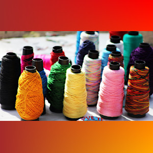
  • Limit the selected gradient colors to specific values (i.e. provide your own palette). The predominant color is then selected from the closest match in the provided palette:

Ruby:
cl_image_tag("string.jpg", :height=>300, :width=>300, :background=>"auto:predominant_gradient:4:palette_red_orange_brown", :crop=>"pad")
PHP:
cl_image_tag("string.jpg", array("height"=>300, "width"=>300, "background"=>"auto:predominant_gradient:4:palette_red_orange_brown", "crop"=>"pad"))
Python:
CloudinaryImage("string.jpg").image(height=300, width=300, background="auto:predominant_gradient:4:palette_red_orange_brown", crop="pad")
Node.js:
cloudinary.image("string.jpg", {height: 300, width: 300, background: "auto:predominant_gradient:4:palette_red_orange_brown", crop: "pad"})
Java:
cloudinary.url().transformation(new Transformation().height(300).width(300).background("auto:predominant_gradient:4:palette_red_orange_brown").crop("pad")).imageTag("string.jpg")
JS:
cl.imageTag('string.jpg', {height: 300, width: 300, background: "auto:predominant_gradient:4:palette_red_orange_brown", crop: "pad"}).toHtml();
jQuery:
$.cloudinary.image("string.jpg", {height: 300, width: 300, background: "auto:predominant_gradient:4:palette_red_orange_brown", crop: "pad"})
React:
<Image publicId="string.jpg" height="300" width="300" background="auto:predominant_gradient:4:palette_red_orange_brown" crop="pad">
        <Transformation height=300 width=300 background="auto:predominant_gradient:4:palette_red_orange_brown" crop="pad" />
</Image>
Angular:
<cl-image public-id="string.jpg" height="300" width="300" background="auto:predominant_gradient:4:palette_red_orange_brown" crop="pad">
        <cl-transformation height=300 width=300 background="auto:predominant_gradient:4:palette_red_orange_brown" crop="pad" />
</cl-image>
.Net:
cloudinary.Api.UrlImgUp.Transform(new Transformation().Height(300).Width(300).Background("auto:predominant_gradient:4:palette_red_orange_brown").Crop("pad")).BuildImageTag("string.jpg")
b_auto:predominant_gradient:4:palette_red_orange_brown

See the documentation for more information on these values and more details on the various padding options.

Summary

There are many cool things you can do with image padding, and as you've seen, Cloudinary enables you to easily do these enhancements in the cloud using simple, dynamic manipulation parameters and delivery URLs. Context-aware padding is especially useful for making sure your images take up the exact space allocated for the image while looking good.

The context-aware features are available for use with all Cloudinary accounts, including free accounts.


ImageCon17: Delivering Responsive Images

$
0
0

After five years many specifications, some inflamed Twitter battles and other conversations, responsive images have finally landed and there's a sound. Which is really exciting right? People have been climbing for this for quite some time and we've reached a point where they're available in modern browsers. So people were excited, they wanted to go use them it's something that designers and developers have had as a point of frustration for a long time.

And yet, as I watch the reaction to it it actually reminds me of my favorite cartoon character, Wile E. Coyote. I love Wile E. Coyote for many reasons. He persists right? Persistence is a big thing right now. Persistence and chasing the Road Runner, despite the fact that he never catches the Road Runner, except for one time which is I think something that people don't know. In 1980 in a cartoon called Soup or Sonic, Wile E. Coyote finally catches the Road Runner after 51 years of chasing him, failed attempts. And I want to show you that moment right now.

Yeah! 51 years!

So I do feel like this is what web designers and developers felt like after years of looking for something and some sort of solution for responsive images. And then all of a sudden they start looking at it and they're like "What hath we wrought." Right? Like look at all this mark up this is a huge huge Road Runner that we've just caught. And you see this in the comments on blog posts where people talk about "This is way too complex. Can you imagine doing this for 300 images?" Or "There's so many things wrong with these new responsive images systems. I don't have the time to enumerate the numbers of ways in which this is wrong." Right? Like this was the reaction and I get it. I get it because I mean who can forget how complex background gradients were and gradients were and the fact that they were so complex meant that they never got adopted and we just don't use CSS gradients on the web.

Actually we do, right? Like we do end up sort of absorbing this complexity. And I think that our sort of gut reaction and pushback on images is not because it's complex because any time there's new mark up it takes us time to learn that mark up. I think it comes from the fact that we think of images as being very simple. And images have never been simple. They've been difficult since the earliest days of the web. Back when we first started designing for the web we had to worry about the 216 web safe colors that were in the shared color space between Windows and Mac and we had to make sure that the images fit inside that color space or they wouldn't show up correctly. This prompted Lynda Weinman of Weinman.com to write a book in 1996 on how to deliver images through the web. It was 258 pages.

The next year that wasn't sufficient so she created a second edition that was 447 pages. She went from this to building Lynda.com and selling it for millions of dollars or billions of dollars to LinkedIn. So I'm hopeful that this is where I launch that same billionaire path, right here. But images have always been complex. Even now, the way in which our images compress and the fact that they compress differently based on whether there's a lot of visual gradation or differentiation from line to line whether it's vertical or horizontal makes a big difference.

So we have to accept that things are a bit more complex. But what I want to do today is I want to talk about the tools that you can use to make decisions about how your images should work and how to pick the right tools from sort of the set of responsive images that we've got available to us. In order to do that we have to talk first about some use cases. So the responsive images community group which worked on this created a series of use cases related to responsive images but I really just narrow it down to two. The two use cases that I think matter the most are resolution switching, and this is the idea that you've got a single image and you want to display it at different sizes based on the size of the view port, based on the design, based on display density. Those sorts of characteristics. But the image itself is essentially the same.

The second use case is what we call art direction, and there are a couple different examples of this. For example, this photograph of President Obama was taken as after the auto bailout he's talking about the success of the auto bailout. So if we're in a large enough screen it makes a lot of sense to show that background, to know that he was speaking at a factory. But if we simply shrink that image down it becomes really hard to recognize who's speaking. We'd be much better off if we actually cropped closer to the speaker so that you could actually make out the details. So that's one form of art direction. But it doesn't have to be cropping. This is the Nokia browser site. It actually launched the same week as the Boston Globe site and I consider it one of the seminal pieces of responsive design work.

The designers Bryan and Stephanie Rieger talked about how they wanted to be able to show off the chrome of the Nokia browser. So when they were on a wide enough screen they used a landscape version of the image, right? They wanted to be able to show off all of those pieces. But as that image shrunk down that version would get so small that you couldn't see the chrome. You couldn't see the details, and so they ended up creating a portrait version that was cropped. So that's another version of art direction.

The most common art direction examples we see are things that have text embedded inside images. So CB2 has this image from their home page from a little bit ago where they've got three photographs on widescreens along with the stamp and some text and a couple of logos but on small screens they swap it out to just two photographs and just the logos, none of the text. If they shrunk it down it would get too small. Now this isn't a responsive design but you can see how they would have to change the image on small screens. Free People is a shopping site that spends a lot of time on art direction. Every single day they have new imagery on their site. It's kind of insane what they do. And because of that they can't actually afford to spend the time to figure out how to overlay text on their images. So they create these new images on a daily basis but if they simply shrunk it down you wouldn't be able to read the text so they create an alternate version of the image. And we know that you couldn't read the text because if you actually click on that photo or tap on that photo you get taken to this page where they actually did just shrink it down and you can't read it.

So despite the fact that they do it differently on their homepage actually on the actual catalog page they're actually showing this problem. So these are the two use cases. 90 percent of the time the use case that people have is the resolution switching use case. So I want to talk a bit about how you decide when you're going to use which responsive image standard. So first we're going to start with an image element. An image element is always required. The way that I think about the image element is that it's a box in to which all of these new responsive image standards go into. Whether it's picture or source set or sizes, whatever those rules are that are applied, they're always actually going to end up on the image element. As a matter of fact you can see this in JavaScript if you look at the source attribute and watch the current source change as you're in this case as the picture element is being applied, the media queries in the picture element are being applied.

Now the first question I ask is if you've got an image element do you need anything else? And if you have a fixed width design, you don't, right? The image element is sufficient. Or in some cases even in a responsive design this is Rainbow Nursery, this really great and beautiful UK nursery. They've got a great design and in the responsive design they have the sorts of things that we see on many sites, right? The little icons at the bottom representing all the social feeds. Now three of the icons are SVG, one of them is a PNG. None of them are significantly different from the smallest version to the largest version. And in that scenario we only need one source.

Where things get different is when we start looking at high density displays, right? And this is where srcset comes in comes in, the ability to define multiple sources. So srcset adds as an attribute to the image element, a comma separated list of sources. And one of the first versions of it for dealing with high density displays is dealing with what they call 'x' descriptors or display density descriptors and so in this case we've got two images. One that's a 1x image, one that's a 2x image and basically the browser selects based on the display density. Easy right? Well then we get into things like this. Now this page has a huge image. It's actually 256k at 1x and 508k at 2x. So if that's all we provide that's going to be far too large for somebody on a mobile device. We need more source files. Thankfully srcset actually solves this as well. So we have the ability to define a series of images and tell the browser what the width of those images are.

Now what's important about this is that it's different than the way that usually happens in CSS where we're defining images based on what the size is and the page. This is actually the size that you would see if you opened it in Photoshop or an image editor and it asked what are the raw pixels of this image. And then the browser will pick the best source from that. Which begs the question, really right, like how will the browser pick the best source? And this is where we get into the area that made responsive images really challenging.

So if we look at sort of a typical web page and the way it loads one of the things you'll see is that the HTML is requested and then the HTML returns and you see parsing starting on that and then as the browser parses that HTML it finds a CSS in JavaScript and it asks for those things to go, it requests those items. But then shortly thereafter images are requested, and more images are requested and so it's receiving data about the images more information's coming in from the JavaScript and the CSS and much much later in this timeline is actually when we see layout being calculated. When we actually get the CSS process to know what's going on on the page. And this is important because the images are downloaded before the size of the image and the page is known. And that's the big problem.

If we go back to this example, how do we know which of these sources we should grab if we don't yet know what the size if of the image and the page when it's downloading? A lot of sort of simplistic versions of responsive images simply look at the size of the view port and think hey if we know the size of the view port we can decide what image is appropriate. And that's good on something like this, like this is Wal-Mart grocery side on a small screen. The images are pretty much the same size as the view port. But as this page gets bigger, as the view port gets bigger, now it's about a third of the size of the view port. And as it gets bigger still, we realize that it's actually completely disconnected from the size of the view port. The view port is actually 15040 pixels wide, and those images are 254 pixels. There's no association between them.

This challenge, this tug of war between responsive images and what's called alternatively the speculative pre-loader or the look-ahead pre-parser, like there are different names that I've heard from people who work on browsers for what this actually is but that thing that looks through the HTML and starts downloading assets before layout is done. This tug of war has been the reason why it took us five years to get to a different standard for responsive images. The way I like to think about it is it's like the two different types of people you might go on vacation with. Like that person who wants like everything lined up ahead of time, they want to know where they're going to be, where they need to go, they have their whole itinerary set. Versus the person who's like "Hey San Francisco I'm here! Let's go figure out what's going on!" Right? And on the left we've got the look-ahead pre-parser. It wants to know what it should do right away. And responsive images are like "No, no, no. Wait. Wait. Wait until the layout is done so that we know the exact image size in the page."

This challenge is the reason why we can't solve responsive images with like CSS or JavaScript, like why we needed a new standard. Or even like a magical new image format. People have talked for awhile about image formats like JPEG2000 where they download portions of an image and then you can stop halfway through the full image size when you've got enough of the image to fill the space that you need. The problem is is that we don't know the size of the space! Right? When we're actually downloading the images. And we can't ignore this because the look-ahead pre-parser is a key to the faster web. The chrome team says that it sped up webpages by 20 percent when they implemented it. Firefox says 19 percent. Ilya Grigri did some research and found that 43 percent of the average webpages images are downloaded by that speculative loader. And that accounts for 50 percent of page weight. So 50 percent of your page weight is being downloaded by something that doesn't know the size of the images in the page. We can't ignore that problem.

So this was something that we were stuck on for quite some time. And this brings us to the hero of our story which is sizes. Sizes is the attribute that people don't talk about but that's actually the one that will have the longest staying power out of all of these related to responsive images. Sizes is required any time we're using width descriptors. So any time we're using width instead of display density descriptors we have to have sizes there. And sizes basically has a series of media conditions, it's a subset of media queries, it does everything you would need it to do it just doesn't do thinks like print which doesn't make a lot of sense in this context. So it's got a media condition and then a length which could be a view port unit. So 100 percent of the view port unit or 33 of the view port unit. And then if there's no media condition then it's considered the default. So if none of the other ones match then it's going to be 254 pixels and that length can be absolute, it can be relative, or it can even be CSS calculated.

So this particular rule actually is the rule that we might use for that Wal-Mart example. So here we are at 100 percent view port. And then once we reach a certain size we go to third of the view port and then as the screen gets bigger it's just 254 pixels. Just let it be. Now when we first started talking about sizes there was a lot of push back. And I think there's still push back because of the idea of separation of concerns, right? Sizes contains information about your design and it's in the markup and we would much rather have our markup just be the content, the design in the CSS, and behavior in JavaScript. And it's not like any of us who were working on this sort of stuff didn't realize that this was a problem, like we had many many conversations about it. But we just came to the conclusion that sizes was a necessary compromise between what responsive images needed to do and speculative downloading behavior. And so while we'd ideally not like to have that in markup, this solves that problem.

The really great thing about srcset and sizes is that they let browsers be smart. That list of sources isn't a declaration. It doesn't say you must download this image. It says "Here's some images to choose from." You know better than us what's going on on that device. You may know the network speed, you may know if that users opt in to Googles fast browsing which I forgot the name of. Like there are a bunch of different factors that a browser could use to decide "Hey, even though this is a 2x display maybe we only want the 1x image." Or maybe this image is actually like size and the page happens to be two pixels wider than 320, we should just grab the 320 image and upscale it slightly. It'll still look good, nobody will know the difference. Right? Those are the sorts of things that we're hopeful that browsers will experiment with. They haven't done a lot of it yet but that's the idea behind providing them with srcset and sizes as a way to make those decisions.

What about the picture element? I mean that's actually the name of the specification. I don't refer to the picture element or picture standard much anymore I usually say responsive images standards because people got really fixated on picture. And picture is important but it's mainly important when it comes to art direction. Because what happens with the picture element is that you've got a series of sources and you've got media queries for these different sources and the first media query that matches tells the browser which image to use. And that's a declaration, that's a rule. You must use this image as opposed to what happens with srcset where you can pick from the different images.

This makes the most sense in situations like what Shopify had where on widescreens they had sort of an image of one of their customers and then on small screens they cropped that image. So it's very important that on small screens that it actually grabs a different image. It's not just simply a resized version of the same image. And I use the picture element to accomplish that. There's actually another use of the picture element that's really exciting and that's to declare different types of images, basically different image formats that you want to supply to the browser. So we could use this type attribute to say "Hey, if this browser supports SVG, use this SVG version of this image." And if you use We Bp, use the We Bp version. You'll also note that in this example because we're not doing art direction we don't need the media queries. As a matter of fact we shouldn't use the media queries we should just provide the browser with different options and allow it to choose between these different options.

This is really really exciting stuff. We haven't had this opportunity since the earliest days of the web. There are a bunch of different types of image formats that we could experiment with. Like JPEG2000 is something that I've completely ignored. But does an incredibly good job with alpha transparencies. So this is a PNG that's 237k and the JPEG2000 version is only 51k, right? Much much better. Same this is true with the stile version. Right? The JPEG2000 version of the stile is 19k. We Bp is better it's 56k. PNG which is what we would normally use for this sort of thing is 325k. That's obscene right? That's much much too big. But we can't use JPEG2000 because it's not supported everywhere. But guess what it's actually supported in Safari. I didn't realize that but JPEG2000 works in Safari so we could use JPEG2000 right now for our Safari customers. And because of the picture element we could provide a WP fallback for people who are on the blank browser and we could provide a PNG fallback for whatever users don't support those two browsers.

This is an amazing opportunity that we haven't had in years. The ability to experiment with different image formats to try to find a better way of handling images on the web. And we can do it now because of the picture element. If that magical unicorn image format that solves all of our problems appears tomorrow the way that we can start using it is because of these responsive images standards. Now when you start implementing responsive images inside your organization, one of the big problems you're going to run into is related to image breakpoints. What I mean by image breakpoints is how many image sources should we deliver? How many image sources make sense for a given image? If you're doing art direction it's really easy. Or it can be really easy. If you think back to that Nokia example, right, at some point the chrome got so small that it was unreadable and so because of that that's when they needed to create a different version of the image and we know that that's when we need to have different sizes, different versions.

But if you're doing image breakpoints for resolution switching it's much more difficult. Your instinct might be to approach it the same way you do responsive design and responsive layouts. At least for us the way that we approach it is that we'll be working on a design, we'll be working on a portion of a design maybe a shopping cart and we'll start designing that shopping cart or that navigation and we start resizing our browser until it looks bad and then boom! That's when we need a breakpoint, right? We make decisions based on how those responsive designs look and when the design breaks down at different screen sizes. But the problem with resolution switching is it's unclear when things are going to break down. How many image breakpoints do we need between 2000 pixels and 200 pixels? Do we need two, do we need 10? And the images themselves aren't going to tell us a lot because if we simply size down an image, it's going to look exactly the same right? There's no point where the image starts looking bad.

As a matter of fact it gets pretty problematic if we have an image that's 2000 pixels wide and it's 400 pixels in the page. If we instead down sampled that to 800 pixels it's 73k that's a big savings we should definitely do that. But you know what? 600 pixels wide is 42k and that's another 30 savings so we should definitely do that. But then you know what? 500 is actually 31k that's 11k, we should definitely deliver one that's 500. Well maybe at 450, right? Like you can just keep going and going, you'll just keep going until basically what you have is you have the actual image the size that it's in the page. Right? That's the only intrinsic information we know about that image. But we can't have every version at every size of an image, it just doesn't make sense.

Scott Joe wrote about how when he was working on responsive, Scott Joe worked on the Boston Globe site about how they decided to make differences of image breakpoints based on sensible jumps and file size which, I was like well what's a sensible jump in file size and how do I make that sort of decision? Because images compress differently. Both of these are the exact same size, the one on the left is 151k, the one on the right is 13k. Right? So I started looking at this idea of applying a performance budget to responsive images. To be able to say "Hey, if we're going to in other areas of our design we're actually saying a new feature gets added to the page. We want to make sure that we know what the budget is for that new feature." Well flexible images is a new feature. So if we have a source image that's 500 by 333 and it's 58k, and in the page it gets shrunk down to 300 by 200, what would the size of that image be if we actually had sized it appropriately for the page?

Turns out that it would have been 24k which means that the cost of using a flexible image on that page was 34k. So what if we decided that we only ever wanted to have a performance budget of 20k per image? Right? So we want to make sure that we deliver sources that are no more than 20k between the different sources so that nobody's ever downloading more than 20k than they actually need to display it in the page. And when you start looking at it that way, what you realize is that the images themselves tell you something about the breakpoints. So this image would require eight breakpoints to have 20k between the different image sources. This one, three. This one, seven. And that logo only needs one. So I had this idea, it was sort of a crazy idea like the only thing that I had come up with that would actually be a way to do this in some sort of logical fashion as opposed to what I think a lot of people were doing which was just sort of arbitrarily deciding oh we need three image sizes because we've got mobile, tablet, and desktop or something like that.

And then a little bit ago I got this email from the people at Cloudinary and they're like "Hey. We've built a tool that does this idea where you can adjust the small and the large and the small versions of it and you can select what you want as your performance budget and then it'll take that image and it will figure out how many different sources you need." And it'll also provide you with the markup and all the images that you can download and things like this. That was an amazing day, I gotta tell you. Here's this crazy idea I'm not smart enough to actually figure out how to do this but I was so happy that somebody else did. But even with this I would say that most of the time image breakpoints aren't a science yet, or at least they're not a practice science yet. The approach for performance budgets I think is probably the best one that I've seen in terms of actually having some sort of logic for the way we pick them. But most organizations are just doing what I said which is like "Hey we've got three layout breakpoints, we're going to do three image breakpoints." If you cannot do something like performance budget based stuff for each individual image then at minimum pick some representative images and test how they compress and try to come up with a good number of images that makes sense for your design.

Which brings me to another point. Humans shouldn't be doing this work at all. Adam Bradley had this quote he said "save for the web should die." And he's absolutely right. There was a point in time in the past when we used to hand convert video right? But nobody does that now because there are way too many codets, way too many resolutions that you need to support different bit rates all of this sort of stuff, right? Now we use services that are designed to automatically adapt based on the speed of the person's browser, things of that nature. We shouldn't be doing this with images either. And I think that there are some things that are going to help us in that regard.

The first is a new standard, it's not widely accepted or adopted yet but it's called client hints. So client hints is interesting. What it does is it takes HTTP headers so every time an image is requested, every time HTML or CCS is requested your browser sends some headers along and it adds some new headers. It adds DPR, the view port width, and the width of the image and the page. The two that I think matter are the DPR and the width. As I was showing earlier with the Wal-Mart grocery site, view port width often times has no relation to the size of the image in the page and so I think that there are some people who may find that useful but I can't think of a scenario where I would actually use that one. But the other two are really interesting because if we send that information in the header, then instead of having this markup, we can just do this. Right? We still need sizes but we can get rid of srcset.

In addition, this is not related to client hints but it's another header which is the accept header which tells the server what image formats the browser understands. And so if we combine these two things, if we combine client hints with the browser telling the user or the server what image formats it does, we can take this markup which right now is designed to declare WP and then JPEG XR and JPEG and different sources and a few different ... It's doing some really complex things. I'm very happy that we have this option because we didn't have this option in the past. But we can replace that with this. Right? It's a big win. So client hints are huge. In order to use them you have to add a meta tag to your page and you declare what hints you want. Unfortunately client hints are only supported in blink based browsers at the moment.

And this brings a bit of a ... Sorry. A chicken and an egg scenario when it comes to client hints because the browser makes a request to the server. The server doesn't know whether the browser supports client hints or not, but it has to decide whether to add that meta tag and it has to decide what markup to put in the page. Do we put that big long image stuff or can we just use the condensed version of it? But it doesn't know yet whether the browser supports that so it probably has to do both which right now means that client hints have this impediment both of the fact that it's not widely supported in browsers and also in order to support it you end up kind of duplicating work. This won't go on forever, hopefully the other browsers will start to implement it and there is some discussion going on about how to get away from sort of how the browser might actually indicate on that first request whether it supports client hints or not. So that we can then just present the correct markup based on whether the browser does.

But right now the solution to this, the recommended solution is actually to use user agent detection to make these decisions. Which is really funny because one of the reasons why they started doing client hints was because they wanted to have an alternative to device detection databases which do everything based on user agent strings. So we're like "We're back!" Kind of like we've gone backwards and forwards at the same time. But client hints are something to keep your eye on because they really simplify the process of handling responsive images.

When you're looking at working on responsive images inside your organization I highly recommend doing a responsive images audit. We were working with an organization, large hotel chain they had I think it was 400,000 images in their site that had been hand cut and sized appropriately for the pages, and they were going to move to responsive design. If they had three image sources that's 1.2 million images. If they decide to support retina displays, 2x displays that'd be 2.4 million images. Huge number of images. It becomes really important to have a systematic view of images. So these are the sorts of questions that we end up asking. Where are the source files and what is the process for publishing them? Is there a big difference between the largest and smallest version of these images? Because if there isn't maybe we can get away with just a single source. Is it resolution switching or art detection? Can we use SVG? {lease, please, God, 'cause if we use SVG we don't have to worry about all this stuff. Are there representative images that we could use to provide sensible jumps or can we use some sort of way of doing that sort of automated way of detecting the number of image breakpoints that are needed? Do we need to support multiple image formats?

And the end result of this for that site was we had a series of images and we were able to really bring them down to just five types of images. 90 percent of the images were property photography which at the time this was before srcset and sizes was available but ultimately what we would have used if it was available is we would've used srcset and sizes on that. And that would have been the solution for the vast majority of the images. We had a few that were art directed where we had to make modifications to the CMS so that the CMS could support the designers uploading multiple versions of a particular image to support the different sizes that they would need across their design.

But then we had some other images that were like badges or awards that particular properties had won where the difference between the largest version of that image even with retina was not much different than the smallest version. So the decision was made for those images we just do the retina version, it wasn't that big a deal. It was just like little badges, awards. In general the big hope is automation related to responsive images. Again, we shouldn't be doing these on a manual basis we should be automating them. And there's a lot of work happening in this space. Picturefill is a polyfill that allows you to use responsive images even in browsers that don't support the picture element in responsive images. We have at Drupal they worked on a picture module which has responsive images support and it's actually part of Drupal 8 Core. WordPress, the responsive images community group worked on a responsive images plugin and that I believe Eric has also been put into the main core. Right? Yes. Okay. Thank you. I had a moment of doubt. But yeah, WordPress now does this by default and we see this over and over again that CMS's and E-Commerce systems and things like this are trying to figure out ways to incorporate them.

There are also a bunch of imagery sizing services. I maintain a spreadsheet of all the different imagery sizing services that I'm aware of. Some of them are software that you can install on your own systems, some of them are free services, some of them are paid services just sort of depends on what you're looking for. And they didn't ask me to do this but the Cloudinary stuff they are doing some really really good stuff in terms of responsive images. It doesn't hurt that they took my crazy idea and implemented it but from a responsive images perspective you find ... I'm hopeful that other services will start doing the same sorts of things that Cloudinary's doing in terms of supporting responsive images and breakpoints and making it so that you don't have to think about it, designers and developers on a daily basis. You just upload the largest possible image that you've got and then you create your template and you put the markup in the templates and then you just let the machines do their business.

All right. So I understand that responsive images can seem daunting. I get that. I've been there. I've been there way too many times. Just remember that you're not alone. The really remarkable thing about the responsive images community group is that it is a standard that was driven by designers and developers. It was driven by people who were working in the field as opposed to browser makers. And that's not to say that the browser makers don't create really really good stuff and that they didn't participate in this. I mean it's critical that the people who are involved in building browsers participated in the responsive images group. But this is really a community driven effort. The people inside the responsive images community group are here to help you if you're running into problems. Just this week I was answering questions from people on Twitter who were trying to figure out how to do things with srcset and sizes. I'm happy to help. Eric's part of the responsive images community group he would help. Matt Marquis. There's a bunch of folk, Yoav Weiss who works for Akamai, like a bunch of different people inside that group who will answer questions if you're running into problems.

And in the long run we're going to build tools to make this climb easier. We just need to take the first steps. Vitaly, had talked about the fact that not many people are using these new standards yet. The time to start is now. We want to see how you use them. We want to learn from you, we want to learn how people are implementing them in the real world. And I'd love to hear how you use them. So thank you very much.

Serverless Tutorial: File Storage with Webtask and Cloudinary

$
0
0

Serverless

Media makes up the majority of today's website content. While it makes websites more interesting for visitors, media presents challenges because these images and videos are more difficult to store, deliver and manipulate on-the-fly to suit any given situation.

One particularly challenging topic is storage. Traditionally - before the cloud era - FTP was the the go-to solution. We relied on FTP for transferring files to our remote computers. These files are mapped to a URL that we could just deliver to the browser.

What if you have hundreds of images of varying quality and size that need to be stored and delivered. If you do not carefully manage them, storing these files could become difficult, which could lead to unforeseen complexities.

The introduction of cloud storage and hosting helped address the storage problem. Notwithstanding, the cloud (and DevOps engineering generally) still remain a mystery for those of us developers who just write code.

This mystery, however, is about to be solved. Today, we are going to attempt to go completely serverless by deploying Functions to Webtask and storing media files on Cloudinary.

The term serverless does not imply that servers will no longer exist. Rather, it implies that we, the developers, no longer have to care about their existence. We won’t have to set anything up, or bother about IP address and all those terms (like load balancing, containers, etc) that we aren’t accustomed to. We will be able to write and ship functions, as well as upload images to an existing server, for free by creating a Cloudinary account.

Why Serverless

Let's now look in more detail about why you may want to consider this serverless option:

"Serverless" in this article refers to both deployable functions (Function as a Service) and cloud platforms (aka Backend as a Service) like Cloudinary

  • Affordability: Not just serverless, but generally, PaaS, SaaS, IaaS, and *aaS are affordable on a large scale when compared to the cost of doing it yourself. In fact, on a small scale, most services are made free, much like Cloudinary
  • Risk Free: Managing backups, security and other sensitive aspects of your project lifecycle shouldn’t be something you have to worry about. As a developer, your sole job is to write code, so you can focus on that while the platforms take care of these other tasks.
  • Taking the serverless route enables you to focus on what matters in your development cycle as a developer. Sticking to your job of writing code and using simple APIs to store and ship code/assets.

Hosting Functions with Webtask

To get started, let's create a Hello World example with Webtask and see how simple it is.

To do so, we need to install the Webtask CLI tool. The tool requires an account with Webtask so we can create one before installation:

npm install wt-cli -g

Login to the CLI using your sign-up email address:

wt init <Your Email>

Create an index.js file with the following Function as a Service:

module.exports = function (cb) {
    cb(null, 'Hello World');
}

Deploy and run your function:

wt create index.js

Amazing! You have a deployed your app, which now runs on the Webtask server. Go to the URL logged to your console after running the last command to see your deployed app running.

Two things you might want to take note of:

  1. We just wrote a function. A function that takes a callback and sends content as a response. You could already imagine the power.
  2. The create command deploys our app (function) and serves us a URL to interact with.

Let's employ Express to make endpoints which you might be more familiar with:

// ./index.js
var Express = require('express');
var Webtask = require('webtask-tools');
var bodyParser = require('body-parser')
var app = Express();

app.use(bodyParser.urlencoded({ extended: false }))
app.use(bodyParser.json())

// yet to be created
app.use(require('./middleware/cl').config);
require('./routes/galleries')(app);

module.exports = Webtask.fromExpress(app);

Endeavour to install the dependencies: express, webtask-tools, and body-parser.

  • express is a fast Node framework for handling HTTP requests/responses

  • body-parser parses the HTTP request body and exposes it to express req.body

  • webtask-tools simplifies integrating Express and Webtask. No need for the previous function we wrote, we can now write Express routes instead.

Let's create the routes:

// ./routes/galleries.js

module.exports = (app) => {
  app.get('/images', (req, res) => {
      res.json({msg: 'Images are coming soon'})
  });
}

Storing and Delivering Images with Cloudinary

Our next major concern is that Webtask might do a great job at hosting functions, but it may be terrible at file storage, especially media files. Therefore, we need a media storage solution to take care of this for us. Cloudinary offers media storage, but that's not where it shines.

Cloudinary is a media server that manages your media storage and delivery. What’s most impressive is Cloudinary’s ability to transform these media during upload or delivery by simply adjusting the image's delivery URL. Using Cloudinary, you can specify width, height, filters, overlays, and enable a lot of other cool features by editing an image/video transformation URL, which you can learn about here.

To use Cloudinary effectively, we recommend using the SDKs rather than interact with the APIs directly (which you are allowed to do). You can install the SDK to your current project:

npm install --save cloudinary_js

You also need to create a FREE Cloudinary account to get credentials that you will supply to the SDK in order to interact with Cloudinary.

Configuring Cloudinary with Webtask Context

Webtask allows you to dynamically adjust its behavior based on the information provided via the Webtask context. We could use the context to maintain dynamic state of our application. Things like query parameters, secrets and environmental variables are a good fit for what could live in the Webtask context. Speaking of environmental variables, let's rely on those to configure Cloudinary:

// ./middlewares/cl.js
var cloudinary = require('cloudinary');

module.exports = {
    config: (req, res, next) => {
        cloudinary.config({
            cloud_name: req.webtaskContext.secrets.CL_CLOUD_NAME,
            api_key: req.webtaskContext.secrets.CL_API_KEY,
            api_secret: req.webtaskContext.secrets.CL_SECRET
        });
        req.cloudinary = cloudinary;
        next()
    },
}

A simple Express middleware that configures an instance of cloudinary using credentials provisioned via the Webtask Context Secret. While running the functions, you are expected to supply the credentials:

wt create index --secret CL_CLOUD_NAME=<CLOURINARY_CLOUD_NAME> --secret CL_API_KEY=<CLOURINARY_API_KEY> --secret CL_SECRET=<CLOURINARY_API_SECRET> --bundle --watch

Remember to fetch the credentials from your Cloudinary dashboard.

Notice how we are passing each credential using the --secret option, as well as telling Webtask to bundle our file and watch for changes using --bundle and --watch flags, respectively. Bundling is only necessary when you have multiple local modules.

Uploading Images to Cloudinary

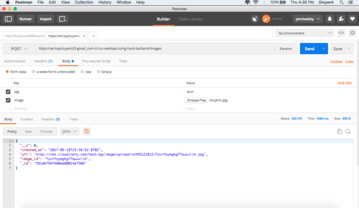
Now that we have everything configured, let's store our image on Cloudinary by uploading it from our computers. We can do this by adding an endpoint that its logic will process the image and send it to Cloudinary using the SDK:

// ./routes/galleries.js
var multipart = require('connect-multiparty');
var multipartMiddleware = multipart();

module.exports = (app) => {
    ...
    app.post('/images', multipartMiddleware, (req, res) => {
        console.log(req.files)
          req.cloudinary.uploader.upload(req.files.image.path, function(result) {
             res.status(200).send('Image uploaded to Cloudinary')
         });
     })
}

When the image arrives from the client, it is parsed and processed with multipart and uploaded to Cloudinary using the upload method. Remember that req.cloudinary is provided via the middleware we created earlier.

Source Code

Notice how stayed away from creating any local host/server and built everything using the actual environment that our code and media will live. This is where the power of serverless lies.

Cloudinary exposes lots of APIs and transformation options that you can learn about in the documentation. Feel free to dig these docs and find what suits your situation.

Image Optimization in PHP

$
0
0

PHP

Image optimization involves delivering images with the smallest possible file size while maintaining visual quality. Optimizing images means saving bytes and improving performance for your website. The fewer bytes per image, the faster the browser can download and render the content on your users’ screens.

Web developers build their web platforms using a variety of programming languages, such as PHP, Python and Ruby.

In this article, we’ll take a look at how to perform and implement image optimization in one of the most common server-side languages on the web, PHP. However, before we dive right in, let’s explore why image optimization is so important.

Why Optimize Images?

The faster images load on your website, the higher your conversion rates will be. In fact, half of your visitors expect your website to load within two seconds. Surveys from akamai.com and Gomez reveal that:

  • 73 percent of mobile internet users report that they have experienced problems with page load times on their devices.
  • A one-second delay in page load time can decrease visitor satisfaction by 16 percent and can lead to a drop in conversion of 7 percent or more.
  • Load time is a major contributing factor to page abandonment, which increases as a percentage with every second of load time. Nearly 40 percent of users abandon a page after 3 seconds.

Optimizing Images in PHP

PHP has some built-in functions that can be used to optimize images, such as imagejpeg(). This function takes the path of the output image and quality specification ranging from 1 to 100.

Note: Ensure that the GD library for PHP is installed.

<?php

      function compress_image($source_url, $destination_url, $quality) {

       $info = getimagesize($source_url);

        if ($info['mime'] == 'image/jpeg')
              $image = imagecreatefromjpeg($source_url);

        elseif ($info['mime'] == 'image/gif')
              $image = imagecreatefromgif($source_url);

      elseif ($info['mime'] == 'image/png')
              $image = imagecreatefrompng($source_url);

        imagejpeg($image, $destination_url, $quality);
    return $destination_url;
    }


?>

The higher the number, the better the quality, but unfortunately the larger the size. You also can resize images with functions like imagecopyresampled and imagecopyresized.

Image Optimizer

This is a PHP library written by Piotr Sliwa for optimizing image files. Under the hood, it uses optipng, pngquant, jpegoptim and a few other libraries. With this library, your image files can be 10 percent to 70 percent smaller without losing their visual appeal.

Note: You have to ensure these other libraries like optipng, pngquant and others are installed on your server.

You will optimize an image like so:

    $factory = new \ImageOptimizer\OptimizerFactory();
    $optimizer = $factory->get();

    $filepath = __DIR__ . '/images/prosper.png'; /* path to image */

    $optimizer->optimize($filepath); //optimized file overwrites original one

You can also specify an optimizer before optimizing an image:

 $optimizer = $factory->get(); //default optimizer is `smart`


 $pngOptimizer = $factory->get('png');  //png optimizer


 $jpgOptimizer = $factory->get('jpegoptim'); //jpegoptim optimizer etc.

PHP Image Cache

This is a simple PHP class that compresses images on-the-fly to reduce load time and web page resource management. It accepts an image, compresses it, then moves and caches it in the user’s browser. It then returns the new source of the image.

<?php

 require_once 'ImageCache.php';

 $imagecache = new ImageCache();

 $imagecache->cached_image_directory = dirname(__FILE__) . '/images/cached';

 $cached_src = $imagecache->cache( 'images/unsplash1.jpeg' );

?>

You also can use Composer to download it:

  composer require nielse63/phpimagecache

Imagick

Imagick is a native PHP extension to create and modify images using the ImageMagick API. One of the ways of using Imagick to optimize an image is:

<?php

// Create new imagick object
$im = new Imagick("File_Path/Image_Name.jpg");

// Optimize the image layers
$im->optimizeImageLayers();

// Compression and quality
$im->setImageCompression(Imagick::COMPRESSION_JPEG);
$im->setImageCompressionQuality(25);

// Write the image back
$im->writeImages("File_Path/Image_Opti.jpg", true);

?>

I have given the image a quality of 25 and also set the compression type to JPEG. And the image layers have been optimized with the code above.

Now, there are so many wonderful things you can do with Imagick that I might not be able to cover. Check out this platform for more information.

Cloudinary: An Easy Optimization Alternative

Using Cloudinary, you can optimize your images, quickly and easily, regardless of the programming language you work with. Cloudinary automatically performs certain optimizations on all transformed images by default. Its integrated, fast CDN delivery also helps to get all the image resources to your users quickly.

Cloudinary offers:

Automatic quality and encoding: Using the q_auto parameter, the optimal quality compression level and optimal encoding settings are selected based on the specific image content, format and the viewing browser. The result is an image with good visual quality and a reduced file size. For example,

Ruby:
cl_image_tag("woman.jpg", :quality=>"auto")
PHP:
cl_image_tag("woman.jpg", array("quality"=>"auto"))
Python:
CloudinaryImage("woman.jpg").image(quality="auto")
Node.js:
cloudinary.image("woman.jpg", {quality: "auto"})
Java:
cloudinary.url().transformation(new Transformation().quality("auto")).imageTag("woman.jpg")
JS:
cl.imageTag('woman.jpg', {quality: "auto"}).toHtml();
jQuery:
$.cloudinary.image("woman.jpg", {quality: "auto"})
React:
<Image publicId="woman.jpg" >
        <Transformation quality="auto" />
</Image>
Angular:
<cl-image public-id="woman.jpg" >
        <cl-transformation quality="auto">
        </cl-transformation>
</cl-image>
.Net:
cloudinary.Api.UrlImgUp.Transform(new Transformation().Quality("auto")).BuildImageTag("woman.jpg")
http://res.cloudinary.com/demo/image/upload/q_auto/woman.jpg

You also can use q_auto:best, q_auto:low, q_auto:good or q_auto:eco to adjust the visual quality of your images.

Automatic formatting: The f_auto parameter enables Cloudinary to analyze the image content and select the best format to deliver. For example, it can automatically deliver images as WebP to Chrome browsers or JPEG-XR to Internet Explorer browsers, while using the original format for all other browsers. Using both f_auto and q_auto, Cloudinary will still generally deliver WebP and JPEG-XR to the relevant browsers, but might deliver selected images as PNG-8 or PNG-24 if the quality algorithm determines that is optimal.

Resizing and cropping images with w and h parameters: Using the width and height parameters in URLs, you can resize the images with Cloudinary like so:

Ruby:
cl_image_tag("sample.jpg", :width=>0.5, :crop=>"scale")
PHP:
cl_image_tag("sample.jpg", array("width"=>0.5, "crop"=>"scale"))
Python:
CloudinaryImage("sample.jpg").image(width=0.5, crop="scale")
Node.js:
cloudinary.image("sample.jpg", {width: "0.5", crop: "scale"})
Java:
cloudinary.url().transformation(new Transformation().width(0.5).crop("scale")).imageTag("sample.jpg")
JS:
cl.imageTag('sample.jpg', {width: "0.5", crop: "scale"}).toHtml();
jQuery:
$.cloudinary.image("sample.jpg", {width: "0.5", crop: "scale"})
React:
<Image publicId="sample.jpg" >
        <Transformation width="0.5" crop="scale" />
</Image>
Angular:
<cl-image public-id="sample.jpg" >
        <cl-transformation width="0.5" crop="scale">
        </cl-transformation>
</cl-image>
.Net:
cloudinary.Api.UrlImgUp.Transform(new Transformation().Width(0.5).Crop("scale")).BuildImageTag("sample.jpg")
http://res.cloudinary.com/demo/image/upload/w_0.5/sample.jpg
Ruby:
cl_image_tag("sample.jpg", :height=>200, :crop=>"scale")
PHP:
cl_image_tag("sample.jpg", array("height"=>200, "crop"=>"scale"))
Python:
CloudinaryImage("sample.jpg").image(height=200, crop="scale")
Node.js:
cloudinary.image("sample.jpg", {height: 200, crop: "scale"})
Java:
cloudinary.url().transformation(new Transformation().height(200).crop("scale")).imageTag("sample.jpg")
JS:
cl.imageTag('sample.jpg', {height: 200, crop: "scale"}).toHtml();
jQuery:
$.cloudinary.image("sample.jpg", {height: 200, crop: "scale"})
React:
<Image publicId="sample.jpg" >
        <Transformation height="200" crop="scale" />
</Image>
Angular:
<cl-image public-id="sample.jpg" >
        <cl-transformation height="200" crop="scale">
        </cl-transformation>
</cl-image>
.Net:
cloudinary.Api.UrlImgUp.Transform(new Transformation().Height(200).Crop("scale")).BuildImageTag("sample.jpg")
http://res.cloudinary.com/demo/image/upload/h_200/sample.jpg

It maintains the aspect ratio, but resizes the image to whatever height and width you desire.

Ruby:
cl_image_tag("sample.jpg", :width=>200, :height=>100, :crop=>"scale")
PHP:
cl_image_tag("sample.jpg", array("width"=>200, "height"=>100, "crop"=>"scale"))
Python:
CloudinaryImage("sample.jpg").image(width=200, height=100, crop="scale")
Node.js:
cloudinary.image("sample.jpg", {width: 200, height: 100, crop: "scale"})
Java:
cloudinary.url().transformation(new Transformation().width(200).height(100).crop("scale")).imageTag("sample.jpg")
JS:
cl.imageTag('sample.jpg', {width: 200, height: 100, crop: "scale"}).toHtml();
jQuery:
$.cloudinary.image("sample.jpg", {width: 200, height: 100, crop: "scale"})
React:
<Image publicId="sample.jpg" >
        <Transformation width="200" height="100" crop="scale" />
</Image>
Angular:
<cl-image public-id="sample.jpg" >
        <cl-transformation width="200" height="100" crop="scale">
        </cl-transformation>
</cl-image>
.Net:
cloudinary.Api.UrlImgUp.Transform(new Transformation().Width(200).Height(100).Crop("scale")).BuildImageTag("sample.jpg")
http://res.cloudinary.com/demo/image/upload/w_200,h_100/sample.jpg

Cloudinary supports the following image cropping modes: scale, fit, mfit, fill, lfill, limit, pad, lpad, mpad, crop, thumb, imagga_crop and imagga_scale.

Conclusion

One of the best ways to increase page performance is via image optimization, so you will want to take some time to ensure that all your images are properly optimized and cached.

We have highlighted how to optimize images using PHP and Cloudinary. But these tips are just a start. Check out how to optimize your JPEG images without compromising quality for more ideas.

Cloudinary provides many options for optimizing your images. Feel free to dive in and explore them.

Prosper Otemuyiwa Prosper Otemuyiwa is a Food Ninja, Open Source Advocate & Self-acclaimed Developer Evangelist.

Devoxx: Image Optimization. The “How to”.

$
0
0

This talk was given at DevoxxUK by Jon Sneyers

Talk Summary

Images are a crucial part of any website or app. In this talk we'll give a brief history of image formats for the web, discussing both the universally supported GIF, JPEG, and PNG formats and some of the newer formats: WebP, JPEG XR, JPEG 2000, BPG and FLIF. We also briefly look at vector formats, in particular SVG and icon fonts. We will cover the strengths and weaknesses of each format and how to use them effectively.

Selecting the right format and compression quality settings for an image is not a trivial task. It has become even more challenging when progressive and responsive web design are thrown into the mix, as well as user-uploaded images. Optimizing your images is important though, since on average, about two thirds of website bandwidth goes to images. We will give you some pointers on how to do this manually, and more importantly, how to automate the process.

Jon Sneyers is a member of Cloudinary’s R&D team, and works on its image processing backend. Cloudinary is a cloud-based image management solution that manages 15 billion images; its backend processes thousands of images per second. It is used by over 100,000 web developers. Jon is an expert in image formats for the web. He created the Free Lossless Image Format (FLIF), which achieves better lossless compression than any other format.

Jon has a PhD in computer science from the University of Leuven (Belgium) and he currently lives in Brussels.

Slides available here.

The "How to"

Jon Sneyers:
Welcome, everybody, to my quick talk about image optimization and how to do it. Just a little slide about me: I am from Belgium. I work at Cloudinary, which is a image management solution end-to-end. We manage about 15 billion images. We do thousands of image encodings per second, so we are kind of experienced in dealing with images. It's what we do. I'm also one of the guys who invented a new image format called the Free Lossless Image Format.

Why does it matter?

Why does image optimization matter? 65% of an average website is images, in terms of bytes. Moreover, most of these images are part of the content of the website, just like the HTML. Unlike, say, the style sheets or the JavaScripts or the fonts, which are things that don't change very often, images do change very often, so there's not much opportunity for client-side caching of it.

A lot of the bytes that get transferred and a lot of the things that slow down your website or your mobile application for that matter are images, so if you're optimizing things, it's the first thing you should look at.

Vector images

There are different kinds of images. One type of image is vector images, which are scalable by design. These kind of images consist of drawing instructions: drawing lines, drawing curves, maybe filling them with some color.

These type of graphics can be scaled to any display resolution because they don't have the concept of pixels, so this is very suitable if you have your material in this representation and you can use an image format like SVG: scalable vector graphics, which is supported by all browsers. If you have material like this, and typically it will be things like icons, text, or plots, maybe drawings or logos, stuff like that, it could be a very good idea to use it.

However, a lot of the images we deal with are not of this kind and you cannot just convert any type of image to a vector image.

Raster images

Most of the time we are dealing with rasterized images, pixel images that are based on some rectangular grid of pixels, which is also what your screen does. Every pixel has some numeric value for the different color channels, typically red, green, and blue.

This representation can be used for any type of image, not just logos and text, but the main downside, of course, is that it's not scalable. I mean, you can always scale down an image reasonably well, but scaling it up is going to look blurry at best. I will focus, of course, on pixel images, and I will talk a bit about different kinds of image formats that are available. Here's a timeline, more or less, of the internet and of image formats for the web.

The boxes in red are pixel image formats. The ones in green are vector formats. Let's start with the ones everybody knows, which are JPEG, PNG, and GIF or GIF, I don't know. These formats are universally supported. You can use them on any browser on any platform. That's the main benefit of these formats: universal adoption.

GIF

Let's start with the oldest one, which is GIF. It dates back to the late '80s. Still, currently it's the only universally supported format for animated stuff.

If you have something animated and you want it to work everywhere, the only option still, sadly is GIF or "JIF". Either way, it's limited to a palette of only eight bits of color, so 256 colors. And it's limited in terms of transparency, in that you can only have fully transparent pixels or fully opaque pixels, but not semi-transparency. These limitations mean that you cannot really represent colors very well, so you will have to do some kind of color quantization, color dithering, which will make your images look worse.

But within these limitations, it's a lossless image format, so there's nothing lossy going on, except of course maybe you have to first reduce the number of colors.

JPEG

JPEG, on the other hand, is, by design, a lossy format, and it's specifically designed for photographic images. It doesn't support transparency because your camera doesn't produce transparency, and it's always lossy. Even a quality 100 JPEG is going to be slightly lossy.

Progressive Rendering

One of the neat features of JPEG is that it supports progressive rendering, which means that if you are loading on a slow connection, a JPEG file which has progressive rendering, it will look like the image on the right, which gives you a decent preview of the full image very quickly. The very beginning of the file already gives you a nice preview. Whereas, if you have a non-progressive JPEG, it will load from top to bottom, which means that on a slow connection, it can take a while before the bottom part becomes visible.

The progressive one is incrementally refining the quality of the image, but you can see it already looks as if it is completely loaded while it's actually still loading at the moment, but you cannot really see that. It's going to stop loading now. Yeah. The progressive one is slightly smaller than the non-progressive one. That's typical. I recommend using progressive JPEG, but there is some controversy. Not everybody agrees with me on that. I think it's usually a good idea.

PNG

Then there's the PNG file format, which was designed to replace the GIF format, mostly because there were some patent issues with GIF. It does a really good job at replacing GIF in the sense that it offers better compression than GIF. It does have support for semi-transparency and full color, but it doesn't support animation, sadly, so in that respect, it doesn't replace GIF, and that's probably the only reason why GIF is still around today.

There is an animated variant of PNG called APNG, and it is supported in Firefox, Safari, and Chrome, so it is starting to become more and more of an option. It's only recent versions of Chrome, so not yet.

How to pick the right format?

So how to pick the right image format. The first question is "Does your image have to work on all browsers?" If it doesn't have to work on all browsers, you can do much more interesting stuff, but if it has to work on all browsers, then the first question is, "Is it an animation or not?"

If it's animated, you have no other choice than to use GIF. If it's not animated, then there's no reason to use GIF. If it has transparency, then, again, you have no other choice than to use PNG because JPEG doesn't support it, but the bulk of the images on the web are still images that are not using transparency, and in that case it depends on the kind of image: which format is right. If it's a photographic image, typically JPEG will be the best choice. If it's non-photographic, PNG might be a better choice.

So it is a bit tricky to make this decision automatically, but this is more or less what you would have to do. Okay. Those are the universally supported formats. Now let's look at some of the more recent formats that do not have universal support. Let's first look at these. If you look at the support table, none of these formats have universal support. You have JPEG XR, which is supported only on Windows, JPEG 2000 only in Safari. Then there's WebP, which is supported on Chrome and Android in general also.

It's probably going to be supported soon, also, in Firefox and hopefully in Safari, so it is starting to get more adoption. Then there's some even newer formats that haven't got any browser support whatsoever.

Newer formats

JPEG 2000 is a improved version of JPEG. It adds some missing features like support for transparency. It has a lossless mode. It supports a higher bit depth for more accurate color representation. Sadly, it didn't really catch on, at least on the web.

There are some niche cases where it is quite popular like medical imaging, but on the web it's not used very much, and of course that's mostly because only Safari supports it.

JPEG XR: more or less the same story. It's an improvement of JPEG, also supports transparency, a higher bit depth, slightly better compression than JPEG, but the difference is not that huge, and it's only supported in Internet Explorer, so quite similar to JPEG 2000 in a sense.

Then there's WebP, which is a really interesting format. It was developed by Google. It's based on the WebM video codec, so VP8, which means that it has some limitations, but usually it's superior to JPEG in terms of compression quality, so it's a highly recommended format. It comes in two variants. There's lossy variant, which basically improves upon JPEG: adds support for transparency and so on. And there's a lossless variant, which is a replacement for PNG and tends to be superior to PNG. It also supports animation, so it can replace GIF.

Then there's some even newer formats. I won't go into much detail. BPG is based on H265, the video codec. It is currently the best available format in terms of lossy compression, so it will give you the best quality for a given file size. Sadly, it has some patent issues and it has no browser support, so it's not really practical to use right now, except maybe in an application not on a website I guess.

Then there's the Free Lossless Image Format.. The same situation: no native browser support, but this is a lossless format, and it's currently the best available option for lossless compression, and it doesn't have any patent issues.

Responsive Web Design

Just some brief words about responsive web design. 10 years ago it would be acceptable to have websites like this. Actually, this is an example from last week, so you can still find these kind of websites, where you've designed the website for a fixed view-port width.

You just say to people, "If you don't have this screen resolution, it's your problem." That's, today, no longer acceptable. We have a variety of devices which people use to browse the internet. People are viewing websites on very large televisions. They are viewing websites on phones and on smartwatches even. So the variety of screen resolutions is becoming huge. If you look at the top statistics of screen resolutions, you can see that the most popular resolution is actually much smaller than what used to be common 10 years ago.

It's just 640 by 360, but a bit down the list you get full HD or maybe even higher, so it's a huge range of resolutions. The question becomes how to deliver the right image to the right person because you cannot actually give the same image to everybody. It doesn't make sense to send a 4K resolution image to a smartwatch, so you have to make sure that your images get the right dimensions in terms of resolution, taking into account things like DPR.

You also have to take into account the physical size of the device. If you are showing an image on a very small device, you might want to zoom in to the interesting bits of the image, not show the entire thing down-scaled. So you need to do some kind of cropping usually to deliver slightly different variants of the same image to different people. Also, you have to take into account the browser and the capabilities in terms of image formats so you can make use of the best format that is available.

In the near future, there are going to be other ways in which different images are going to be served to different people. For instance, wide gamut displays are becoming more and more of a thing, and you might want send different versions of an image depending on this as well. Finally, bandwidth considerations are also important to take into account. In order to deliver the right image to the right person, you need to make a lot of variants of your images.

Cloudinary: "Images Solved"

Doing this manually, it's basically becoming impossible, so one way to solve this is to use dedicated image servers like Cloudinary, which I work for. Basically you just upload your original images once in the highest resolution you have available and you let the image management service do all the rest, so convert it to the right sizes, automatically crop it, automatically select the right formats, and so on and so on.

Summary

To summarize just a few take-home lessons, images are incredibly important for the performance of your website and mobile applications, but it's tricky to get it right. You probably don't want to spend too much development effort into trying to solve these problems yourself and reinvent the wheel, so I would suggest to automate this process. Use one of the existing services to take the hassle out of it and let people who know what they're doing do their thing. That's just my suggestions. Any questions? Yeah?

Q&A

Speaker 2: What are the issues related to progressive JPEG, the controversy?

Jon Sneyers:
The controversy is mostly about ... In a progressive JPEG, you first get a blurry version of the image and it gets better and better. According to some people, this can give you a bad first impression of the website because the image looks bad and you don't wait for it to fully load. Whereas, in a non-progressive you see the image load, so you know the pixels you can see, they are at the highest quality already. So it's a psychological issue I guess. There are some different opinions about what is best. There's also performance things like progressive JPEGs take a bit more memory to decode. I think most people would agree that progressive JPEG is the right thing to do. Any other questions?

Speaker 2:
What kind of optimizations do you do on the images, like stripping metadata for example?

Jon Sneyers: Yeah, stripping metadata is obvious. In lossy compression, there's many ways to compress an image. You can select quality settings, but there's various knobs you can turn. What we try to do is automatically find out which quality settings can give you the smallest size in terms of bytes but still give an image that looks good because you cannot just save everything as, say, a quality 70 JPEG. That's not going to work. Some images will have artifacts while other images, they might look fine as a quality 50 JPEG. So it depends on the image and you need some clever heuristics to figure out how far you can go basically. Speaker 3: Do you do that then?

Jon Sneyers:
Yeah.

Speaker 3:
How about with smaller images, the zooming? Actually, some kind of gravity or something like that to zoom in.

Jon Sneyers: Yeah. The question is "What about the cropping, the zooming in?" We also have algorithms for that. For instance, based on face detection and other kinds of heuristics we zoom in on the parts that are most likely to be the focal area of the image so you can automatically crop without you knowing in advance where you want to crop. We can figure out what part you want to keep and what you want to crop out.

Speaker 4:
Could you comment on what you do better than your competitors like Imgix or Kraken, technically speaking, not in terms of pricing or any of that?

Jon Sneyers:
Yeah. I don't know about pricing. Technically, I think we have the most complete solution. In terms of functionality, we have the most features. Like the automatic quality selection, automatic cropping, I think we have much more advanced features in that respect than what Imgix has to offer, for instance. I'm not saying you have to use us.

I'm just saying, don't try to do it yourself because it's messy, it's difficult, and you will waste a lot of time reinventing stuff and reimplementing things in a probably less scalable and less robust way because there's all kinds of issues, especially if you have user-uploaded images: there is also security risks involved, maliciously crafted input images and so on. We had the ImageTragick problem some time ago, so it can be dangerous to do your homegrown solutions stuff. Okay. Thank you.

How to let your users upload images directly from Facebook, Dropbox and more

$
0
0

JavaScript Upload widget with third party media sources

As developers of web apps, you often need to let users upload files to your app - mainly images and videos. You want the upload interface you provide to offer an intuitive user experience, including the ability to drag & drop multiple media files, preview thumbnails of selected images and videos, view upload progress indication and more. Since we now all live in the cloud era, chances are that many of your users also store media files in the cloud rather than only locally on hard drives and mobile devices, so the option to pick files from social networks like Facebook, cloud storage services such as Dropbox, photo services like Google Photos and more is a big advantage.

Introducing the new and improved Cloudinary Upload Widget - now allowing your users to interactively select images from their Facebook and Google Photos albums, from their Dropbox accounts or from the results of a Google Image Search.  

By including a small JavaScript library and adding a single JavaScript call, you can embed a complete interactive upload UI experience in your web applications:

<script src="//widget.cloudinary.com/global/all.js" 
        type="text/javascript"></script>

<script type="text/javascript">
  cloudinary.openUploadWidget(
    { 
      cloud_name: 'demo', 
      upload_preset: 'a5vxnzbp', 
      sources: [ 'local', 'url', 'camera', 'image_search', 
                 'facebook', 'dropbox', 'google_photos' ],
      google_api_key: '.....' }, 
    function(error, result) { console.log(error, result) });
</script>

Here's a live example. Click the button below to see the widget in action and try out the different media source tabs.

Upload Images

To see the upload widget in action with all media sources, including the Camera and Dropbox sources that require HTTPS, see the following demo page:

https://demo.cloudinary.com/default

From upload API to complete upload UI

A little bit of history... When Cloudinary's image management service was first introduced back in 2012, it included a cloud-based API for uploading images to the cloud and for delivering those images with dynamic manipulations to match your graphic design. The API was powerful, but only when we added SDKs for popular development frameworks such as Ruby on Rails, PHP and Node.js, did developers find it easy enough to use from their back-end applications.

That wasn't enough either. We wanted to eliminate the need for developers to have a server-side upload infrastructure at all, so we added support for direct upload from the browser using a JavaScript library (jQuery plugin). Then, the web development world moved towards Single-Page Applications (SPAs), so we took it one step further and introduced unsigned direct upload from the browser, thus eliminating the need for a server component at all.

While we focused on API and developer components behind-the-scenes, we continued to listen to our customers, and answered with our first front-end user interface component: the Upload Widget. It's a very customizable UI component that supports drag & drop, camera photo capturing, progress indications, interactive image cropping, media preview thumbnails and a lot more.

And now, we are happy to introduce the next phase of the Upload Widget: enabling your users to upload images from third-party cloud storage services and social networks.

Uploading images from third party sources

When using the JavaScript function to open the widget, you can now select up to 7 different media sources to include as tabs within the upload widget's UI. When users select the Facebook, Dropbox, or Google Photos tab, they are prompted to connect to the relevant account. After a successful connection, they can interactively browse through the image search results, their Facebook albums, an image stream of their Google Photos, or the folders & files in their Dropbox account.

The files selected from the remote media sources are then uploaded directly to your Cloudinary account, and are available for dynamic manipulations to match your graphic design. Furthermore, the files are delivered to your users via CDN URLs, optimized for any device, any browser and in any resolution.

Select files from Google image search results

Create your Google Search API key, select whether to allow users to search the whole web or a narrowed down set of predefined sites, and whether to include copyright protection modes (e.g., only images of wikimedia.org that are free to use commercially). Users can type any search term and then select one or more images from the results.

Upload widget - pick images from Google image search results

Select photos from Facebook albums

You can allow your users to connect to Facebook and browse through their Facebook photos and albums. Users can select multiple photos from Facebook that will be uploaded to your web application, and then be available for further management, delivery and graphic manipulation - such as resizing & cropping.

Upload widget - Connect to Facebook application for photo browsing

Upload widget - pick images from Facebook albums

Note: None of your users' personal information is collected or used by the Media Upload Facebook application.

Select images or videos from Google Photos

Similar to the Facebook media source, you can allow your users to connect to their Google Photos account and browse through all their media files. Selected images can either be uploaded as-is to your Cloudinary account or interactively cropped by your users before uploading.

Upload widget - pick images from Google Photos

Upload widget - Connect to Facebook application for photo browsing

Select files from a Dropbox account

Dropbox accounts can contain any kind of file - not only images - and Cloudinary's upload API and upload widget also support uploading any file type (PDF documents, videos, Office documents, text files, ZIP files, and more). After connecting to their Dropbox account, your users can browse through their Dropbox folders and select one or more files that can then be uploaded to your Cloudinary account and associated with the model of your dynamic web application.

Upload widget - pick files from Dropbox folders

For a full listing of all the JavaScript options and parameters available for the upload widget, take a look at the API reference table on the upload widget's documentation page.

Towards a better image upload user experience

In this article, we have highlighted the new media sources you can use with the upload widget. The widget supports many additional capabilities that you can mix and match: interactive cropping, client-side resizing, look & feel customization and more. Take a look at our documentation for more details.

Spoiler alert! We are already working on the next version of the upload widget, which should be released within the next few months. More media sources, such as additional social networks, cloud storage services and stock photography services will be supported. We are also redesigning the widget with a revamped look & feel, and we are developing the widget to be a centric uploader component for modern web applications.

The upload widget, including support for all-the new media sources described in this post, is available for free for all of Cloudinary's plans. You can create your free account here. We would of course appreciate any feedback you have!

Image Optimization in Ruby

$
0
0

Ruby

Image optimization is a science that involves reducing the size of an image while maintaining high visual quality with the help of different techniques and algorithms.

In this article, we’ll take a look at how to perform and implement image optimization in Ruby.

However, before we dive right in, let’s go through why image optimization is so important.

The Importance of Image Optimization

There are many reasons why you would want to optimize images. But let’s look at three of the main ones:

  • Bandwidth - Users actually take note of the amount of data they spend surfing different websites. Bandwidth costs money. Optimizing your images will save a lot of bandwidth, which reduces users’ costs of surfing your site and minimizes the costs of your hosting plan.
  • Download time - A user that is made to wait for several seconds or minutes for your page to load might not visit that page a second time. Not optimizing your images will make your web page load time increase, which in turn discourages users from visiting your platform.
  • Storage space - Reduced image sizes will automatically reduce the amount of storage space you need. Consider this typical scenario: A user uploads an image that is 5MB in size and, your website optimizes the image by reducing it to 2MB without losing the quality of the image. Storing 100 images of that size will require only 200MB of storage rather than 500MB at the original size. You have just shaved off 300MB of storage space.

In addition, you also have to deal with several factors about each image, including:

  1. Quality
  2. Format
  3. Metadata
  4. Size and resizing

Optimizing Images in Ruby

Piet

Piet is a gem that optimizes images. Under the hood, it uses optipng and jpegoptim. You can install it like so:

gem install piet

You can use it:

Piet.optimize(‘/images/dog.jpg’)

This will optimize the image but output nothing. Add an option :verbose => true:

Piet.optimize('/images/dog.png', :verbose => true)

An output will be generated:

Processing: dog.png
340x340 pixels, 4x8 bits/pixel, RGB+alpha
Input IDAT size = 157369 bytes
Input file size = 157426 bytes

Trying:
  zc = 9  zm = 9  zs = 0  f = 1   IDAT size = 156966
  zc = 9  zm = 8  zs = 0  f = 1   IDAT size = 156932

Selecting parameters:
  zc = 9  zm = 8  zs = 0  f = 1   IDAT size = 156932

Output IDAT size = 156932 bytes (437 bytes decrease)
Output file size = 156989 bytes (437 bytes = 0.28% decrease)

You can use Piet to convert 24/32-bit PNG images to paletted (8-bit) PNGs. The conversion reduces file sizes significantly and preserves full alpha transparency:

Piet.pngquant('/a/path/where/you/store/the/file/to/convert')

Check out the documentation for more options.

Image_optim

This is a comprehensive optimization gem that takes advantage of several utilities, such as jhead, jpegoptim, jpeg-recompress, jpegtran, optipng, pngcrush, pngout, pngquant and others. Install the gem:

gem install image_optim

In your ruby application, you can invoke it:

image_optim = ImageOptim.new

image_optim = ImageOptim.new(:pngout => false)

image_optim = ImageOptim.new(:nice => 20)

And you can optimize an image:

image_optim.optimize_image('dog.png')

Check the documentation for a wide range of options to use with the gem.

Mini_magick

This Ruby gem is a wrapper for ImageMagick. It gives you access to all ImageMagick options. Add the gem to your Gemfile like so:

gem "mini_magick"

Resize an image:

image = MiniMagick::Image.open("dog.jpg")
image.path #=> "/var/folders/k7/6zx6dx6x7ys3rv3srh0nyfj00000gn/T/magick20140921-75881-1yho3zc.jpg"
image.resize "300x300"
image.format "png"
image.write "output.png"

It makes a resized copy of the image. You can modify the original image by not calling the write method. Check out the documentation for more optimization options using mini_magick.

Cloudinary: An Easy Optimization Alternative

Using Cloudinary, you can quickly and easily optimize your images, regardless of the programming language. Cloudinary automatically performs certain optimizations on all transformed images by default. Its integrated, fast CDN delivery also helps to get all the image resources to your users quickly. Cloudinary offers:

Automatic quality and encoding: Using the q_auto parameter, the optimal quality compression level and optimal encoding settings are selected based on the specific image content, format and the viewing browser. The result is image with good visual quality and a reduced file size. For example:

Ruby:
cl_image_tag("woman.jpg", :quality=>"auto")
PHP:
cl_image_tag("woman.jpg", array("quality"=>"auto"))
Python:
CloudinaryImage("woman.jpg").image(quality="auto")
Node.js:
cloudinary.image("woman.jpg", {quality: "auto"})
Java:
cloudinary.url().transformation(new Transformation().quality("auto")).imageTag("woman.jpg")
JS:
cl.imageTag('woman.jpg', {quality: "auto"}).toHtml();
jQuery:
$.cloudinary.image("woman.jpg", {quality: "auto"})
React:
<Image publicId="woman.jpg" >
        <Transformation quality="auto" />
</Image>
Angular:
<cl-image public-id="woman.jpg" >
        <cl-transformation quality="auto">
        </cl-transformation>
</cl-image>
.Net:
cloudinary.Api.UrlImgUp.Transform(new Transformation().Quality("auto")).BuildImageTag("woman.jpg")
http://res.cloudinary.com/demo/image/upload/q_auto/woman.jpg

You also can use q_auto:best, q_auto:low, q_auto:good or q_auto:eco to adjust the visual quality of your images.

Automatic transformation: The f_auto parameter enables Cloudinary to analyze the image content and select the best format to deliver. For example, it can automatically deliver images as WebP to Chrome browsers or JPEG-XR to Internet Explorer browsers, while using the original format for all other browsers. Using both f_auto and q_auto, Cloudinary will still generally deliver WebP and JPEG-XR to the relevant browsers, but might deliver selected images as PNG-8 or PNG-24 if the quality algorithm determines that as optimal.

Resizing and cropping images with w and h parameters: Using the width and height parameters in URLs, you can resize the images with Cloudinary:

Ruby:
cl_image_tag("sample.jpg", :width=>0.5, :crop=>"scale")
PHP:
cl_image_tag("sample.jpg", array("width"=>0.5, "crop"=>"scale"))
Python:
CloudinaryImage("sample.jpg").image(width=0.5, crop="scale")
Node.js:
cloudinary.image("sample.jpg", {width: "0.5", crop: "scale"})
Java:
cloudinary.url().transformation(new Transformation().width(0.5).crop("scale")).imageTag("sample.jpg")
JS:
cl.imageTag('sample.jpg', {width: "0.5", crop: "scale"}).toHtml();
jQuery:
$.cloudinary.image("sample.jpg", {width: "0.5", crop: "scale"})
React:
<Image publicId="sample.jpg" >
        <Transformation width="0.5" crop="scale" />
</Image>
Angular:
<cl-image public-id="sample.jpg" >
        <cl-transformation width="0.5" crop="scale">
        </cl-transformation>
</cl-image>
.Net:
cloudinary.Api.UrlImgUp.Transform(new Transformation().Width(0.5).Crop("scale")).BuildImageTag("sample.jpg")
http://res.cloudinary.com/demo/image/upload/w_0.5/sample.jpg

Ruby:
cl_image_tag("sample.jpg", :height=>200, :crop=>"scale")
PHP:
cl_image_tag("sample.jpg", array("height"=>200, "crop"=>"scale"))
Python:
CloudinaryImage("sample.jpg").image(height=200, crop="scale")
Node.js:
cloudinary.image("sample.jpg", {height: 200, crop: "scale"})
Java:
cloudinary.url().transformation(new Transformation().height(200).crop("scale")).imageTag("sample.jpg")
JS:
cl.imageTag('sample.jpg', {height: 200, crop: "scale"}).toHtml();
jQuery:
$.cloudinary.image("sample.jpg", {height: 200, crop: "scale"})
React:
<Image publicId="sample.jpg" >
        <Transformation height="200" crop="scale" />
</Image>
Angular:
<cl-image public-id="sample.jpg" >
        <cl-transformation height="200" crop="scale">
        </cl-transformation>
</cl-image>
.Net:
cloudinary.Api.UrlImgUp.Transform(new Transformation().Height(200).Crop("scale")).BuildImageTag("sample.jpg")
http://res.cloudinary.com/demo/image/upload/h_200/sample.jpg

It maintains the aspect ratio, but resizes the image to whatever height and width you desire.

Ruby:
cl_image_tag("sample.jpg", :width=>200, :height=>100, :crop=>"scale")
PHP:
cl_image_tag("sample.jpg", array("width"=>200, "height"=>100, "crop"=>"scale"))
Python:
CloudinaryImage("sample.jpg").image(width=200, height=100, crop="scale")
Node.js:
cloudinary.image("sample.jpg", {width: 200, height: 100, crop: "scale"})
Java:
cloudinary.url().transformation(new Transformation().width(200).height(100).crop("scale")).imageTag("sample.jpg")
JS:
cl.imageTag('sample.jpg', {width: 200, height: 100, crop: "scale"}).toHtml();
jQuery:
$.cloudinary.image("sample.jpg", {width: 200, height: 100, crop: "scale"})
React:
<Image publicId="sample.jpg" >
        <Transformation width="200" height="100" crop="scale" />
</Image>
Angular:
<cl-image public-id="sample.jpg" >
        <cl-transformation width="200" height="100" crop="scale">
        </cl-transformation>
</cl-image>
.Net:
cloudinary.Api.UrlImgUp.Transform(new Transformation().Width(200).Height(100).Crop("scale")).BuildImageTag("sample.jpg")
http://res.cloudinary.com/demo/image/upload/w_200,h_100/sample.jpg

Cloudinary supports the following image cropping modes: scale, fit, mfit, fill, lfill, limit, pad, lpad, mpad, crop, thumb, imagga_crop and imagga_scale.

Conclusion

One of the best ways to increase page performance is via image optimization, so you will want to take some time to ensure that all your images are properly optimized and cached.

We have highlighted how to optimize images using the beautifully crafted language, Ruby, as well as with Cloudinary. But that’s just a tip of the iceberg, you can check out how to optimize your jpeg images without compromising quality for more ideas.

Cloudinary provides many options for optimizing your images. Feel free to dive in and explore them.

Prosper Otemuyiwa Prosper Otemuyiwa is a Food Ninja, Open Source Advocate & Self-acclaimed Developer Evangelist.

Image Optimization in Python

$
0
0

Python

Approximately 62 percent of today’s internet traffic is made up of images. Media-rich websites must ensure that all images are optimized to speed up the site. A faster site will make your visitors happy; and when they are happy you will likely see increased conversion rates.

In this article, we’ll take a look at how to perform and implement image optimization in Python.

First let’s examine why image optimization matters.

Why Optimize Images?

  • SEO: The speed of your website is an important ranking and engagement factor. If your images are optimized, your site will be faster. Your site’s load time and overall size have a direct impact on your search engine rankings.
  • Storage: Optimizing your images result in reduced image file sizes, which in turn reduces the amount of storage space needed to house your images.
  • Bandwidth: Optimizing your images will save a lot of bandwidth. Reduced bandwidth usage lowers costs of your hosting plan and will automatically save your users some amount in the costs of data used for browsing your website.

Optimizing Images in Python

Pillow

Pillow is a fork of the the Python Imaging Library, which builds on PIL by adding more features and support for Python 3. It supports different file formats, such as PNG, JPEG, PPM, GIF, TIFF and BMP.

You can install it like so:

  Pip install pillow

Easily resize an image:

from PIL import Image
image = Image.open('dog.jpg')
newImage = image.resize(300, 300)
newImage.save('dog_300.jpg')

The piece of code above resizes the image to 300x300.

You also can resize images and keep their aspect ratio by using thumbnails like so:

from PIL import Image
image = Image.open('dog.jpg')
image.thumbnail(300,300)
image.save('dog_thumbnail.jpg')

And you can convert an image into another format by saving the new image with the a new type:


from PIL import Image

image = Image.open('dog.jpg')
image.save('new_dog.png')

img4web

This is a Python script that optimizes .jpg, .png and animated .gif images on the web. The script produces a lossless optimization for the images. A small size saving for each image, but it speeds up the load time of web pages and reduces the bandwidth cost for a website.

smush.py

This is a Python command line tool that is an implementation of Yahoo’s smush.it. It is a lossless image optimizer script for displaying images on the web.

The following lossless optimizations are performed:

  • GIFs - If they're animated GIFs, they are optimized with Gifsicle. If they aren't animated, they're converted to PNGs with ImageMagick, then optimized as PNGs, which we show later in the article.
  • PNGs - Quantized with pngnq, then crushed with pngcrush.
  • JPEGs - You can optionally remove ALL metadata. If they're larger than 10kb, they're converted to progressive JPEGs. Compression is optimized with jpegtran.

Run it over a collection of existing images like so:

python smush.py /path/to/file/or/directory(ies)

Tinify

Tinify is a Python package that enables you to compress and optimize JPEG and PNG images using the Tinify API. Install the package like so:

    pip install --upgrade tinify

You can upload any JPEG or PNG image to compress it:

source = tinify.from_file("before_optimization.jpg")
source.to_file("optimized.jpg")

Upload an image from a buffer and get the compressed image data:

with open("unoptimized.jpg", 'rb') as source:
    source_data = source.read()
    result_data = tinify.from_buffer(source_data).to_buffer()

You can resize images:

source = tinify.from_file("large.jpg")
resized = source.resize(
    method="fit",
    width=150,
    height=100
)
resized.to_file("thumbnail.jpg")

Tinify has method “scale”, “fit” and “cover”.

Scikit-image

Scikit-image is an image process library in Python. It provides a versatile set of image processing routines. Install:

pip install scikit-image

It provides a lot of functions for optimizing and transforming your images, such as rescale, resize and others. Check out the documentation.

Other good options are PythonMagick, and Wand (ctypes-based simple ImageMagick binding for Python).

Cloudinary: An Easy Optimization Alternative

Cloudinary is a cloud-based service that provides an end-to-end image and video management solution including uploads, storage, administration, image manipulation and delivery.

Using Cloudinary, you can quickly and easily optimize your images, regardless of the programming language. Cloudinary automatically performs certain optimizations on all transformed images by default. Its integrated, fast CDN delivery also helps to get all the image resources to your users quickly. Cloudinary offers:

Automatic quality and encoding: Using the q_auto parameter, the optimal quality compression level and optimal encoding settings are selected based on the specific image content, format and the viewing browser. The result is an image with good visual quality and a reduced file size. For example,

Ruby:
cl_image_tag("woman.jpg", :quality=>"auto")
PHP:
cl_image_tag("woman.jpg", array("quality"=>"auto"))
Python:
CloudinaryImage("woman.jpg").image(quality="auto")
Node.js:
cloudinary.image("woman.jpg", {quality: "auto"})
Java:
cloudinary.url().transformation(new Transformation().quality("auto")).imageTag("woman.jpg")
JS:
cl.imageTag('woman.jpg', {quality: "auto"}).toHtml();
jQuery:
$.cloudinary.image("woman.jpg", {quality: "auto"})
React:
<Image publicId="woman.jpg" >
        <Transformation quality="auto" />
</Image>
Angular:
<cl-image public-id="woman.jpg" >
        <cl-transformation quality="auto">
        </cl-transformation>
</cl-image>
.Net:
cloudinary.Api.UrlImgUp.Transform(new Transformation().Quality("auto")).BuildImageTag("woman.jpg")
http://res.cloudinary.com/demo/image/upload/q_auto/woman.jpg

You also can use q_auto:best, q_auto:low, q_auto:good or q_auto:eco to adjust the visual quality of your images.

Automatic transformation: The f_auto parameter enables Cloudinary to analyze the image content and select the best format to deliver. For example, it can automatically deliver images as WebP to Chrome browsers or JPEG-XR to Internet Explorer browsers, while using the original format for all other browsers. Using both f_auto and q_auto, Cloudinary will still generally deliver WebP and JPEG-XR to the relevant browsers, but might deliver selected images as PNG-8 or PNG-24 if the quality algorithm determines that as optimal.

Resizing and cropping images with w and h parameters: Using the width and height parameters in URLs, you can resize the images with Cloudinary:

Ruby:
cl_image_tag("sample.jpg", :width=>0.5, :crop=>"scale")
PHP:
cl_image_tag("sample.jpg", array("width"=>0.5, "crop"=>"scale"))
Python:
CloudinaryImage("sample.jpg").image(width=0.5, crop="scale")
Node.js:
cloudinary.image("sample.jpg", {width: "0.5", crop: "scale"})
Java:
cloudinary.url().transformation(new Transformation().width(0.5).crop("scale")).imageTag("sample.jpg")
JS:
cl.imageTag('sample.jpg', {width: "0.5", crop: "scale"}).toHtml();
jQuery:
$.cloudinary.image("sample.jpg", {width: "0.5", crop: "scale"})
React:
<Image publicId="sample.jpg" >
        <Transformation width="0.5" crop="scale" />
</Image>
Angular:
<cl-image public-id="sample.jpg" >
        <cl-transformation width="0.5" crop="scale">
        </cl-transformation>
</cl-image>
.Net:
cloudinary.Api.UrlImgUp.Transform(new Transformation().Width(0.5).Crop("scale")).BuildImageTag("sample.jpg")
http://res.cloudinary.com/demo/image/upload/w_0.5/sample.jpg

Ruby:
cl_image_tag("sample.jpg", :height=>200, :crop=>"scale")
PHP:
cl_image_tag("sample.jpg", array("height"=>200, "crop"=>"scale"))
Python:
CloudinaryImage("sample.jpg").image(height=200, crop="scale")
Node.js:
cloudinary.image("sample.jpg", {height: 200, crop: "scale"})
Java:
cloudinary.url().transformation(new Transformation().height(200).crop("scale")).imageTag("sample.jpg")
JS:
cl.imageTag('sample.jpg', {height: 200, crop: "scale"}).toHtml();
jQuery:
$.cloudinary.image("sample.jpg", {height: 200, crop: "scale"})
React:
<Image publicId="sample.jpg" >
        <Transformation height="200" crop="scale" />
</Image>
Angular:
<cl-image public-id="sample.jpg" >
        <cl-transformation height="200" crop="scale">
        </cl-transformation>
</cl-image>
.Net:
cloudinary.Api.UrlImgUp.Transform(new Transformation().Height(200).Crop("scale")).BuildImageTag("sample.jpg")
http://res.cloudinary.com/demo/image/upload/h_200/sample.jpg

It maintains the aspect ratio, but resizes the image to whatever height and width you desire.

Ruby:
cl_image_tag("sample.jpg", :width=>200, :height=>100, :crop=>"scale")
PHP:
cl_image_tag("sample.jpg", array("width"=>200, "height"=>100, "crop"=>"scale"))
Python:
CloudinaryImage("sample.jpg").image(width=200, height=100, crop="scale")
Node.js:
cloudinary.image("sample.jpg", {width: 200, height: 100, crop: "scale"})
Java:
cloudinary.url().transformation(new Transformation().width(200).height(100).crop("scale")).imageTag("sample.jpg")
JS:
cl.imageTag('sample.jpg', {width: 200, height: 100, crop: "scale"}).toHtml();
jQuery:
$.cloudinary.image("sample.jpg", {width: 200, height: 100, crop: "scale"})
React:
<Image publicId="sample.jpg" >
        <Transformation width="200" height="100" crop="scale" />
</Image>
Angular:
<cl-image public-id="sample.jpg" >
        <cl-transformation width="200" height="100" crop="scale">
        </cl-transformation>
</cl-image>
.Net:
cloudinary.Api.UrlImgUp.Transform(new Transformation().Width(200).Height(100).Crop("scale")).BuildImageTag("sample.jpg")
http://res.cloudinary.com/demo/image/upload/w_200,h_100/sample.jpg

Cloudinary supports the following image cropping modes: scale, fit, mfit, fill, lfill, limit, pad, lpad, mpad, crop, thumb, imagga_crop and imagga_scale.

Conclusion

One of the best ways to increase page performance is via image optimization, so you will want to take some time to ensure that all your images are properly optimized and cached.

We have highlighted how to optimize images using Python and Cloudinary. But these tips are just a start. Check out how to optimize your JPEG images without compromising quality for more ideas.

Cloudinary provides many options for optimizing your images. Feel free to dive in and explore them.

Prosper Otemuyiwa Prosper Otemuyiwa is a Food Ninja, Open Source Advocate & Self-acclaimed Developer Evangelist.

An Introduction to Progressive Image Rendering

$
0
0

Progressive_Images

[Author's Note:] This article is inspired by the work of José Manuel Pérez. A lot of the information presented here appeared, in one form or another, in a talk Perez gave at Render 2017 in Oxford, England. If this article inspires you, check out his original talk.


Images play important roles in websites, helping to improve conversions, enhance user experience and increase their engagement. There’s almost nothing better than an ideal image to draw the eye to where you want it to go. That’s why more than two-thirds of the web’s data is comprised of images.

However, using images has its downsides. The processing power required for large images is often too great for small devices, it can be a challenge to manage large numbers of images, and bandwidth usage can be costly. In this article, we’ll look at how you can save your users bandwidth and time by loading and rendering well-optimized images lazily and progressively.

Lazy Loading
Minimums.com - Improving the UX of the site

Progressive loading
Kennedyandoswald.com - Increasing user engagement

Well-optimized images

The first step in optimizing your images is choosing the right image format.

And the first format you should consider should always be SVG. We should use SVG illustrations as often as possible, taking advantage of the way they can be resized, reshaped, restyled and even further compressed. A lot of photos on the web are designed to portray concepts, rather than specific people, places or things. In these cases, vector graphics may even be an improvement to using photos, especially stock photos.

We will always need some bitmap images. There are cases where you just need to use a photo to get your point across, or display a product, or show off a real person's beautiful smile.

Currently, JPEG is still one of the best formats for bitmap images because of its widespread support, and the various compression algorithms available. You can get large, good-looking JPEGs that are surprisingly small in file size.

However, WebP is fast becoming a competitor to JPEG, and its compression is far, far better. It's already supported in Chrome and Opera (and presumably any other Blink-based browser), and will soon be supported Firefox. Safari and Edge are hopefully not far behind. In the meantime, you can use the <picture> and <source> elements with the type attribute to send WebPs to browsers that support them, and JPEGs to everyone else.

PNG and GIF are, of course, better suited to those occasions when you need transparency or animation, respectively.

Lazy-loaded images

Lazy loading is the practice of not loading content until the user scrolls down far enough to see it. This practice can save a lot of bandwidth, and is especially useful on pages where the call to action (CTA) is right at the top of the page. If half your users hit the CTA button without reading further, why load other content when you don't need it?

Here’s how it typically works: You use JavaScript to see if the space where the image will load is within the viewport. If yes, then you load the image. This approach works well enough, except that you have to run that check every time the user scrolls, or resizes the browser window. This can, somewhat ironically, hamper performance.

Fortunately, the new IntersectionObserver API offers a fix. With this API, you don't bind the image loading to scroll or resize events. You bind it to an "image entering the rendered area" event, which would only happen once per image, presumably. However, the IntersectionObserver API is only currently implemented in Chrome and Opera. It is being developed in Firefox and Edge, though, so it will be a viable solution in most cases before long.

IntersectionObserver will be great for people that want to build their own solutions. For the rest of us, there’s lazysizes. It’s a fully-functional, highly-optimized, and battle-tested lazy image loading library that writes out responsive sizes attributes for you, too. It works on every major browser, today (and there’s even an experimental version with IntersectionObserver support).

A good example is shown below:

See the Pen Lazy loading images by Eitan Peer (@eitanp461) on CodePen.

Check out the source code on Codepen. This demo was developed by Eitan Peer.

Progressive images

A “progressive” image starts off low-resolution, and progressively enhances itself over time. There are two ways we can achieve this: progressive encoding, and placeholders.

Progressive encoding

JPEG, GIF and PNG all provide different forms of progressive encoding. Browsers can paint low-res approximations of progressively encoded images to screen, long before the full file has been downloaded. For a thorough deep dive into progressive JPEGs, please see “Progressive JPEGs and Green Martians” by Jon Sneyers on the Cloudinary blog.

Placeholders

Placeholders Placeholders don't actually make images load faster, but they can help your users remain patient. They simply tell the user that images are on the way, if the user will just wait a second. These are typically used on sites that have to load a lot of images.

Placeholders come in several varieties:

  • Empty spaces that match the dimensions of the image to be loaded.
  • Icons - Like empty spaces, but they use a picture icon to represent the content that is yet to be loaded.
  • Solid colors - Like empty spaces, but filled with color. Examples include Bleacher Report and Google Images.
  • Low-res versions of the images - Some sites will load a small, blurry version of the image first, then transition the full image in when it's ready. Low-res image placeholders can be combined with responsive and lazy loading techniques to make sure that users get only the bytes they need, when they need them. The classic example of this is Medium.

Lazy Loading
Blurred version of the image loading…

Lazy Loading
Image downloaded and fully loaded on the page

Codepen Demo here:

See the Pen Progressive image Loading -Blurr/Sharper by Cloudinary (@Cloudinary) on CodePen.

Did We Mention SVG?

José Manuel Pérez, who inspired this article, developed a newer, more experimental placeholder technique. He runs an edge detection algorithm on the images (with Canny edge detector) that creates a stylized illustration of the image, which is then replaced by the actual image once it loads.

The illustrations are animated SVG files, so they load very quickly. Here's a live demo, and here's the official tutorial on Github.

There are still some potential drawbacks of using placeholders. Simply put, if the JavaScript meant to load in the image when it's ready breaks for any reason, the user might get stuck with a very blurred version of the image (or whatever placeholder you're using). When Medium first started using their placeholder method, they got a lot of complaints about just that.

Putting It All Together

In the end, images are bandwidth, and bandwidth is money. You need to decide whether you want to, or have to, use a photo in the first place. If you do, select the right format for your project. Optimize your images as much as you can. Then decide how much you can rely on JavaScript.

Lazy loading and placeholder solutions both tend to rely quite a bit on JavaScript, and if that breaks, so does your site. JavaScript can, of course, break for any number of reasons, including slow connections, slow devices, outdated software and other factors. That’s why you need to know your user base, and make your decisions accordingly, while implementing fallbacks.

If you load your well-optimized images lazily and progressively, your site will feel faster, and your users will love you for it, even if they're not quite sure why.

Ezequiel Bruni Ezequiel Bruni is a web/UX designer, writer, and aspiring e-sports commentator. When he's not up to his finely-chiseled ears in wire-frames and front-end code, or ranting about the same, he indulges in video games, beer, pizza, video games, fantasy novels, stand-up comedy, and video games..

Detecting the psychovisual impact of compression related artifacts using SSIMULACRA

$
0
0

title image

SSIMULACRA

Lossy image compression is a great way to reduce the file size of an image, which helps to improve the performance of your website or app and cut bandwidth costs. And, if it goes well, nobody can tell the difference. If it goes well…

When lossy compression does not go well, compression artifacts become noticeable or even completely ruin an image. For example, the following JPEG images have been encoded with a compression setting that is too aggressive:

butterfly
comic

The 8x8 block structure of the JPEG format becomes obvious (“blockiness”) and too much quantization of the DCT coefficients causes “halos” (also called “ghosts” or “echoes”) to appear around sharp edges (“ringing”) and speckles to form around text (“mosquito noise”). Chroma subsampling causes colors to blur into neighboring pixels (“color bleeding”) and quantization of the chroma channels degrades the smooth color gradients (“color banding”).

In other words: lossy is fine, as long as we don’t lose too much.

The question is then, how much compression can we apply before it becomes problematic? If you are a person (which should be a safe assumption), you can answer this question yourself when manually saving an image: just use the lowest quality setting that still looks “good” to you. But if you’re a computer – or someone who has to save a whole lot of images – that approach is problematic. Just using a fixed compression setting for all images is not a good strategy either: some images seem to get away with very aggressive compression, while others require a much higher quality to avoid visible artifacts.

For this reason, Cloudinary has implemented a feature called q_auto. It automatically selects a quality setting that strikes the right balance between compression density and visual quality. But how does it work, behind the scenes?

What we need for q_auto to work is an automatic method – an algorithm – that can judge the visual quality of a compressed image when compared to the original. This kind of algorithm is called a perceptual metric. Given two input images, an original and a lossy version of it, a perceptual metric computes a numeric score that indicates the visual difference between the two. If the metric outputs a low number, the images are probably visually indistinguishable, so the compression is acceptable (or maybe a lower-quality setting can be tried). If it outputs a high number, there is a lot of difference between the images – probably enough to be visually noticeable – so a better compression quality should be used. This kind of scoring is a core ingredient of the q_auto magic. So let us dig a bit deeper.

Perceptual metrics

There are many perceptual metrics out there. Probably the simplest metric is called PSNR: Peak Signal-to-Noise Ratio. Essentially it compares the numeric pixel values of both images and gives a worse score as the differences get larger – more precisely, as the Mean Square Error (MSE) gets larger.

A simple metric like PSNR does not really take human perception into account. It can easily be ‘fooled’: for example an image that is just slightly brighter or darker than the original will get a bad score (since all pixels have some error), while it can give a good score to an image that is identical to the original except for a small region where it is completely different – something people will most certainly notice.

But PSNR is easy to compute, and to some extent it does give an indication of image fidelity, so it has been, and still is, widely used in image and video compression research.

At the other end of the spectrum, there are metrics like Google’s Butteraugli, which are computationally much harder to calculate (so it takes a long time to get a score), but which do take human psychovisual perception into account. Butteraugli is used behind the scenes in Google’s Guetzli JPEG encoder.

Unfortunately, Butteraugli (and Guetzli) currently only works well for high quality images – it has been optimized specifically for images that are just on the threshold of having very subtle, just-barely visible artifacts when meticulously comparing a compressed image to an original. Guetzli will not let you save a JPEG in any quality lower than 84 for this reason. But on the web, you typically want to be quite a bit more aggressive than that in your image optimization. After all, your visitors are not going to do a meticulous comparison – they don’t even have access to the original, uncompressed image. They just want an image that looks good and loads fast.

Somewhere in between these two extremes – PSNR and Butteraugli – there is a well-known perceptual metric called SSIM (Structural Similarity). It takes an important aspect of human perception into account: the spatial relationship between pixels, i.e. the structure of an image. Instead of focusing on absolute errors like PSNR, which ignores where the pixels are located in the image, SSIM looks at relative errors between pixels that are close to one another.

One variant of SSIM is called MSSIM (Multi-Scale SSIM). It does the SSIM analysis not just on the full-resolution image, but also on scaled-down versions of it, which results in a more accurate overall metric. A good and popular implementation of MSSIM is Kornel Lesinski’s DSSIM (the ‘D’ indicates that it computes dissimilarity scores, i.e. lower is better, unlike the original SSIM where higher is better).

Kornel’s DSSIM improves upon the original (M)SSIM algorithm in a few ways: instead of looking at grayscale or RGB pixel values, it does the comparison in a different color space called CIE Lab*, which corresponds more closely with the way people perceive colors.

Still, SSIM can be fooled by some images. The final score it gives is still based on averaging the score over the entire image. For photographs that is a reasonable thing to do, but not all images are purely photographic. In e-commerce for example, it is a common practice to remove the background of an image and replace it with a solid color (usually white). Solid backgrounds are easy to compress, so even with aggressive compression the background will be very close to the original. As a result, simply taking an average of the metric over the entire image will give a score that is better than it should be, since it is artificially inflated by the ‘easy’ background, while the important part of the image – the foreground object – might not be OK at all.

Illustration:

Cat
Original image
Cat
Compressed image at very poor quality
Cat
SSIM heatmap. Much of the image area (the background) is almost perfect, so the overall score will get inflated.

Since the perceptual metric is such a crucial component of q_auto, we decided to implement our own metric based on SSIM. We tuned it to be better at detecting the psychovisual impact of compression artifacts (as opposed to other kinds of distortions an image might have, like incorrect camera calibration). It is also better at dealing with images that are not purely photographic. Our metric is called SSIMULACRA: Structural SIMilarity Unveiling Local And Compression Related Artifacts.

How SSIMULACRA works

Our metric is based on a standard multi-scale SSIM implementation in CIE Lab* color space. This produces several “heat maps”, one for every combination of scale (full image, 1:2 downscaled, 1:4 downscaled, and so on) and color channel. These maps indicate how problematic each part of the image is, according to the metric. In a standard SSIM implementation, the final score is then computed as a weighted sum of the average values of the metric for each scale and color channel – the luma channel (L) gets more weight than the chroma channels (a and b*) since it is perceptually more important, and more zoomed-out scales also get more weight since their errors have more impact.

Illustration: SSIM heatmap for a JPEG-compressed image at various qualities. Only the full-scale heatmap is shown here; green corresponds to luma errors, red and blue correspond to chroma errors.

However, simply taking the average is not quite the right thing to do. If the error is concentrated in one region of the image, while the other regions are close to perfect, the average might be overly optimistic. This can be problematic for images with a solid or blurry background, as we discussed above.

To avoid such problems, we added local artifact detection, which looks for local “lumps” of errors, and adjusts the metric result accordingly. So instead of considering just the overall error (a global average), we also consider the worst-case errors (local minima).

We’ve also added blockiness detection as most lossy image formats encode images in blocks, for example, JPEG uses blocks of 8x8 pixels. At low quality settings, this block structure becomes noticeable. In fact, “blockiness” seems to be one of the most visually annoying compression artifacts – for that reason, modern formats like WebP and JPEG 2000 explicitly try to avoid it, e.g., by using a so-called deblocking filter.

Blockiness shows up in the SSIM heat maps as a grid of errors along the edges of the blocks. SSIMULACRA is able to detect the presence of such a grid, and again adjusts its score accordingly.

Finally, there is one more thing we added to our metric: redundant edge detection. It is a bit harder to explain.

Most lossy image formats use some kind of quantization in the frequency domain, which is the main source of compression artifacts. One possible outcome of this quantization is blur (because the high-frequency detail gets removed). Another possible outcome is the introduction of spurious edges and speckles (ringing and mosquito artifacts). The latter typically happens near strong edges in the original image, for example around text.

These two kinds of artifacts – blurriness and ringing – do not have the same psychovisual impact. In general, people seem to be more tolerant to blur than they are to ringing, especially when they don’t have access to the original image. Blur can even have the desirable side-effect of eliminating some sensor noise that was present in the original. Also, it is not uncommon for parts of a photograph to be (slightly) out of focus for artistic reasons, so it can be hard to tell whether the blur was part of the original image, or introduced by compression. In ‘sharp’ contrast to blurriness, ringing artifacts always look like undesirable compression artifacts.

Illustration: detecting the redundant edges

For that reason, we treat blur (removing edges that should be there) in a different way to how we treat ringing (introducing edges that shouldn’t be there). Edges that are in the distorted image, but not in the original, contribute an extra penalty to the score, while edges that get blurred out, don’t. We call this penalty redundant edge detection. It helps to “punish” ringing artifacts, mosquito noise, blockiness and color banding, which all introduce edges that shouldn’t actually be there.

This is, by the way, the only non-symmetric part of the metric: it matters which of the two input images is the original. The other computations (including the original SSIM algorithm) are completely symmetric: the “difference” between image A and image B is the same as the difference between image B and image A. In SSIMULACRA this is no longer the case because of the redundant edge detection.

How does it perform?

The goal of any perceptual metric is to accurately predict how people would score the quality of images. So to measure the performance of a metric, one has to look at how well it correlates with human opinions.

The Tampere Image Database (TID) is one of the largest publicly available datasets which can be used to evaluate perceptual metrics. In its 2013 edition (the most recent one), it consists of 25 original images, which are distorted in 24 different ways, at 5 different levels of distortion, for a total of 3000 distorted images. Almost a thousand people were asked to score a number of distorted images given the original. Over half-a-million such comparisons were done in total. The result: Mean Opinion Scores (MOS) for 3000 distorted images. Then, in order to measure the accuracy of a perceptual metric like SSIMULACRA, you can examine the correlation between the metric and the MOS. This allows us to evaluate and compare metrics, and come to conclusions like: multi-scale SSIM performs better than PSNR.

At first, we thought we could use the TID2013 dataset to validate SSIMULACRA. But the initial results were rather disappointing. The reason? While TID casts a wide net, capturing many different kinds of distortion, SSIMULACRA is only concerned with the distortion introduced by lossy image compression. Most of the distortions in TID are not related to image compression: of the 24 distortions, only 2 correspond to image compression (JPEG and JPEG 2000); the others are related to problems that may occur while capturing, transmitting or displaying an image. In addition, in the experimental setup of TID, the observers are always comparing an original image to a distorted image, and they know which is which. On the web, all you get is the compressed image, which is a somewhat different setting.

So we decided to conduct our own experiment. Compared to TID2013, our experiment was more modest in size, but more focused. We encoded 8 original images in 8 different lossy image formats and at 4 different compression densities (file sizes) – so that we could compare the different formats fairly, but more about that in a later blogpost. The following image formats were used: Lepton (MozJPEG, recompressed with Lepton), WebP, JPEG 2000, JPEG XR, (lossy) FLIF, BPG, Daala, and PNG8 (pngquant+optipng).

We then let people compare pairs of images, asking them which of the two images they think looks best. Given two images A and B, there were 5 possible responses they could pick: “A looks much better than B”, “A looks a bit better than B”, “I cannot really say which one is best”, “B looks a bit better than A”, and “B looks much better than A”.

The pairs we presented them with were as follows: the original versus each of the compressed images (without saying which is the original), and each pair of two compressed images (in different image formats) at the same compression density. Each comparison was done multiple times and in both orders – A vs B and B vs A.

We used ScaleAPI to implement the experiment. That way, we did not have to worry about finding people to do all of these comparisons. We just had to create a Comparison Task, provide instructions, a list of responses, and the URLs of all the image pairs, and a week later we had the results. ScaleAPI transparently assigns all of these small comparison tasks to a pool of people – they call them “Scalers”. These human observers are screened by ScaleAPI and receive micropayments for each completed comparison. For each comparison we submitted to ScaleAPI, they actually internally assign it to at least two different Scalers, and aggregate the responses based on their internal reputation metrics. So the final results that we got back from ScaleAPI are high-quality, valid responses. In total we submitted just over 4000 comparisons to ScaleAPI; making sure we did at least 4 independent ScaleAPI requests per pair of images, which means that at least 8 actual human comparisons were done per pair of images.

To see how various perceptual metrics manage to capture human opinions, we first averaged the human opinions about each A,B pair. We represent this average opinion on a scale from -10 to 10, where 10 means that everyone said A looks much better than B, and -10 means that everyone said B looks much better than A. If the score is closer to zero, it can be because respondents had weaker opinions, or because they had conflicting opinions: for example the score can be 0 because everyone said “I cannot really say which one is best”, but it could also be the case that half of the observers said A looks better than B and the other half said the opposite. In any case, the absolute value of the score says something about the level of “confidence” we can have in human judgement.

Then for each A,B pair we can use a perceptual metric to compute two scores: one for A compared to the original and the other for B compared to the original. We’ll say that the metric says A looks better than B if the metric’s score for A is better than that for B.

A good perceptual metric should agree with human judgement, especially concerning the high-confidence judgements. However we cannot expect it to completely agree with human judgement. People are weird creatures and some of the results were surprising. In some cases, people considered a (slightly) compressed image to look a bit better than the original. In other cases, (averaged) human preferences seemed to be non-transitive: for example, people said that one particular 30KB WebP image looked a bit better than a 30KB Daala image, and that the same Daala image looked a bit better than a 30KB Lepton-compressed JPEG. So we would expect preferences to be transitive, which would imply that the WebP would look at least a bit better (or maybe even much better) than the JPEG. But in this case, when comparing the WebP directly to the JPEG, everyone said that the JPEG looked a bit better.

When we compare two images to an original with a perceptual metric, the results will always be transitive, and original images will always be better than a distorted image. So for this reason, we cannot expect perceptual metrics to agree with people in 100% of the cases. But we can get close, since fortunately such weird human judgements are relatively rare.

There were 682 pairs of images for which the averaged human judgement was non-zero, i.e. there was a preference (strong or weak) about which of the two images looked best. For these pairs, we looked at whether or not various perceptual metrics agree with this human preference. Random guessing should already give about 50% agreement, and luckily all of the metrics that we considered performed better than that. All of them also get better as the confidence in human judgement increases. Here is a plot of our results:

results

Overall, PSNR is “correct” in only 67% of the cases. Butteraugli gets it right in 80% of the cases, DSSIM in 82% of the cases (we used Kornel’s implementation of DSSIM, which is the best one we know of). Our new metric, SSIMULACRA, agrees with human judgements in 87% of the cases. Looking just at the high-confidence human judgements - say, those with an average (absolute) value of 6 or higher, i.e. one image looks more than “a bit” better than the other - we get about 78% agreement for PSNR, about 91% agreement for both Butteraugli and DSSIM, and almost 98% agreement for SSIMULACRA.

Free and Open Source

We have released SSIMULACRA as Free Software under the Apache 2.0 license. This means you can use it in your own projects and experiments, or maybe even build upon it and further improve it. The code is relatively simple and short (thanks to OpenCV). It is available on GitHub: https://github.com/cloudinary/ssimulacra. Feel free to try it out!

We will also share the dataset and the results of the ScaleAPI human comparisons we have conducted – the more datasets available publicly the better, in our opinion. Besides being useful to validate perceptual metrics, this dataset also allows us to make a direct comparison between different image formats at various compression densities. For example, which looks best at a given file size, (Microsoft’s) JPEG-XR or (Google’s) WebP? The answer to that question (and many others) will be revealed in an upcoming blogpost in which we will benchmark different lossy image compression formats, on a small scale using people (the ScaleAPI experiment) and on a large scale using SSIMULACRA. Stay tuned!

Don’t let your digital assets become a liability!

$
0
0

DAM

Everyone is a content producer today - from the largest publishing house and entertainment studio, down to the smallest ecommerce store, corporate website or personal blog.

If content is the lifeblood of your website or application, images and videos form the heart that makes it tick and creates an emotional connection with the audience. But, using images and videos to make the content visually engaging and meet your conversion goals, you face a new challenge: managing your digital assets. Because the images and videos are created by different teams for different channels - such as website, social media, ecommerce store, blogs, partners and digital agencies to name a few - chaos can ensue.

The pressure to create engaging content is amplified by the challenge of delivering a consistent and coherent experience that meets the performance requirements. With limited resources, this can slow down the time to market or shoot up the cost.

Bringing order to this chaos is where digital asset management (DAM) can save the day.

Why Should You Give a DAM?

DAM gives method to this digital media madness, enabling effective management, streamlined operations and optimized delivery of high-quality content to each and every user, irrespective of their device preference, bandwidth or location.

A DAM isn’t just for storage and consolidation of assets. It’s the foundation for orchestrating unique customer experiences across various channels, at scale.

What to Look for in a DAM?

Managing an ever-growing media library requires having a central hub from which teams can categorize and organize files, collaborate, control access, and monitor usage and performance. Ensuring your DAM solution meets these needs will enable you to streamline operations and improve productivity. The key to achieving these goals is automation. You’ll want a DAM that automates upload, storage, metadata management and manipulation of images and videos, as well as the delivery workflows.

Other features to look for include an interactive user interface, with dashboards that help you gain greater insights into performance and usage, and how to potentially improve use of digital assets to reach your marketing goals.

As you evaluate DAM offerings, you’ll want to look for features that enable you to:

Manage and organize assets:

  • Easily upload assets from any browser or application
  • Organize images and videos in folders and subfolders
  • Create flexible, but deep taxonomies for different projects or campaigns
  • Automatically add relevant tags and categories associated with the content, making the library easy to browse
  • Add, edit and store metadata
  • Sync with local folders
  • Create collections for easy sharing, for example “all images with dogs”
  • Edit images and videos in bulk
  • Remove duplication assets
  • Apply predefined rules, for user-generated content, so it’s consistent with the design and layout

Collaborate and streamline the workflow:

  • Edit, review and approve from a single source of truth
  • Enable alerts and notifications
  • Set up predefined workflows for all uploads images and videos
  • Maintain different versions to ensure that the most up-to-date file versions are available for download and it’s easy to restore older versions when required

Search and browse the media library:

  • Browse your media library using faceted search with attributes and properties, including file type, size, color, keywords and tags, metadata and more
  • Sort results to match your criteria and change the preview style from grid or list

Share and Distribute Assets:

  • Privately share assets with other teams at your organization, or with external agencies
  • Publish and deliver assets to end-users via a global delivery network
  • Schedule publishing for the right time to meet your launch timeline
  • Directly embed media into your website by pasting an automatically-generated code into your content management system (CMS)
  • Use descriptive URLs to describe the specific content for search engines or to support different languages
  • Control read/write access to suit the needs of different users - developers, creative, marketing and others - based on their roles

Now that we’ve covered the basics of adding assets and managing the media library, let’s focus on the main goal of using images and videos, which is to improve engagement and user experience. So it would be logical for the DAM solution (no pun intended) to have features that enable the goal, such as the ability to:

Manipulate, optimize and adapt assets to suit user requirements:

  • Automatically adapt media to fit any graphic design, viewport, device and browser
  • Dynamically manipulate images and videos using simple parameters for height, width, crop, format and quality, as well as apply enhancements, artistic filters and effects
  • Dynamically personalize content for multi-channel experiences
  • Optimize performance for varying device characteristics and network connectivity by:
  • Selecting the most efficient format
  • Adjusting quality compression and
  • Resizing and cropping images to serve the most optimal version

Get Performance and Usage Analytics

Once your images are made public, you’ll want to see how they’re performing with key audiences. Doing so will enable you to:

  • Gain important insights into your media assets with in-depth analytics on performance, bandwidth usage and error monitoring
  • Create and share detailed reports, highlighting key metrics

If done right, DAM helps unify disparate organizations and channels, streamlines and automates vitals processes, and drives conversions that matter to you.

Organizations today know that engaging content is critical for meeting a number of goals, including speeding time to market, improving user experience, strengthening brand identity and increasing engagement. Adopting a DAM strategy, and finding the right tools, is an ideal way to ensure efficient management, streamlined operation and optimized delivery of your digital assets.

ImageCon17: Image Performance Good for Your Users, Good for Your Business

$
0
0

Talk Summary

You might have read some tutorials or articles explaining the importance of images and how to optimize them to deliver a great experience to your users. But does this work really translate into wins for your company? In this talk, you see real-world examples of the positive impact that image optimizations can have on metrics that your bosses and clients care about. You will walk away from this talk with compelling data and useful tools to help you get buy-in and support for this important user experience work at your company.

Allison McKnight is a software engineer on the Performance team at Etsy, where she helps the people who build Etsy reason about the performance of their features, creates tools that reveal how how code changes effect site performance, and checks IRC regularly for any bear gifs that may have wandered in.

Etsy

Hi. I’m Allison McKnight. I’m an engineer on the web platform team at Etsy and I’m really excited about everything that we’ve been learning about today. There have been some great talks earlier with a ton of really good content and if you're anything like me, you're really excited about what you've learned and you're excited to take that back to your company where you work and implement these performance improvements so that you can get performance wins on your images but you might be having some questions like, how much will this affect the user experience that my users see on my sites? You might also have some doubts like, how am I going to convince other people at my company that didn't come to this daylong conference just on images that it’s worth it to invest in these image optimizations for your site?

Agenda

I’m going to address these things in this talk today. Before we dive in, I’ll give you a little bit of background. I work on the web platform team at Etsy. Etsy operates marketplaces where people from around the world can connect to make, sell and buy unique goods. At Etsy, we use images to showcase all of the unique items that our sellers make. The web platform team at Etsy provides and maintains the foundation on which production teams at Etsy can build out the site. This includes infrastructure and tools that help these teams understand and reason about their performance of their products.

"how much will this affect the user experience that my users see on my sites?"

I've been working on performance for about four years at Etsy and I’m hoping to share some of what I learned during those four years with you today to help you better understand the impact, the performance, an image performance has on your user’s experience. I also want to share some tricks and tips that you can use to encourage everybody else at your company to get on board with the idea of making image optimizations on your site.

All right, we’re going to cover all of this in three steps. First, I’m going to share with you how performance is a really essential part of the user experience. With that background, we’re going to explore the impact that images have on the performance of pages today and finally, we’ll explore how image performance impacts not only the user experience on your site but also, the business metrics that your company cares about. As we do this, we’re going to go through some case studies that demonstrate that link between performance and business metrics but I’ll also point out some techniques that you can take away from these studies so that you can convince everybody else from around your company that you need to focus on image performance.

Performance is User Experience

I’m going to start out by emphasizing this point. Performance is user experience. If you're looking to build a product that your users are comfortable with, you need to consider performance as a part of that picture. I have a case study that’s kind of going to take that point home to you. This particular case study comes from Tammy Everts’ book, Time is Money, which goes in depth into a lot of different case studies that do make this link between business metrics and performance. If you enjoy learning about what I’m sharing today, you should check it out. I’ll have info up about that at the end of the talk.

The company that ran the study was Radware and Radware was interested in better understanding the emotional impact that a slow experience had on users. To do this experiment, they got two groups of users and they had them complete a series of transactions on a couple of mobile sites. The users were split into two different groups. The controlled group experienced all of these mobile sites at a normal speed but the experimental group saw a 500-millisecond artificial network delay that was added to their experience. The users in the second group didn't realize that they were experiencing a slower version of the site.

After these users completed their purchases, they did exit interviews with the researchers and the researchers took the words that the users said in those interviews and generated word clouds so that they could kind of understand the trends that the users felt when they were looking at these sites. This is the word cloud for just one of the sites that the users looked at and this is the word cloud for the normal speed group of users. We can see immediately that a big takeaway was the site was easy to use, so that’s great. We do see a couple of negative words here. Users found the site ugly, confusing and even at its normal speed, they thought it was a little bit slow. Generally, the users are having a straightforward experience as they’re trying to make a purchase on the site.

Now, let’s look at the word cloud generated for the same site but when users were experiencing 500 milliseconds of added delay. We see immediately that they noticed the site was slower. The word slow is quite large there but let’s take another look at some more of the negative words that users had to say. We see a lot. Users found the site frustrating, inelegant, complicated and hard to navigate. Somebody even said that the site was tacky which has like nothing to do with performance. Even though the only difference between these two groups of users was the speed of the site that they were using, the users who experienced that slower site are generating about three times more negative words than users on the control.

The words don’t always cite performance. A lot of these words have to do with brand rather than just a slow experience. A little bit like … Word clouds are probably not your idea of the highest form of science, right? Even so, these findings do suggest that performance impacts user’s connection to your site and your brand beyond just giving them frustration with the slow experience.

The reason for this is because users, humans, need for the tools that they interact with to be fast. They need this on a neurological level. To illustrate this, we’re going to take a look, look at a set of numbers that kind of show how we perceive different load times when we’re interacting with the machine. These numbers can apply to a wide variety of situations, for example, loading the page for the first time, updating shipping costs when a user changes the destination of the package or loading 10 more comments at the bottom of your favorite cat video.

If a change renders in 100 milliseconds or under, then, that will appear instantaneous to the user. If a change takes between 100 and 300 milliseconds to render, the users are going to notice a small delay. After that, if a task takes up to one second to render, then, the user is probably going to make a mental context switch, switching from thinking about whatever they were trying to accomplish on your site and instead thinking about something else. Finally, after 10 seconds, the user is probably going to abandon that task. They're going to close the tab or the browser and forget about it.

At this point, you might be wondering how these numbers have changed as our technology has evolved over time. These numbers were most recently published in 2013 in Ilya Grigorik’s book High Performance Browser Networking. Before that, they were published in 1993 in Jakob Nielsen’s book Usability Engineering. These were very similar numbers published in both of these books. Nielsen’s numbers were actually based on two studies which were performed in 1991 and 1968.

Now, we’re looking at a 40-year period where the recommendations for ideal response times when a user is interacting with something have been pretty consistent. In fact, we can go back even further. One of these numbers we see pop up as far back as 1740. At this time, people were trying to study human’s visual short-term memory. They did this by taking a glowing coal and attaching it to a wheel that they would spin around. They wanted to see how long, how quickly that wheel would have to complete a rotation in order for humans to see a fiery circle instead of just like a wheel spinning around or a coal spinning around on a wheel.

They found that this took, this happened when the wheel completed one rotation in 100 milliseconds. This demonstrated that our short-term visual memory lasts for about that long. Check it out. That’s the same as the threshold that we’re aiming for in order for a change to appear instantaneous to a user. Since these recommendations have kind of remained more or less the same for 40 plus years, I think it’s safe to say that these are baked into our wiring. It’s really on a neurological level that humans need for the tools that they use to be fast.

If we want to create an experience that allows users to seamlessly and comfortably interact with our product, we need to use these numbers to inform and measure our success. Ideally, we want to aim for this range where we’re getting a change to the user in under 300 milliseconds so that they might experience a short delay but they won’t get to the point where they're switching to think about something other than what they're trying to do on your site because science has shown us that if we’re asking them to wait longer, nobody has time for that.

So far, we’ve seen that performance does matter to our users. The speed of an application does influence their perception and comfort with your product. We need to focus on performance as a part of the user experience. If our goal is to deliver that fast experience to our users, you might be wondering, do images really matter that much considering performance? My guess is that you kind of already have an idea that they do because you are at a day-long conference on images but you might need to make this point to your co-workers or boss so that you can focus on image performance.

The impact of images

In this sections, we’ll take a look at some data to help us understand the impact that images have on the performance of your site. For some background before we start off, I want to just take a look at an example image so we have some numbers on our head to compare to for the rest of the talk. This is a hero image that we’re using on the Etsy homepage right now, the hero image being like that, banner image that you display prominently so the user can get a sense of your brand.

We serve a couple of different sizes of this hero image to fit the user’s screen. I took a look at just two of the sizes that we serve, a 900 width version and a 1440 pixel width version. We can see the different weight in kilobytes of each of these images. I ran a couple of tests to see how long it would take to load each of these images in a few different conditions. First, on desktop, we see that the smaller of the images takes 40 milliseconds to load and the larger takes 140 milliseconds. Then, on mobile, on a 3G connection, the smaller image takes 82 milliseconds while the larger image takes 317 milliseconds.

We can see that just loading this larger hero image on mobile is already pushing us over that boundary of a small perceptible delay. Now, keep in mind that this is data from two particular images. Your mileage is going to vary. Even if you're looking at images that have similar dimensions, the weight of that image is going to change based on things like the content of the image, what file type you're using and whether or not compression has been applied to that image. Similarly, download time will change for images with similar weights, depending on things like the user’s connection. All the same, hopefully this will give us some context as we walk through the rest of the talk to like point back to.

At this point, we want to understand how images contribute to webpages today and how they contribute to the performance of these pages. To do this, I looked at some date from the HTTP Archive which has been mentioned in a couple of talks earlier. The first thing that I wanted to know was for a typical webpage, how much of that page is made of images. Somebody showed this chart before but I'm going to share it again because it really is important.

"On average, images make up 64% of our page weight..."

As it turns out, a lot of the modern page weight is made up of images. On average, images make up 64% of our page weight, the other stuff being HTML, CSS, JavaScript that you need to load that page. This is really significant. This is more than half of your page weight tied up in images. This doesn’t seem to be changing. I took another look at some HTTP Archive data, specifically looking at how this has changed over time. You can see that this is on a rise. In 2013, we were serving about 800 kilobytes of images per page. Then, when I checked in December 2016, just a few months ago, we were serving around 1,600 kilobytes of image weight per page on average. This has nearly doubled over the past four years.

Low-hanging fruit

Because images make up such a large part of webpages today, they're kind of a low-hanging fruit of performance optimizations. They make up so much of the page that anything you can do to optimize that will have a big impact. At this point, you might be wondering how big are the ones that I might see when I'm doing some image optimization. I know that it will affect 64% of my page but like can I really get that much savings?

We can explore one optimization that kind of illustrate how that might go. Let’s take a look at lossless image compression. Just as a refresher, lossless compression is applying an algorithm to an image that reduces that image file size in kilobytes but doesn’t actually make any visual changes to the image. It just allows you to ship the same visual image to the user but you can do it more quickly because you're delivering fewer bytes.

I wanted to understand how pages across the internet today are using lossless compression and to what extent they are using it. For this research, I took a look at the Alexa top 1,000 pages that are tracked by the HTTP … Oops, sorry. The HTTP Archive. The HTTP Archive does record things like image requests that that page made. I was able to, for each page, download all the images that that page had requested, run them through some lossless compression algorithms and then compare the original size of the image to the size of the image once it had been losslessly compressed.

When I did this, I found that 15 out of the 1,000 pages had fully optimized all of the images on their site. This is, I GIFs, JPEGs and PNGs. That’s really exciting, great for those 15 pages but maybe like, what's going on with those other 985 pages, right? I looked at the data for those other 985 pages. I found that the median savings that those pages could have had if they had applied lossless compression consistently on all the images on that homepage was 58 kilobytes.

For some reference, if you remember that larger hero image that we looked at earlier, that image was 41 kilobytes. This means that half of the Alexa top 1,000 pages could have saved an entire hero images worth of bytes if they had just used lossless compression. It seems like there's definitely potential for significant image savings if we put in that effort to optimize our images. On top of that, in this case, there really aren’t any trade-offs that we have to make. This optimization only improves the user’s experience.

Image optimization opportunities really are out there. At this point, you're probably wondering how much of a difference will these optimizations make in the user experience, how will my users feel these changes? I have another example that I think is going to help us understand that. You’ve heard about srcset. Again, srcset just allows you to deliver the correct width of image, size of image to a user based on that user’s device size. In 2015, a couple of employees at Etsy realized that there was a page on the site that we hadn’t applied srcset to. We could start using srcset to take those images on that page and deliver the correct size of image to each user depending on that user’s device.

This would save page weight and speed up load times, especially on mobile when the network is a little bit poorer and the devices are smaller so we can get away with a smaller image. These people implemented these changes and used Chrome DevTools on their desktop browser to see what kind of load time changes is based in the download times for those images once they got the correct sizes.

We see here, this is the original full size image that we were originally sending to all devices, regardless of that device’s size. Using srcset, we were able to send smaller and smaller images to smaller and smaller devices. You can see, we actually saved a lot of image weight by optimizing the image to fit the size of the device on which it would be displayed. We can compare this to the load time of each image. Up here, we see that originally, the full size image would take 651 milliseconds to download. Once we’ve cut that image weight about in half, it only takes 126 milliseconds. For the smallest image, that image was now loading in about 49 milliseconds. These are some really good savings.

These savings do affect the load time of your images and your pages and your users do notice that. When the load time for a page is a little bit slower, your users are less likely to engage with your site. I have another study from Etsy that kind of demonstrates this. In 2014, the mobile web team at Etsy tried this experiment where they added 160 kilobytes of images to the search page. They did this by loading some additional images off of the screen where the user can't see them. The only difference between what we normally would give to the users and what the users were seeing in this experiment was that the page was a little bit slower.

When they looked at the data, they found that the users in this experimental group with the extra page weight had a 12% increase in bounce rate over the users in the control group. This is really big. The users who experienced the slower load times were less engaged. We can see here that images really are not small potatoes. They make up a pretty big part of today’s webpages and there are really good performance ones that you can get by implementing optimizations on your images. In order to start optimizing your images, you're going to need support. Specifically, you’ll need buy-in from your boss and you’ll need help from your teammates to help get the job done. How are you going to convince the people at your company that performance should be a focus?

In order to do this, you need to show other people at your company that image performance means business performance. Beyond the user experience, I'm sure that your company has a purpose. Probably you sell something or maybe you're trying to maintain or increase readership. There's some business metric that your company cares about. Linking performance metrics to the business metrics that higher-ups at your company care about is a great way to get buy-in for doing this kind of performance work on your site.

Performance is a business optimization

Now, we have kind of a chicken and an egg problem. I recognized that there was another chicken and egg slide earlier today. Anyway, I'm kind of wondering who did it better. Maybe we can add something to the poll. I don’t know, maybe not. The chicken and egg problem that I'm talking about is how are you going to show these metrics to the bosses, your manager at your company that demonstrate that link between business performance, business metrics and performance if you can't get their support to do that work to find that data in the first place.

Luckily, there are a lot of findings out there that other companies have found and shared with us that demonstrate that link between performance and business metrics. You can also use some tips and tricks that those companies have used to help get the rest of your teammates interested in doing this performance work. In this section, we’re going to go through a couple of case studies that do demonstrate that link between performance and business metrics. As I go through each study, I’ll point out those techniques that you can take away and use at your company to get the interest of your co-workers.

Case Study 1

By the way, all the case studies that I'm going over in this section will be linked to at the end of the talk and I’ll also tweet out a link to the slides and the link with the resources later so you’ll be able to reference this after the talk. All right, let’s dive in. This first case study was performed by the Financial Times. The Financial Times was about to start work on their new site. They were about to start work on a new version of their website but before they do that, they kind of wanted to understand the impact that performance have on our key business metrics. Specifically, they were wondering how performance impacted the number of articles that users read. They needed to do this because that was one of their key metrics and if they had that number, then they could tie that to revenue and therefore, kind of know how performance affected revenue.

To perform the study, users who visited the Financial Times were split into three groups. The control group experienced the site at its normal speed. Then, the experimental groups experienced a one-second, a two-second and a three-second added delay. They ran this for a week and they got some results. After seven days, they found that in the one-second bucket, users read almost 5% fewer articles than users in the control. For the three second bucket, users read about 7.2% fewer articles than users in the control. The Times was like more interested in the long-term effects of performance on readership because hopefully, they have readers who’d go back again and again to read their pages so they decided to keep this experiment running for 28 days.

After 28 days, they saw that for every bucket, one-second, two-second and three seconds, users were reading fewer articles than the control. Additionally, in the three-second bucket, they saw that users continued to read fewer and fewer and fewer articles over time as they continued to the exposed poor performance. The technique that you can take away from this is to appeal to the need for a better understanding of the link between business metrics that your company cares about and performance.

In this case, the need was emphasized because the knowledge would inform the work that the team was about to start. As you go back to your company, if you're about to start work on a new product or if you're kind of cleaning up an old feature, you can keep this in mind. Try and think of metrics that you can point … Sorry. If you appeal to this need of a better understanding of how performance impacts your business, you can get your team members more excited about doing this kind of research by explaining how having that knowledge will help you plan your time so that you can balance between performance and other considerations as you're working on that product.

Case Study 2

All right. Our next case study comes from Mozilla. In 2010, developers from Mozilla were looking to increase the number of downloads that they saw of the Firefox browser. They knew that the page on which users could download Firefox was pretty slow. Then, when they compared it to the same page for the Chrome browser, they saw that the entire Chrome download page rendered in the same amount of time that it took to show just the header for the Firefox download page. That was pretty bad.

When they saw this, engineers did some research and found some optimizations that they could do to shave 2.2 seconds off of the load time for this Firefox download page. When they did this, they saw the download rate increase by 15.4%. This ended up mapping to an additional 10 million downloads of the Firefox browser annually. The technique that we can take away from this is to compare your product to your competition’s product. If you show other people on your team that the competitor’s product is a lot faster than yours, then you're really emphasizing that that competitor is getting all of the benefits of good site performance while your site is not. This is a surefire way to get your boss interested in letting you do performance work.

Show, don't tell

It’s bonus technique time. I have kind of one other technique to share that ties in nicely to that technique of comparing your product to your competitors. That technique is to show, not tell. One technique that we can … Sorry. A tool that we can use to do this is WebPagetest which Steve went through a little bit during his talk. Specifically, he did use this comparison view which, in Steve’s talk, he was comparing the normal load time of the site and then like how long it took to load if one of your blocking resources just never showed up.

Here, we can also use the same comparison film strip to see how long it takes to load your site versus how long it takes to load a competition’s site. Rather than just saying here, “Oh, the Google page finishes loading in three seconds whereas Bing just keeps going.” We can show people that. It does a better job of helping them feel that disconnect.

Another feature that WebPagetest has that you can use to do something similar is the record video view. Hopefully, we’re going to do another switch through because I want to show you this video. At Etsy, we've used this tool in WebPagetest to record videos of our site loading in a number of different conditions. We’ll load different pages on the site on cable and compare that to a mobile view or we’ll load it locally here in our data centers in New Jersey and then, try to load it from around the world and see what that difference is.

We displayed these videos on a dashboard that are on a monitor on a wall in our office so that as they're walking around, Etsy employees can stop and look at this and really feel the difference between these experiences. We could alternatively just display the numbers that takes so many seconds to load here versus here … Sorry, again, but that doesn’t help those people really feel the difference. I think that this is important because at work, we’re spoiled. We have this shiny new devices and we have a great internet connection so we lose track of what our users around the world are seeing.

Performance story

All right. Is this going to work? Yeah, that was it. Amazing. I'm sorry. I need to adjust one thing down here. We’re so close. Okay, cool. I'm actually really excited about this next case study. Has anybody heard of Google or of YouTube Feather? No? Okay. Yeah, a couple. Okay. I'm really excited to share this with the rest of you. It’s one of my favorite performance stories of all time. This study comes from YouTube. A while ago, the YouTube video watching page was like pretty big page weight-wise. One of the engineers at YouTube was complaining that if somebody could build an entire clone of a video game that ran in a browser, a 3D video game in under 100 kilobytes which does exist by the way, then, YouTube really had no excuse for having such a large heavy page.

Hearing this, another engineer on the team decided that maybe he could take a stab at it. He wanted to try and get a version of the YouTube video watching page that weighed in at under 100 kilobytes. After a good amount of work and some manual tweaking, this engineer got a version of the site that loaded in just 98 kilobytes. They went ahead and they pushed that version of YouTube out. This lightweight version was called YouTube Feather.

They waited for a couple of weeks, a week I think, and saw the data come in. When they took a look at it, they were really surprised because they had expected for the load times for this lightweight version of the page to be a lot shorter than the load times for the normal version but actually they were like really long. They were something like two minutes on average. This was really perplexing because it seemed fast but when they looked at the numbers, it was really slow.

After a lot of confusion, they ended up being able to split that performance data out by geographical location. They discovered that the Feather version of the page was getting a disproportionate number of views from areas with really low connectivity. What had happened was that these users, previous to YouTube Feather being launched, would have had to wait for 20 minutes on average just to load that page to watch one video. That was basically impossible. Nobody was going to do that. When Feather shipped, they were finally able to load a video on a kind of reasonable amount of time, only two minutes. This allowed YouTube to reach new users in areas of low connectivity that they hadn’t had the reach to get before.

As the engineer, Chris, who worked on this product put it, large numbers of people who are previously unable to use YouTube before were suddenly able to. This really allowed having this lighter version of a page increase the reach of this product. Something neat that we can take away as a technique from this is to issue a challenge to yourself or to your team to achieve a performance goal. The puzzle of trying to accomplish some performance goal, some stretched goal that might be kind of challenging and new is going to get other members of your team excited to find new ways to improve the performance of your site.

SEO

Next, we’re going to talk about search engine optimization. Search engine optimization or SEO is kind of the science of getting your keywords trust rate so that when a user searches for a product that you're selling in Google or Bing, then your site is going to appear hopefully close to the top in those search results. SEO is a pretty big focus for a lot of e-commerce companies because ranking high in search results is an important first step in helping potential buyers find your site.

In 2010, smartfurniture.com was in a situation of having focused on SEO for a pretty long time but they still haven’t been able to break into those top search results rankings but in this same year, Google announced that they were going to start considering page speed as a part of the search ranking algorithm so that pages that loaded more quickly would rank higher in search results than pages that loaded more slowly.

Smart Furniture had been trying to do this for years to break into those top slot so they jumped on this. They focused on this performance of their site and by speeding up their site, they saw their key search terms rise in those search results so that more users were able to find smartfurniture.com when they were looking for their new couch. Because of this bump in search rankings, Smart Furniture enjoyed 20% more traffic to the site through search. They additionally saw a related bump in sales which is pretty nice for them.

Something that we can take away from this is to link performance to another opportunity that is already regarded as profitable at your company. If we’re thinking about Smart Furniture, they already knew that high search rankings were important to their business. When performance became a factor in that, they were really ready to focus on performance instead. By tying performance to your business’s existing goals, you can make a case for a focus on performance. Now, this will work really well if you're able to tie performance to a metric that your company specifically cares about.

I have a tool that can help you find those statistics about specific metrics that you're interested in at your company. This is a site called WPO Stats. WPO Stats has a list. It’s basically just this repository of different statistics that link performance to a variety of metrics. Here are some of the metrics that you can find statistics about on this site. Something that’s really neat about WPO Stats is that they accept submissions, so if you do go back to your company and you’d run some experiment that does end up linking performance to a business metric that you care about, you should go post it on this site so that the rest of us can learn from that.

Business metrics

Now, since we’re talking about metrics, a couple of you in the room might have noticed that I've been talking a lot about a lot of business metrics but none of them are like business metrics that are super related to money, so like, where are those stats? Those stats are also there. I just wasn’t going over them because I don’t have any good technique stories to tie into them but here are a couple of examples. Autoanything.com in 2010, it’s a site where you can buy car stuff, they were able to improve their page load time by 50% and saw a 12% increase on their sales. That’s big.

This one’s pretty interesting. Obama for America, when Obama was campaigning, they did a redesign of the donation page and were focusing on performance for that redesign. They were able to ship a new page that was 60% faster and they saw a 14% increase in donation conversions. Now, 50%, 60%, that’s pretty big. What about smaller ones? A study done by Glasses Direct found that just a one-second increase in page load time led to a 7% drop in conversion rate for their users. Yes, performance does go back to money if that’s what your business is most interested in.

Tips and tricks

To wrap up, I have a couple of more techniques that I wanted to share that I learned from my time at Etsy. The first of these is to hold yourself accountable to your stakeholders. I have a story that goes along with this. At Etsy, the people who sell on Etsy rely on our site being fast so that they can run their business as effectively. In 2011, the performance team at Etsy published our first site performance report. This report contains some load time numbers for the five most important pages on the site and there was this obvious outlier here. The home page took about a second to load and that was just on the backend, so like just generating that page on the backend took a second.

The homepage team, when we were publishing this data, they saw this and they realized that they needed to focus on performance to make a change in order to help our sellers continue to run their businesses. Performance is important to them. By the time the second performance report was published three months later, the homepage team had been able to improve that load time by 65% making the homepage one of the fastest pages on the site. By holding ourselves accountable to our users, our stakeholders, we gave that team the motivation that they needed to focus on performance, to set aside some time to make these optimizations.

My last technique that you can take back with you and maybe my favorite is to celebrate performance. I think we’re pretty good at Etsy. We keep an eye out for people who are doing performance work around the company and when we see that happening, we celebrate it by sharing what that team is doing around the company with the entire company. Here’s an example of our Performance Hero dashboard. When somebody is able to make a performance improvement to the site, we celebrate by taking goofy picture and showing graphs of how much faster they made the site. We love seeing those cliff drops. By celebrating performance, we’re shining a light on that work that’s already being done and encouraging everybody around the company to be continuously thinking about performance.

Make performance relevant

On this talk, we’ve explored how performance is an essential part of the user experience and we’ve studied how much of an impact images have on the performance of pages today. We’ve seen real world examples that link performance to business metrics, a large range of business metrics that your company might care about. As you take what you've learned with all of the talks today back to your company, I encourage you to put all of that knowledge into the context of your company. By making performance relevant to your company’s goals and priorities, you can convince the rest of your team that a focus on performance will help your business to pursue those goals. All right, that is all I have for you. Here is the link if you want to check out some of the stats that I had today and I’ll tweet out a link to these sites later.

Q&A

MC Travis Wright:

Excellent. Allison McKnight, great job.

Allison M.:

Thank you.

MC Travis Wright:

It was awesome. All right, do we have any questions for Allison? Speak now or forever hold your peace. Questions? All right. You'd get off the hook that easy? Are we going to let Allison off the hook that easy?

Speaker 3:

I noticed earlier, you'd mentioned that [WebP isn’t very like a huge priority for you right away. If web performance is so important, what’s the reason behind not implementing something like WebP?

Allison M.:

Yeah. That’s a great question. There are a lot of things that our team has on our plate and we’ve actually been kind of small recently so the number of things that we’ve been able to tackle has been limited although we are now a bit of a larger team so hopefully that’ll come up soon. Another really interesting thing about images specifically is … At Etsy, we love data. We want to measure every single thing ever. We do this in part by running A/B tests every time we make any change to the site so that we can see how that change impacts a whole variety of metrics that we track like conversion, bounce rate, favorating rates, other engagement metrics.

With images, right now, it is not super easy to run an experiment that shows us that link because in order to do that with the A/B testing framework that we have right now, I think we would have to backfill like a ton of images. Normally, when we’re talking about images of Etsy, we’re talking about the images that sellers upload of the product that they’re selling and there are a lot of those because we’ve been around for more than 10 years and so we have a lot of images. It’s something that I've been thinking about a lot because there are some experiments that I and other people that I work with are like really excited to run. Hopefully, we’ll figure out a way around that somehow so that we can experiment with a technology like WebP and get data from that.

MC Travis Wright:

Another question?

Speaker 4:

Yeah, last one. A quick comment and a question with respect to the … You mentioned the images getting larger year by year. Even worse is the fact that the requests aren’t even increasing so you should do that math. That’s bad news. Now, here’s the question. You mentioned sort of downloading all the images from the top 1,000, 10,000 and then doing a lossless optimization.

Allison M.:

Yeah, loss-

Speaker 4:

Why did you go lossless?

Allison M.:

That’s another good question. Lossless compression … All right. Coming from my background, again at Etsy, our sellers do rely on us running the site well so that they can sell things and run their businesses. Something that we’ve learned is that they really care a lot about the quality and the crispness of their images so lossy compression is something that I’m pretty conscious about. It does change the quality of an image and it’s hard to really understand without having a human look at it what that threshold is where you're like, “Good, you're cutting out bytes but the image still looks great.” Then, at some point, the image just doesn’t look good at all.

The optimizations that I ran on those images are kind of like at the least you could have saved this number base. It could be that if those sites also use lossy compression, they could save a lot more of their image weight but I don’t have the authority to make that decision of where that boundary is and also like no way I was going to, with my human eyes, look at the images for 1,000 websites. Does that make sense?

Speaker 4:

It did.

MC Travis Wright

Good stuff. You get one more question. You get the bonus question.

Speaker 5:

I noticed in the public data that you showed that the elasticity for conversions was actually dropping as you gained performance but in the opposite direction, you actually lose a lot more conversion. Your team can always, or your boss can always make the argument that, “Well, we’ve already hit … We’ve already gained all the low-hanging fruit that we can get.” It’s hitting an asymptotic upper limit to what conversions we can get. How do you get around that especially considering that it’s really hard to run an A/B test where you're showing the increase in performance for a few …

Allison M.:

Yeah, okay. That’s a great question about kind of coming up against that point where you're getting diminishing returns. If your boss is making that argument, I’m not sure I have a ready answer for you right now but maybe I’ll think about it and we could talk later. In terms though of running an experiment to get data where you're slowing down you site, that’s an interesting thing that you’ve brought up. We’re considering maybe doing something like that at Etsy in the future.

The way that we’re thinking about this is that it’s like you are slowing down the site, it’ll make performance worse, it’ll make user engagement metrics worse, we’re probably going to lose money but it’s like a research cost. You're gaining a lot of valuable information because it’s not just that you understand that performance impacts business metrics. It’s that you understand how much performance impacts business metrics. You can use that to reason about what your focus is going to be and how you're going to balance your focus between working on performance and working on other things.

MC Travis Wright:

Great stuff. Thank you so much, Allison McKnight. Give her another big round of applause. Excellent stuff. Thank you.

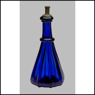
Introducing Website Speed Test: An Image Analysis Tool Integrated with WebPagetest

$
0
0

Because images dominate page weight, methodical image optimization can have a significant effect on conversions and user experience. And the performance tools you choose to use can have a powerful impact on how websites are built and maintained. One such popular open source tool is WebPagetest. It is designed to measure and analyze webpage performance, which is why Cloudinary chose to partner with our friends over there to launch Website Speed Test.

Website Speed Test is an image analysis tool that provides detailed optimization insights beyond a simple compression check. The tool leverages Cloudinary’s advanced algorithms to demonstrate how changes to image size, format, quality and encoding parameters can result in significant reductions in file size while maintaining perceived quality. In short, Website Speed Test shows the why and how of image optimization.

Improved Image Analysis Using WebPagetest

Linked from a new Image Analysis tab, Cloudinary powers WebPagetest with robust image analysis capabilities, enabling you to receive valuable data and guidance on how to manage images and deliver an optimal user experience.

Integration_with_WebPagetest

How Website Speed Test Works

Advanced algorithms take into account many factors when examining images, including the exact content of an image and the need for responsive design. The resulting insights enable you to ensure that images are encoded correctly, optimized for performance and look their best regardless of bandwidth, viewing browser, device or viewport.

At the top of the page, the report shows the total weight of images, potential compression and ‘Page Image Score’: a grade ranging from A-F. This grade is based on the image format used, fit between image resolution and the displayed size in the graphic design, and compression rate of all the images that were analyzed.

Image_Analysis_Result

The overview is followed by a detailed analysis of each image, with performance insights and recommendations for improvement.

Detailed_Insights

Left Tab – Current Image

Presents the current version of the image being analyzed along with its image score.

Middle Tab – Optimized Image

Presents an optimized version of the image, using the same format as the original image, with the following adjustments:

  • Correctly-sized images - scales the image down to the actual required dimensions on the web page.
  • Intelligent content-aware encoding - analyzes the image to find the best quality compression level and optimal encoding settings, based on the content and viewing browser, producing a perceptually fine image while minimizing the file size.

Learn more about these manipulations

Right Tab - Format Alternatives

This tab shows how optimization works for different image formats and the impact on image weight.

Optimizing Images is No Easy Task

The Website Speed Test tool provides insights on the why and how of optimization. While you may be able to optimize an image or two manually, the process becomes exponentially more complicated when you need to scale up, managing hundreds, thousands, or even millions of images delivered to a website.

For the best user experience, each image should be enhanced and optimized to meet the viewing context. This entails automatically adapting the image to fit the layout of the page and selecting the optimal quality and encoding settings.

Accomplishing this type of optimization is no ordinary feat. Optimizing images for different browsers, devices and bandwidth requires considerable knowledge of the intricacies of image formats, encoding parameters and visual quality metrics. For example, it makes sense that a smaller image file size will result in faster load time, less bandwidth usage and a better user experience. However, reduce the file size too much, and image quality could suffer and impair user satisfaction. This is where Cloudinary’s automatic optimization comes in play.

You can create your free account here. We would of course appreciate any feedback you have!

Should You Transform Images On Upload or On Demand?

$
0
0

cover

As a developer, you hope and anticipate that your website or mobile application will be accessed by different users on various devices. To improve the user-experience, irrespective of the viewing device, you need to make sure that each image adapts to different graphic layouts, device resolutions and other viewing requirements. For example, for an E-Commerce site, one image will be displayed on different pages — home page, product page, shopping cart and more — and will be viewed on a desktop, cellphone or a tablet. This means that you need to create numerous versions of every image and for a website with hundreds of images, manual manipulation is not scalable.

Cloudinary enables you to programmatically transform original images from various sources based on viewing requirements.

Lazy and Eager Transformation

Cloudinary offers multiple strategies for transforming your images. In this article, we’ll discuss two options: “lazy transformations”, which is the default option, and “eager transformations”, which can be selected by adding a flag to the upload API call.

Lazy transformation entails uploading images to Cloudinary as is and then transforming the images only when a user requests the image. The transformation for a given user is performed once, cached and delivered via a CDN for subsequent requests.

This type of transformation is the default option because it limits the bandwidth usage by generating transformations on-demand.

Let’s look at an example:

// Upload image to cloud
cloudinary.v2.uploader.upload('lady.jpg',
    function(error, result) {console.log(result); }
);
// Request image and lazy-transform the image
cloudinary.url("lady.jpg", 
    // Transformation
    {transformation: [
  {width: 400, height: 400, gravity: "face", radius: "max", crop: "crop"}
  ]})

The uploaded image is transformed only when requested with cloudinary.url, which returns a transformed image URL. This is what the request looks like in the network tab:

Even as small as the transformed image is (4.2kb), it still took as much as 976ms to complete the request. Consider how much time it would take if we had up to 50 images that required such transformations on one page of our website. Additionally, customers attempting to access these images during this 1 second in which they are created, will get broken images (error 420) due to concurrent access.

There are cases where, due to highly concurrent access patterns, it is not a good idea to wait until the first access to create the derived image or video. For example, if you run a news site, and tweet about your new article, for thousands of users to access it concurrently, and the images and videos on the article page were not created in advance, many of these users could encounter concurrency issues. In this case, the first user will experience a delay in accessing the images and videos, and while these transformations are being created, rest of the users will get broken images and videos. Reloading the page would fix the problem, but you might lose some users by then.

One way to solve this is to have editors preview their pages before publishing. However, with responsive design, real-time communications, and multiple devices accessing the content, it’s best to make sure the images are created during upload.

Now let’s consider a better solution: Eager transformation.

Eager Transformation

Just as the name states, eager entails transforming images during upload so when the transformations are requested, they will always be optimized and delivered with the best possible performance. So, when a user requests an image, Cloudinary no longer needs to perform transformations on this image because it has already been completed during upload.

With the eager approach, transformation tasks are performed once (during upload) for all requests so users don’t experience any delays.

To perform an eager transformation, use the eager array, which accepts transformation configuration objects:

// Perform transformation while uploading
cloudinary.v2.uploader.upload("lady.jpg", 
    // Eager transformation
    { eager: [
        { width: 400, height: 300, crop: "pad" }, 
        { width: 260, height: 200, crop: "crop", gravity: "north"} ]}, 
    function(error, result) {console.log(result); });

You can pass as many transformation objects as you choose to the eager array. The callback will be executed once the upload and transformation is completed.

You can as well request the image, but this time, you don't transform:

// Request image without transforming the image
cloudinary.url("lady.jpg");

This is what the request looks like in the network tab:

Let’s consider an image larger in size (22.8k) compared to image in the lazy transformation example. The image request was completed at 469ms, which is about 50 percent faster than the lazy method.

Transforming with API URL

Cloudinary provides a SDK for most of the platforms available today, including .Net, Node, PHP, Ruby, Python, React and Angular. If you want to talk directly to the API, that is possible. For eager transformation, you can use the eager parameter to carry out your actions:

eager=c_crop,w_400,h_400,g_face/w_50,h_50,c_scale|w_30,h_40,c_crop,g_south

The eager parameter receives a list of transformation strings separated with a pipe character (|). Chained transformations are separated with a slash (/).

What Of My Existing Images?

You no doubt have other images already stored on your cloud. It’s possible to use eager transformation on those as well.

Cloudinary allows you to perform explicit transformations on your existing images using the explicit method:

// Update existing image
cloudinary.v2.uploader.explicit('lady', 
      { eager: [
          { width: 200, crop: "scale" }, 
          { width: 360, height: 200, crop: "crop", gravity: "north"} ] }, 
    function(error, result) {console.log(result); } );

The method takes the name of the existing image as the first argument, then options (which transformation is part of) as the second argument and then the callback function to handle the completed update.

Conclusion

Eager transformation delivers better performance, and an improved user experience, while consuming fewer resources. Transformation is just one of the many features you can get from Cloudinary. Learn more.

This post originally appeared on Scotch.io

Christian Nwamba Christian Nwamba (CodeBeast), is a JavaScript Preacher, Community Builder and Developer Evangelist. In his next life, Chris hopes to remain a computer programmer.

Build a Vue Watermarking App for your Image Gallery

$
0
0

Cover image

If you intend to build a photo gallery online, you have to seriously consider how to protect the images from users who are not buying them. While visitors need to see the picture before purchasing, there needs to be a way to ensure that even serious buyers are not tempted to use the images without agreeing to your license terms.

One way to address this issue is to overlay bold transparent text or an image - called a watermark - on the image. By doing so, the image can not be used unless the user pays for the rights to use it. Adding watermarks is not a simple task. You could hire resources for manually watermarking using a photo editor . But, this process is not scalable for a massive photo gallery. Automating the process to add default watermarks to every image can make the process more efficient.

Cloudinary, an end-to-end media solution enables you to simplify the watermarking process. Cloudinary offers storage, manipulation and delivery of your images and videos as a service. Dynamic transformations enable you to manipulate media files either on upload or by adjusting the delivery URLs,. One of the transformations-- overlay -- can be used to watermark images.

To see this in action, let’s build a Vue app to upload images to Cloudinary and creating a new watermarked version .

Create a Cloudinary Account

We can start start with creating an account on Cloudinary and retrieving our cloud credentials before building the app. Sign up on Cloudinary for a free account:

When you sign up successfully, you're presented with a dashboard that holds your cloud credentials. You can safely store them for future use:

Provision a Server

Before diving into the Vue app, we need to provision the server/API, which the Vue app depends on to upload images. A simple Node server will do; thankfully, Cloudinary has a Node SDK to make our lives much easier.

Setup a new Node Project with npm:

npm init

Install the following dependencies:

  • Express: HTTP routing library for Node
  • Body Parser: Attaches the request body on Express's req object, hence req.body
  • Connect Multiparty: Parse http requests with content-type multipart/form-data, also known as file uploads.
  • Cloudinary: Node SDK for Cloudinary
  • CORS: To enable CORS
npm install express body-parser connect-multiparty cors cloudinary --save

Create an index.js file at the root of the project folder. This is the only file this project will have (except for the package.json and dependencies). Import the installed dependencies in this file:

const Express = require('express');
const multipart = require('connect-multiparty');
const bodyParser = require('body-parser')
const cloudinary = require('cloudinary');
const cors = require('cors');

Next, configure the body-parser and cors global middlewares:

app.use(cors());
app.use(bodyParser.urlencoded({ extended: false }))
app.use(bodyParser.json())

Configure Cloudinary with the credentials you retrieved from your dashboard after you created your account:

cloudinary.config({
    cloud_name: 'CLOUD_NAME',
    api_key: 'API_KEY',
    api_secret: 'SECRET'
});

Add a POST route to handle incoming requests:

// Multiparty middleware
const multipartMiddleware = multipart();

app.post('/upload', multipartMiddleware, function(req, res) {
  // Upload files to cloudinary
  cloudinary.v2.uploader.upload(
    // File to upload
    req.files.image.path,
    // Overlay Tranformation
    { width: 700, overlay: `text:Times_90_bold:${encodeURIComponent(req.body.watermark)}`, gravity: "south", y: 80, color: "#FFFF0080" },
    // Callback function
    function(error, result) {
      res.json({data: result})
  })
});

Above is a POST route pointing to /upload. The route is configured with the multiparty middleware to parse uploaded files and attach to the req object.

When this route is hit, we attempt to upload the image using Cloudinary's upload() method. It takes a file path, optional transformation argument and a callback function to be executed when the upload is successful.

The transformations provided are:

  • Width: The width that the image should be scaled to
  • Overlay: Content that should be placed on the image. In our case a Times font, 90px font size, bold text. This text is gotten from the request payload via req.body
  • Gravity + y: Where the text should be placed. In this case, 80px from bottom
  • Color + Opacity: Color of the text. #FFFF00 is the color, while 80 attached at the end is the opacity value in percentage.

You can start listening to port:

app.listen(process.env.PORT || 5000, () => console.log('Running...'))

Run the following command to start the server while we head right to building the client:

node index.js

Upload Client with Vue

Our front-end app will be built using Vue (a progressive JavaScript framework). To get started, install the Vue CLI tool:

npm install -g vue-cli

Next, create a simple Vue project using the Vue CLI tool we installed:

vue init simple watermark-app

The index.html file found in the scaffold is enough for us to actualize our idea. Let's start by adding a basic template for a form that contains the upload and watermark text fields:

<h2 class="text-center">Watermarker</h2>
<form enctype="multipart/form-data" @submit.prevent="onSubmit">
  <div class="form-group">
    <label for="">Watermark Text:</label>
    <input type="text" class="form-control" name="text" v-model="model.text">
  </div>
  <div class="form-group">
    <label for="">File:</label>
    <input type="file" class="form-control" accept="image/*" name="image" v-on:change="upload($event.target.files)">
  </div>
  <div class="form-group">
    <button class="btn btn-primary">Upload</button>
  </div>
</form>

 <div class="col-md-6">
   <img:src="watermarked" class="img-responsive" alt="">
 </div>

The text is bound to a model, while the upload field is bound to an upload event handler. When the "Upload" button is clicked, the onSubmit method on our Vue instance will be called.

There is also an image at the bottom of the template that its src attribute is bound to watermarked. This will be where the watermarked images will be placed.

This is the model on our Vue instance:

data: function() {
   return {
     model: {
       text: '',
       image: null
     },
     watermarked: null
   }
 },

Because we cannot have a two-way binding on an upload field, we attach a change event. before and after properties will be updated with the URL of non-watermarked and watermarked images. When the field changes, the upload method is called, which should set the value of model.image:

methods: {
   upload: function(files) {
     this.model.image = files[0]
   }
 }

Finally, when the form is submitted, we assemble the uploaded file, as well as the watermark text, using FormData:

methods: {
  onSubmit: function() {
    // Assemble for data
    const formData = new FormData()
    formData.append('image', this.model.image);
    formData.append('watermark', this.model.text);
    // Post to server
    axios.post('http://localhost:5000/upload', formData)
    .then(res => {
      // Update UI
      this.watermarked = res.data.data.url
    })
  },
  // ...
 }

You can launch the app and try to upload an image. You should get the following response:

Custom Font

Cloudinary enables you to use custom fonts. This comes handy when universally supported fonts do not suit your brand guidelines, and a custom font is required. Before using a custom font, you need to upload it with your chosen public ID:

cloudinary.v2.uploader.upload("fonts/AlexBrush-Regular.ttf", 
    {resource_type: 'raw', 
    type: 'authenticated', 
    public_id: 'AlexBrush-Regular.ttf'}, callbackFunction)

Then you can use it as the font for the text overlay, while uploading an image to your Cloudinary server:

app.post('/upload', multipartMiddleware, function(req, res) {
  // Upload files to cloudinary
  cloudinary.v2.uploader.upload(
    // File to upload
    req.files.image.path,
    // Overlay Tranformation
    { width: 700, overlay: `text:AlexBrush-Regular.ttf_90_bold:${encodeURIComponent(req.body.watermark)}`, gravity: "south", y: 80, color: "#FFFF0080" },
    // Callback function
    function(error, result) {
      res.json({data: result})
  })
});

Note that the overlay transformation property has changed from text:Times_90_bold... to text:AlexBrush-Regular.ttf_90_bold....

To always get the expected behavior from custom fonts, it's important to follow these guidelines:

  • .ttf and .otf font types are supported.
  • Make sure to include the file extension when referencing the public_id of the raw file.
  • To make use of bold or italic font styles, upload separate font files for each emphasis style and specify the relevant file in the overlay transformation.
  • A custom font is available only to the specific account or sub-account where it was uploaded.
  • Underscores are not supported in custom font names. When uploading the font as a raw file, make sure the public_id does not include an underscore.
  • As with any resource you upload to Cloudinary, it is your responsibility to make sure you have the necessary license and redistribution rights for any custom fonts you use.

Conclusion

There are various techniques you could use for adding your brand logo or custom text as watermarks. Cloudinary makes it easy to implement, automate and scale your watermarking requirements. Learn more overlay docs about different styling techniques and take it for a spin (for free).

Christian Nwamba Christian Nwamba (CodeBeast), is a JavaScript Preacher, Community Builder and Developer Evangelist. In his next life, Chris hopes to remain a computer programmer.

Image Optimization in WordPress

$
0
0

Cover image

WordPress is the number one content management system (CMS) in use today, running approximately 27 percent of the entire internet. Several high-traffic websites run on WordPress, and many utilize media, such as images and videos, to attract users and meet their needs.


A media-rich website must ensure that all images are optimized to speed up site performance. The faster your site, the higher the re-engagement from users on your platform. And the higher the user's re-engagement, the more conversion rates go up!


In this article, we’ll explain how to perform and implement image optimization in WordPress. With these tips, you can ensure that you set up proper image optimization techniques that will make your website flourish as soon as you install WordPress and the theme of your choice.


Optimizing Images in WordPress


Thankfully, WordPress has an authentic plug-and-play system, called Plugins, for adding extra functionality to your WordPress setup. This system prevents you from modifying the core WordPress code to avoid loss of key functionalities during WordPress upgrades.


I’ll highlight a number of Plugins that will help you optimize your images easily on your WordPress-powered website.


Imagify


Imagify


Imagify Image Optimizer is an image compression tool that enables you to speed up your website with lighter images while not sacrificing quality. It offers three levels of compression:

  • Normal, using a lossless compression algorithm

  • Aggressive, using a lossy compression algorithm

  • Ultra, using a lossy compression algorithm


WP SmushIT


WP SmishIT


WP SmushIT - Smush Image Compression and Optimization is an image optimization plugin developed by the popular WPMUDEV. It helps you to resize, optimize and compress your images.


The WPMUDEV’s servers smush every single image that is uploaded on your website by stripping out unnecessary data before adding it to your media library.


Oh, by the way, it is compatible with other media library plugins, such as WP All Import, WP Offload S3, NextGEN GalleryandWP Media Folder.


Tiny Compress Images


WooCommerce


Tiny Compress Images is an image optimization plugin that makes your website faster by optimizing your JPEG and PNG images. Under the hood, it uses the TinyJPG and TinyPNG services. It automatically optimizes new images on upload, as well as those already in your media library.


It is compatible with WooCommerce, WP Retina 2x and WP Offload S3.


EWWW Image Optimizer


EWWW Image Optimizer


The EWWW Image Optimizer is a WordPress plugin that automatically optimizes your images when they are uploaded to your website. It uses lossless optimization techniques so that the quality of your image will be the same before and after the optimization.


It has a sister plugin, EWWW Image Optimizer Cloud, that enables you to defer the optimization of images to designated servers rather than have it happen on your own servers.


Optimus


Optimus


Optimus is a WordPress image optimizer developed by the folks at KeyCDN. With Optimus, you can reduce files by up to 70 percent. It can optimize existing images too. There are different versions of Optimus:

  • Optimus (Free)

  • Optimus HQ

  • Optimus HQ Pro


ShortPixel Image Optimizer


ShortPixel


ShortPixel is a lightweight image optimization plugin that can compress all existing images. After installation, new images are resized and optimized on-the-fly.


It offers both lossy and lossless image compression: Features include:

  • Ability to compress JPG, PNG, GIF and PDF documents.

  • No file size limit.

  • Compatibility with Woocommerce and NextGen Gallery.

  • Compatible with watermarking plugins.


Cloudinary


Cloudinary


Cloudinary is a cloud-based service that provides end-to-end image and video management, including uploads, storage, administration, manipulation and delivery.


With Cloudinary, you can quickly and easily optimize your images. Cloudinary automatically performs certain optimizations on all transformed images by default. Its integrated, fast CDN also helps deliver all image resources to your users quickly.

Cloudinary offers:

Automatic quality and encoding: Using the q_auto parameter, the optimal quality compression level and encoding settings are selected based on the specific image content, format and the viewing browser. The result is an image with good visual quality and a reduced file size. For example,

http://res.cloudinary.com/demo/image/upload/q_auto/woman.jpg

You also can use q_auto:best, q_auto:low, q_auto:good or q_auto:eco to adjust the visual quality of your images.

Automatic transformation: The f_auto parameter enables Cloudinary to analyze the image content and select the best format. For example, it can automatically deliver images as WebP to Chrome browsers or JPEG-XR to Internet Explorer browsers, while using the original format for all other browsers. Using both f_auto and q_auto, Cloudinary will still generally deliver WebP and JPEG-XR to the relevant browsers, but might deliver selected images as PNG-8 or PNG-24 if the quality algorithm determines one of those is optimal.

Resizing and cropping images with width and height parameters: Using the width (“w”) and height (“h”) parameters in URLs, you can resize the images with Cloudinary:

http://res.cloudinary.com/demo/image/upload/w_0.5/sample.jpg

http://res.cloudinary.com/demo/image/upload/h_200/sample.jpg

It maintains the aspect ratio, but resizes the image to whatever height and width you desire.

http://res.cloudinary.com/demo/image/upload/w_200,h_100/sample.jpg

Cloudinary supports the following image cropping modes: scale, fit, mfit, fill, lfill, limit, pad, lpad, mpad, crop, thumb, imagga_crop and imagga_scale.

The Table below shows a comparison of the different wordpress plugins and Cloudinary:

  Lossless Compression Lossy Compression Smaller File Sizes Bulk Optimization Compressions of animated PNG
Cloudinary
  • Yes
  • Yes
  • Yes
  • Yes
  • Yes
Imagify
  • Yes
  • Yes
  • Yes
  • Yes
  • No
ShortPixel
  • Yes
  • Yes
  • Yes
  • Yes
  • Yes
Optimus
  • Yes
  • No
  • Yes
  • Yes
  • No
WPSmushIT
  • Yes
  • No
  • Yes
  • Yes
  • No
Ewww Image Optimizer
  • Yes
  • No
  • Yes
  • Yes
  • No
Tiny Compress Images
  • Yes
  • Yes
  • Yes
  • Yes
  • Yes

Conclusion

One of the best ways to improve page performance in WordPress is via image optimization. That’s why you will want to take some time to ensure that all of your images are properly optimized and cached.


We have highlighted how to optimize images in WordPress, as well as with Cloudinary. There is a Cloudinary WordPress Plugin available that you can use. It offers cloud storage for your images and automatic image optimization.


Cloudinary provides many options for optimizing your images. Feel free to dive in and explore them.


Prosper Otemuyiwa Prosper Otemuyiwa is a Food Ninja, Open Source Advocate & Self-acclaimed Developer Evangelist.

Video at Large Scale - Contributions from the Developer Community

$
0
0

cover image

Video is an increasingly important component for websites - whether it’s to inform visitors, enhance user experience or support sales and marketing efforts. But delivering high-quality video at large scale can be quite a challenge. You need to consider encoding, format, bandwidth usage, delivery and the devices on which visitors may be watching the video, to name just a few concerns.

To help answer questions and alleviate any confusion you may have about video at scale, we’ve polled a dozen experts, who share their best practices, tips and tricks. Keep reading to learn more from these industry thought leaders.


There are many technological features that are key to delivering smooth and successful enterprise video. It's the delivery piece that can be a tricky beast if not done right.

First, there’s the complicated web of general internet connections and content distribution networks that a video stream must travel to reach intended viewers. We've designed something we call our software-defined content delivery network (SD-CDN) that cracks the code on leveraging a multitude of distribution networks to make video delivery something you can count on.

The SD-CDN manages interactions between major commercial CDNs as needed, globally and on-the-fly. This tool also analyzes performance and works to prevent stream failure by automatically switching to standby equipment if potential issues are detected, which maximizes resiliency. This capability is especially critical when performing live streaming. With more and more companies live streaming their product launches and other events, making sure your video will scale to meet thousands of simultaneous viewers is essential.

Another important capability that is often overlooked is an internal enterprise delivery of a live video stream. We offer our clients an enterprise content delivery network (ECDN) to make simultaneous delivery of streaming video to employees work beautifully. This capability brings video content inside the firewall so that thousands of employees can concurrently watch a video stream without creating network bottlenecks.

For more insight on these capabilities, you can check out our “Definitive Guide to Enterprise Video”: http://info.ustream.tv/definitive-guide-to-enterprise-video.html

Contributed by Stacy Nawrocki, director of Product Marketing, IBM Cloud Video


Here are five rules for using audio/video media on your site:

  1. Avoid Autoplay. From my experience, autoplay isn't the way to go. A user could enter the page and walk away from their computer. The volume on the user's computer could be too high or too low and the autoplay could blast them out before they can adjust their volume. Additionally, autoplay could be a waste of bandwidth. Unless you run a video site, like YouTube or MetaCafe, don't use autoplay.
  2. Always Give Stop, Pause and Volume Controls. I've actually found myself on websites that autoplay media and don't provide stop, pause and volume controls. Needless to say, not providing media player controls is a terrible practice.
  3. Make the Media Player Easy to Find. Place your media players in an easy to find area on your site. Burying a media player on the page will only guarantee that your user sets the record for quickest "back button" click ever.
  4. Quality - Everything or Nothing. I can't stand when a video or audio snippet is placed on a website to support an article, but the media is of such poor quality that they actually damage the article's credibility. Provide quality video, even at the expense of load time - I'll wait for something good.
  5. Warn Users About NSFW Material. Unless your website is clearly NSFW as a whole, clearly label any audio or video "NSFW" (and definitely DO NOT auto play this material).

Link to full article: https://davidwalsh.name/rules-audio-video-media

Contributed by David Walsh, Mozilla, evangelist and MooTools core developer, DWB


When I think about responsive video, and anything responsive these days, I think about three main things:

  • Is the media fluid/responsive?
  • Am I serving the right codec?
  • What is the optimal size/weight of the video file I'm serving?

One option for responsive video is self hosting. Self hosting video is great because it's easy to implement on the front end. Gone are the days when you needed JavaScript or Flash a player like JWPlayer (my old personal favorite). Instead, you can now use the magical <video> tag and make your video work in the browser immediately. Of course there are a few snags, but let’s bask in the <video> tag glory for a while. The <video> tag is like a fancy <div>, so you can style it and make it super flexible with relative simplicity.

The problem with self hosting is that you're now paying for the bandwidth of video, and videos are not the lightest in bytes on the internet. You also need to encode the video yourself for all of the different types of video codecs that are required for cross browser/device/operating systems.

By Justin Avery, director, digital consultant and responsive web design evangelist - author of ResponsiveDesign.is and RWD Weekly Newsletter


Delivery is one particular area of concern about videos at scale. Streaming video over the internet is no small feat, and doing it at scale can be very challenging. Amongst other things, it involves taking into consideration the heterogeneous set of viewing devices and supporting various codecs, such as HEVC/H.265, H.264, MPEG-4, Theora, VP9, VP8, VP6 and WMV.

One of the techniques for streaming and delivering video at scale is adaptive bitrate streaming (ABS).
ABS is a technique that adjusts the quality of a video stream in real time according to the users bandwidth and CPU capacity. It enables videos to start a little quicker with fewer buffering interruptions. You can generate multiple streams of a video with different resolutions, qualities and bitrate. These multiple streams, also known as variants, will need index and streaming files for each variant. Therefore, during playback, the video player will determine and select the optimal variant, such as screen resolution or player size, in response to the client environment and automatically switch between variants to adapt to changing network connections.

CDNs are also responsible for serving the video needed to play content during streaming. In order to maximize video delivery efficiency, ensure that content is served via servers close to your users/viewers/customers. For example, a user streaming video from the United States should be served content via a CDN located in/around the North America region, not the EU region. This technique goes a long way in providing a great viewing experience for your users. Cloudinary leverages multiple CDNs, including Akamai, the leading CDN provider, with thousands of worldwide edges.

Encoding compresses and transforms video source files to smaller files that users can view on their devices. Handling the overall video encoding process can be challenging. Companies, like Netflix, have built in-house solutions for encoding videos to various deliverable formats because they have enormous engineering resources at their disposal. As an organization or production company serving video content to users without a lot of resources to build your in-house solution, you can employ cloud-based encoding services that will provide on-the-fly video encoding. Cloud services, like Cloudinary, handle on-the-fly encoding effortlessly.

By Prosper Otemuyiwa, Google Developer Expert and prominent OSS front-end developer


For video platforms owners, it has always been a headache to think about which standard to use to become multiplatform-compatible and achieve the maximum number of different devices, while maintaining the best video quality and user experience. Most of the first video platform deployments used progressive download techniques for VoD contents, or costly RTMP solutions like Flash Streaming for Live contents.

Adobe HDS, Microsoft MSS and Apple HLS are all proprietary adaptive HTTP streaming protocols that were introduced years ago to enable more efficient adaptive video delivery. They use different methodologies and formats, but none is compatible with the wide range of devices (mobile devices, smart TVs, computers, set-top boxes, gaming devices and others).

MPEG Dynamic Adaptive Streaming over HTTP (DASH) was born to be an international open standard to solve issues with internet video, such as video accessibility problems due to firewall, lack of plugins or bandwidth problems. But, as mentioned in the third Encoding.com 2017 Global Media Format Report, although DASH (21%) has shown strong growth year over year, HLS (72%) remains the most popular adaptive bitrate protocol.

Apple keeps its HLS standard as the only one compatible with its Apple devices, and this is a big constraint to adopt DASH as the only standard because it would mean losing the audience of all customers with Apple mobile devices. On the other hand, adopting both HLS and DASH would be costly as video platforms should encode and store both formats.

But, since June 2016, there is a new hero in the digital video industry, called CMAF (Common Media Application Format), with the aim of enabling a single media encoding to be used across many applications and devices. CMAF supports fragmented MP4 (fMP4) container, which is also supported by DASH and the renewed Apple HLS manifests. By adopting CMAF, it’s possible to encode and store unique video content that can be delivered at the same time with HLS and DASH manifests.

First tests with fMP4 encoding delivered using CMAF showed great results. Tests using CMAF multi-quality video contents with multiple audio and WebVTT subtitles were delivered and played with web players like Bitmovin, JWPlayer, TheoPlayer and DashIF. CMAF contents are also fully compatible with Apple and Android mobile devices with minor issues.

Therefore, the evolution in the broadcast of contents in OTT platforms is expected to improve notably, facilitating a single format for almost all platforms. Of course, there will be some old, incompatible devices and it will be necessary to assess whether the amount is big enough to preserve older distribution formats, such as Progressive Download or Flash.

Contributed by Francesc Mas, engineer consultant, CCMA


Delivering video at a large scale, especially through live streaming, is a daily challenge for many businesses because viewers want to be able to watch their videos at anytime, anywhere and from any device at the best quality possible. We aim to reach 1.9 billion users of online video by 2018, combined with a growing demand in terms of quality requirements: only 8.2% of viewers will return to a site during the stream if they experience a video failure. So, you’d better find out the best way to deliver your video content across the globe with minimal buffering and the best visual quality possible.

First, you want to make sure that all of your viewers can access your stream. Using HTTP Live Streaming (HLS) is currently the safest bet to reach the largest number of devices at a reasonable cost and a reasonable level of security. HLS, originally developed by Apple, is a live streaming protocol that cuts your stream into video chunks, or fragments, of about 10 seconds each. A HTTP server creates a manifest file, a playlist, that indexes the chunks so your player knows where they are stored and to make sure they are played back following the right order.

HTTP Live Streaming also supports adaptive bitrate streaming (ABR), which is the most recent delivery evolution, reducing a lot the buffering issues. This method creates multiple renditions of your stream and will play the highest quality possible by dynamically switching between bitrates according to the speed of the network connection.

As a second step, you want to look at a CDN, which is the safest bet to ensure a high-quality video delivery. Being composed of a network of servers around the world, a CDN can send your output stream to an edge server close to your viewer to minimize transmission problems and quality degradation. Just make sure your CDN has servers in the areas where most of your viewers are located, since not all CDNs are global or serve all locations equally.

Especially for live streaming, you want to use a top-tier CDN with a large-scale network of locations to avoid buffering issues as much as possible. You might have to commit to a considerable amount of bandwidth to partner directly with a large CDN, which might not be the best option in terms of pricing.

Often, the best solution is to use an online video platform that has already integrated with a top-tier CDN. This approach can help you benefit from the low pricing negotiated by the OVP along with other integrated tools that will help you optimize your video delivery, such as video analytics dashboard.

To learn more about DaCast online video platform, check out here: https://www.dacast.com/why-dacast-to-broadcast-live/

Contributed by Elise Furon, product manager, DaCast


A key aspect of delivering video at scale that’s often overlooked is how to architect your infrastructure in a way that aligns with your business initiatives.

Here are some initial questions to consider when defining your video traffic profile:

  • Are you streaming live or video on-demand (VOD)?
  • How many videos are you creating and how quickly do you need to publish your content?
  • Which portion of your video traffic will drive business initiatives and needs to be dynamic (i.e., video manifests, user comments) rather than just focusing on caching and delivery (i.e., video segments)?

Choose a CDN that best serves your business objectives. Many of you may know that caching content at the edge of the network (closer to users) cuts origin infrastructure costs, while improving viewer experiences. But what about processing business logic at the edge? Or allowing request chaining for user authentication, feature flagging or A/B testing? Find out what your CDN can do beyond byte delivery to unlock the full potential of this often overlooked piece of your infrastructure.

When architecting your video service, you also should define key performance indicators so you can measure how well you’re tracking towards your goals. You’ll want to evaluate components that give you the visibility you need to uncover insights and the control to take incremental action.

The final piece is analyzing total cost of ownership of your architecture. Go beyond analyzing the prices of the different vendors, because that doesn’t tell the whole story. Consider all the elements of operating your solution: How much time and effort does it take to manage and maintain? How quickly does the support team resolve your issues? Is it self-serviceable?

Contributed by Ashok Lalwani, head of Video Product, Fastly


There is nothing worse for a customer than waiting, staring anxiously at a frozen uploading progress bar. Unfortunately, videos, which tend to be large files, can take several minutes to upload, especially when being uploaded from mobile devices with spotty internet connections. As the makers behind Filestack, the No. 1 developer service for uploading and managing files, we’d like to share some tips for uploading large files:

  1. Chunk large files into smaller pieces. The best way to upload a large file quickly and effectively is to break it up into more manageable small files. You can specify the size of the pieces to optimize for network conditions. When you chunk video files, you reduce the risk of timeouts. If a small chunk fails to upload for whatever reason, you can automatically retry only that chunk, instead of having to restart the entire upload.
  2. Upload asynchronously. When you upload asynchronously, the upload happens behind the scenes, so your users can continue to use your app as usual, instead of having to stare longingly at the slowly moving progress bar. Instagram does a great job of this, returning you to your feed after you post, showing you that your video is still uploading.
  3. Use a Content Ingestion Network (CIN). A CIN is essentially a reverse CDN. While a CDN has a globally distributed network of server points of presence (POPs) to deliver content, a CIN has a globally distributed network of ingestion POPs to upload content from users nearby. CINs regularly increase upload speed by 10x, which makes a huge difference if you are cutting user wait time from 60 seconds to only 6 seconds for a video to upload.

Contributed by Bethany Stachenfeld, marketing manager, Filestack


It's no secret that the internet is no longer a network consisting primarily of static and dynamic content. The Internet has become a video delivery platform. For new media publishers, social media platforms and websites that lean heavily on video to convey their message or product information, the need to focus on video quality, while optimizing for smaller screens and congested networks, has never been higher. To facilitate the broadest coverage possible, Beamr recommends video encoding approaches that operate in symbiosis with existing standards: H.264/AVC or H.265/HEVC.

Though the H.264 codec is ubiquitous and supported widely across devices and browsers, the next-generation codec H.265/HEVC has been proven to be 30 percent more efficient at the same quality. This added performance - when combined with the power of frame-level optimization using a perceptual quality measure - is establishing a new quality and UX bar.

Block-based video encoding schemes are inherently lossy methods that achieve compression by removing information from the bitstream, taking into account the effect of such information on the perceived visual quality of the video and the file size. A video encoder rate-control algorithm adjusts the encoding parameters to achieve a targeted bitrate. This algorithm allocates a budget of bits to each group of pictures, individual frames, and in some cases, subframes in a video sequence.

Beamr has developed a process for content-adaptive encoding based on closed-loop re-encoding of input frames at various compression levels, while checking the value of Beamr’s patented perceptual quality measure, which has a high correlation with human subjective results. The input to the Beamr optimization process is a video file (when used in the Beamr 5x encoder, YUV is the input) that has been compressed at the quality level desired.

By evaluating the quality of the video on a frame-by-frame basis, this method of content-adaptive encoding ensures that the results are optimal and the video file is encoded to the lowest possible size, while fully retaining the quality desired. The advantages of integrating a quality driven rate-control process into the video encoding process is an average 20 percent to 50 percent reduction in file/stream size. This level of saving brings tremendous benefits and ROI to any large website operator. For those engaged in video distribution, the adoption of HEVC, along with frame-level optimization contributes cost savings and UX benefits that directly translate into improved engagement and content monetization.

Contributed by Mark Donnigan, vice president, Marketing, Beamr


When delivering videos at scale, there are a few things you should consider to ensure the best playback experience. Videos are big files, but the time to first frame can be actively reduced. Most importantly, you'll want the video files cached as close as possible to your users; your CDN's edge servers will help with that. You'll also want to leverage the browser's ability to preload the video using the ‘preload’ attribute in the video tag, so that playback, once triggered, takes an instant instead of waiting for the buffer to fill.

For the lowest possible time-to-first-frame, make sure you use properly encoded MP4 video files in which the first frame is a keyframe. If the first frame is not a keyframe, the video will start by showing a black image until the first keyframe kicks in. Additionally, the MOOV atom should be placed at the beginning, it's downloaded first. The MOOV atom holds information about the length of the video and is needed by the browser to enable seeking.

Contributed by Octavian Naicu, founder and product manager, Pipe


Here’s a quick look at the VOD and live bitrate requirements in Apple’s HLS authoring specification for Apple devices. Following are three basic requirements for VOD data rates:

  • The average segment bit rate must be within 10 percent of the AVERAGE-BANDWIDTH attribute.
  • The measured peak bit rate must be within 10 percent of the BANDWIDTH attribute.
  • The peak bit rate should be no more than 200 percent of the average bit rate.

Working through the first requirement is simple. Basically, it means that the average bitrate for each segment must be within 10 percent of the AVERAGE-BANDWIDTH attribute, which, according to 4.3.4.2 of the Pantos spec, measures the “average segment bitrate of the variant stream.” Basically, it’s an accuracy requirement: Your actual average must be within 10 percent of the stated attribute in the M3U8 file.

The second and third requirements are potential causes for confusion, because it looks like the second requirement demands a peak within 10 percent of file bandwidth, while the third requires a peak no more than 200 percent of the average bitrate. Once you check the Pantos spec, however, you see that the BANDWIDTH tag represents the “peak segment bit rate of the Variant stream.” It’s not the average bandwidth, it’s the peak. So again, number two is an accuracy requirement in that the peak bit rate should be within 10 percent of the peak bitrate represented in the BANDWIDTH tag.

In contrast, the third is an encoding requirement and an accuracy requirement. That is, the peak bitrate should be no more than 200 percent of the average bit rate, which means that 200 percent constrained VBR is an acceptable technique. I’m more conservative, and recommend 110 percent constrained VBR because of what I learned in an article entitled “[Bitrate Control and QoE-CBR is Better].(http://streaminglearningcenter.com/articles/bitrate-control-and-qoe-cbr-is-better.html)” That said, you can encode at up to 200 percent constrained VBR and meet the Apple spec.

The requirements for live video are much simpler.

  • The average segment bit rate over a long (~1 hour) period of time must be less than 110 percent of the AVERAGE-BANDWIDTH attribute.
  • The measured peak bit rate must be within 25 percent of the BANDWIDTH attribute.

The first one, again, is an accuracy requirement; if you say the stream is 4 Mbps, it should be between 3.9 and 4.1 Mbps. The second is an encoding requirement and an accuracy requirement that means that the peak bit rate MUST be within 25 percent of the peak bitrate represented within the bandwidth tag. Since the only encoding technique you can use for live is CBR, this shouldn’t be a problem.

Apple could make all of this easier to remember if they changed the name of the BANDWIDTH tag to PEAK BANDWIDTH, which is really what it means. Since that’s unlikely to happen, if you just remember that BANDWIDTH means peak bandwidth, you should be able to keep it straight.

Link to full text: http://streaminglearningcenter.com/blogs/encoding-hls-delivery-understanding-bitrate-rules.html

Contributed by Jan Ozer, expert on H.264 encoding, contributing editor to Streaming Media Magazine


Video is already a critical media for business and its importance will keep growing. By 2019, 80 percent of the world's internet traffic will be video, says Cisco. But every additional second in page load increases risk of abandonment on your website. Video performance is difficult to maintain as you face two events when delivering videos to customers: Initial buffer fill, which is the time it takes for your video to start playing, and lag time, which is the time the video pauses to get the next chunks to play.

To ensure your content is delivered correctly, you should anticipate and run load tests on your infrastructure so that you can fine tune, add software layers, and know your users’ future experience before they let you know how bad it is. To ensure your load test is useful, try the following approaches:

  • Ensure you don’t face the cache effect, which makes you think everything is OK even if it’s not.
    • Use many video streams: Your users will surely watch different movies or ads, you need to reflect that in your test.
    • Vary bandwidth: Your users don’t have the same network bandwidth, particularly mobile users. Vary the bandwidth available to your virtual users to simulate the different networks and know the lags per bandwidth available.
    • Vary source locations: Your users will probably come from different locations in your country or worldwide, ensure you use different source locations. The cloud is your friend.
  • Check all the content you deliver:
    • To ensure your users have the best experience, you’ll have to deliver at least two or three of the most popular formats.
    • Ensure you test all these formats under load. This can be tedious, but fortunately there are tools that can help you.
  • Reproduce the players’ behavior: Load testing streaming servers realistically is not easy, as a player does many things at the same time that can impact user experience:
    • Download streams: This will occur on startup and while player is playing the video to ensure video keeps playing smoothly.
    • Contact DRM servers to check rights: These can be third parties for which you would define SLAs, but you can also host them. In the latter case, you’ll need to ensure they correctly handle the load. *Play stream that involves decoding: This is more a client (player) issue so it is less critical, but to ensure you provide the best experience, use popular and fast codecs to encode your video.
  • Collect the critical metrics: Finally, load testing metrics are a bit different for video streaming load testing. Besides the usual metrics, like connect and download time, in order to understand user experience, you should track the following:
    • Initial buffer time
    • Lag times
    • Lag ratio

Contributed by Philippe Mouawad, leading development of UbikLoadPack

UbikLoadPack is a set of Apache JMeter-based plugins for load testing Video Streaming protocols (MPEG-DASH, HLS, MS Smooth).

Finding the right media assets with a powerful new search API

$
0
0

Find media assets instantly with new search API

Great content is hard to come by. You can invest a lot of time and effort in building a great media library, but if content managers and editors can't quickly find what they need at the right time, it's almost useless (and frustrating). Good search capabilities allow you to provide them with a better experience: present relevant content or a well-organized catalog by a variety of criteria such as tags, folders, size, resolution, aspect ratio, faces, colors and many more.

Introducing image & video advanced search API

Cloudinary is an end-to-end image and video management solution. Our new search API allows you to incorporate advanced search capabilities into your media management workflow, letting your content managers easily find assets uploaded to Cloudinary by almost any criteria. You can use the data in the search response to display an organized view of your catalog, display relevant content, or even expose dynamic search options directly.

For example, let's say John is an editor who is writing an article that needs an image. The website design requires a landscape image with good quality. John also remembers that the company purchased some images earlier this month and there was one with a dog that could be just right, that may have been tagged. Well, if the company's images are stored in a Cloudinary account, then finding that perfect image is easy with the Search API.

Here's a quick Ruby example:

Cloudinary::Search.expression('tag:dog uploaded_at>1m aspect_ratio>="4:3" width>2048').execute

This query returns a JSON response that provides a summary of the search results and lists all matching images. In this example, the response includes all images tagged with 'dog', with an aspect ratio of 4:3, wider than 2048px, and that were uploaded within the past month. Results are sorted by relevance.

Search API - sample result returned 1

Search API - sample result returned 2

Search API - sample result returned 3

Search API - sample result returned 4

The search API is based on a robust new asset search engine, so that even if you have millions of assets, results are returned immediately. You can truly focus on your core product and let us do the searching for you.
Search for any combination of criteria

The search expression syntax is Lucene-based, and supports any combination of attributes:

  • Asset attributes such as file size, aspect ratio, resolution, video duration
  • Categorization attributes such as tags, context, folders
  • Dates such as when the resource was uploaded or created
  • Advanced options such as embedded image metadata (Exif) and image analysis (colors, faces, transparency, and more).

Using flexible query expressions, you can tailor your search to match the way your content managers and editors like to search for content.

Faceted search

Faceted search is a great way to provide themed navigation and exploration by predefined categories, usually more suitable for the less tech-savvy users within your organization. Rather than expecting users to search by different criteria, you can use the API's aggregation options to proactively display different category values, and how many assets match that category.

Here's an example of aggregating assets by format:

Cloudinary::Search.('flower').aggregate('format').execute

The response returns all assets that contain the search term 'flower', listing the number of assets for each of these formats:

{
  
  "aggregations": {
    "format": {
      "png": 484,
      "jpg": 121,
      "gif": 3,
      "pdf": 2
    }
  },
  
}

More examples

1. Dynamic image search in an e-commerce catalog

Say you have an e-commerce catalog, with millions of product images, and multiple photographers who upload them from a variety of sources. Images are usually uploaded to a specific folder (e.g., 'products/photos/'), and you carefully manage metadata for product types, but for a specific campaign you want to be able to find all blue shirts, with high quality (above 5 MP), that were taken within the last week. Just one simple query and here they are:

Cloudinary::Search.expression(
'resource_type:image AND folder:products/photos/* AND
 context.productType:shirt AND 
(colors.blue>10 pixels>5mp taken_at>1w)').execute

Now it's easy to download them, tag them, or publish them on your website.

2. Housekeeping and cleanup

You can also use the search API for cleaning up a cluttered media library. Let's say you want to get rid of meaningless large videos to save some space. Just search for all mp4 videos that are shorter than 1 minute and weigh over 10 MB, and request them in descending order of size. Housekeeping has never been easier.

Cloudinary::Search.expression(
'format:mp4 AND duration<30s AND size>10mb').sort_by('size','desc').execute

3. Taking advantage of auto-tagging

Tagging every image in your media library is valuable in many ways and improves the searchability of your media, but manual tagging according to image content is a very time-consuming task. And if you have a lot of user-generated content, you simply cannot manually handle it all.

Cloudinary offers fully integrated add-ons for automatic image tagging using AWS Rekognition & Imagga. Using one of these, you can ensure that all your images are automatically tagged with relevant terms based on content. You can then easily search for specific content or for inspiration, without relying on manual categorization and taxonomy. And if your search turns out to be too broad, it's easy to refine it to quickly find what you're looking for without the tedious manual efforts.

Here is an example of searching for an image of a bike. Note that when no fields are specified in the search expression, we search for the term in all string fields, including tags.

Cloudinary::Search.expression('bike').execute

Examples of results appear below, along with the automatic tags that were identified.

Search API - auto tagging 1

Search API - auto tagging 2

Still haven't found what you're looking for?

There are many more examples of what you can accomplish with the advanced search API. Search for transparent logos, photos with a certain number of people in them, media that is protected with copyright or taken with a specific camera model in a specific location, and more.

Check out our Search API documentation for a full list of search options.

Give it a try

The asset search API is part of our Admin API and is available in the following SDKs: Ruby, Node, Java, PHP, Python and Scala.

It is included for our Advanced Extra plans and higher and requires a small setup on our side. An additional search tier is available which allows more advanced functionality, such as embedded image metadata, image analysis and aggregations.

Our beta customers have been trying it out for a while now, and so far we've been hearing great feedback. Want to try it out? Contact us and we'll set it up for you. Looking forward to hearing what you think!
ChatBot for Image Manipulation

$
0
0

Chatbot

Bots - which have been around for a long time and perform different functions - are gradually replacing traditional applications. Consider Internet bots, also known as web robots, as software applications that run automated tasks over the internet, such as crawling websites and indexing search engines. Slack, the popular business messaging service, also popularized the use of bots for almost anything, from tracking stand-ups and sending reminders, to activating continuous integration and different types of activities.

Chatbots are the new trendy type of bots and they are becoming ubiquitous. Several organizations around the world are now taking advantage of chatbots to simulate conversations between users and computers. With chatbots, you can eliminate the need to have a human on the other end, for basic customer enquiries or requests. Messaging platforms, such as WeChat and Facebook Messenger, are massive advocates of chatbots.

The Image Editing Chatbot Overview

Chatbot screen

The Image Editing Chatbot is a simple prototype/experiment that can quickly solve your image editing challenges. Let’s examine a scenario here to illustrate my point better:

You work for an ecommerce store that has hundreds of images that are being delivered to different layouts, devices, screens and bandwidths. Manually creating these variants can be resource intensive and not scalable.

However, creating multiple variants of an image being delivered across different layouts, devices and bandwidth using an image manipulation chatbot could help. In fact, you can avoid taking on some tasks by simply assigning the URL of the deployed chatbot for others to use. One of the main resulting benefits is that non-technical folks can comfortably use it to solve their image editing challenges, as well.

Some Tech Required

Let’s analyze the technology behind the chatbot.

Before we start, you will want to clone the chatbot from GitHub.

Follow the instructions on the README and execute the commands displayed on the repo in the right sequence. Are you having fun yet?

Chatbot screen

I used the command please overlay ACME logo at the south-west corner and the resulting image was the previously uploaded image with ACME logo placed on it as specified in the command.

Chatbot screen

The first image is the original size of the uploaded image. I entered the command please set the width to 500 and it immediately cropped the image and returned the smaller size.

Easy, isn’t it? Next, let’s talk about the stack.

The chatbot is built with:

  • React - for building out the front-end of the image editing tool
  • Node - for building the backend that interacts with the Cloudinary service for image editing
  • Cloudinary - a cloud-based, end-to-end image and video management solution that enables uploads, storage, administration, image manipulation and delivery
  • PubNub - a service for developing Real-time applications

Now, let’s go more in-depth. Open up the source code.

Check out the src/App.js file.

render() {
        return (
            <div className="vbox fill">
                <div className="scroll grow" id="scroll">
                    {this.renderHistory()}
                </div>
                <div className="hbox">
                    <input ref='text' type="text" className="grow"
                           value={this.state.currentText} onChange={this.textEdit.bind(this)}
                           onKeyDown={this.textKeydown.bind(this)}
                    />
                    <button onClick={this.sendMessage.bind(this)}>send</button>
                    <button onClick={this.showUploader.bind(this)}>Upload Image</button>
                </div>
            </div>
        );
    }

    showUploader() {
        var cloudinary = window.cloudinary;
        cloudinary.openUploadWidget({ cloud_name: 'pubnub', upload_preset: 'mcipauzl'},
            (error, result) => {
                console.log(error, result);
                console.log("the upload path is", result[0].path);
                ImageService.setImagePath(result[0].path);
            });
    }

render() is responsible for displaying the send, Upload Image buttons and the history of messages sent in the chatbot.

showUploader() is responsible for calling the Cloudinary upload widget. Take a look at the image below:

Note: You can change the cloud_name and upload_preset to the credentials from your Cloudinary dashboard.

Upload Widget

Check out the src/ImageService.js.

You can change the publishKey and subscribeKey values to the credentials from our PubNub dashboard.

The ImageService is responsible for communicating with PubNub channels on setting and getting image paths in real time.

Check out the src/ParserService.js. The ParserService is a giant service responsible for analyzing keywords in the commands such as upload, display, show, resize, reset, make, overlay and processing it.

src/ParserService.js

if(command.action === 'overlay') {
            console.log("doing an overlay");
            var fname = command.target;
            fname = "sample";
            var scale = 1.0;
            scale = 0.2;
            var grav = command.direction;
            if(command.direction === 'southwest') {
                grav = 'south_west';
            }
            transforms.push("l_"+fname+",w_"+scale+",g_"+grav);
        }

Taking the overlay action and applying the needed Cloudinary transformation.

//apply the context
        if(!context.format) context.format = 'jpg';
        if(context.width) {
            transforms.push("w_"+context.width);
        }
        if(context.autoContrast) transforms.push("e_auto_contrast");
        if(context.autoSharpen) transforms.push("e_sharpen");
        if(context.crop) {
            transforms.push("w_"+context.width+",h_"+context.width
                +",c_fill,g_"+context.gravity);
        }

        console.log("final context is",context);


        //generate the final url
        var apiUrl = 'http://res.cloudinary.com/' +
            cloudName + '/' + resource + '/' + operation + '/';
        if(transforms.length > 0) {
            apiUrl += transforms.join("/") + "/"
        }
        var filename = context.path.substring(0,context.path.lastIndexOf('.'));
        apiUrl += filename  + '.' + context.format;
        return apiUrl;

It obtains the required transformation parameters and generates the Cloudinary URL with those parameters.

The server.js is simply responsible for processing the commands from the frontend via the parser service and returning the right responses.

Cloudinary Transformations

Using Cloudinary, you can quickly and easily optimize your images, regardless of your programming language preference. Cloudinary automatically performs certain optimizations on all transformed images by default. Its integrated, fast CDN delivery also helps to get all the image resources to your users quickly.

Let’s explore some image manipulation techniques and transformations that are effortless using Cloudinary:

Cropping:

Ruby:
cl_image_tag("lady.jpg", :width=>400, :height=>400, :crop=>"crop")
PHP:
cl_image_tag("lady.jpg", array("width"=>400, "height"=>400, "crop"=>"crop"))
Python:
CloudinaryImage("lady.jpg").image(width=400, height=400, crop="crop")
Node.js:
cloudinary.image("lady.jpg", {width: 400, height: 400, crop: "crop"})
Java:
cloudinary.url().transformation(new Transformation().width(400).height(400).crop("crop")).imageTag("lady.jpg")
JS:
cl.imageTag('lady.jpg', {width: 400, height: 400, crop: "crop"}).toHtml();
jQuery:
$.cloudinary.image("lady.jpg", {width: 400, height: 400, crop: "crop"})
React:
<Image publicId="lady.jpg" >
        <Transformation width="400" height="400" crop="crop" />
</Image>
Angular:
<cl-image public-id="lady.jpg" >
        <cl-transformation width="400" height="400" crop="crop">
        </cl-transformation>
</cl-image>
.Net:
cloudinary.Api.UrlImgUp.Transform(new Transformation().Width(400).Height(400).Crop("crop")).BuildImageTag("lady.jpg")
lady

Image overlay:

Ruby:
cl_image_tag("lady.jpg", :transformation=>[
  {:width=>500, :crop=>"scale"},
  {:overlay=>"cloudinary_icon", :width=>0.9, :gravity=>"south_east", :opacity=>70, :effect=>"brightness:50", :crop=>"scale"}
  ])
PHP:
cl_image_tag("lady.jpg", array("transformation"=>array(
  array("width"=>500, "crop"=>"scale"),
  array("overlay"=>"cloudinary_icon", "width"=>0.9, "gravity"=>"south_east", "opacity"=>70, "effect"=>"brightness:50", "crop"=>"scale")
  )))
Python:
CloudinaryImage("lady.jpg").image(transformation=[
  {"width": 500, "crop": "scale"},
  {"overlay": "cloudinary_icon", "width": 0.9, "gravity": "south_east", "opacity": 70, "effect": "brightness:50", "crop": "scale"}
  ])
Node.js:
cloudinary.image("lady.jpg", {transformation: [
  {width: 500, crop: "scale"},
  {overlay: "cloudinary_icon", width: "0.9", gravity: "south_east", opacity: 70, effect: "brightness:50", crop: "scale"}
  ]})
Java:
cloudinary.url().transformation(new Transformation()
  .width(500).crop("scale").chain()
  .overlay("cloudinary_icon").width(0.9).gravity("south_east").opacity(70).effect("brightness:50").crop("scale")).imageTag("lady.jpg")
JS:
cl.imageTag('lady.jpg', {transformation: [
  {width: 500, crop: "scale"},
  {overlay: "cloudinary_icon", width: "0.9", gravity: "south_east", opacity: 70, effect: "brightness:50", crop: "scale"}
  ]}).toHtml();
jQuery:
$.cloudinary.image("lady.jpg", {transformation: [
  {width: 500, crop: "scale"},
  {overlay: "cloudinary_icon", width: "0.9", gravity: "south_east", opacity: 70, effect: "brightness:50", crop: "scale"}
  ]})
React:
<Image publicId="lady.jpg" >
        <Transformation width="500" crop="scale" />
        <Transformation overlay="cloudinary_icon" width="0.9" gravity="south_east" opacity="70" effect="brightness:50" crop="scale" />
</Image>
Angular:
<cl-image public-id="lady.jpg" >
        <cl-transformation width="500" crop="scale">
        </cl-transformation>
        <cl-transformation overlay="cloudinary_icon" width="0.9" gravity="south_east" opacity="70" effect="brightness:50" crop="scale">
        </cl-transformation>
</cl-image>
.Net:
cloudinary.Api.UrlImgUp.Transform(new Transformation()
  .Width(500).Crop("scale").Chain()
  .Overlay("cloudinary_icon").Width(0.9).Gravity("south_east").Opacity(70).Effect("brightness:50").Crop("scale")).BuildImageTag("lady.jpg")
Lady

Text overlay:

Ruby:
cl_image_tag("lady.jpg", :transformation=>[
  {:width=>500, :crop=>"scale"},
  {:overlay=>"text:Arial_50:Awesome"}
  ])
PHP:
cl_image_tag("lady.jpg", array("transformation"=>array(
  array("width"=>500, "crop"=>"scale"),
  array("overlay"=>"text:Arial_50:Awesome")
  )))
Python:
CloudinaryImage("lady.jpg").image(transformation=[
  {"width": 500, "crop": "scale"},
  {"overlay": "text:Arial_50:Awesome"}
  ])
Node.js:
cloudinary.image("lady.jpg", {transformation: [
  {width: 500, crop: "scale"},
  {overlay: "text:Arial_50:Awesome"}
  ]})
Java:
cloudinary.url().transformation(new Transformation()
  .width(500).crop("scale").chain()
  .overlay("text:Arial_50:Awesome")).imageTag("lady.jpg")
JS:
cl.imageTag('lady.jpg', {transformation: [
  {width: 500, crop: "scale"},
  {overlay: "text:Arial_50:Awesome"}
  ]}).toHtml();
jQuery:
$.cloudinary.image("lady.jpg", {transformation: [
  {width: 500, crop: "scale"},
  {overlay: "text:Arial_50:Awesome"}
  ]})
React:
<Image publicId="lady.jpg" >
        <Transformation width="500" crop="scale" />
        <Transformation overlay="text:Arial_50:Awesome" />
</Image>
Angular:
<cl-image public-id="lady.jpg" >
        <cl-transformation width="500" crop="scale">
        </cl-transformation>
        <cl-transformation overlay="text:Arial_50:Awesome">
        </cl-transformation>
</cl-image>
.Net:
cloudinary.Api.UrlImgUp.Transform(new Transformation()
  .Width(500).Crop("scale").Chain()
  .Overlay("text:Arial_50:Awesome")).BuildImageTag("lady.jpg")
Awesome/lady

Blur:

Ruby:
cl_image_tag("flowers.jpg", :effect=>"blur:300")
PHP:
cl_image_tag("flowers.jpg", array("effect"=>"blur:300"))
Python:
CloudinaryImage("flowers.jpg").image(effect="blur:300")
Node.js:
cloudinary.image("flowers.jpg", {effect: "blur:300"})
Java:
cloudinary.url().transformation(new Transformation().effect("blur:300")).imageTag("flowers.jpg")
JS:
cl.imageTag('flowers.jpg', {effect: "blur:300"}).toHtml();
jQuery:
$.cloudinary.image("flowers.jpg", {effect: "blur:300"})
React:
<Image publicId="flowers.jpg" >
        <Transformation effect="blur:300" />
</Image>
Angular:
<cl-image public-id="flowers.jpg" >
        <cl-transformation effect="blur:300">
        </cl-transformation>
</cl-image>
.Net:
cloudinary.Api.UrlImgUp.Transform(new Transformation().Effect("blur:300")).BuildImageTag("flowers.jpg")
Flowers

Artistic Filter effects:

Ruby:
cl_image_tag("flowers.jpg", :effect=>"art:sizzle")
PHP:
cl_image_tag("flowers.jpg", array("effect"=>"art:sizzle"))
Python:
CloudinaryImage("flowers.jpg").image(effect="art:sizzle")
Node.js:
cloudinary.image("flowers.jpg", {effect: "art:sizzle"})
Java:
cloudinary.url().transformation(new Transformation().effect("art:sizzle")).imageTag("flowers.jpg")
JS:
cl.imageTag('flowers.jpg', {effect: "art:sizzle"}).toHtml();
jQuery:
$.cloudinary.image("flowers.jpg", {effect: "art:sizzle"})
React:
<Image publicId="flowers.jpg" >
        <Transformation effect="art:sizzle" />
</Image>
Angular:
<cl-image public-id="flowers.jpg" >
        <cl-transformation effect="art:sizzle">
        </cl-transformation>
</cl-image>
.Net:
cloudinary.Api.UrlImgUp.Transform(new Transformation().Effect("art:sizzle")).BuildImageTag("flowers.jpg")
Flowers

Note: There are several effects, such as athena, audrey, frost, quartz, zorro and more. Check out the docs for more filter effects.

And consult the Cloudinary documentation to see a wide array image transformation techniques.

Conclusion

The Image Manipulation Chatbot can be further improved to provide more functionality. We can have the chatbot analyze images and detect objects in them. In addition, we can connect the chatbot with Google Cloud Speech API to enable a user to speak the commands to the bot. The chatbot will convert audio to text, pass the text onto the Parser Service, process and return the desired results.

One thing to consider, though. The chatbot understands commands written only in English. What about making it multilingual so that our Spanish, French, Dutch or Chinese colleagues could write commands in their language and have the chatbot process and work correctly? Awesome right? Google Cloud Translation Service might just come in handy here.

Building a chatbot is not rocket science. Harnessing the potential and competence of serverless backends, such as Cloudinary and PubNub, can empower you to automate tedious, time-consuming tasks by building interactive software that simply works.

What would you like a Cloudinary-powered Chatbot to do? Let me know in the comments section.

From photos to art with style transfer

$
0
0

Art+Photo + style_transfer effect = new artwork

If you are anything like me, one of the things you love about this digital era is that you can be artistic and creative, even if your drawing skills never made it much past stick figures. The average smartphone can take photographs of astonishing quality. And all sorts of special effects, filters, and overlays enable users to convert their favorite photos into unique expressions of themselves.

But all of this still generally remains within the realm of photographic content.

What if there was an algorithm so smart, that it could actually analyze your favorite work of art and then 'paint' you a replica of any other photo in the same style? Not some pixel-by-pixel analysis, but evaluating it as a talented artist would: taking into account colors, brush styles and other artistic techniques and then applying those styles in a way that blends with the content of the target photograph.

Yep, you got it. There is in-fact such an algorithm. Well, it's more than just an algorithm. It requires a sophisticated, multi-layered neural network, known as VGG 16. The network can be used for a variety of applications in categorization, semantic segmentation, and more. Since Gatys et al first realized the network's potential for separately extracting style and content information from images in 2015, there have been a few attempts to commercialize these style transfer capabilities (applying the style of one image to the content of another). However, in most cases, the practicality of these services has been quite limited.

For example, most services available today limit the source artworks to a few, limit the resolution size of the output image, require unrealistic wait times, appropriate huge amounts of the customers' data allotment and processing resources, and/or have a pricing model for high resolution images that makes it impractical to really commercialize.

But now here's the real "what if": What if you could offer all that genius neural network and style transfer capability to your web site or mobile app users with only a few lines of code and get reliable results, in seconds, for a nominal cost, with all the processing done in the cloud?

As of today, "Yes you can". You can do it with Cloudinary's new Neural Artworks add-on by simply adding the style_transfer effect to any delivered image while specifying the image ID of any source artwork as it's overlay. And voila! Your users can generate and share their own masterpieces in seconds!

This is all it takes:

Ruby:
cl_image_tag("golden_gate.jpg", :transformation=>[
  {:width=>700, :height=>700, :crop=>"fill"},
  {:effect=>"style_transfer", :overlay=>"sailing_angel"}
  ])
PHP:
cl_image_tag("golden_gate.jpg", array("transformation"=>array(
  array("width"=>700, "height"=>700, "crop"=>"fill"),
  array("effect"=>"style_transfer", "overlay"=>"sailing_angel")
  )))
Python:
CloudinaryImage("golden_gate.jpg").image(transformation=[
  {"width": 700, "height": 700, "crop": "fill"},
  {"effect": "style_transfer", "overlay": "sailing_angel"}
  ])
Node.js:
cloudinary.image("golden_gate.jpg", {transformation: [
  {width: 700, height: 700, crop: "fill"},
  {effect: "style_transfer", overlay: "sailing_angel"}
  ]})
Java:
cloudinary.url().transformation(new Transformation()
  .width(700).height(700).crop("fill").chain()
  .effect("style_transfer").overlay("sailing_angel")).imageTag("golden_gate.jpg")
JS:
cl.imageTag('golden_gate.jpg', {transformation: [
  {width: 700, height: 700, crop: "fill"},
  {effect: "style_transfer", overlay: "sailing_angel"}
  ]}).toHtml();
jQuery:
$.cloudinary.image("golden_gate.jpg", {transformation: [
  {width: 700, height: 700, crop: "fill"},
  {effect: "style_transfer", overlay: "sailing_angel"}
  ]})
React:
<Image publicId="golden_gate.jpg" >
        <Transformation width="700" height="700" crop="fill" />
        <Transformation effect="style_transfer" overlay="sailing_angel" />
</Image>
Angular:
<cl-image public-id="golden_gate.jpg" >
        <cl-transformation width="700" height="700" crop="fill">
        </cl-transformation>
        <cl-transformation effect="style_transfer" overlay="sailing_angel">
        </cl-transformation>
</cl-image>
.Net:
cloudinary.Api.UrlImgUp.Transform(new Transformation()
  .Width(700).Height(700).Crop("fill").Chain()
  .Effect("style_transfer").Overlay("sailing_angel")).BuildImageTag("golden_gate.jpg")
Sailing angel - source artwork Source artwork Golden gate bridge - target photo Target photo Style transfer result Style transfer result

The applications for this functionality are endless, from marketing contests to cool profile pics to unique personalized canvas prints, and more. I'm sure your mind is already jumping with ideas.

Wait, what's Cloudinary, anyway?

Cloudinary is a SaaS offering that provides solutions for image and video management, including server or client-side upload, a huge range of on-the-fly image and video manipulation options, quick CDN delivery, and powerful asset management options.

Cloudinary enables web and mobile developers to address all their media management needs with simple bits of code in their favorite programming languages or frameworks, leaving them free to focus primarily on their own product's value proposition.

The style_transfer transformation effect provided with the new add-on integrates seamlessly with all other Cloudinary features.

Tell me more about that neural network

Deep neural networks like the one used by our add-on use a type of artificial intelligence (AI) that's designed to mimic the behaviors of the neurons in our brain. Like young children, they 'learn' by 'viewing' large amounts of data until they begin to recognize common patterns.

Neural networks that focus on style transfer attempt to synthesize textures and colors from the source artwork within constraints that enable it to still preserve the main semantic content of the target photograph, and thus allow, to some extent, a separation of image content from image style.

This very simplified diagram, taken from the paper 'A Neural Algorithm of Artistic Style' by Leon A. Gatys et al, provides a conceptual demonstration of how different abstractions of the source and target images can be filtered at different layers. The target photograph is downsampled so that the essential elements of the input image can be applied without losing the essence of the original content.

neural network diagram by Leon A. Gatys


The more the neural network is allowed to process a particular source artwork, the better the replication of the style can be. But each incremental improvement comes at a huge performance cost.

Cloudinary's algorithm takes advantage of Xun Huange and Serge Belongie's enhancement on the Gatys algorithm, which make it possible to use any image for both source and target, and still deliver a good quality style transfer in real time, using a single feed-forward neural network. While the style match is not as precise as some other available services, Cloudinary's implementation is much faster, is not limited to pre-learned images, and even supports high resolution outputs that are out of scope for most similar services currently available.

Your turn!

By now, I'm sure you are ready to get your hands on this artistic magic, so here's a small demo for you to play with.

Note: Although the feature supports using any image for the source artwork, we've provided a limited set of sources here to avoid uploads of unlicensed art. When you start using this feature on your own account, do make sure that all source artworks have valid usage licenses.

Pick a source artwork:

  Pick a target photo:Or pick your own:   
golf course target photo coffee target photo old man target photo custom target photo

  Press the magic button!

The demo above shows the default style_transfer effect. If you want to retain more of the target photograph's colors or photographic essense, you can include the Boolean preserve_color option or adjust the style_strengthof the effect. Learn more about the style_transfer effect and these additional options in the Neural Artwork Style Transfer documentation

I want to jump on this bandwagon too!

Are you ready to offer Neural Artworks to your users? Or just want to take advantage of this powerful deep learning feature to create some masterpieces for your own site or blog page?

Anyone with a Cloudinary account can register for the Neural Artworks add-on. Take advantage of the add-on's free quota to start playing around with it within your own app.

Share your ideas!

We can't wait to see what amazing ideas you come up with! We'd love if you would share how you envision using style transfer in your app and better yet, screencaps of your own creations, right here in the comments for everyone to enjoy!

The future is so bright...

It's clear that this is just the beginning of the line. Deep learning and neural networks are undoubtedly going to fundamentally change the way we create media and art of all kinds in the very foreseeable future. So, jump on the bandwagon now. It's going to be one heck of a ride!

Viewing all 601 articles
Browse latest View live