Quantcast
Channel: Cloudinary Blog
Viewing all 601 articles
Browse latest View live

Automatic responsive images with Client Hints

$
0
0

Seven matroyshkas (Russian nesting dolls), all in a row

I'll start by giving it to you straight:

As part of the recent "auto–everything" launch, we introduced two new transformation parameters – dpr_auto and w_auto, which pair the DPR and Width Client Hints with Cloudinary’s existing image resizing and delivery infrastructure, in order to serve up simple, automatic responsive images.

If you’ve spent any time wrestling images into responsive layouts you know that those words — “simple”, “automatic”, and “responsive images” — are rarely found in honest proximity. So, take a quick peek at the demo and allow me give you a glimpse into the future of images on the web.

Client Hints live demo

Mo' resources, mo' problems

A cluster of matroyshka heads

Along with media queries and fluid grids, “flexible images” are one of the tentpoles of Ethan Marcotte’s Responsive Web Design. And, as Ethan pointed out in the seminal first edition of his book, achieving visually flexible images is as easy as:

img { max-width: 100%; }

For that rule to work though, the image resources backing it up must be big enough to fill large viewports and high-resolution displays. Shoving single-src images into responsive layouts means sending gigantic resources to everyone. Which is a performance disaster.

And so, along came a suite of new HTML features which allow images to adapt, ensuring that each user gets a resource that is tailored to their particular context. These features implement a key idea: authors should be able to mark up multiple, alternate resources. These features let us transform this bit of ham-fisted responsiveness:

<img src="enormous.jpg" 
     alt="Worst-case performance scenarios for all" />

…into an adaptable, multi-headed Hydra:

<img sizes="100vw"
     srcset="tiny.jpg      320w,
             small.jpg     512w,
             medium.jpg    640w,
             large.jpg    1024w,
             huge.jpg     1280w,
             enormous.jpg 2048w"
     src="fallback.jpg" 
     alt="To each according to his ability" />

But this adaptability comes at a price, paid in complexity. Generating, managing, and marking-up two or three (or six) “multiple, alternate” resources for every image can be both tedious and fiendishly complex. Services like Cloudinary can automate the resource generation side of the equation. But what to do about all of that markup?

Considering JavaScript

One answer to that question — one that we have embraced and implemented — is: use JavaScript.

Our last example offered the browser an array of options, allowing it to pick the best resource for the current context. A smart bit of JavaScript can directly measure the browsing context, and — when paired with on-the-fly, server-side resizing — request a single, perfectly-sized resource every time, with little or no extra markup required.

But... There are some problems with this approach. First, it requires setting up some JavaScript infrastructure, which is a complexity of a different flavor. Second, we’re inserting JavaScript between users and our pages’ core content, which can be tricky to do well. Worst of all, though — as it turns out — the smart people that make browsers for a living have noticed that images account for 64% of the web’s bytes, and they have gone to Herculean lengths to get those bytes across the wire as quickly as possible. Their main tool in that quest: the speculative pre-parser. In a nutshell, it tries to kick off as many image loads as possible[1] before a page’s HTML has even finished parsing. This results in an enormous 20% speed boost, and an intractable problem, when it comes to responsive images.

You see, for a JavaScript to load made-to-measure image resources, it must first measure the page — which means waiting until page layout is complete. This happens long after the pre-parser has raced through the HTML, kicking off image loads with wild abandon. This means that if we wish to use JavaScript to load responsive images, we face a choice. We must either:

  1. let the pre-parser do its thing, and, after a lengthy delay, set our Javascript loose to double-load all of our images, or,
  2. sabotage the pre-parser by authoring invalid, src-less <img>s so that our JavaScript can, after that same delay, start loading our pages’ images last, instead of first.

Both options present significant compromises; both set us back from achieving our over-arching goal, which is not, after all, simply to load appropriately-sized images. Our larger goal is performance.

Enter Client Hints

A small Matroyshka head popping out of a bunch of nested bottoms

So, where does that leave us? Performant, flexible images are inherently complex; marking up multiple, alternate resources can get verbose and complicated; trying to solve the problem with Javascript is fraught with compromise. What other tools do we have at our disposal? Where else can we shift the burden of this complexity?

The idea of Client Hints is: let’s put it on the server! If you’re a front-end developer, Client Hints means making responsive images somebody else’s problem. Cloudinary’s pitch to you, front-end-developer, is: make responsive images our problem! Leverage our Automatic Width and Automatic DPR features and we’ll handle this stuff so that you don’t have to.

Automatic DPR

Here’s a simple, live example:

Ruby:
cl_image_tag("bike.jpg", :width=>512, :dpr=>"auto", :use_root_path=>true, :client_hints=>true)
PHP:
cl_image_tag("bike.jpg", array("width"=>512, "dpr"=>"auto", "use_root_path"=>true, "client_hints"=>true))
Python:
CloudinaryImage("bike.jpg").image(width=512, dpr="auto", use_root_path=True, client_hints=True)
Node.js:
cloudinary.image("bike.jpg", {width: 512, dpr: "auto", use_root_path: true, client_hints: true})
Java:
cloudinary.url().transformation(new Transformation().width(512).dpr("auto")).clientHints(true).useRootPath(true).imageTag("bike.jpg")
jQuery:
$.cloudinary.image("bike.jpg", {width: 512, dpr: "auto", use_root_path: true, client_hints: true})
.Net:
cloudinary.Api.UrlImgUp.Transform(new Transformation().Width(512).Dpr("auto")).ClientHints(true).UseRootPath(true).BuildImageTag("bike.jpg")
Live Client-Hints responsive image example

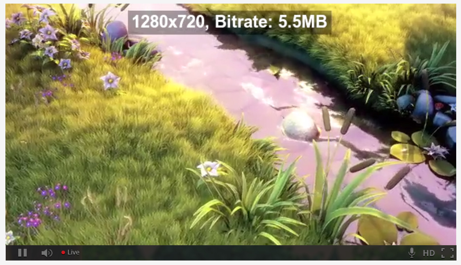
The above URL delivers different resources to different users, depending on their context. In browsers that support Client Hints (at the moment, that’s mostly just Chrome), 1x devices will receive 1x resources; 2x screens will receive 2x resources. The above URL responds to varying DPRs automatically.

How? There’s a little tag in the <head> of this page which looks like this:

<meta http-equiv="Accept-CH" content="DPR">

That tells the browser to tack an extra HTTP header named DPR onto all of its subsequent requests, advertising the current devicePixelRatio. Those DPR HTTP headers are Client Hints. And smart servers can use them to tailor custom, smart responses. And so, when we opt-in to sending DPR Hints with a little meta magic, and add dpr_auto to our URL, we’re able to deliver different resources to different users depending on the density of their display.

Why else might we want to vary the scale of a resource in response to a fact about the browsing context? I’ll tell you why: to fit flexible, responsive layouts!

Automatic Width

Just like dpr_auto, w_auto sends different users different resources from the same URL. But whereas dpr_auto scales images to fit different display densities, w_auto scales images to fit variable layout widths. In its simplest form, w_auto looks like this:

<meta http-equiv="Accept-CH" content="DPR, Width">

[…snip…]

<img sizes="100vw"
     src="http://res.cloudinary.com/demo/w_auto/bike.jpg" 
     alt="Smiling girl with a bike." />

What have we done here?

First, we’ve used our meta tag to opt the browser into sending another Client Hint along with its requests: Width.

Next, note that our img includes a sizes attribute. This attribute tells the browser the layout width of the image [2] The browser then broadcasts that width to the server, via the Width hint. No sizes, no Width. No Width? w_auto does nothing. So (besides the opt-in meta tag), this is the one additional thing that w_auto asks of you: for it to work, you’ll have to stick sizes on your imgs.

Finally, note that I didn’t include dpr_auto in the URL. I didn’t have to! If we opt into sending both DPR and Width Hints in the meta tag up top, w_auto images will be scaled based on both of them.

So — that’s w_auto at its simplest; in Chrome, it just works. But, especially if you’re using the feature in production, you should dive a little deeper.

Advanced w_auto usage

Now the matroyshkas are wearing glasses

w_auto can take two optional parameters:

Ruby:
cl_image_tag("bike.jpg", :width=>"auto:100:400", :use_root_path=>true, :client_hints=>true)
PHP:
cl_image_tag("bike.jpg", array("width"=>"auto:100:400", "use_root_path"=>true, "client_hints"=>true))
Python:
CloudinaryImage("bike.jpg").image(width="auto:100:400", use_root_path=True, client_hints=True)
Node.js:
cloudinary.image("bike.jpg", {width: "auto:100:400", use_root_path: true, client_hints: true})
Java:
cloudinary.url().transformation(new Transformation().width("auto:100:400")).clientHints(true).useRootPath(true).imageTag("bike.jpg")
jQuery:
$.cloudinary.image("bike.jpg", {width: "auto:100:400", use_root_path: true, client_hints: true})
.Net:
cloudinary.Api.UrlImgUp.Transform(new Transformation().Width("auto:100:400")).ClientHints(true).UseRootPath(true).BuildImageTag("bike.jpg")

Responsive image with Client Hints example

The first (:100) tells Cloudinary how big the “jumps” between alternate resources should be. If you set this to :1, resources will be scaled to match the layout width exactly — which as it turns out, is a bad idea. To deliver perfectly-scaled resources, our servers must render and store hundreds, maybe thousands of alternate versions of your image, which is both computationally expensive and terrible for your pages’ performance. More, alternate resources means fewer cache hits, and a hit at any level — in the local browser cache, on the CDN, or server-side — will always be significantly faster than a miss. Thus, this first parameter allows you to limit the number of possible responses by defining a “rounding step” between them. For example, here, if the target width is 452 pixels, Cloudinary will round up to the nearest hundred and return a 500-pixel-wide resource.

The second parameter (:400) serves as a fallback Width, which will be used if the browser doesn’t send a Width Hint. In this example, browsers that don’t support Client Hints are served a 400-pixel-wide image. (400 is a “mobile-first” default. If you would rather serve a “desktop-first” default to non-supporting browsers, set this to something higher, like 1000). Word to the wise: without a Width or this fallback, w_auto images will be delivered at their original size. If you’re working with large originals — especially given Client Hints’ nascent support — this could be disastrous! You do not want to start sending 12 megapixel originals to Mobile Safari.

There is one more thing to know about these parameters; I’ve saved w_auto’s best trick for last.

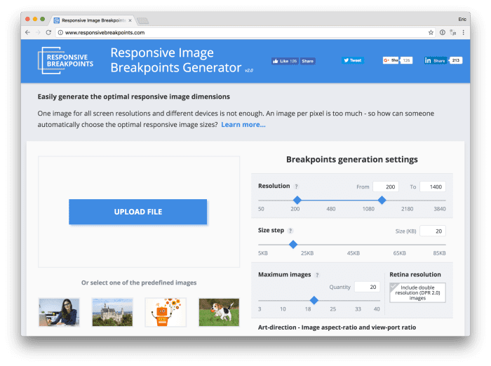
Automatic breakpoints

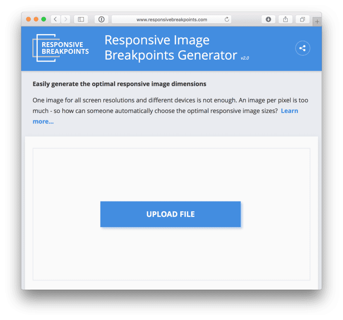
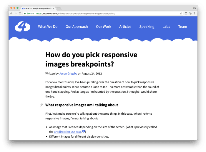
Picking an arbitrary step-size using the first parameter can feel, well, confusingly arbitrary. Four years ago, Jason Grigsby pointed out that it makes more sense to think about these steps in terms of bytes, rather than pixels. We agreed, and built a tool that implements Jason’s idea — the Responsive Image Breakpoints Generator. The tool was built on API calls that are available to everyone with a Cloudinary account; we’ve now built that same logic into w_auto.

Our servers can look at your images, see how they compress, and determine byte-size-based gaps between images for you if you set the steps parameter to a special value: :breakpoints.

w_auto:breakpoints packages up a lot of smart thinking and builds on years’ worth of foundational effort to provide an astoundingly automatic responsive images solution that’s smart not only about images’ context — but also their particular content. Alas, :breakpoints requires a bit of gymnastics at the CDN layer and at the moment, you’ll need to contact us to set it up for your account.

Speaking of the imperfect present…

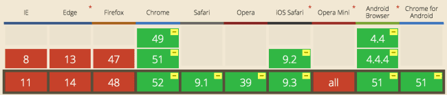
Let’s talk about Client Hints’ browser support

A matroyshka has fallen over; a friend observes, concerned

Right now, Client Hints are only supported in Chrome and Opera. That means that dpr_auto and w_auto will work for approximately half of your users[3].

Other browsers have been slow to follow Google’s lead. Like every new web platform feature, Client Hints faces a chicken-and-egg problem. Vendors don’t want to implement features in browsers until they see a clearly-expressed demand; authors don’t want to use features on their pages until they enjoy almost universal support.

dpr_auto and w_auto are, among other things, our attempt to nudge Client Hints forward. We developed these features and are advocating for their adoption because we believe fully-automated, drop-dead simple, responsive, and performant images should not be the exception, but rather the norm.

So, should you use them?

If you’re starting a new project or retrofitting an old one, doing something about responsive images should be at the top of your to-do list. If you’re willing to put in the effort, a markup-based solution will get you the most browser support, but automating that markup can be complicated. JavaScript-based solutions are simpler, but operate within significant performance constraints.

Client Hints pave a third path, which is both simple and performant. And, despite browsers’ uneven Client Hints support, w_auto and dpr_auto provide a lot of value, right now.

The vast majority of websites aren’t doing anything about responsive images; most developers are still sending a single, wasteful, high-resolution resource to everyone. Implementing dpr_auto and w_auto requires next-to-no effort and delivers fully-responsive images to around half of your visitors without negatively impacting the other half. They provide tremendous performance gains now, and those gains will grow as browser support improves.

Client Hints are where the puck is going for images on the web. Sign up for a free account and start using them, today.

Further reading

2,000 words in and you still want more? I encourage you to dive into the following resources:

[1] Speculative pre-parsers initiate 43% of all image loads

[2] Sizes takes CSS lengths and optionally pairs them with media queries. A complete account of its abilities is out of scope for this article, but suffice to say, sizes (especially in combination with viewport relative units, the CSS calc function, and media queries), can express just about any dynamic layout width that you can dream up. Based on the information in sizes, browsers (and their speculative pre-parsers) can figure out how many px the image will occupy on the layout without knowing about, or needing to load, any other piece of the page.

[3] Depending on your audience, it could actually be a lot higher! For instance: 70% of our readers here on the Cloudinary blog use Chrome.


How to get the most from the HTML5 video player

$
0
0

HTML5 video player

Once upon a time, in long forgotten browser versions, getting a video into a website required creating and embedding Flash resources. But these days, all modern browsers support HTML5, including the HTML5 <video> tag, which means you’ve got a built-in video player that anyone can use.

At first glance, the default HTML5 video player may not look like a fairy tale come true, but the built-in functionality packs more value than you might think. Even if you need more than what the <video> tag gives you out-of-the box, you can always use a bit of CSS and Javascript to build on top of the <video> tag to enhance and customize it to your heart’s content.

To complement the options available with the HTML5 video tag, Cloudinary offers a set of video transcoding and transformation capabilities, with all processing done in the cloud. The resulting output can be delivered on-the-fly, or you can prepare your video transformations eagerly beforehand, to ensure fast delivery even to the first user.

When you use the HTML5 video player together with Cloudinary’s video functionality, you’ll see that you can do some pretty cool things with very minimal code or time investment.

What’s in an HTML5 video tag?

Many websites embed proprietary video players with a variety of bells and whistles, but in many cases, the basic HTML5 <video> tag provides everything you need to deliver videos as part of your website content. For example, completely whistle-free HTML5 video player code, enables you to:

  • Specify the width and height of the player.
  • Display or hide the video controls, including play/pause, volume, full-screen toggle, and seek slider.
  • Set a poster image to display while the video is downloading or not playing.
  • Provide a set of videos in different formats, so that each browser can play a format it supports.
  • Include closed-caption subtitles or captions in multiple languages (great for SEO!).
  • Tell the browser whether to start downloading the video when the page loads or only when the user presses Play.
  • Control whether to automatically play the video as soon as it’s ready.
  • Decide whether to play once or in a loop.
  • Indicate if you’d like to play the video without sound (muted). For example, Facebook does this when it autoplays videos.

The following simple HTML renders a 640x480 video player with video controls. Each browser will select the video file with the most appropriate format for it (webm, mp4, or ogv). Because subtitle tracks were provided, the video controls include a closed-captioning list of languages.

<video width="640" height="480" poster="CloudinaryTales.jpg" controls>
 <source src="CloudinaryTales.webm" type="video/webm">
 <source src="CloudinaryTales.ogv" type="video/ogg">
 <source src="CloudinaryTales.mp4" type="video/mp4">
 <track src="subtitles-en.vtt" kind="subtitles" srclang="en" 
        label="English" default>
 <track src="subtitles-fr.vtt" kind="subtitles" srclang="fr"
        label="French">
</video>

You can find more details about the <video> tag on the w3schools website.

Transforming and transcoding to a glass slipper fit

So now you know how easy it is to fit an HTML5 video player into your Web page.

But what about preparing and optimizing your video content fit your player?

What good is a glass slipper, if Cinderella’s foot doesn’t fit?

In other words, if your videos, or the videos your users upload, are the wrong format or wrong size for your site’s art design, if they are too heavy or too long to download, or they otherwise fail to deliver the impact needed to capture the attention of your users and keep them watching, then that convenient HTML5 video player just isn’t enough.

Formats, formats, formats

To start with, the video that you or your users want to upload, might not even be a standard Web format. Even if it is, you should have your movies available in WebM, Ogg (aka Theora), and MP4 formats, to ensure that the optimal format is delivered for each browser.

Cloudinary enables you to easily transcode your videos from a long list of possible video input formats (including non-Web formats) to all the three of the formats mentioned above. The transcoding is performed on the cloud, with no need to install any video processing software. You can transcode and deliver on-the-fly, or eagerly during the upload process.  All you need to do to transcode a video to a single format on-the-fly, is to deliver it with the new format as the extension type. For example:

The easiest way to transcode to multiple formats is  to use the cl_video_tag SDK method in your code. For example, this tiny line of code:

Ruby:
cl_video_tag("dog")
PHP:
cl_video_tag("dog")
Python:
CloudinaryVideo("dog").video()
Node.js:
cloudinary.video("dog")
Java:
cloudinary.url().videoTag("dog")
jQuery:
$.cloudinary.video("dog")

automatically generates an entire <video> HTML snippet, including automatically generating the <source> URLs for transcoding to all three formats.  And it always puts the WebM format first, since that format generally produces smaller formats, so that browsers that support it, will always deliver the smaller format.

More details about this tag below.

When you transcode video on-the-fly, the conversion may take some time the first time a user accesses it, but all subsequent requests to the same URL are delivered quickly via the CDN cache. To avoid the lag time even for your first viewer, use eager transformations to prepare your content as part of the upload process.

Optimize your HTML5 video for quick delivery

Many videos are recorded at very high quality. And especially if your site includes user-generated video content where the original quality is outside your control, it’s important to make sure you will be able to deliver those videos at an acceptable size and speed.

Delivering in the right file format and via CDN, as described in the previous section, already goes a long way towards improving delivery times. Furthermore, when Cloudinary transcodes or transforms any video, it also automatically optimizes the video for optimal Web viewing, using best practices for quality, bitrate, codecs, and more.

But, if you still want to cut the file size of the delivered video, there are lots of other steps you can take.

To control the physical size of videos uploaded to your site, you can use resize or crop the video  as an eager transformation to ensure that the videos your users upload will not exceed a maximum physical size.

For example, even if users watch your videos in full screen size, a 1280X720 frame size is generally plenty for most purposes. So, you can limit videos to this maximum size with an upload command such as the following:

Cloudinary::Uploader.upload("my_video.mp4",:resource_type => :video,
  :eager =>   { :width => 1280, :height => 720, :crop => :scale })

You can also take advantage of eager cropping transformations to resize videos if users upload videos with aspect ratios different than that of the video player you want to include.

When relevant, you can limit the video length by trimming long videos to a certain duration of time, using the duration parameter.

In some cases, adjusting the quality and bitrate settings can also decrease file size without having a significant impact on the visually perceived quality. For example:

Changing the quality of an uploaded 9.8 MB mp4 video to 50, or changing the bitrate to 500 kilobits reduced the file size of this video to around 1 MB.

For videos that you are delivering in their original format, and with no other custom transformations, you can set the video_codec to auto, to normalize and optimize the video for web, including the audio settings.  
Alternatively, you can manually select the video_codec settings.

Capturing your audience

It’s often the little things that make the difference. You want to make sure you grab your audience’s attention and get them to press that play button.  And of-course you want them to keep watching after they start.

Grand opening

The HTML5 video player supports displaying an initial poster image, to hint to users what the video’s all about while it’s downloading or before they play it, but where does that image come from?

An easy way is to have Cloudinary automatically generate an image from a frame in your video. By default, it takes the middle frame, but you can select any other frame by specifying an offset time.   You can also select any other image in your Cloudinary image library to act as your opening poster image.

Whatever image you choose, you can apply any image transformations you want; you can zoom in, add special effects or artistic filters, overlays, and much more.

For example, for the poster image below, we use second 0:36 of this cool Edinburgh time lapse video by Betsy Weber, and we overlay a transparent movie curtain .png file along with some text.

:poster => { :transformation => 
    [ { :width => 1850, :crop => "scale" },
      { :overlay=>"movie_curtain_overlay_new"},
      { :overlay=>"text:Courier_80_bold:Once%20upon%20a%20time...", 
         :gravity=>"north", :y=>60 },
      { :start_offset=>36 } ] }

Poster image for HTML5 video player

Thickening the plot

That opening image is just the start of the fun. There are many things you can do with the video itself, depending on your video’s purpose and audience. Here are just a few examples of what’s possible, with a single line of code:

  • Apply improvement effects to your video to adjust contrast or saturation.
  • Add fade in and fade out effects.
  • Display the video with rounded corners, or even as a circle or oval. Or show the video with a vignette effect.
  • Add overlays at specified times and locations. For example, you could add callouts to a video demonstration without the need to edit the original video.
  • Overlay video on video, such as a sign-language interpreter or a narrator for a demo.
  • Rotate a video; not only 90 degrees to allow for portrait videos, but to any angle you please.
  • Concatenate two videos, for example to include an advertisement at the start.
  • Accelerate or decelerate the play speed.

If you are accepting video uploads from users, you may want to consider defining the transformations in an upload preset, making it easier to apply your selected effects to all incoming videos.

Or you might want to allow your users to select from a list of effects, and you can apply the selected options as eager transformations, upon upload.

All for one and one for all

We’ve described a lot of things you can do with your video using Cloudinary upload and transformation functionality, and we’ve shown you how you can then play your masterpiece in the built-in video player, using the <video> tag.

We already hinted earlier about the cl_video_tag SDK helper method, which you can use to  automatically generate a <video> HTML snippet. So let’s show you how it’s done, and how you can actually include almost everything we’ve talked about so far, inside a single cl_video_tag.

The cl_video_tag is can be used in all supported SDK frameworks (Ruby, PHP, Javascript, Python, Node.js, .NET, and more). The basic syntax (shown here in Ruby) is:

cl_video_tag(public_id, options = {})

Where the public_id is the name of a video that has been uploaded to your Cloudinary account, and the options include a bunch of optional settings, such as:

  • Formats to include for the <video> sources (default webm, mp4 and ogv).
  • A poster image (default = middle frame), and any transformations to apply on that image.
  • Any transformations you want to apply to the transformed video.
  • fallback text content for (ancient) browsers that don’t support any of the output source formats.
  • any attribute of the HTML5 <video> tag (to customize those player options we mentioned earlier in this article).

As we mentioned previously, the cl_video_tag method call can look as simple as this:

Ruby:
cl_video_tag("castle_timelapse")
PHP:
cl_video_tag("castle_timelapse")
Python:
CloudinaryVideo("castle_timelapse").video()
Node.js:
cloudinary.video("castle_timelapse")
Java:
cloudinary.url().videoTag("castle_timelapse")
jQuery:
$.cloudinary.video("castle_timelapse")

That one little line of code, applying default values, generates this:

<video 
  poster="http://res.cloudinary.com/demo/video/upload/castle_timelapse.jpg">  
  <source 
    src="http://res.cloudinary.com/demo/image/upload/castle_timelapse.webm" 
    type="video/webm"/>  
  <source 
    src="http://res.cloudinary.com/demo/image/upload/castle_timelapse.mp4" 
    type="video/mp4"/>  
  <source 
    src="http://res.cloudinary.com/demo/image/upload/castle_timelapse.ogv" 
    type="video/ogg"/>  
</video>

But as you saw from the list of options above, you can really go all out with this tag.

In the following example:

  • We use the custom poster image we talked about earlier in this post, for a theatrical opening.
  • We set our timelapse video to loop, for those who want to enjoy more than one sunrise and sunset.
  • We crop the video to 640x480 (4:3 aspect ratio) using the pad method, so that one size video player can host videos uploaded in both 4:3 and 16:9 ratios.
  • We lower the quality to 70, which decreases the file size from 17.5 MB to 8.2 MB.
  • We shorten the duration of the video to 60 seconds, resulting in a 2.9 MB file.
  • We add a fade-in effect.
  • We add a little princess overlay to our castle video for some extra cuteness points.
  • And of-course by default, we still get the video player controls and video output in all three formats.
cl_video_tag("castle_timelapse.mp4",  
  :loop => true, 
  :poster => { :transformation => 
    [ { :width => 1850, :crop => "scale" },
      { :overlay=>"movie_curtain_overlay_new"},
      { :overlay=>"text:Courier_80_bold:Once%20upon%20a%20time...", 
         :gravity=>"north", :y=>60 },
      { :start_offset=>36 } ] },
  :transformation => [  
    { :crop=>"pad", :height=>480, :width=>640, :quality=>70, 
       :duration=>"60", :effect=>"fade:4000" },  
    { :overlay=>"princess_small", :height=>100, :start_offset=>"0.5", 
      :gravity=>"west", :y=>80}  
    ])

Here’s the <video> tag it generates:

<video controls="controls" height="360" loop poster="http://res.cloudinary.com/demo/video/upload/c_scale,w_1850/l_movie_curtain_overlay_new/l_text:Courier_80_bold:Once%20upon%20a%20time...,g_north,y_60/so_36/castle_timelapse.jpg" preload="none" style="margin: 0 auto;display: block" width="640">

  <source src="http://res.cloudinary.com/demo/video/upload/c_pad,h_480,w_640,q_70,du_60,e_fade:4000/l_princess_small,h_100,so_0.5,g_west,y_80/castle_timelapse.webm" type="video/webm" />

 <source src="http://res.cloudinary.com/demo/video/upload/c_pad,h_480,w_640,q_70,du_60,e_fade:4000/l_princess_small,h_100,so_0.5,g_west,y_80/castle_timelapse.mp4" type="video/mp4" />

  <source src="http://res.cloudinary.com/demo/video/upload/c_pad,h_480,w_640,q_70,du_60,e_fade:4000/l_princess_small,h_100,so_0.5,g_west,y_80/castle_timelapse.ogv" type="video/ogg" />

</video>

And here’s the final video. Grab the popcorn!

Adding a few more magic touches to your Video Player

While every modern browser provides a media player for the <video> tag with the main features we talked about above, each browser’s player looks a bit different. If you want to ensure a consistent look and feel of your browser, or if you want to add extra controls and other fancy stuff, you can do it with a bit (or a lot, depending on how adventurous you are) of CSS and Javascript on top of the built-in <video> tag.

We won’t go into the details of that here, but it’s not hard to find more information on this subject.

For example, here’s one article series that walks you through the steps of building your own comprehensive YouTube application (or YourTube as this in-depth tutorial aptly calls it).

The moral of the story...

As we’ve seen, embedding a video in your website these days is as simple as adding a <video> tag to your HTML page.

And outputting video that can run in all browsers, download quickly, and keep your audience watching, is as simple as a Cloudinary dynamic URL with transcoding, resizing, and manipulation parameters to make the video fit your design and your users..

Furthermore, you can generate the HTML code and the video transformation code at once, using the cl_video_tag SDK helper method.

And so, the HTML5 <video> tag and the Cloudinary cl_video_tag went off into the sunset, hand-in-hand as the perfect couple.  And they lived happily ever after.

OK, OK, that’s a bit sappy. But I think you get the idea.

You can do everything described in this post by subscribing to any of Cloudinary’s plans, including the free plan.

Cloudinary now delivers images and videos over HTTP/2

$
0
0

http2 graphic

Even though websites have changed dramatically over the years – from simple text-based pages to advanced in-browser apps full of images and videos – the underlying HTTP protocol really hasn’t changed - until recently, with the approval of the HTTP/2 protocol by the IETF. Today Cloudinary is proud to announce, as part of a CDN infrastructure upgrade, general availability of HTTP/2 support in our image and video management solution. This will help you optimize the user experience on your app or website even more.

The benefits of delivering your site images and videos over HTTP/2 are: improving website performance; reducing the amount of bandwidth required by supporting header compression; improving latency and making it easier for developers to use optimized connections, by eliminating the need for domain sharding and other subtle performance tricks.

As more and more sites begin to adopt the technology, HTTP/2 is generating a lot of buzz in the industry. Most browsers already support HTTP/2 (though some only do so through over HTTPS) and it is designed to be backwards compatible with older versions.

While the adoption of HTTP/2 was slow initially, since January 2016 more sites have announced plans to move to HTTP/2 or are offering true support of the protocol. For example, at the beginning of May 2016 both Wikipedia and Blogspot announced that their sites were now supporting HTTP/2.

HTTP/2 adoption over time Source: http://isthewebhttp2yet.com/measurements/adoption.html

The highest gains in performance for those moving to HTTP/2 will be those with image heavy pages. And the more images on a single page, the more improvement that will be seen. The reason: With HTTP/2, instead of requesting images sequentially or creating many parallel connections, the browser makes a single connection to the server and optimizes the requests to all images over a single connection. A great (although extreme) example of the performance differences between HTTP/2 and its predecessor HTTP/1.1 can be found in this demo on the Akamai website.

HTTP2 vs HTTP1 Source: https://kinsta.com/learn/what-is-http2/

We began beta testing HTTP/2 about six months ago, and the results are impressive. Based on our measurements, the average improvement in page load time is close to 10%.

Ok, I want it - how do I get it?

For current Cloudinary users, there’s nothing you need to do to benefit from our HTTP/2 enhancements. As of today, we've upgraded our CDN integrations, so that every url delivered from Cloudinary's standard CDN layer (using hostnames res.cloudinary.com or cloudname-res.cloudinary.com), in the HTTPS protocol, offers HTTP/2 as a default connection method to the browser that calls it.

Even if your website's HTML itself is not delivered via HTTP/2, you will still gain a performance boost, as all the images on your site that are delivered via Cloudinary will be now pipelined through a single optimized connection.

To check whether your images are delivered via HTTP/2 install this Chrome extension, which indicates the newest protocols.

If you have a specialized or private CDN setup, contact your account manager or support@cloudinary.com to discuss your options.

Obsolete optimizations

There are two optimizations that Cloudinary supports that HTTP/2 makes obsolete: domain sharding and sprites.

If your site is delivered via HTTPS and you are using one of our client libraries, consider turning off CDN subdomains in your Cloudinary configuration (stop setting securecdnsubdomain to true).

If you use sprites for performance reasons, you may see a benefit in using separate images, as multiple images will re-use the connection to load faster (but not as fast) as a sprite, but caching can improve as replacing a single image doesn't require generating a new sprite.

To sum it up

Content delivery is an important part of Cloudinary's end-to-end image and video management solution. We constantly upgrade and monitor the CDN-based delivery of assets, and HTTP/2 is the latest feature we've added. Keep watching this blog for further announcements regarding the CDN layer in the future.

How I used Cloudinary to solve responsive image needs in my Jekyll website, and shared the magic in a plugin

$
0
0

Jekyll Cloudinary Plugin

This is a guest post by Nicolas Hoizey, co-founder of Clever Age and creator of the Jekyll Cloudinary plugin. Nicolas’ plugin leverages Cloudinary’s image storage, optimization, resizing, and delivery infrastructures to automate responsive images in Jekyll-generated static sites. We think it’s the bee’s knees, and invited Nicolas to write a bit about the process and motivation behind it. Without further ado, here’s Nicolas.

I recently migrated my personal website to the latest major version of Jekyll, and took the opportunity to re-think my toolchain.

Some of the plugins that I’d been using were not satisfying my needs for responsive images, so I decided to find other ways to fulfill these needs.

To generate the responsive images HTML (do I really need to say that using native responsive images should be a no-brainer nowadays?), I tried the Jekyll Responsive Image plugin. It is really nice; it lets you define your own image markup templates, which means you can use srcset or <picture> as you like. But it didn’t address all of my concerns:

  • Generating a Jekyll site from scratch with this plugin requires generating all images’ variants from the master images. I currently have around 750 images on my blog, leading to some very long build times.
  • Sending all these variants to the server also takes quite some time, because I don’t have fast network access at home.
  • And of course, all these images are served from the same server as the pages, which in my case is cheap (but nice) shared hosting.

I wanted a simplified and faster workflow, and less load on the server side.

Most of the responsive web sites that my company builds for clients use ad-hoc solutions for responsive images, but I was aware of a few SaaS responsive image solutions, so I decided to check if any of them would fit my needs.

Cloudinary is one of the most feature-rich solutions available, and it can even be used for free if your needs are reasonable. It's not easy for other solutions to compete with that…

With a free account, I could test whatever I wanted, try different features, and decide to continue or look elsewhere.

The main features I was looking for, which Cloudinary provides, are:

  • The ability to use the service as a proxy: the master images are stored on my hosting, but all images delivered to my visitors come from Cloudinary, generated on the fly from the masters. Even better, I don’t need to manually upload the master images – Cloudinary fetches them automatically from my local, published versions. In other words, the only “client” for my originals is Cloudinary. As a result, the bandwidth for images on my hosting is really low.
  • Image cropping and resizing options: right now, I am only scaling my images down from large masters to fit responsive layouts. But I’m definitely looking at the possibility of doing advanced art direction using Cloudinary’s magical automatic cropping features.
  • Image format optimization: if I publish JPEG images in my posts, Cloudinary can send WebPs to visitors if their browser supports them. Last month, two thirds of the images delivered by Cloudinary to my visitors were WebPs, which Cloudinary generated and served for me, automatically. That’s a huge win for both my visitors’ performance and data plans, and for my Cloudinary bandwidth quota.
  • Image compression optimization: Cloudinary is able to compute the best compression level to lower the weight of each image while keeping the visual quality high.

Convinced that Cloudinary offered everything I needed, I still had to develop a Jekyll plugin that used these features.

After some consideration, I decided to start with a {% cloudinary %} Liquid tag that would ease image publication with Cloudinary, while still being relatively easy to develop. I took inspiration from other plugins, found help on StackOverflow when needed, and finally released the first version of the Jekyll Cloudinary plugin in July 2016.

The syntax is pretty straightforward:

{% cloudinary [preset] path/to/img.jpg alt="alt text" caption="image caption" %}

From this input, the plugin outputs responsive image HTML, using the srcset and sizes attributes for the <img> tag (see the “varying size and density” section of this post to understand how these attributes work, and this post which explains why you should use them instead of <picture>, most of the time). The srcset and fallback src contain Cloudinary URLs that fetch the post’s master images on-the-fly and resize them to several, alternate sizes.

For example, as shown in the documentation, this code in a Markdown file:

{% cloudinary logo /assets/logos/cloudinary.png alt="Cloudinary logo" %}

will generate this HTML code:

<img
  src="https://res.cloudinary.com/<cloud_name>/image/fetch/c_limit,w_480,q_auto,f_auto/https://<domain>/assets/logos/cloudinary.png"
  srcset="
    https://res.cloudinary.com/<cloud_name>/image/fetch/c_limit,w_80,q_auto,f_auto/https://<domain>/assets/logos/cloudinary.png 80w,
    https://res.cloudinary.com/<cloud_name>/image/fetch/c_limit,w_240,q_auto,f_auto/https://<domain>/assets/logos/cloudinary.png 240w,
    https://res.cloudinary.com/<cloud_name>/image/fetch/c_limit,w_400,q_auto,f_auto/https://<domain>/assets/logos/cloudinary.png 400w"
  sizes="
    (min-width: 50rem) 13rem,
    (min-width: 40rem) 25vw,
    45vw"
  class="logo"
  alt="Cloudinary logo"
  width="480"
  height="350"
/>

You are in full control of the number of generated images, their resolutions, and the sizes attribute (which helps the browser decide which image to download). This control comes from the configuration options you can use in your _config.yaml. Here is the part of my configuration file where I defined rules for logos:

cloudinary:
  cloud_name: 
  presets:
    logo:
      min_width: 80
      max_width: 400
      fallback_max_width: 200
      steps: 3
      sizes: '(min-width: 50rem) 13rem, (min-width: 40rem) 25vw, 45vw'
      figure: never
      attributes:
        class: logo
  • cloud_name: … is your personal ID from Cloudinary
  • presets: starts the list of presets you define for your site
  • logo: is the name of one of my presets, which I use in the Liquid tag before the name of the image file
  • min_width: 80 defines the narrowest generated image
  • max_width: 400 defines the widest generated image
  • fallback_max_width: 200 defines the fallback (src) image width
  • steps: 3 defines the number of images to generate
  • sizes: '(min-width: 50rem) 13rem, (min-width: 40rem) 25vw, 45vw' defines the sizes attribute of the responsive image, which depends on the design and breakpoints
  • figure: never prevents generation of a full <figure>/<img>/<figcaption> element (I often don't want them on logos)
  • attributes: starts a list of attributes to always add to generated <figure> and/or <img> elements
  • class: logo adds a class attribute with a logo value, which I use in my CSS to make sure the logo never takes more than one fourth of its container width, and is floated right

You can define all of these rules, for any number of presets that you need.

With this plugin and my free Cloudinary account, the build time of my site has been reduced by 90%, the storage on my server has been reduced by 60%, and I don't have to worry about image optimization anymore. Huge wins.

Where to go from here? Originally, I wanted to allow writers to use the simple standard Markdown syntax for images, but I have not managed to build this yet, despite some valuable answers to my questions from Jekyll lead maintainer Parker Moore himself. I'll have to dig deeper into Jekyll hooks in the future.

At the end of the day, this was a great way to learn a bit of Ruby, a bit about the Jekyll internals, how plugins work, and how to build and release a gem… I’ve learned so much in a short period of time thanks to this useful little pet project.

Of course, help is welcome to make the plugin even better. There are already a few issues open for bugs or things that should be added to the plugin. Feel free to add your bug reports and ideas, or even contribute through pull requests!

Media related web development challenges

$
0
0
Web Development
Websites have evolved greatly over the past few years. Once text-heavy websites have become more eye-catching with prominent images and video. But the addition of richer media isn’t the only change impacting websites. Consumer behavior also factors into this evolution, as web access has moved from the desktop realm to a variety of different devices – smartphones, tablets, laptops, smartwatches and TVs – with different dimensions and resolutions. And consumers want to be able to access web content anytime and from any location.
 
To ensure that website performance is optimized, bandwidth usage is minimized and users have a top-notch experience, we will need to address many challenges.

High resolution images and videos

If a picture is worth 1,000 words, it’s no surprise that website owners are using images and videos as powerful tools on their websites to engage visitors. High-resolution images look best, but these files are so big that they cause websites to load slowly and use excessive bandwidth. These problems frustrate visitors, and potentially decrease their incentive to  engage further on the website.
 
Loading image
 
Whether your users are visiting your site from a phone or a computer, it’s imperative that it loads quickly. Gabriel A. Mays, founder of Just Add Content, a website platform for businesses, told CIO magazine that developers should “Aim to keep website load time to [a few] seconds or less. Your biggest threat isn't a competitor, it's the back button. If your website loads too slowly, customers won't wait around. They'll go elsewhere.”
 
When addressing these issues:
  • Resize images/videos to match device resolution – One size doesn’t fit all, particularly with the increasing number of devices of different sizes being adopted by consumers.
  • Leverage modern image formats or video codecs – For images, consider using WebP, with automatic fallback to JPEG or other formats for browsers that don’t support newer formats. With video, consider the codecs, frame rate and bit-rate to save file size and bandwidth.
  • Adjust the quality level – There is a tradeoff between compression levels and visual quality to ensure a satisfactory user experience without excessive bandwidth use.
New types of images are introduced almost daily, requiring we stay on trend and learn how to best display them on our websites. For example, Apple introduced Live Photo, kind of a hybrid between a static image and video, combining a photo with other moments before and after it was taken, and displays them with movement and sound. What is the best way to support uploading, transforming and displaying these new forms of content? How might one ensure that these images are bandwidth and storage efficient and visually appealing, regardless of the device where it’s viewed? 

Greater use of video - upstream and downstream

It’s undeniable that video is becoming a primary component on the web – from the videos uploaded by website owners to attract visitors, to the videos being uploaded by users to share with the public. By 2019,  nearly a million minutes of video content will cross the network every second , according to the Cisco Visual Networking Index
 
User uploaded videos
 
As users upload greater quantities of videos, so will grow the task of making videos of various qualities, dimensions and aspect ratios fit into the graphic design of a website or mobile app.
 
But it’s not just the number of minutes of video being uploaded, it’s the resolution. Today’s devices are made to handle high resolution video, and as a result, 4K video is increasing in popularity. But the huge resolution translates into long upload and download times; need for increased storage space; and intensive client-side processing that is required to convert, resize and manipulate these videos.
 
This requires us to normalize and optimize 4K and high-res video specifically for web and mobile devices, and leverage responsive technology that will enable us to deliver the smallest file size while still maintaining the highest visual quality to match the user’s device, browser and network speed.

Responsive design

Probably the most debated issue these days is responsive design. Responsive design enables the same website to adapt to different resolutions, with various techniques, ensuring images and videos look and operate properly on the plethora of devices in use today, at various resolutions. 
 
Google, as well as standards organization W3C, Microsoft and Apple, are all trying to simplify responsive design with solutions built into web browsers. But these aren’t sufficient. For example, the Client Hints solution that’s being promoted by Google is only supported in Chrome, so additional work is required to ensure your images are displayed properly on other browsers.
 
Many devices require responsive design
 
Another option includes relying on the new HTML5 features - specifically the <picture> element and the 'srcset' attribute of the <img> element - to define the various image resolutions and art-directed cropped and manipulated image versions within the HTML code. 
 
There are two problems with this approach: 
  1. Not all browsers support the modern HTML5 features, so workarounds must be developed as a fallback mechanism for browsers that don’t. However Google has been supporting modern HTML5 elements in Chrome for awhile, and Microsoft and Safari are adding support for responsive design to the latest versions of their browsers.
  2. While the browsers automatically select the best matching images for each device and resolution, the browser doesn’t automatically create the images. This requires double (or triple or quadruple…) the work, pre-creating multiple different image versions, or alternatively using a dynamic image manipulation service.
Additionally, these solutions do not focus on finding the appropriate Responsive Breakpoints. When creating a responsive website, choosing the correct image resolutions and how many different image versions to include in your responsive website is called Responsive Breakpoints. 
While breakpoints can technically be any size, ideally they should be set at the optimal resolutions and sizes of images needed to best fit the various devices and screen sizes on which your website will be viewed.
For determining breakpoints, developers need a solution that helps them decide which image resolutions are needed, create multiple images, and integrate with their HTML code or leverage Javascript solutions. 
 
To solve this issue, Cloudinary last year launched a Responsive Image Breakpoints Generator tool, which efficiently and intelligently calculates the image breakpoints.
 
Recently, we also launched our "Auto-everything" solution, taking Cloudinary's cloud-based image management solution to the next level using automatic content-aware and context-aware image adaptation. Within this, we introduced two new transformation parameters, which pair the 'DPR' and 'Width' Client Hints with our existing image resizing and delivery infrastructure, in order to serve up simple, automatic responsive images.

Moving forward

The evolution of video and image formats, coupled with constant innovation in devices and displays, will continue to raise challenges, as developers seek to create a superb user experience while minimizing the impact on bandwidth, storage and website performance.
 
Effectively managing high resolution files, adeptly handling the growing amount of video both incorporated in designs and uploaded by users, and incorporating responsive design techniques as described above can help address some of today’s challenges, and establish a good foundation for future best practices.

Jason Grigsby on Responsive Images: Where It All Started

$
0
0
Jason Grigsby Interview
 
Portland-based web developer Jason Grigsby co-founded Cloud Four. He’s a prolific writer and speaks about front-end development as thoughtfully as anyone in the business. He’s been writing about responsive images since there were responsive images to write about, and recently, he and I had a chance to sit down and talk about the past, present, and future of images on the web.
Here, in Part 1 (of a three-part series), we discuss how the industry slowly came to understand the surprisingly hard problems around “flexible media,” what’s been done to solve them, and the pain points and open questions that remain.
 
Eric Portis:  One of the interesting points I’ve heard you make — which is a nice entry point into all of this — is that images on the web have always been complicated. Can you give me a sense of what problems developers were facing in the early days of the web?  What did we have to worry about then, that we don’t have to worry about now?
 
Jason Grigsby: So basically, you’re starting off by asking me, okay grandpa—
 
EP: [Laughs]

JG: —Grandpa, tell me what it was like, I’m too young to understand. I see how you are! Well, in the earliest days, the web started without any images at all, and when we first started incorporating them, the problems were tough.  There were differences in color space between Macs and PCs, and we had to make sure that images were compressed well enough to download on connections that are much slower than we have now. Lynda Weinman, of Lynda.com, wrote books — I think it was five books — that were each several hundred pages long, all on images, and they were best sellers. In addition there were a number of specialized tools — I remember a piece of software called Debabelizer — that allowed us to handle images and GIF compression much better than Photoshop did.  It took awhile for Photoshop to add the ability to export for the web. 
 
Linda Wineman’s books
Linda Wineman’s Designing Web Graphics, Coloring Web Graphics, Preparing Web Graphics, and Deconstructing Web Graphics - 1,333 pages all about images!
 
So yes, I think there is a knee jerk reaction that a lot of people have when they start looking at responsive images. They think that the responsive images syntax is too complex and that it should be simple like images have always been. I reject that. Images are complex by their very nature. We’ve gotten good at automating some things and we’ll get better at automating others in the future. But to think that they’re not complex is to deceive yourself. They’ve always been complex.
 
Even after all of the time that I’ve spent on them, I still don’t feel like I understand the full complexity of images. And I think about them far too much.
 
EP: Let’s fast forward to 2010 or so, when developers started asking hard questions about images in responsive layouts.  You were right there at the beginning of those conversations, saying that, hey, something here is broken. What were the first problems that you and other developers ran up against? What were some of the early ideas floating around about how to solve those problems?
 
JG: Back in 2010, I wrote an article with the unfortunate title, “CSS Media Query for Mobile is Fool’s Gold.” I wrote it because about a year before – in 2009 – my company Cloud Four was brought in to consult on a site that was having a ton of performance problems. The site used media queries to do what we now call “responsive design,” before Ethan Marcotte coined that phrase.
 
We dug into what was going on, and found that the media queries were hiding assets. On this site, it was a Google map, which wasn’t necessary on small screens. But we discovered that the map was still loading – along with 47 other files, tiles and a bunch of other stuff – which made the page slow to a crawl.  
 
After Ethan wrote “Responsive Web Design”, I started seeing similar problems everywhere. There were pages where images were hidden but still downloading in the background. Similarly, images that were far too large were being shrunk down for small screens. As a result, you’d have a page that looked great, but it was 5MB in size.  
 
The analogy I make for this problem is that it’s akin to having a dinner party, but not having time to clean, so you shove everything into the closet. It may look like your house is clean, but you’ve really just hidden the problem and you’re ok if no one opens that door.  But on a website, even if it looks good, you can’t hide the performance impact of large assets.
 
About a year later my co-founder Lyza Gardner and I started writing “Head First Mobile Web,” and we wanted to have a chapter on “mobile first” responsive design. At the time people thought, ok, if we start with a minimal set of small assets and only load larger assets if they’re needed, we can solve the responsive image problem.  So I started looking at the techniques people that were using to do this, because I assumed that enough time had gone by — that by then somebody had to have a good solution. But I found that every single technique had problems.  They were all insufficient, even on high-profile sites. The Filament Group built the Boston Globe site with assumptions based on browser behavior that they saw in 2010, when they started working on the project.  But by 2011, when the site launched, that behavior had changed and their attempts at responsive images were no longer working. Experiences like that showed us that this needed to be fixed at a lower level. Things needed to change from a standards perspective. 
 
Boston Globe responsive website

The Filament Group’s landmark 2011 Boston Globe redesign proved that responsive design could be practical (and performant!) at scale. It also highlighted the “Responsive Images” problem – Filament Group developer Mat Marquis wrote prominently about the image problems that the Globe team encountered (and, later, founded/chaired the W3C Responsive Images Community Group, which solved them).

EP:  One thing I’ve found curious is that the push for responsive images really came from the bottom up — from developers like Cloud Four and The Filament Group — rather than from the top down. And initially, there was a lot of push back from browser vendors. Do you have any insight into why this problem was more visible to, more impactful for, developers? 
 
JG: Well, first off, not everybody was pushing back. Bruce Lawson [who works at Oprea] gets credit for coming up with the <picture> syntax. Other people were resistant, because they may not have seen the responsive design tidal wave that was coming.  So you have people who aren’t really thinking about mobile yet, or who were used to sites that were using device detection to route visitors to different, device-specific pages – and they couldn’t see how important this problem was, they didn’t see it as an issue.
 
Plus there are some tradeoffs that happen in responsive design that we still haven’t quite resolved.  By not supplying the height and width of images, we’re affecting browser’s ability to lay out pages quickly, and there’s a jumpy effect that happens when images come in. Browser makers were more attuned to those issues. And they had just finished doing a ton of performance optimization work to try to load images as quickly as possible, and, at first, it seemed like there was no way to do responsive images without breaking those optimizations.
 
So it wasn’t like browser vendors were saying, “we don’t want you in the clubhouse.” They really just had a different worldview. But the people who were building sites had come to realize that responsive design was inevitable and really important; that device diversity had gotten to the point where there was no point in making distinctions between a mobile site or a tablet site because some mobile devices were large and some tablets were small. But browser vendors weren’t there yet.
 
EP: Speaking for myself, and coming at it from the developer side, I know that I didn’t understand anything about low-level browser performance, and had no concept of how layout really worked at a deep level.  I was demanding tools and not understanding their potential impact – I couldn’t see the bigger picture. And it took a while to have that conversation – for the people who make web sites and the people who make web browsers to get into each other’s heads.
 
JG: In May 2012 I wrote about the preparser, two years after I started looking at responsive image issues. It took me that long to get to the point where I fundamentally understood that what we were talking about was a conflict between the browser, which wants to start downloading assets as soon as possible – before it starts laying out the page – and developers working on responsive designs, who want to delay and only start downloading images after layout. Because if we wait until after layout, we can download an image that fits. That fundamental conflict is what took so long to solve, from 2010 when we started identifying these problems, until 2014 when solutions started rolling out in browsers.
 
EP: And full support for the responsive images spec only rolled out in the last couple of browsers – mobile and desktop Safari – this past February. That felt amazing, like — ok, finally, it took four or five years but — we did it! This is complete.
 
JG: You know I had to write a bio for an article that just came out in A List Apart, and I ended it with: “He never wants to talk about responsive images again—”
 
EP: [Laughs] Sorry.
 
JG:“—he never wants to talk about responsive images again, but he has ideas for two more blog posts.”
 
[More laughs]
 
JG: Which is true. I really do have ideas for two more.
 
Thus concludes part 1 of my three-part interview with Jason Grigsby. Stay tuned for part 2, where Jason and I dive into today’s solutions and the prickly problem of Responsive Image Breakpoints.
 

Jason Grigsby on Responsive Images: A Look at Today’s Solutions

$
0
0
Jason Grigsby Interview P.2

In part 1 of this interview, Jason Grigsby and I discussed how the industry came to understand the responsive image problem. Here, in part 2, we discuss today’s solutions — taking a particularly deep dive into the puzzle of “responsive image breakpoints.”

EP: So, where are we, today, with responsive images? We have a number of new markup features that let us send different image resources to different users, depending on their context. Depending on which feature you use, you can either tell the browser which resource to load, or leave it up to the browser to pick. Each feature has been developed for a different use case, but all of them require you, the developer, to generate many images, whereas before you only had to generate one. And you have to decide — what underlying resources do I actually need? What should their dimensions be? Which is a surprisingly hard problem. You were one of the big, early thinkers about this, and coined the term “responsive image breakpoints.” What are responsive image breakpoints? 

How to pick responsive image breakpoints

In 2012, Jason asked a hard question

JG: The Responsive Images Community Group defined a bunch of use cases, but there are two that I find especially useful:

  • Art direction – Which means you want to vary the image somehow based on the size at which it’s going to be presented. The most common example is an image that contains text; if you simply shrink it down, the text becomes unreadable. As a result, you have to make some variations of the image as you go from size to size. The other use case is –
  • Resolution switching – With resolution switching, there are no visual differences between the images. This is the most common use case – Yoav Weiss did some early analysis and saw that something like 80 percent of sites were only doing resolution switching. Either to fit both high-density and regular-density displays, or because the size of image on the screen can be bigger or smaller on a flexible layout. 

When you’re resolution switching, you run into some challenges; how many images do you want to provide? So let’s say you have an image that runs from, say, 300 pixels wide on small screens, all the way up to a large device, where the image is displayed at 2,000 pixels wide. How do you know whether you need five image sources, or 10? How do you pick how many steps you need between 300 pixels and 2,000 pixels? In the art direction use case, the image itself provides us with hints: when the text becomes unreadable, we know we need to do something. When it comes to resolution switching we don’t know. That’s the real challenge.

For example, if an image is displayed at 400 pixels wide on a device, and we only had 300 and 2,000 pixel versions to choose from, we’d have to provide the 2,000 but shrink it down to 400. That’s a big jump. So maybe we decide to provide an image that is 800 pixels wide, too – that’s better! The browser picks that one instead of the 2,000, and the file size is smaller, the browser has to do less work; that’s a vast improvement. But you know what’s better than that? 600! And what’s better than that? 500, or 450, 410 – and eventually you realize that there’s nothing about this problem that gives you any idea of how many images you need; nothing intrinsic to say you need five images, or 10. If you start going down this path, you realize that the only thing you know is that if you could perfectly resize the image to the exact size that it’s used on the page, that’s the size you would choose – anything else is a compromise.

EP: Yes, but doing that is its own compromise! The markup complexity—

JG: Oh god!

EP: —is unimaginable. And you have to generate all of those resources. Originally, Cloudinary’s responsive image Javascript solution dynamically resized images to fit perfectly – and it was terrible. Suddenly we’re generating hundreds of resolutions of each image, and every time somebody resizes their window they’re downloading a whole new version. So what we ended up doing – what everyone ended up doing – was, we pegged the jumps to some arbitrary step size, like 100 pixels. And you came along, and said, hey, we can be smarter about this.

JG: So, one of the things that stood out to me, from the early conversations on the WhatWG mailing list – Scott Jehl [of Filament Group] said that when they picked image breakpoints, they picked them for different reasons than layout breakpoints. They picked them based on sensible jumps in file size. But that definition – “sensible jumps in file size” – is arbitrary. We asked, “what if it wasn’t arbitrary?” What if we were OK with downloading excess image data and resizing the image down, as long as the excess image data didn’t exceed 10K or 20K per image – whatever we decide our budget is.

This is very much the idea of “performance budgets” that Steve Souders and Tim Kadlec have talked about. In their case, for each feature that you add to a web page, you define the budget for it. If you do that – if you have an image, and you say you don’t want the jumps to be any larger than 20k, then you get into some interesting territory. You have something that is a hard rule. And then one image – if it has a ton of visual diversity in it – may take 10 images to cover the range, while another image may only take three. Or with a PNG, it could be one image that covers the entire range.

So that was my idea and I wrote about it as a thought experiment. My co-founder John Keith wrote a very simple algorithm to do this. He’s far more technical than I am, but neither of us are really image experts. Our test example was “let’s have these two ranges and resize the image and guess….and if it’s too large, we’ll guess again, and guess again, and guess again.”It wasn’t the most efficient way to go about this, but it allowed us to generate 10 examples for my article.  

My hope in writing that post was that someone smarter than me would see it and say, “this is a good idea!,” and figure out how to do it. So I was really pleased last year when Cloudinary reached out and said “you know that crazy idea you had – we’ve built it.” I thought “You did what?! Are you crazy?” And apparently you are.

So those are the academic and theoretical origins of Cloudinary’s Responsive Images Breakpoint Generator, which is a free tool; part of the platform now. It’s so neat that someone smarter than me took the idea and made something with it.

Responsive Images Breakpoints Generator

Cloudinary’s Responsive Image Breakpoints Generator

EP: That tool — its public face is very manual. You upload a high-resolution image, and download a zip full of down-sized versions. But what’s really exciting for me is watching that breakpoints logic be automated, either through our APIs, or in SDKs, or in new features, like the Client Hints support we just launched. Which brings me to my next point, automation. I pulled a quote from one of your blog posts: “most of what we deal with when it comes to responsive images is not something that designers and developers should be thinking about on a regular basis. The goal for most organizations should be to centralize image resizing and processing and automate as much of their responsive images as possible.” Why is automation so important?

JG: Oh, I mean, who wants to do it? I’m very glad we have these new standards – both srcset, and the escape hatch of being able to do art direction with the picture element. 

But, in reality, images have become so complex – they’re at the point where video was a few years ago. I used to have software that I’d use to manually convert video into different formats and codecs; now we use a service. If it’s a small enough project, we use YouTube or Vimeo. If it’s a bigger project, we may go to private label service, like Brightcove or Zencoder. We don’t think “now I’m going to become an expert in how to encode video” because we recognize that with all the different ways we need to handle video – all the different codecs – it doesn’t make sense to do it manually. 

The same is true of images. Adam Bradley said “‘Save for web...’ should die;” and he’s right. In an ideal world, content authors don’t have to think about images. They should just upload the highest-resolution, highest-quality image they have access too, and not have to worry about resizing and compressing it for delivery. Storage is cheap. Maybe you don’t even need that much resolution – right now – but who knows what screens are going to look like or what layout is going to look like in the future. But now you have it stored and all of the resizing happens automatically. That’s the ideal world.

What’s happening now is that people upload images that are far too large and they’re not getting resized at all. I could go to any local small business site and see this going on. And images aren’t in the right format – sometimes it’s as simple as line art that’s being saved as a JPEG when it should be a PNG. Sometimes it’s more complicated – they should be providing WebP alternatives, other alternatives. Trying to do all of that manually is tough.

Automation in this space makes sense; so does having a way to manually opt-out as needed. But I’ve spent a ton of time working with responsive images – even working on the specification – and I have no interest in writing markup out by hand.

EP: Are there any specific projects you can discuss where you’ve leveraged automation?

JG: We worked on a project for a major hotel chain; they had 400,000 images that had been hand-cut and resized over the years, and they were moving to a responsive design. So, if they had three responsive image breakpoints, they would have 1.2 million images. If they also supported 2x images, that would be 2.4 million images.

They were fortunate that they had all of the source files, but they were in a media management system that was disconnected from the content management system. So the process of moving to responsive design was complicated by the fact that they had to do a lot of work on those images before they could transition. We spent a lot of time auditing their responsive image useage and deciding which images needed resolution switching and which didn’t. We had to determine when we could automate, and when we needed to have people manually manipulate things.

This was before there was a responsive images standard, before srcset, sizes, and picture. And so the client was able to work with their CDN provider to automate image resizing, but not any of the markup, or breakpoints – stuff that we can automate now as services have taken things much further, but couldn’t back then. But at least they moved to a system where there was a connection between the content and the images, and they moved from manually resizing things to doing it automatically.

At some point, they’ll probably want to retool that, if they haven’t already, and move away from an old version of Picturefill, to the actual standards. When they do, they’re going to be in much, much better shape because they’ve centralized image processing and automated those pieces. 

Thus concludes part 2 of my interview with Jason Grigsby. Next week, in part 3, I’ll ask Jason to predict the future of images on the web.

Manage thousands of images with multiple versions across all of your web properties

$
0
0
Managing your website or app's images
This article originally appeared on Inc. Magazine and is reprinted with permission.

Back in the day, responsive website design wasn't the business imperative that it is now. In fact, just having a functioning website was all that it took to set you apart, and if it had images that loaded correctly within a few minutes, then that was a nice bonus. Needless to say, but I'll say it anyway, those days are long gone.
 
These days, dynamic image management, or having images that load quickly at the optimal resolution with the appropriate dimensions and art direction for every device upon which they're viewed isn't a luxury--it's a necessity for optimal customer experience.
 
I had the chance to sit down with Itai Lahan, the CEO and co-founder of Cloudinary, at a recent tech conference and asked him about their image management platform.
 
"Image optimization is both an art and a science, requiring a delicate balance between device resolution, image dimensions, viewing quality and image optimization. The challenge is finding the right mix, serving the highest quality image a device can handle while minimizing the impact on site performance and user experience." - Itai Lahan, CEO Cloudinary
 
As the curator and creator of the Inc. Magazine's Tech Tools for Entrepreneurs, I wanted to go out on a different limb and talk about a tech solution that many developers and most marketers haven't taken into consideration, dynamic image management.
 
Have you ever been to a site on your mobile device where it was clearly optimized for the web, and you can barely see the image, even though the mobile site is responsive? This is where programmatic image optimization can solve that problem.

Enter Dynamic Image Management

The challenge for modern marketers and developers is to create websites that don't just tell a story, but that are also responsive to the technology used to view them. Each device and browser have its own specifications for displaying website content including images.
 
This means that you will almost always need to have different versions of each of your images available at different breakpoints to facilitate a smooth, comfortable, and engaging user experience.
 
Managing potentially thousands of images that each have multiple versions across all of your company's web properties can be a daunting, time-consuming, and expensive proposition. This is obviously an area of serious concern for marketing technologists and web developers.
Dynamic image management assets
 
Fortunately, there are steps you can take to simplify this process immensely to save you time, money, and valuable IT resources while still having compelling images where you need them on your site.

Responsive website design to facilitate conversions

As I mentioned in a previous Inc. article, for every hundred customers who visit a website, nearly 68 of them move on before making a purchase due to a variety of factors. One of those is undoubtedly user experience. The longer it takes for your website to load, or the more distorted the images on it appear, the more likely users are to move on without converting.
 
This is especially relevant due to the fact that human attention spans are at an all-time low of just around 8 seconds, and typically a person leaves a website after about 10-20 seconds. That doesn't leave a lot of time for you to hook your website's viewers with a compelling narrative, let alone guide them down the path to a conversion.
 
My digital strategy agency was looking for a solution for a client and we stumbled upon the digital asset management software platform, Cloudinary, which allows you to handle these issues effectively and efficiently. It works extremely well in solving our client's image management issue.

Here's how it works:

Dynamic image compression

One might naturally assume that it's best to use the largest files so that images appear at the highest resolution across all platforms. However, this can result in excessive loading times and unnecessarily stretched bandwidth. Ensuring that images are optimally compressed for each platform automatically can help you avoid this problem.

Automated image resizing

Not all viewports are of equal size, and so images need to scale up and down depending on how much physical space the user has to view them. This means that it's crucial to be able to adjust image height and width instantly depending on the size of the viewport. Otherwise, you could make your viewers squint a bit too much, or conversely make them stare at a tiny section of the image while they lose sight of the bigger picture, literally.
 
This is important, particularly with the growing usage and increased variety of mobile devices, which commonly have high pixel density, but suffer from unreliable connectivity and monthly bandwidth limitations.

Content-aware art direction

Sometimes the browser or device needs a little help knowing exactly what part of the image to centralize on when it's being displayed. Using a dynamic image management system to tell the browser where to focus will allow your users to see the most important part of an image first. After all, it's practically common sense that a picture of a person needs to center on that person's face without chopping his or her head off, figuratively.
 
"The right sized image on the device, that your customer is using at that time, makes for a much better customer experience." - Chris Pulley, president of CCP.Digital 

Using a dynamic image management system optimizes user experience

Dynamic image management reduces load times and increases website conversions. It's also convenient because it allows you to upload one high-resolution image which is then automatically adapted to any device where it might be viewed. This way, you know that browsers will always center on the most important part of the image, select the optimal quality and size, and deliver it in any resolution or pixel density.

As a result, you'll have a responsive website that's fully adaptable to the needs of your audience every time. The experience will be better for the customer, and you could see much higher conversions as a result.


Travis Wright is a venture catalyst, keynote speaker, CMTO, marketing technology entrepreneur, data and analytics geek, tech journalist, startup growth hacker, standup comic, and a former digital marketing strategist at Symantec. Over the past 15 years, Wright has optimized and strategized marketing for hundreds of B2B and B2C business websites, from startups and midsize businesses to Fortune 500 companies.@teedubya


Jason Grigsby on Responsive Images: Gazing into the Crystal Ball

$
0
0
Jason Grigsby Interview P.3

In the conclusion of this three-part interview the Jason Grigsby, we examine what the future may hold for images on the web. Previously: Part 1, Part 2.

EP: I want to go back to the idea that we started with, that images are fundamentally complicated; that they’ll always present us with problems. What do you think we are going to be working on and talking about in five-to-10 years with regard to images?

JG: In five-to-10 years, I hope this stuff is all automated and we won’t be talking about it. In the nearer term, there are a few things things we haven’t yet solved. The obvious one is that the image-set() specification [which allows you to use the srcset syntax in CSS] is not yet on par with srcset – it’s not implemented in as many browsers as it should be. image-set() actually existed before srcset, so it’s ironic that it now languishes behind.

Can I use image set?

Can I Use image-set()? Not yet, unfortunately.

Another thing that we encountered during our recent Cloud Four redesign – the SVG image element for embedding bitmaps in SVGs doesn’t support srcset. So we can’t have responsive images inside of SVGs without resorting to some pretty ugly markup.

I know Tab Atkins [of Google] talked on an SVG mailing list earlier this year about adding srcset to SVG, and there was some discussion, but it seems to have died out. That’s another area where we need to shore things up that have been left behind.

And, I think, people are going to start understanding Client Hints. Right now, the only people who get what they do are CDN providers or people who work on very large sites. Client Hints can really simplify the implementation for people.

EP: Yes!

JG: To the point where occasionally I think, why’d we go do all of this stuff with markup standards if Client Hints were just going to come along? But, you know, Client Hints still work best with sizes; at a minimum you need that. But they can really simplify client side implementations.

Client Hints specification

The Client Hints specification.

EP: They allow you to move all of the complexity of srcset from the markup to the server.

JG: And they can also replace some picture elements! You no longer need picture to provide different image file format options. You can have an img with the src pointing to an asset and have a server look at the Accept headers and decide whether a particular browser accepts WebP – if so, and if the WebP is smaller, let’s ship out a WebP. And all of that can be done automatically.

So, to get format adaptation, instead of having a picture element with a bunch of source elements with different types, you just have a basic img element – you don’t even need a srcset. Boom you’re done.

There is support for that right now. But we’ve got a ways to go to get it into all of the browsers, and also to support it from a server perspective.

EP: Cloudinary just rolled out support, and I’m trying to strike a balance between telling people to be really excited about it – this is here, use it! – while also acknowledging the fact that, right now, it will only work in Chrome. Hopefully later this year it’ll work in Firefox and maybe someday in Safari.

JG: Support should get better. But — we’re so much better off than we were before. Five years ago, we had no solutions for any of this. So any griping at this point...  Sure, there is still work that needs to be done, but it feels great to be where we are now, compared to where we were before.

EP: Yeah, it feels like there’s a foundation for people to build tooling on top of to make responsive images easy to use. But before, it wasn’t hard to do responsive images — it was impossible.

JG: People didn’t even think it was a problem! We’ve come a long way.

Simplifying the delivery of video content

$
0
0
Video management
Video is an increasingly important component for websites and apps, as consumer demand for and consumption of video content is growing. It’s not only for wired devices, though. More and more, consumers are accessing video where they want it, when they want it, on whatever device that happens to be nearby.
 
While this may be convenient for consumers, the varying screen sizes, resolutions and bandwidth limitations result in some significant challenges for developers, who want to ensure an optimal experience for their viewers. As a result, developers will need to rethink their approach to video transcoding, so it can work on a variety of screens, while ensuring an optimal user experience, reducing costs and minimizing bandwidth demands. 

The challenge is real

Case in point: by 2019, consumer Internet video traffic will account for 80 percent of all consumer Internet traffic, according to Cisco’s Visual Networking Index. And, increasingly, consumers are using their mobile devices to view videos. In the IAB Mobile Video Consumption survey, 35 percent of viewers said they are watching more video on their smartphones compared to last year, with many of them noting that they’ll spend five minutes or more watching videos from their mobile device. Of those using smartphones for video, 68 percent indicated that they watch on iOS devices. The iPad accounts for even more video consumption, comprising 86 percent of tablet viewing, followed by the Samsung Galaxy Tablet, Kindle Fire and Microsoft Surface in the single digits.
 
Before the proliferation of devices from which consumers could access video content, it was relatively simple to pre-transcode video. That, however, is now impossible, so Web and app developers are moving toward live transcoding to ensure users have the right format of video for the device they’re using. 
 
But live transcoding is a time-consuming delicate process, and if it’s not done right, there will be a noticeable loss in quality. If you’re doing a lot of in-house transcoding, you’ll likely have to purchase expensive software that is complex to use, requiring you to manage and configure the settings yourself, which may not be part of the average developer’s expertise. You’ll also have to consider how to reduce the file size to ensure that it’s easier to distribute over mobile networks and less expensive for consumers who often don’t have unlimited bandwidth plans, and have both standard definition and high definition versions available so that streaming sessions can adapt to the bandwidth available. And then you’ll have to worry about storage. Having videos in a variety of formats to meet all users’ needs requires a lot of capacity and requires servers to be provisioned in advance, another task that is typically outside of the scope and expertise of most Web designers.
 
To address these challenges, developers are moving toward adaptive bitrate streaming and HTTP Live Streaming (HLS). While in the past most video streaming technologies utilized streaming protocols such as RTP with RTSP, today's adaptive streaming technologies are almost exclusively based on HTTP and designed to work efficiently over large distributed HTTP networks, such as the Internet. Adaptive bitrate streaming works by detecting a user's bandwidth and CPU capacity in real time and adjusting the quality of a video stream accordingly. It requires the use of an encoder that can encode a single source video at multiple bit rates, which results in very little buffering, a fast start time and a good user experience. HLS is an HTTP-based media streaming communications protocol implemented by Apple. It is similar to MPEG-DASH because it breaks the overall stream into a sequence of small HTTP-based file downloads, that combine in an unbounded transport stream. As the stream is played, alternate streams containing the same material encoded at a variety of data rates may be selected, allowing the streaming session to adapt to the available data rate.

Some pointers

When addressing these complex issues, there are a number of key features to keep in mind, allowing users to upload videos, transcode and modify them to ensure an optimal user experience and apply fine-grained control over codecs and bitrate.
 
  • Choosing the correct format – the most fitting format (MP4, OGV, FLV, WebM) must be accurately specified for optimal viewing in various resolutions and aspect ratios and delivery over any type of browser, laptop or mobile device.
  • Responsive Design – your video content must be optimized for delivering on different screen sizes or fitting into a graphic design by dynamically resizing and cropping video on the fly. Also, by resizing and cropping on the fly, you can ensure that the video is not stretched or shrunk when adapting to different devices.
  • Video Setting Adjustments – adjust properties of video files, such as quality, bitrate, video and codecs, on the fly to ensure optimal viewing for all of your users. Adjusting the quality of videos can achieve significant bandwidth savings. There are a number of Web codecs, including HEVC/H.265, H.264, MPEG-4, Theora, VP9, VP8, VP6 and WMV.

Cloudinary can of course assist in doing these easily and on-the-fly, alongside many other features, such as creating thumbnails from videos and applying various transformations and manipulations on the video and audio controls to enhance your visitors’ viewing experiences.

You can read more about Cloudinary's video management solution here, and specifically about transcoding, quality & bit rate control, video codec settings and more here.  


Video has become an integral part of virtually every website and app, and will grow in importance as consumers seek out more video content. If you’re still pre-transcoding video or working with an in-house transcoding system, now is the time to rethink your approach of how you upload, transform manage and store videos so you can deliver an optimal experience to all of your users.

The Content Dilemma: How Optimized Media Results in Maximized Revenue

$
0
0
Optimizing media
If you took economics in college, you probably heard about the Laffer Curve, which illustrates the point where the optimum tax rate will maximize tax revenue. The same concept holds true for today’s websites and apps, when you consider your desire to customize content for visitors, ensure the appropriate media performance and generate revenue.
 
So, let’s consider this theory as it applies to your website. You know you have to compress your images so your site loads quickly. But if you compress them too much, the images won’t look good. As a result, many times you have to guess what size image to use to ensure that the sites loading won’t lag too much or that the images won’t appear poor quality, which both turn off visitors and hamper your site’s ability to maximize revenue.
The Laffer Curve equivalent for website images is illustrated below. 
 
The Laffer Curve
 
It can be difficult to determine the optimal image quality – represented by Q* in the chart above – because there are a number of variables impacting how you manage images on your site. So, if you know your audience prefers a fast-loading website, you’ll opt to compress images as much as possible without severely impacting the quality. But if your audience has high standards and you don’t want to risk bad perceptions about your brand, you may then opt for minimal compression, seeking to avoid even the most minor, barely noticeable image artifacts. 
 
Even though we can use A/B testing and advanced analytics with micro segments down to the 1:1 level to delivered personalized experiences, we ultimately end up guessing what people want. And that guesswork is potentially leaving a lot of money on the table. For example, ecommerce giant Amazon noted that a page load slowdown of only 1 second would cost it $1.6 billion in sales revenue. Similarly, Google noted that a slowdown of just four tenths of a second in its search results would result in a loss of 8 million searches per day, which translate into millions less in online advertising. 
 
The relationship between site performance and revenue/conversion is a highly studied one and the evidence is overwhelming that performance has an outsized effect on your key performance indicators (KPIs). This potential A/B test uniquely doesn’t start with a hypothesis, but an established theory. So why is it rarely, if ever, tested? My theory: the “content dilemma”.

The Content Dilemma

The content dilemma is a stubborn bottleneck that has plagued marketers, creative teams, product managers and developers alike. Even though you’d like to use content in unique ways for each web visitor, you can’t because you don’t have the capacity to create such a vast quantity of individualized content. If you’ve tried to personalize your site, run a nurture campaign, or deal with segment-based display advertising, you’ve no doubt experienced this limitation. As a result, you don’t have the capacity to test the impact of image quality for these personalized variations, since it is time consuming and resource intensive. 
 
But you may be a bit closer to solving this dilemma than you think. New tools available today, like Cloudinary, can help you create dynamic content programmatically and on the fly, eliminating this creative bottleneck, and providing vital assistance when executing A/B testing to ensure that you’re maximizing revenue.
 
To determine the optimal image resolution to maximize bandwidth, three ingredients are needed: 
  1. A way to conduct A/B/N tests – These can be internal systems or a third-party tools, like Maxymiser, Optimizely, Adobe Target or SiteSpect. For technical reasons, a server side solution or a SiteSpect account, since manipulating image URLs with JavaScript might introduce its own performance issues.  
  2. A reporting mechanism – To get maximum value out of an A/B/N test, it is necessary to set up as many segments as possible, since these segment will help better define results. For instance, you can compare mobile vs. desktop, since there’s typically a huge variability in connection speed and browser performance. There are also distinctions between rural and urban, different browsers, new and returning customers, with hundreds of other unique factors coming into play. Maxymiser is a really great tool for doing this because it will identify your important segments are without requiring you to set them all up ahead of time. Passing the visitor experience as a variable to your site analytics tool (Adobe Analytics, Coremetrics, WebTrends, to name a few) will work great as well, enabling you to closely examine how exactly behavior is affected by image size/quality.
  3. Images – You will want to start with four different quality levels (a A/B/C/D test), which will require you to take the number of images on your site and multiply by four. Don’t ask your creative team to do this, they will never talk to you again. Here’s where a tool like Cloudinary is valuable because it enables you to quickly create various images simply by changing a parameter in the image URL. The ability to make these image changes on the fly will not only help you execute the test, but also maintain the winning experiences going forward.

A Closer Look at Image Quality

Now, let’s take a closer look at how you can change image quality when doing A/B/C/D testing. 

This is my original image, Farmer Bob: 

Farmer Bob
 
I can adjust the quality of the image simply by adding a parameter to the url. If I want 80 percent quality, it looks like this:
 
Farmer Bob q_80
 
After the “q_” string, simply insert the with the % quality you want between 1-100. Doing this for this image for four different qualities, we come up with the following sizes:
 
Farmer Bob q_90   Farmer Bob q_80
Q_90 (196.83 KB)                                              Q_80 (143.08 KB)  
 
Farmer Bob q_60   Farmer Bob q_40
Q_60 (85.37 KB)                                                 Q_40 (62.48 KB)
 
Cloudinary also offers more advanced compression algorithms, called “auto quality” (q_auto), which use a perceptual model to investigate each image individually and adjust several levers that have quality and size impacts (format, chroma/luma quality, chroma subsampling, progressive vs. non, etc.) to compress as much as possible while maintaining a high level of visual quality. If you wanted to use those options, there are actually four levels of “auto” quality.
 
 Farmer Bob q_auto:best   Farmer Bob q_auto:good
Q_auto:best (113.54 KB)                                       Q_auto:good (89.57 KB)

Farmer Bob q_auto:eco   Farmer Bob q_auto:low
Q_auto:eco (65.48 KB)                                            Q_auto:low (57.91 KB)
 
Of course you could add more variations to your test, but I recommend starting with four because it will allow you to gather enough data per experience for relevant results. From there you can hone in on where you should perhaps dig a bit deeper in a follow-up test.
 
As you can see, there are many variables and scenarios that can impact how you manage images on your website - from resolution and image size to bandwidth usage. By leveraging these tips, you can optimize your website for site performance and revenue/conversion rates, plot your Laughable Curve and find your Q* for each key segment. The processes outlined here can take the guesswork out of the testing process, help you overcome the content dilemma, enabling you to simply and effectively reach each unique web visitor. 

The Laughable Curve - Optimizing Your Media and Maximizing Revenue

$
0
0
Optimizing media
In economics, there is a concept referred to as “The Laffer Curve,” which illustrates how increases in government tax rates beyond a certain level will ultimately decrease tax revenue.  It is often visualized with the following graph:


Beyond tax rate t*, tax revenues actually decrease because economic activity is stifled as a result of excessive tax burdens. You may wonder why we are discussing mundane economic principles, but there is a very good reason: Your website/app follows a similar curve with regard to revenue and media performance.


Consider how this concept applies to your website. You have to compress your images so your site loads as fast as possible, but you don’t want to compress them too much and suffer the consequences of poor image quality. In most cases, we have to guess what our optimal tax rate (bandwidth) is to maximize revenue. If we compress our images too much, visual quality becomes poor and our website/app becomes laughable from the user perspective. Because of this, I call the web performance version of the Laffer Curve “The Laughable Curve” and it looks like this:
 
The Laffer Curve
 

Some sites opt for a quality that still looks pretty good but is compressed as much as possible. Perhaps those developers understand their visitors and know that a faster loading website is more valuable than a nice looking one. Others opt for high visual quality and even minor, barely noticeable image artifacts are unacceptable. In these cases, developers may know that their visitors are discerning types, who have very high standards, and they don’t want to risk their brand image.


Much of this is likely speculation, though, because it is hard to determine where Q* sits.  Even in today’s world of personalized experiences, A/B testing and advanced analytics with micro segments down to the 1:1 level, we’re still left to guess what people want.  And that guesswork is potentially leaving a lot of money on the table. For example, ecommerce giant Amazon noted that a page load slowdown of only 1 second would cost it $1.6 billion in sales revenue. Similarly, Google noted that a slowdown of just four tenths of a second in its search results would result in a loss of 8 million searches per day, which translate into millions less in online advertising.


The relationship between site performance and revenue/conversion is a highly studied one and the evidence is overwhelming that performance has an outsized effect on your key performance indicators (KPIs). This potential A/B test uniquely doesn’t start with a hypothesis, but an established theory.  So why is it rarely, if ever, tested?  My theory:  the “Content Dilemma.”

The Content Dilemma

The Content Dilemma is a stubborn bottleneck that has plagued marketers, creative teams, product managers and developers alike. Simply stated, your ideas for using content in unique ways for each web visitor is hampered by your capacity to create that content. Anyone who is trying to personalize their site, run a nurture campaign, or deal with segment-based display advertising quickly runs into this limitation. In turn, the idea of testing image quality on your site falls victim as well, since different images have to be created for each different quality level you want to test. Cloudinary can help you create dynamic content programmatically and on the fly, eliminating this creative bottleneck, and providing vital assistance when executing A/B testing to ensure that you’re maximizing revenue.


To determine the optimal image resolution to maximize bandwidth, three ingredients are needed: 
 
  1. A way to conduct A/B/N tests – These can be internal systems or a third-party tool like Maxymiser, Optimizely, Adobe Target or SiteSpect. For technical reasons, a server side solution or a SiteSpect account might be best, since manipulating image URLs with JavaScript could introduce its own performance issues.  
  2. A reporting mechanism – To get maximum value out of an A/B/N test, it is necessary to set up as many segments as possible, since different cohorts will respond differently to changes. For instance, you can compare mobile vs. desktop, since there’s typically a huge variability in connection speed and browser performance. There are also distinctions between rural and urban, different browsers, new and returning customers, with hundreds of other unique factors coming into play. Maxymiser is a really great tool for doing this because it will identify what your important segments are without requiring you to set them all up ahead of time. Passing the visitor experience as a variable to your site analytics tool (Adobe Analytics, Coremetrics, WebTrends, to name a few) will work great as well, enabling you to closely examine how exactly behavior is affected by image size/quality.
  3. Images – You will want to start with four or so different quality levels (a A/B/C/D test), which will require you to take the number of images on your site and multiply by four. Don’t ask your creative team to do this, they will never talk to you again. Here’s where a tool like Cloudinary is valuable because it enables you to quickly create various images simply by changing a parameter in the image URL. The ability to make these image changes on the fly will not only help you execute the test, but also maintain the winning experiences going forward.

A Closer Look at Image Quality

Now, let’s take a closer look at how you can change image quality when doing A/B/C/D testing. 

This is my original image, Farmer Bob: 

Farmer Bob
 
I can adjust the quality of the image simply by adding a parameter to the url. If I want 80 percent quality, it looks like this:
 
Farmer Bob q_80
 
After the “q_” string, simply insert the % quality you want between 1-100.  For this image for four different qualities, we come up with the following sizes:
 
Farmer Bob q_90   Farmer Bob q_80
Q_90 (196.83 KB)                                              Q_80 (143.08 KB)  
 
Farmer Bob q_60   Farmer Bob q_40
Q_60 (85.37 KB)                                                 Q_40 (62.48 KB)
 
Cloudinary also offers more advanced compression algorithms, called “auto quality” (q_auto). These algorithms use a perceptual model to investigate each image individually and adjust several levers that have quality and size impacts (format, chroma/luma quality, chroma subsampling, progressive vs. non, etc.) to compress as much as possible while maintaining a high level of visual quality. If you wanted to use those options, there are actually four levels of “auto” quality.
 
 Farmer Bob q_auto:best   Farmer Bob q_auto:good
Q_auto:best (113.54 KB)                                       Q_auto:good (89.57 KB)

Farmer Bob q_auto:eco   Farmer Bob q_auto:low
Q_auto:eco (65.48 KB)                                            Q_auto:low (57.91 KB)
 
Of course you could add more variations to your test, but I recommend starting with four because it will allow you to gather enough data per experience for relevant results. From there you can hone in on where you should perhaps dig a bit deeper in a follow-up test.
 
As you can see, there are many variables and scenarios that can impact how you manage images on your website - from resolution and image size to bandwidth usage. By leveraging these tips, you can optimize your website for site performance and revenue/conversion rates, plot your Laughable Curve and find your Q* for each key segment. The processes outlined here can take the guesswork out of the testing process, help you overcome the content dilemma, enabling you to simply and effectively reach each unique web visitor. 

Push-button Art Direction with Cloudinary’s Responsive Image Breakpoints Generator

$
0
0

Hero image

Note: this article was originally published in Smashing Magazine.

Four years ago, Jason Grigsby asked a surprisingly difficult question: How do you pick responsive images breakpoints? A year later, he had an answer: ideally, we’d set responsive image performance budgets to achieve “sensible jumps in file size”. Cloudinary built a tool that implemented this idea, and the response from the community was universal: “Great! Now – what else can it do?” Today, we have an answer: art direction!


Since its release earlier this year, the Generator has been turning high-res originals into responsive <img>s with sensible srcsets at the push of a button. Today, we’re launching v2.0, which allows you to pair layout breakpoints with aspect ratios, and generate art-directed <picture> markup with smart-cropped image resources to match. Check it out, and read on.

Responsive image breakpoints: asked and answered

Why did we build this tool in the first place?

“Responsive images” send different people different resources, each tailored to their particular context; a responsive image is an image that adapts. There are a number of different axes along which that adaptation can happen. Most of the time, most developers only need adaptive resolution – we want to send high resolution images to large viewports and/or high-density displays, and lower-resolution images to everybody else. Jason’s “responsive image breakpoints” question concerns this sort of adaptation.

When we’re crafting images that adapt to fit variable resolutions, we need to generate a range of differently-sized resources. We need to pick a maximum resolution, a minimum resolution, and (here’s the tricky bit) some sizes in between. The max and min can be figured out based on the page’s layout and some reasonable assumptions about devices. But when developers began implementing responsive images, it wasn’t at all clear how to size the in-betweens. Some people picked a fixed step size between image widths – Rectangles showing the relative dimensions of a group of srcset resources that use a fixed-step-size strategy. Rectangles showing the relative dimensions of a group of srcset resources that use a fixed-step-size strategy.

others picked a fixed number of steps, and used it for every range –

Rectangles showing the relative dimensions of three groups of srcset resources that use a fixed-number-of-steps strategy. Rectangles showing the relative dimensions of three groups of srcset resources that use a fixed-number-of-steps strategy.

some people picked common display widths:

Rectangles showing the relative dimensions of a group of srcset resources scaled to common display widths: 300, 512, 600, 768, 800, 1024, 1200 Rectangles showing the relative dimensions of a group of srcset resources scaled to common display widths.

At the time, because I was lazy and didn’t like managing many resources, I favored doubling:

Rectangles showing the relative dimensions of a group of srcset resources scaled using a doubling strategy. Rectangles showing the relative dimensions of a group of srcset resources scaled using a doubling strategy.

All of these strategies are essentially arbitrary. Jason thought there had to be a better way. And eventually realized that we shouldn’t be thinking about these steps in terms of pixels at all. We should be aiming for “sensible jumps in file size”; these steps should be defined in terms of bytes.

For example, let’s say we have the following two JPEGs:

300 pixels wide (41 KB)

300 pixels wide (41 KB)

1200 pixels wide (336 KB)

1200 pixels wide (336 KB)

The biggest reason we don’t want to send the 1200-pixel-wide resource to someone who only needs the small one isn’t the extra pixels, it’s the extra 295 KB of useless data. But different images compress differently; while a complex photograph like this might increase precipitously in byte-size with every increase in pixel-size, a simple logo might not add much weight at all. For instance, this 1000-pixel-wide PNG is only 8 KB larger than a 200-pixel-wide version.

Sadly, there weren’t any readily-useable tools to generate images at target byte-sizes. And ideally, you’d want something that could generate whole ranges of responsive image resources for you — not just one at a time. Cloudinary built that tool!

A screenshot of the Responsive Images Generator

And released it as a free, open source web app.

But the people wanted more…

The next frontier? Automatic art-direction!

So: we built a solution to the the breakpoints problem. And in the process, built a tool that made generating resolution-adaptable images easy. Upload a high-resolution original; get back a fully-responsive <img> with sensible breakpoints and the resources to back it up.

That basic workflow – upload an image, get back a responsive image – is appealing. We’d been focusing on the breakpoints problem, but when we released our solution people were quick to ask — what else can it do?

Remember when I said that resolution-based adaptation is what most developers need, most of the time? Sometimes, it’s not enough. Sometimes, we want to adapt our images along an orthogonal axis: art direction.

Any time we alter our images visually to fit a different context, we’re “art directing”. A resolution-adaptable image will look identical everywhere – it only resizes. An art-directed image changes in visually-noticeable ways. Most of the time, that means cropping, either to fit a new layout, or to keep the most important bits of the image legible when it’s viewed at small physical sizes.

On small screens, we want to zoom in on the image’s subject

On small screens, we want to zoom in on the image’s subject.

People asked us for automatic art direction.

Which is a hard problem! It requires knowing what the “most important” parts of the image are. Bits and bytes are easy enough to program around; computer vision and fuzzy notions of “importance” are something else entirely.

For instance, given this image…

Ruby:
cl_image_tag("white_cat.jpg")
PHP:
cl_image_tag("white_cat.jpg")
Python:
CloudinaryImage("white_cat.jpg").image()
Node.js:
cloudinary.image("white_cat.jpg")
Java:
cloudinary.url().imageTag("white_cat.jpg")
jQuery:
$.cloudinary.image("white_cat.jpg")
.Net:
cloudinary.Api.UrlImgUp.BuildImageTag("white_cat.jpg")
A white cat, off-center

…a dumb algorithm might simply crop in on the center:

Ruby:
cl_image_tag("white_cat.jpg", :aspect_ratio=>"4:6", :crop=>"fill")
PHP:
cl_image_tag("white_cat.jpg", array("aspect_ratio"=>"4:6", "crop"=>"fill"))
Python:
CloudinaryImage("white_cat.jpg").image(aspect_ratio="4:6", crop="fill")
Node.js:
cloudinary.image("white_cat.jpg", {aspect_ratio: "4:6", crop: "fill"})
Java:
cloudinary.url().transformation(new Transformation().aspectRatio("4:6").crop("fill")).imageTag("white_cat.jpg")
jQuery:
$.cloudinary.image("white_cat.jpg", {aspect_ratio: "4:6", crop: "fill"})
.Net:
cloudinary.Api.UrlImgUp.Transform(new Transformation().AspectRatio("4:6").Crop("fill")).BuildImageTag("white_cat.jpg")
The subject of the image has been cropped out of the frame

What you need is an algorithm that can somehow “see” the cat, and intelligently crop in on it.

It took us a few months, but we built this, too, and packaged it up as a feature available to all Cloudinary users: g_auto.

Here’s how it works: when you specify that you want to crop your image with “automatic gravity”, the image is run through a series of tests, including edge-detection, face-detection, and visual uniqueness. These different criteria are then all used to generate a heat-map of the “most important” parts of the image.

The master, rolled-up heatmap

The master rolled-up heat map

A frame with the new proportions is then rolled over the image, possible crops are scored, and a winner is chosen. Here’s a visualization of the rolling frame algorithm (using a different source image):

The rolling frame, visualized. Bluer squares mean higher scores; the green square is the current pick.

The end result? Our cat, front and center:

Ruby:
cl_image_tag("white_cat.jpg", :aspect_ratio=>"4:6", :gravity=>"auto", :crop=>"fill")
PHP:
cl_image_tag("white_cat.jpg", array("aspect_ratio"=>"4:6", "gravity"=>"auto", "crop"=>"fill"))
Python:
CloudinaryImage("white_cat.jpg").image(aspect_ratio="4:6", gravity="auto", crop="fill")
Node.js:
cloudinary.image("white_cat.jpg", {aspect_ratio: "4:6", gravity: "auto", crop: "fill"})
Java:
cloudinary.url().transformation(new Transformation().aspectRatio("4:6").gravity("auto").crop("fill")).imageTag("white_cat.jpg")
jQuery:
$.cloudinary.image("white_cat.jpg", {aspect_ratio: "4:6", gravity: "auto", crop: "fill"})
.Net:
cloudinary.Api.UrlImgUp.Transform(new Transformation().AspectRatio("4:6").Gravity("auto").Crop("fill")).BuildImageTag("white_cat.jpg")
The subject is now front and center

Neat!

It was immediately obvious that we could and should use g_auto’s smarts to add automatic art-direction to the Generator. After a few upgrades to the markup logic and some (surprisingly-tricky) UX decisions, we did it: version 2 of the tool — now with art-direction — is live.

Let’s take a tour

How do you use the Responsive Image Breakpoints Generator?

The workflow has been largely carried-over from the first version: upload an image (or pick one of our presets), and set your maximum/minimum resolutions, a step size (in bytes!), and a maximum number of resources (alternatively, you can simply use our pretty-good-most-of-the-time defaults). Click “generate”, et voila! You’ll get a visual representation of the resulting image’s responsive breakpoints, some sample markup, and a big honkin’ “download images” button.

Screenshot of the tool’s inputs

Screenshot of the tool’s inputs

Screenshot of the tool’s outputs

Screenshot of the tool’s outputs

The new version has a new set of inputs, though, which enable art direction. They’re off by default. Let’s turn a couple of them on and regenerate, shall we?

Screenshot of the art-direction inputs, with “Desktop” and “Smartphone” selected

Screenshot of the art-direction inputs, with “Desktop” and “Smartphone” selected

The first output section is unchanged: it contains our “desktop” (full) image, responsively-breakpointed to perfection. But below it there’s a new section, which shows off our new, smartly-cropped image:

Screenshot of the 1:1 Aspect Ratio section

Screenshot of the “1:1 Aspect Ratio” section

And below that, we now have all of the markup we need for an art-directed <picture> element that switches between the two crops at a layout breakpoint.

Screenshot of the picture markup section

Screenshot of the markup section

Finally, there’s a live <picture> example, which shows you what all of that markup actually does.

Screenshot of the Live Picture Element in Action section

Screenshot of the “Live Picture Element in Action” section

Lets circle back and look at the art direction inputs in a little more detail.

Screenshot of the art direction inputs, annotated to point out what each thing does

Screenshot of the art direction inputs, annotated to point out what each thing does

Each big box maps to a device-type, and each device-type has been assigned a layout breakpoint. The text under the device-type name shows the specific media query that, when true, will trigger this crop.

Below that, we can specify the aspect ratio we want to crop to on this device-type.

Below that, we specify how wide the image will appear relative to the width of the viewport on this type of device. Will it take up the whole viewport (100%), or less than that? The tool uses this percentage to generate simple sizes markup – which reflects/specifies how large the image is on the layout. If you’re using this code in production, you’ll probably want to go back into the example markup and tailor these sizes values to match your particular layout more precisely. But depending on your layout, rough estimates, input here, might be good enough.

And there you have it: simple, push-button art direction.

Automation

What if you want to work with more than one image at a time? If you’re building entire sites, with hundreds, or thousands (or hundreds of thousands!) of images – especially if you’re working with user-generated content – you’ll want more than push-button ease; you’ll need full automation. For that, there’s Cloudinary’s API, which you can use to call the smart-cropping and responsive image breakpoints functions that power the Generator, directly. With the API, you can create customized, optimized, and fully-automated responsive image workflows for projects of any shape or size.

For instance, here’s Ruby code that would upload an image to Cloudinary, smart-crop it to a 16:9 aspect ratio, and generate a set of downscaled-resources with sensible responsive image breakpoints:

    Cloudinary::Uploader.upload("sample.jpg",
        responsive_breakpoints: { 
            create_derived: true,
            bytes_step: 20000,
            min_width: 200,
            max_width: 1000,
            transformation: {
                crop: :fill,
                aspect_ratio: "16:9",
                gravity: :auto
            }
        }
    )

If you’re only working on the front end, all of this functionality is available via URL parameters, too! Here’s a Client-Hints-and-smart-crop-powered URL that does the same thing on download that the Ruby above does at uploadand delivers different, dynamically optimized resources to different devices, responsively:

Ruby:
cl_image_tag("sample.jpg/c_fill,ar_16:9,g_auto,q_auto/w_auto:breakpoints/sample.jpg", :use_root_path=>true, :secure=>true)
PHP:
cl_image_tag("sample.jpg/c_fill,ar_16:9,g_auto,q_auto/w_auto:breakpoints/sample.jpg", array("use_root_path"=>true, "secure"=>true))
Python:
CloudinaryImage("sample.jpg/c_fill,ar_16:9,g_auto,q_auto/w_auto:breakpoints/sample.jpg").image(use_root_path=True, secure=True)
Node.js:
cloudinary.image("sample.jpg/c_fill,ar_16:9,g_auto,q_auto/w_auto:breakpoints/sample.jpg", {use_root_path: true, secure: true})
Java:
cloudinary.url().secure(true).useRootPath(true).imageTag("sample.jpg/c_fill,ar_16:9,g_auto,q_auto/w_auto:breakpoints/sample.jpg")
jQuery:
$.cloudinary.image("sample.jpg/c_fill,ar_16:9,g_auto,q_auto/w_auto:breakpoints/sample.jpg", {use_root_path: true, secure: true})
.Net:
cloudinary.Api.UrlImgUp.Secure(true).UseRootPath(true).BuildImageTag("sample.jpg/c_fill,ar_16:9,g_auto,q_auto/w_auto:breakpoints/sample.jpg")

There’s a tremendous amount of smarts packed into that little URL!

Final thoughts

But, back to the Generator. Now, it can do more than “just” pick your image breakpoints – it can pick your art-directed crops too. And it will do all of the tedious resource-and-markup generation for you; upload one, high-res original, and get back all of the markup and down-scaled resources you need to include a scalable and art-directed image on your webpage.

Have I mentioned that the Responsive Image Breakpoints Generator is free? And open source? Give it a whirl, and please, send us feedback. Who knows, maybe we’ll be back again soon with version 3!

Progressive JPEGs and green Martians

$
0
0

There are two different kinds of JPEG images: progressive JPEGs and non-progressive JPEGs. These categories have nothing to do with the JPEGs’ political beliefs. They’re all about the order in which they’ve been encoded.

Non-progressive JPEGs are encoded (and thus also decoded) in a very simple order: from top to bottom (and left to right). This means that when a non-progressive JPEG is loading on a slow connection, you first get to see the top part of the image. More and more of the image is revealed as loading progresses.

Progressive JPEGs are encoded in a different way. When you see a progressive JPEG loading, you’ll see a blurry version of the full image, which gradually gets sharper as the bytes arrive.

Here is the same image, encoded as a non-progressive JPEG (on the left) and as a progressive JPEG (on the right), decoded in slow motion:

What’s the magic behind progressive JPEGs?

JPEG first converts RGB pixels to YCbCr pixels. Instead of having Red, Green and Blue channels, JPEG uses a luma (Y) channel and two chroma channels (Cb and Cr). Those channels are treated separately, because the human eye is more sensitive to distortion in luma (brightness) than it is to distortion in chroma (color). The chroma channels are optionally downsampled to half the original resolution; this is called chroma subsampling.

Then, JPEG does a bit of mathematical magic with the pixels. This magic is called the Discrete Cosine Transform (DCT). What this does is the following: every block of 8x8 pixels (64 pixel values) is converted to 64 coefficients that represent the block’s information in a different way. The first coefficient is called the DC coefficient and it boils down to the average pixel value of all the pixels in the block. The other 63 coefficients (the so-called AC coefficients) represent horizontal and vertical details within the block; they are ordered from low frequency (overall gradients) to high frequency (sharp details).

The goal of these transformations is to do lossy image compression. For our perception, luma and low-frequency signals are more important than chroma and high-frequency signals. JPEG cleverly encodes with less precision what we can’t see well anyway, resulting in smaller files. But as a side effect, a kind of extra ‘bonus’, this transformation also makes it possible to encode and decode JPEGs progressively.

Instead of going through the image block by block, encoding all of the coefficients of each block (which is what a non-progressive JPEG does), you can encode all of the DC coefficients first, some low-frequency AC coefficients after that, and the high-frequency AC coefficients at the very end. This is called spectral selection. Additionally, you can do successive approximation, storing the most significant bits of the coefficients first, and the least significant bits later in the bitstream.

For both spectral selection and successive approximation, the encoder and decoder have to traverse the image multiple times. Each iteration is called a scan. Typically, a progressive JPEG has about 10 scans, so when decoding, the image goes from a very blurry first scan to a nice and sharp final scan in about 10 steps of refinement.

Advantages and disadvantages

One obvious advantage of progressive JPEG encoding is that you get full-image previews while downloading the image on a slow connection. You can see what’s in the picture even when only a fraction of the file has been transferred, and decide whether you want to wait for it to fully load or not. On the other hand, some people consider progressive loading behavior to be something of a disadvantage, since it becomes hard to tell when an image has actually finished loading. You might even get a bad impression from a website because “the photos look blurry” (while in fact the site was still loading and you only saw a progressive preview of the photos). We will come back to this point later.

A less obvious advantage of progressive JPEGs is that they tend to be smaller (in terms of filesize) than non-progressive JPEGs, even though the (final) image is exactly the same. Because similar DCT coefficients across multiple blocks end up being encoded together, they tend to compress somewhat better than non-progressive JPEGs, whose blocks are encoded one-at-a-time. The extra compression is not huge – a few percentage points, typically – but still, it saves some bandwidth and storage, without any effect on the image quality.

Progressive JPEG encoding also has some downsides, though. First of all: they’re not always smaller. For very small images (thumbnails, say), progressive JPEGs are often a bit larger than non-progressive JPEGs. However, for such small image files, progressive rendering is not really useful anyway.

Another disadvantage of progressive JPEGs is that it takes more CPU time and memory to encode and decode them. It takes more time because the algorithm has to go over the image data multiple times, instead of doing everything in one single scan. It takes more memory because all of the DCT coefficients have to be stored in memory during decoding; in non-progressive decoding, you only need to store one block of coefficients at a time.

Decoding a typical progressive JPEG image takes about 2.5 times as much time as decoding a non-progressive JPEG. So while it does give you a preview faster, the overall CPU time is significantly longer. This does not really matter on desktop or laptop computers – JPEG decoding is pretty fast, progressive or not, and memory and processing power are usually abundant. But on low-power devices like smartphones, it does have a slight impact on battery life and image loading time.

Encoding a progressive JPEG also takes more time. It’s about 6 to 8 times slower, and harder to do in hardware. For this reason, cameras (even high-end ones) typically produce non-progressive JPEGs.

How to get the best of both worlds

Until now, I have talked about “progressive JPEGs” as if there is only one way to do progressive JPEG encoding. As if it’s a binary choice: either progressive, or non-progressive. But that’s not the case. It’s actually possible to do something “in between”.

Progressive JPEGs use a so-called scan script that defines which part of the image data is encoded in each of the scans. Most JPEG encoders use a default scan script which defines 10 scans. Advanced JPEG encoders like MozJPEG try different scan scripts and pick the one which results in best compression; they might end up with fewer or more scans, depending on the image.

The advantages of progressive and non-progressive encoding can be combined by using a customized scan script. After some experimentation (and inspired by a talk by Tobias Baldauf), Cloudinary came up with the following scan script, which we use to encode progressive JPEGs:

0 1 2: 0 0 0 0;
0: 1 9 0 0;
2: 1 63 0 0 ;
1: 1 63 0 0 ;
0: 10 63 0 0;

Every line in the script corresponds to one scan. This is a relatively simple script, with only five scans. The first scan contains the DC coefficients of all three channels (0=Y, 1=Cb and 2=Cr). The second scan encodes the first 9 AC coefficients of the luma channel. The third and fourth scan have all of the AC coefficients of the chroma channels (Cr is done first because it tends to be visually somewhat more important). And the final, fifth scan contains the remaining 54 AC coefficients of the luma channel.

This scan script only uses spectral selection; it does not use successive approximation. There’s a reason for this: successive approximation has a larger negative impact on decode speed (because the same coefficient is revisited multiple times) than spectral selection. It has only five scans for the same reason: decode time depends mostly on the number of scans.

Using this scan script, we effectively do something “in between” non-progressive and the default progressive encoding. Let’s call it “semi-progressive”. We hit a quite good trade-off:

  • Decode time: almost as fast as non-progressive. On my laptop, a non-progressive JPEG decodes at about 215 megapixels per second; a default progressive JPEG decodes at about 110 MP/s, and a semi-progressive JPEG decodes at about 185 MP/s.
  • Compression: usually between non-progressive and default progressive. Testing on a few corpuses of images, default progressive was on average 4.5% smaller than non-progressive, while semi-progressive was 3.2% smaller. But it depends on the image: sometimes semi-progressive is even smaller than default progressive, sometimes it’s closer to the non-progressive filesize.
  • Progressive rendering: almost the same as default progressive. The only difference is that there are fewer steps of refinement, but that’s not necessarily a bad thing, as we will discuss in a minute.

Here is a comparison of an image encoded with MozJPEG as a non-progressive JPEG (on the left), a default progressive JPEG (in the center), and a semi-progressive JPEG (on the right) :

In this example, the non-progressive JPEG is 283 KB, the default progressive JPEG is 271 KB, and the semi-progressive JPEG is 280 KB. You can see that the default progressive JPEG has more steps of refinement, so it gets to a high-quality preview faster than the semi-progressive JPEG. However, the gain in compression comes at a price.

Firstly, the default progressive JPEG takes a bit longer to decode. On my laptop, the non-progressive JPEG decodes in 8.2ms, the semi-progressive JPEG in 11.9ms, and the default progressive in 18.4ms. This is obviously not going to be the main thing slowing down your website loading, but it does contribute a little. Default progressive also takes longer to encode, but that’s not typically an issue (unless you’re generating images on demand and you want to avoid latency).

A potentially bigger problem is the following. The first few progressive scans look quite weird in the default progressive JPEG (at least on this image, with MozJPEG):

First progressive scan

Yikes! Why do we get a green Martian first, which then turns out to be a human?

It turns out that in this case, MozJPEG decides it’s a good idea (for compression) to split the DC coefficients of the three channels into three separate scans. The ‘Martian’ is what you get if only one of the two chroma channels is available.

From a psycho-visual point of view, it’s probably just as unsettling to have images with a “Flash Of Strange Colors” as it is to have a Flash Of Unstyled Text. So in this respect, the simpler semi-progressive scan script might actually be better.

Another scan script

Both the default progressive and the semi-progressive scan script still have the “problem” that it can be hard to tell when exactly the image is actually completely loaded. Whether or not this is a problem is debatable – after all, it means the progressive mechanism is doing its job, which is giving you a high-quality preview fast. At Cloudinary we like to give our users options, so let’s assume that it is indeed a problem.

Some websites improve the user experience by first loading very small, very low-quality placeholder images, which then get replaced by the actual image. In this way, by using two images, they essentially implement an explicit two-step progressive rendering approach. One of the advantages of this method is that it is very easy to tell when the image is actually loaded, since the gap between the placeholder image and the actual image is usually quite large.

But wait. Can’t we implement a similar two-step progressive rendering using just one file, by crafting a suitable progressive scan script?

Unfortunately, within the limitations of the JPEG standard it is not possible to make a progressive scan script that consists of just two scans, at least not for color images. But it is possible to do something that has the same flavor: a quick low-quality preview, followed by a steep transition to the full-quality image. Let’s call it “steep-progressive”. We use the following scan script for that:

0 1 2: 0 0 0 2;
0 1 2: 0 0 2 1;
0 1 2: 0 0 1 0;
1: 1 63 0 0 ;
2: 1 63 0 0 ;
0: 1 63 0 0;

The first scan does the DC coefficients of all three channels, except for the two least significant bits. This gives you a rough preview very quickly. The next two scans encode those two missing bits, which doesn’t result in much visual improvement. Then there are two scans that encode all of the remaining chroma information. Again, this will not result in much visual improvement, because we’re still stuck with the blocky luma. And then the final scan, which is usually the bulk of the data, encodes all remaining luma information. When this scan starts loading, the rough preview gets replaced by the final image, from top to bottom, much like a non-progressive image.

In the video below you can see a slow-motion comparison of the different scan scripts. All of these JPEGs encode exactly the same image, just in a different order. From left to right in the video: non-progressive, steep-progressive, semi-progressive, default progressive.

Want to give it a try?

OK, so how do you make these semi-progressive or steep-progressive JPEGs? Most image programs don’t offer it as a choice, but if you’re not afraid of the command line, you can simply copy/paste either of the above scan scripts into a text file, and then use the libjpeg or mozjpeg encoder with the following parameter:

cjpeg -scans scanscript.txt < input.ppm > output.jpg

If you’re already using Cloudinary, then perhaps you’re already serving semi-progressive JPEGs without even realizing it. If you use q_auto, then you’ll automatically get semi-progressive JPEGs (unless the image is very small; in that case, non-progressive is a better choice). This is just one of the things q_auto does; it does much more than that, like detecting if chroma subsampling should be enabled or not, figuring out which image format to use (if combined with f_auto), and of course adjusting the quality parameters to find the perfect balance between avoiding artifacts and reducing the filesize.

By default, Cloudinary encodes non-progressive JPEGs (except if you use q_auto, as said above). If you want to get a (default) progressive JPEG instead, you can use the flag fl_progressive; if you want to use the semi-progressive scan script, you can use fl_progressive:semi, and if you want to use the steep-progressive scan script, there is fl_progressive:steep. Finally, if you want to force q_auto to produce non-progressive JPEGs, you can use fl_progressive:none.

Here is an overview table that summarizes the pros and cons of the different progressive scan scripts we have discussed in this blogpost:


Non-progressive

Steep-progressive

Semi-progressive

Default progressive

Cloudinary flag:

fl_progressive:none

(default)

fl_progressive:steep

fl_progressive:semi

(q_auto default)

fl_progressive

Progressive rendering

★★

★★★

Easy to tell when done loading

★★★

★★

Smaller files

(on average)

★★

★★★

Decode speed

(and encode speed)

★★★

★★


Conclusion

The technicalities of image formats can be tricky to master, and there’s still much left to be discovered even in ‘old’ formats like JPEG. While there’s only one way to decode an image, there are always many, many ways to encode it. Custom progressive scan scripts are just one of the many ways to tweak JPEG encoding and fine-tune image loading behavior. At Cloudinary we continuously tweak our image encoding (and processing) algorithms, in an ongoing effort to get the most out of every image format and give end-users the best possible experience. At the same time, we try to make life as easy as possible for developers. All you have to do is add q_auto,f_auto to your image URLs, and you’ll automatically benefit from best practices and new image formats, now and in the future.

Adaptive browser based image format delivery

$
0
0

Automatic format selection

One of the main optimization challenges for website and mobile developers is how to display sufficiently high quality images to their visitors while minimizing the image file size. A smaller image file size can lead to faster load times, reduced bandwidth costs and an improved user experience. The problem is that reducing the file size too much may lead to a lower image quality and could harm visitor satisfaction. Delivering an optimized image with just the right balance between size and quality can be quite tricky.

Selecting the optimal image format - f_auto

Some formats such as WebP and JPEG-XR are more efficient than the standard JPEG format for delivering web images, but they are not supported by all browsers: JPEG-XR is supported only in Internet Explorer/Edge browsers, while WebP is currently supported only in Chrome/Opera browsers and Android devices. The result is that the best image to deliver to your visitor depends on which browser they are using.

Cloudinary has the ability to automatically detect which browser is requesting the image and then select the most efficient image format to deliver. Just add the fetch_format parameter and set its value to auto (f_auto in URLs).

The example below displays two sample images. The image on the left uses a URL without Cloudinary's f_auto flag and is therefore delivered in JPEG format across all browsers (while being scaled on-the-fly to 300px width with its aspect ratio retained). The image on the right includes f_auto in its delivery URL and so is delivered as WebP (9.8 KB - a saving of 51%) if you are using a Chrome or Opera browser, as a JPEG-XR (12.6 KB - a saving of 37%) to Internet Explorer, Edge, and Android browsers, and as a JPEG (20 KB) in all other cases.

JPEG to all browsers

WebP to Chrome, JPEG-XR to IE and JPEG to all others

Ruby:
cl_image_tag("pond_reflect.jpg", :width=>300, :fetch_format=>:auto)
PHP:
cl_image_tag("pond_reflect.jpg", array("width"=>300, "fetch_format"=>"auto"))
Python:
CloudinaryImage("pond_reflect.jpg").image(width=300, fetch_format="auto")
Node.js:
cloudinary.image("pond_reflect.jpg", {width: 300, fetch_format: "auto"})
Java:
cloudinary.url().transformation(new Transformation().width(300).fetchFormat("auto")).imageTag("pond_reflect.jpg")
jQuery:
$.cloudinary.image("pond_reflect.jpg", {width: 300, fetch_format: "auto"})
.Net:
cloudinary.Api.UrlImgUp.Transform(new Transformation().Width(300).FetchFormat("auto")).BuildImageTag("pond_reflect.jpg")

The example above demonstrates automatic format selection for images that were uploaded to Cloudinary first, either using our upload API from your server code or directly from your visitor's browsers or mobile apps.

In addition to direct uploads, Cloudinary also supports fetching images via their public URLs, manipulating these on-the-fly and delivering the resulting images optimized via a CDN. This means, for example, that you can easily integrate Cloudinary with your website without modifying your infrastructure and code. Simply prefix your image URLs with Cloudinary's fetch URL.

With Cloudinary's automatic format feature, you can also dynamically convert and deliver remote images and improve your site's performance.

For example, the following URL delivers a picture of Dwayne Johnson from a remote Wikimedia Commons HTTP URL. The remote image is fetched by Cloudinary, stored persistently in the cloud, dynamically converted to WebP or JPEG-XR as required by the user's browser and delivered optimized and cached through a high-end CDN.

Ruby:
cl_image_tag("https://upload.wikimedia.org/wikipedia/commons/6/68/Dwayne_Johnson_at_the_2009_Tribeca_Film_Festival.jpg", :width=>300, :fetch_format=>:auto, :type=>"fetch")
PHP:
cl_image_tag("https://upload.wikimedia.org/wikipedia/commons/6/68/Dwayne_Johnson_at_the_2009_Tribeca_Film_Festival.jpg", array("width"=>300, "fetch_format"=>"auto", "type"=>"fetch"))
Python:
CloudinaryImage("https://upload.wikimedia.org/wikipedia/commons/6/68/Dwayne_Johnson_at_the_2009_Tribeca_Film_Festival.jpg").image(width=300, fetch_format="auto", type="fetch")
Node.js:
cloudinary.image("https://upload.wikimedia.org/wikipedia/commons/6/68/Dwayne_Johnson_at_the_2009_Tribeca_Film_Festival.jpg", {width: 300, fetch_format: "auto", type: "fetch"})
Java:
cloudinary.url().transformation(new Transformation().width(300).fetchFormat("auto")).type("fetch").imageTag("https://upload.wikimedia.org/wikipedia/commons/6/68/Dwayne_Johnson_at_the_2009_Tribeca_Film_Festival.jpg")
jQuery:
$.cloudinary.image("https://upload.wikimedia.org/wikipedia/commons/6/68/Dwayne_Johnson_at_the_2009_Tribeca_Film_Festival.jpg", {width: 300, fetch_format: "auto", type: "fetch"})
.Net:
cloudinary.Api.UrlImgUp.Transform(new Transformation().Width(300).FetchFormat("auto")).Type("fetch").BuildImageTag("https://upload.wikimedia.org/wikipedia/commons/6/68/Dwayne_Johnson_at_the_2009_Tribeca_Film_Festival.jpg")
Remote fetched image with automatic format selection

Optimizing image quality

Cloudinary's dynamic format selection feature can be further enhanced by using it together with Cloudinary's automatic quality selection feature. Including the quality parameter and setting its value to auto (q_auto in URLs) tells Cloudinary to automatically determine the optimum quality setting for an image based on its format and contents, that results in the smallest file size while maintaining visual quality. When you add f_auto together with q_auto in the delivery URL, the Cloudinary algorithm also checks if a different image format gives a smaller file size while maintaining the visual quality.

For example, the canyons image scaled down to a width of 400 pixels and delivered with both automatic quality selection and automatic format selection (q_auto and f_auto), will be delivered as WebP (20.2KB - a saving of 45%) to Chrome browsers, JPEG-XR (24.3KB - a saving of 34%) to Internet-Explorer/Edge browsers, and JPEG (36.6KB) to all other browsers:

Ruby:
cl_image_tag("canyons.jpg", :width=>400, :quality=>"auto", :fetch_format=>:auto)
PHP:
cl_image_tag("canyons.jpg", array("width"=>400, "quality"=>"auto", "fetch_format"=>"auto"))
Python:
CloudinaryImage("canyons.jpg").image(width=400, quality="auto", fetch_format="auto")
Node.js:
cloudinary.image("canyons.jpg", {width: 400, quality: "auto", fetch_format: "auto"})
Java:
cloudinary.url().transformation(new Transformation().width(400).quality("auto").fetchFormat("auto")).imageTag("canyons.jpg")
jQuery:
$.cloudinary.image("canyons.jpg", {width: 400, quality: "auto", fetch_format: "auto"})
.Net:
cloudinary.Api.UrlImgUp.Transform(new Transformation().Width(400).Quality("auto").FetchFormat("auto")).BuildImageTag("canyons.jpg")
Optimized image quality and format

Furthermore, when using f_auto and q_auto together, not only is the visitor's browser taken into account when deciding on the best image format, but also the image contents. For example, the Cloudinary algorithm might determine that the PNG format is a better fit for specific images that contain content such as drawings. For some images, even the PNG8 format can be automatically selected for providing great looking results with a very efficient file size.

For example, the following URL dynamically generates a 400 pixels wide version of a drawing only using automatic image quality selection (q_auto without f_auto).

Ruby:
cl_image_tag("cloud_castle.jpg", :width=>400, :quality=>"auto")
PHP:
cl_image_tag("cloud_castle.jpg", array("width"=>400, "quality"=>"auto"))
Python:
CloudinaryImage("cloud_castle.jpg").image(width=400, quality="auto")
Node.js:
cloudinary.image("cloud_castle.jpg", {width: 400, quality: "auto"})
Java:
cloudinary.url().transformation(new Transformation().width(400).quality("auto")).imageTag("cloud_castle.jpg")
jQuery:
$.cloudinary.image("cloud_castle.jpg", {width: 400, quality: "auto"})
.Net:
cloudinary.Api.UrlImgUp.Transform(new Transformation().Width(400).Quality("auto")).BuildImageTag("cloud_castle.jpg")
Drawing with automatic quality

The result is a JPEG image (20.4KB) where, if you look carefully, you can see that the lossy nature of the JPEG format resulted in some visual artifacts. In the next example with the same drawing, we will combine both q_auto and f_auto:

Ruby:
cl_image_tag("cloud_castle.jpg", :width=>400, :quality=>"auto", :fetch_format=>:auto)
PHP:
cl_image_tag("cloud_castle.jpg", array("width"=>400, "quality"=>"auto", "fetch_format"=>"auto"))
Python:
CloudinaryImage("cloud_castle.jpg").image(width=400, quality="auto", fetch_format="auto")
Node.js:
cloudinary.image("cloud_castle.jpg", {width: 400, quality: "auto", fetch_format: "auto"})
Java:
cloudinary.url().transformation(new Transformation().width(400).quality("auto").fetchFormat("auto")).imageTag("cloud_castle.jpg")
jQuery:
$.cloudinary.image("cloud_castle.jpg", {width: 400, quality: "auto", fetch_format: "auto"})
.Net:
cloudinary.Api.UrlImgUp.Transform(new Transformation().Width(400).Quality("auto").FetchFormat("auto")).BuildImageTag("cloud_castle.jpg")
Drawing with automatic quality and format

In this case, the algorithm decided to encode the image using the PNG8 format. The image looks better, has no artifacts, and weighs even less - just 16.5KB

Summary - automatic format delivery

Delivering an image in the best format can be easily automated with Cloudinary's format selection algorithm. The feature can also be combined with automatic quality selection for a powerful and dynamic solution that delivers all your images using minimal bandwidth and maximum visual quality. For more details, see the automatic format selection documentation.

All image manipulation and delivery features discussed here are available with no extra charge for all Cloudinary's plans, including the free plan.


Responsive Images Guide, Part 1: What does it mean for an image to be “responsive”?

$
0
0

Ergonomics FTW

“Responsive.” Where did that term come from, anyways?

In his sea-changing essay, Responsive Web Design, Ethan Marcotte explained:

Recently, an emergent discipline called “responsive architecture” has begun asking how physical spaces can respond to the presence of people passing through them. Through a combination of embedded robotics and tensile materials, architects are experimenting with art installations and wall structures that bend, flex, and expand as crowds approach them. … rather than creating immutable, unchanging spaces … inhabitant and structure can—and should—mutually influence each other.

This is our way forward.

This is a grand and exciting vision! After establishing the problem he hoped to address – a radically diversifying device landscape – Ethan began to sketch a solution by likening ”responsive“ future-websites to robotic, flexible, massive, and intelligent structures, which can shape-shift before our very eyes, to suit our ever-changing needs. Who wouldn’t want to build the digital version of that?

A coder, hunched over, typing furiously

As we begin our series of investigations into what it means for images to be “responsive,” I want you to spend a moment with that vision – that huge, creative ambition. Relish it, cherish it. And then put it on a shelf, as we enter the world of responsive images through a much more mundane metaphorical portal.

Office chairs

I want to talk about office chairs, but our story starts with cockpits.1 In the 1940s, the United States began making thousands of airplanes. Planes designed using a vast dataset – averaging out servicemens’ measurements to craft the perfect cockpit for the average man.

But as war began, these one-size-fits-all planes began crashing at an alarming rate. A researcher named Gilbert S Daniels figured out why: the “average” cockpit fit almost nobody – less than 5% of pilots, to be exact. In short order, cockpits were made adjustable, so that pilots could ratchet and slide their seat and controls into reach. Crash rates declined, pilots stopped dying, and whole new classes of people (short people! tall people! women!) were able to fly. “Equal fit” led to enormous gains in both performance and opportunity.

Thus, “ergonomics” was born, and after the war the idea that we should imbue mass-produced artifacts with affordances for human diversity spread – all the way to the humble office chair.

Our coder adjusts their chair — ah! That’s better!

Responsive images are like desk chairs. While the idea of creating robotic, shapeshifting spaces appeals, responsive images aren’t as spectacular as all that. Their aims are humble and true: equal fit and ergonomics. Most of the time, responsive images are invisible; as forgettable and indispensable as your chair. Visually “boring,” but in service of goals that are reflective of what’s truly and deeply exciting about creating on the web: improved performance and expanded opportunity.

One size fits nobody

Time was, most browsers ran on on same-ish-sized screens. De-facto “standards” like the 960 grid embraced this uniformity, and encouraged designers to craft fixed-size cockpitslayouts tailored for the average screen. Static layouts on same-y screens meant that sizing images was a snap. One simply had to measure precisely how many pixels an image occupied within a layout and “Save for web” at exactly that size. Every visitor would then receive exactly the same resource, which provided precisely the amount of data that they needed – no more and no less.

Over the past decade, this set of one-size-fits-all practices has become, well, problematic. The web’s reach has expanded beyond 1027×768 monitors, to phones, TVs, e-ink screens, heck, even a few brave smartwatches – hardware of every shape and size. Hi-DPI screens mean that a pixel is no longer a pixel; the gap between low- and high-powered hardware, and the newest and oldest browsers continues to widen; and a new revolution – wide-gamut color on the web, is just over the horizon.

To cope with this ever-growing diversity, the industry has embraced Ethan’s philosophy of Responsive Design. CSS Media Queries made responsive layout possible, but images – whose resources are intrinsically fixed in height, width, color-depth, and content – have been stuck in the fixed, one-size-fits-all past.

Just as single-sized cockpits couldn’t cope with the diversity of human form, single-resource images have failed to accommodate a newly diversified device landscape.

Worst-case scenarios

And they’ve failed spectacularly! You see, we, on the web, haven’t merely targeted an average – we’ve optimized for an extreme. For years, the only way to take advantage of new, high-end hardware – Retina displays, huge monitors – was to craft enormous resources and send those resources to everybody. The result? A slow-motion performance disaster:

Imagess have largely propelled the startling rise in average page size

Which brings us to the present day. As of this writing, images account for 64% of the total byte-size of the average page. Measured by weight, most of the web is images. Looked at one way, this is a catastrophe – the web’s glorious promise of universal access to information, blighted by 1MB stock photos of people smiling at salads. But in another light, this is catastro-tunity! If we want to make the web faster, images are swollen pieces low-hanging fruit: ripe for the picking.

So: how can we improve image performance?

Fight fire with fire

What do robotic architecture, ergonomic chairs, responsive design and responsive images have in common? All of them:

  • …take something static, and make it adaptable; changeable
  • …result in products which are more complex than their static predecessors
  • …were responses to, and strategies for dealing with, newfound variability in how the product was, or could be used.

In short, they all fight variability with variability.

What sorts of variability are talking about, when it comes to images?

The most obvious sort is variable size. Responsive layouts reshuffle at breakpoints and stretch and squish between them to look good at a wide range of sizes. In 2009, it made total sense to “Save for Web” at the only size your viewers would ever need. In 2016, our images need to be as flexible as our layouts.

Compounding this, our static assumptions about pixels themselves have broken down. High-density (aka “Retina”) displays are legion.

These two, newly variable contexts – flexible layout sizes and a diversity of screen densities – both have the same solution. We need to provide images with variable resolution. We’ll cover this next, in part two of this series.

Variable-resolution images are the most common responsive image use case. But once we’ve opened the door to images whose resources can vary to meet a diversity of contexts, we can do much else besides.

In part three of this series, we’ll explore the disjointed browser format support landscape (which we can address by supplying images with variable formats), and the vast diversity of network speeds (which we can address by dynamically adjusting the amount of lossy compression we apply to our images). Both techniques fall under the umbrella of supplying images with variable compression.

Finally, in part four, we’ll break out of our invisible, ergonomic mode, and think about how we can make our images visually responsive, using a technique called art direction. When we art direct, we vary our images’ actual, visible content in order to tailor them to particular contexts. When we art direct, we’re not just marshaling variability to improve performance; we’re wielding it to solve problems of design.

And there you have it: a high-level overview of what it means for an image to be “responsive.” Responsive images are variable, dare I say ergonomic, images, which strive to provide equal fit in order to improve performance and extend opportunity.

Next time, we’ll dive into the most common responsive image use case: variable-resolution images.


  1. This story of averages, desk-chairs, and cockpits comes from the On Average episode of the amazing podcast, 99% Invisible. ↩︎

Plug-and-play adaptive bitrate streaming with HLS and MPEG-DASH

$
0
0

Plug and play image for HTTP Live Streaming  and MPEG-DASH

You know that moment when you click a video link on your phone while on your way to grab a coffee from the office kitchen, but then you get that annoying buffering icon, and just give up? That video might have been interesting, maybe even valuable, but it’s just not worth your time.

Millions of users repeat this experience every day: stealing a couple minutes before starting work, stretching the time before going to sleep or getting out of bed, grabbing a quick break in between other planned tasks, etc. In any of these scenarios, a short video can be a great way to learn more about a concept, product, or get the latest news, but our ‘free’ moments are precious and we are not going to waste them waiting for heavy videos to download to our phones and other devices. Even when we do have more time to spare, we find ourselves too impatient to wait for any video that buffers for too long.

If you deliver video on your website, you understand that great video content is of little value if it isn't delivered quickly enough to get your users watching and then keep their attention until the end. You may also know that the best way to minimize these incredibly costly failures is to deliver video using adaptive bitrate streaming.

Adaptive bitrate streaming is a video delivery technique that adjusts the quality of a video stream in real time according to detected bandwidth and CPU capacity of each user.

Two of the most popular adaptive bitrate streaming formats are HLS (HTTP Live Streaming) and MPEG-DASH (Dynamic Adaptive Streaming over HTTP). If you can deliver video in both of these formats, you can probably minimize buffering time for just about all of your users. But each of these formats requires outputting every video multiple times at different qualities along with a set of additional required files. This process is generally both complex and tedious. Services that help you create these files can be costly, and most don’t provide an end-to-end solution.

You can simplify the creation of these files using Cloudinary’s adaptive streaming profile functionality, which enables you to automatically generate all of the required video files for each of the desired quality and bitrate levels, along with the corresponding index and master files. You just upload a video in any format, plug in the name of one of Cloudinary's predefined streaming profiles in an eager transformation request (or specify a custom streaming profile that you defined with the Admin API), and then deliver the automatically generated, fully packaged .m3u8 or .mpd file using the HTTP Live Streaming or MPEG-DASH player of your choice. Literally Plug... and Play!

How adaptive bitrate streaming works

Providing a video using adaptive bitrate streaming means that you actually provide several versions (known as representations or variants) of your video, each with different qualities, bitrates, and codecs. Each video file must also be accompanied by an index file that specifies predefined segments or chunks of the video. These segments are usually 2, 5, or 10 seconds long. Additionally, there is a master playlist that points to the available representations with additional information about each one.

adaptive bitmap streaming files, diagram

The adaptive streaming player uses this information to decide which of the available representations best matches a user’s network conditions or preferences at any time. It can switch to another representation with higher or lower quality at each segment if the network conditions change. This helps maintain continuous viewing with the best possible quality to maximize the user experience.

The example below simulates the process that an adaptive streaming player might follow as a user watches a video that’s delivered via adaptive streaming:

adaptive bitmap streaming simulation


User begins playing while connected to wifi. Video begins playing immediately using the smaller 640x360 representation and simultaneously buffers.

After a few seconds, the user expands to full screen, and since the buffering is sufficient, the client delivers the higher resolution 1280x720 representation.


The user manually selects the 1920x1080 representation from the player’s resolution selection box.


As the user walks from his home to his car and leaves his wifi range, he changes the player resolution selection back to automatic. The client recognizes the drop in network performance and reverts to 640x360 play.

HTTP Live Streaming and MPEG-DASH adaptive bitrate streaming formats

The two leading adaptive bitrate streaming formats are HLS (HTTP Live Streaming) and MPEG-DASH (Dynamic Adaptive Streaming over HTTP).

HLS is an adaptive streaming communications protocol created by Apple. The Safari browser can play HLS streams within a web page, iPhones, and iPod touch devices. Since v2, all Apple TV devices also include an HTTP Live Streaming client. Apple’s AppStore requires apps that stream videos longer than 10 minutes over a cellular network to deliver those videos via HLS adaptive streaming. For details, see https://developer.apple.com/library/ios/qa/qa1767/_index.html

MPEG-DASH is an international standard for streaming video, intended to be a standardized replacement for proprietary HTTP streaming technologies, but is currently not natively supported in iOS devices. In other browsers and devices, it requires a javascript library or a video player that supports MPEG-DASH.

As mentioned above, to deliver videos using adaptive bitrate streaming, you must generate multiple video representations, an index file per representation, and a master playlist. The formats and encoding for HLS and MPEG-DASH are different for each of these files. So, if you want to deliver both HTTP Live Streaming and MPEG-DASH formats, to cover both iOS and non-iOS devices, then you need to double the effort for every video you want to deliver. Additionally, for MPEG-DASH, the best practice is to deliver the audio and video separately, so chalk up even more files and complexity.

Cloudinary streaming profiles

Generating so many video outputs and creating all the required supporting files for every video you want to deliver, is a huge and potentially expensive challenge.

To address this challenge, Cloudinary enables you to pick from a set of predefined streaming profiles or create your own custom profile. A Cloudinary streaming profile comprises a set of video representation definitions with various qualities, bitrates, and codecs. For example, the 4k predefined profile specifies 8 different representations in 16*9 aspect ratio, ranging from extremely high quality to audio-only.

Once you pick (or define) a streaming profile, you simply upload your video file with a single eager transformation that instructs Cloudinary to generate all the required files for the requested profile in either HTTP Live Streaming or MPEG-DASH format. If you want to deliver both formats, all it takes is two eager transformations within your upload command, instead of one.

For example, this Ruby code eagerly generates the big_buck_bunny video in both HTTP Live Streaming and MPEG-DASH formats using the full_hd built-in streaming profile, which yields 6 representations of the movie at a variety of quality levels.

Cloudinary::Uploader.upload("big_buck_bunny.mp4", :resource_type => :video, 
  :eager => [
     {:streaming_profile => "full_hd", :format => "m3u8"},
     {:streaming_profile => "full_hd", :format => "mpd"}], 
  :eager_async => true,
  :eager_notification_url => "http://mysite/notify_endpoint",
  :public_id => "bb_bunny")

There are seven different predefined adaptive streaming profiles to choose from. The same profiles are relevant for both HLS and DASH. For full details on the available profiles, see Predefined streaming profiles in the Cloudinary documentation. You can use the Admin API to fine-tune the predefined profiles to fit your needs, or to create your own custom streaming profiles.

When the eager upload is complete, the only thing left for you to do is to embed the relevant adaptive streaming client player(s) in your application. There are a number of open source and closed source HLS and DASH client players available.

While you play an m3u8 or mpd file generated using an adaptive streaming profile, you can take a look at the way the client player selects from your representations using the browser tools, such as the Chrome DevTools console:

browser network console showing the active video representation

For example, you can see above that the highlighted segment played using the 480x360 resolution with 800k bitrate, while the following segment played the representation with 640x480 resolution and 2m bitrate.

The higher-level the streaming profile you select, the more levels the client player has to choose from, to serve up the best possible quality that will enable continuous playback for each user’s current network conditions. However, do keep in mind that higher level profiles will use more storage and transformation resources in your Cloudinary account. If this is an issue, you may want to take advantage of the ‘lean’ predefined profiles, which include fewer representations, with somewhat bigger jumps between lower and higher quality. Also, remember that even though you now only need a single line of code to prepare your HLS and/or MPEG-DASH output, these transformations involve a lot of overhead and must be done eagerly.

(Note: Technically, Cloudinary does support transforming and delivering these files on-the-fly in the case that the total size of all the files together is less than 100MB, but due to the long encoding time, this on-the-fly option should be used only for debugging purposes.)

You can also apply other transformations alongside your streaming profile transformation. For example, the following URL plays the bb_bunny video in HTTP Live Streaming format with a small logo overlayed in the top left corner of the movie.

(Note: The above URL can be viewed only in devices or players that support HLS)

Applying transformations in this manner applies the same transformation to all representations. You can also apply different transformations to different representations in a profile, for example, to include a text overlay showing the user which resolution is currently playing. To do this, you need to create a custom streaming profile.

Custom Streaming Profiles

The predefined adaptive streaming profiles that Cloudinary provides are based on a set of selected best practices and one of them is likely to be a good fit for most standard scenarios.

But what if none of the provided profiles exactly answer your needs? For example, you might want a different number of representations or different divisions of quality available for your profile. Or you might want to apply special transformations for different representations within the profile. To create a customized streaming profile, you use the streaming_profiles method of the Admin API.

For example, below we've used the Ruby implementation of the Admin API to create an hd_debug profile, where each defined representation includes the relevant video transformations as well as text overlay that displays that resolution and bitrate. This helps us debug and watch how the client switches from one representation to another as the video buffer grows, as we resize the screen, or as network conditions change.

Cloudinary::Api.create_streaming_profile("hd_debug", :representations => 
[{:transformation =>
   [{:width=>320,:height=>240,:bit_rate=>'192k',:crop=>'limit'},
    {:overlay=>'text:Arial_24_bold:320x240--bitrate:192KB',
     :color=>'white',:background=>'rgb:00000020'},  
    {:border=>'6px_solid_rgb:00000020',:gravity=>'north',:y=>0.1,
     :flags=>'layer_apply'}]},
{:transformation =>
   [{:width=>480,:height=>270,:video_codec=>'h264:baseline:3.0',
     :bit_rate=>'800k',:crop=>'limit'},                
    {:overlay=>'text:Arial_24_bold:480x270--bitrate:800KB',
     :color=>'white',:background=>'rgb:00000020'}
    {:border=>'6px_solid_rgb:00000020',:gravity=>'north',:y=>0.1,
     :flags=>'layer_apply'}]},
{:transformation =>
   [{:width=>640,:height=>360,:video_codec=>'h264:baseline:3.0',
     :bit_rate=>'2m',:crop=>'limit'},
    {:overlay=>'text:Arial_24_bold:640x360--bitrate:2MB',
     :color=>'white',:background=>'rgb:00000020'},
    {:border=>'6px_solid_rgb:00000020',:gravity=>'north',:y=>0.1,
     :flags=>'layer_apply'}]},
{:transformation =>
   [{:width=>960,:height=>540,:video_codec=>'h264:main:3.1',
     :bit_rate=>'3500k',:crop=>'limit'},
    {:overlay=>'text:Arial_24_bold:960x540--bitrate:3.5MB',
     :color=>'white',:background=>'rgb:00000020'},      
    {:border=>'6px_solid_rgb:00000020',:gravity=>'north',:y=>0.1,
     :flags=>'layer_apply'}]},
{:transformation =>
   [{:width=>1280,:height=>720,:video_codec=>'h264:main:3.1',
     :bit_rate=>'5500k',:crop=>'limit'},
    {:overlay=>'text:Arial_24_bold:1280x720--bitrate:5.5MB',
     :color=>'white',:background=>'rgb:00000020'},
    {:border=>'6px_solid_rgb:00000020',:gravity=>'north',:y=>0.1,
     :flags=>'layer_apply'}]}])

After uploading the bb_bunny video with an eager transformation requesting to use this hd_debug profile in HLS (.m3u8) format, you can play the HLS video below natively in your mobile device or in an iOS browser, such as Safari. Give it a try!

https://res.cloudinary.com/cloudinary/video/upload/sp_hd_debug/bb_bunny.m3u8

(If you don't have a browser that supports HLS, navigate to hlsplayer.net and paste in the link above.)

Just Imagine...

Remember that "moment when" moment I described at the start of this post? You’ve been there. I’ve been there. But just imagine that with a couple lines of code to eagerly generate all your adaptive streaming files, your website users won’t have to 'be there' anymore.

To learn more, see Adaptive bitrate streaming - HLS and MPEG-DASH and the streaming_profiles method of the Admin API in the Cloudinary documentation .

Adaptive bitrate streaming profiles for HLS and MPEG-DASH are supported for all Cloudinary plans, including the Free Plan. Go ahead, try it out for yourself.

How to select the perfect image format

$
0
0
Finding the perfect image format
JPEGs, PNGs, and GIFs — oh my! Most web developers only learn which format to use through trial, error, and long experience, and not necessarily by fully understanding how these formats actually work.
 
In this article, we’ll take a high-level look at each formats’ compression algorithms, in order to understand how their differing strategies make them more or less appropriate for different kinds of images. Then, we’ll tour a few next-generation image formats (like WebP and JPEG-XR) and see how we can use smart servers to take advantage of these powerful (but not yet universally-supported) formats, today.
 
Let’s kick things off with a dear old friend…

JPEG

Allow me, for a moment, to spend some time appreciating the venerable, amazing, JPEG. The twenty-five-year-old bag-of-algorithms that is ISO 10918 aka the JPEG standard has stood the test of time.
 
So, how does it work? And what is it good for?
 
JPEG compression carves an image up into 8×8-pixel-blocks, and then does something a little bit crazy to them, with a whole lot of math. It converts each block’s pixels—lists of R, G, and B values, mapped to sequential points in space—into a list of coefficients, used in equations which describe the block in terms of waves of energy. In technical terms, the JPEG compression algorithm translates an image’s information from the spatial domain to the frequency domain.
 
Practically, this means that JPEG is very good at compressing continuous-tone images: images with a tremendous number of colors, and smooth transitions between them. In other words, JPEG assumes that your image is going to look more or less like a photograph.
Conversely, the JPEG format is terrible at compressing images with crisp edges or high-energy, noisy textures—it’ll put rings around sharp edges and blur out fine detail.
 
Good or bad for JPG
 
In order to compress these images well, we will try to employ different compression algorithms. Enter our next format:

GIF

In the early days of the web, if an image wasn’t a JPEG, it was a GIF.
 
The GIF format uses the LZW compression algorithm, which is far simpler than JPEG’s mathemagic. Essentially, the LZW algorithm scans over your image data and generates very short codes for the parts of it that repeat; LZW shortens repetition. Which means that the GIF format is good at compressing images that have large chunks of identical or repetitive data. Images that only have a few colors, in broad swaths, with sharp transitions between them can be stored efficiently and losslessly as GIFs.
 
And even though it’s a simple format, GIF sports a pair of fancy features: transparency and animation.
 
But… GIF is terrible at compressing things that have even a moderate number of colors; heck, the format has a baked-in, hard, 256-color limit. Converting an image with more than that number of colors into a GIF results in lossy posterization, which looks awful.
 
Good or bad for GIF
 
In short, GIF and JPEG have opposite and complementary strengths. They made a killer team in the web’s early days.
 
But unresolved patent questions surrounding the LZW algorithm inspired a few very smart individuals to take a second crack at designing a lossless image format for the web.

PNG

PNG excels with the same sorts of images that GIF does, and brings a few added benefits:
 
  • No 256 color limit
  • Alpha channel transparency (so a pixel can be partially-transparent, and not simply all-transparent or fully-opaque)
  • In all but a few edge cases, superior compression

 PNG Compression

This image from Wikipedia shows off PNG’s ability to compress a full-color image with semi-transparent pixels pretty dang well.

How does PNG beat GIF, when it comes to compression? By adding some layers to its compression stack…

First, the PNG algorithm tries to reduce the amount of data it will need to store by using the pixels that it already knows about to predict the ones that it doesn’t. The format features five different prediction strategies, but basically, the PNG assumes that pixels next to each other will be similar. If this assumption proves true, PNG saves data by only storing the difference between its prediction and the actual value; small numbers take up less space than large ones.

Second, PNG cuts out repetition by allowing the image to refer to previous, identical pixel sequences (instead of storing the same data twice) using an algorithm called LZ77. If you squint, PNG’s LZ77 and GIF’s LZW are achieving the same ends—cutting out repetition—but get there via means which are distinct enough to evade patent lawyers. Everybody wins!

And then, finally, having done all of that, PNG uses a process called “Huffman coding” to boil the remaining values down even further by generating the smallest-possible codes for the most common values (incidentally, the JPEG format uses Huffman coding as a last-step as well).

Combining all three of these (lossless) techniques provides huge benefits over GIF’s single strategy. And sophisticated tools can provide even greater compression ratios by altering the original image data lossily before it’s run through this gauntlet, in order to make it more compression-friendly.

Stepping back, all that you need to know is this: PNG will perform worse than JPEG when it comes to photographs, and better than GIF almost always. So, use it for images with crisp edges and broad swaths of solid color or precisely repeated patterns.

The next generation

As of this writing, those three formats—JPEG, GIF, and PNG—are the only image formats with universal support. Which is to say, they’re the only formats that developers can actually use. But new, cutting edge formats are already here—and they’re spectacular.

WEBP

WebP is an offshoot of Google’s WebM video format; the core of it’s compression strategy is predictive, which is to say, it takes the simple predictive strategy used by the PNG format to the next level. WebP uses one of up to sixteen different prediction strategies for every (variable-sized) block in the image, and can optionally either losslessly or lossily compress the residual difference between the predicted and actual values. The format’s relative complexity provides it with a lot of flexibility; it’s good for a wide variety of imagery (both graphic, if you choose its lossless settings, and photographic, if you go lossy), with (generally) better compression than either PNG or JPEG.

But, it’s Google’s format and it is only supported in Chrome at the moment.

JPEG-XR

Microsoft’s next-gen-format-of-choice, JPEG-XR layers a bunch of new techniques on top of the basic mechanics of JPEG compression, enabling:

  • Lossless compression
  • More efficient lossy compression
  • Alpha-channel semi-transparency

Like WebP, JPEG-XR is a lot more complex, performant, and less-well-supported than its predecessors. Right now, the format is only supported in Internet Explorer and Edge.

How to use the formats of tomorrow, today

Is there any way for us to use these next-gen formats, right now? There is!
 
New markup allows developers to supply the same image in multiple formats, and lets the browser decide which one to load out of the bunch. Unfortunately, this markup can get a little complex:
 
<picture>
<source type="image/webp" srcset="sunset.wepb" />
<source type="image/vnd.ms-photo" srcset="sunset.jxr" />
<img src="sunset.jpg" alt="A colorful sunset" />
</picture>
 
Fortunately, there’s another way forward. Front-end engineers can shift this complexity to the back-end, employing smart servers that can send different users different resources from the same URL.
 
Using a service like Cloudinary, developers can deploy dynamic, adaptively-compressed images by adding a few simple characters to their URLs. Stick f_auto onto a Cloudinary URL, and you get adaptability without adding any complexity. The picture markup above boils back down to:
 
<img src="http://res.cloudinary.com/eric-cloudinary/
image/upload/f_auto/sunset" alt="A colorful sunset" />
 
How does this work? Turns out, clients tell servers which formats they support when they request image resources from servers. A smart server, then, can send different clients different resources, based on the information contained within their requests.
 
And that’s not all that a smart server can do–when you tack on a q_auto too, Cloudinary will automatically figure out not only which format will work best for each client, but also which specific compression settings will work well for your particular image, saving you from having to remember anything at all about each formats’ complex internal workings. So! Stop reading, and sign up for a free account today.

New Multi-CDN solution auto-selects best CDN for optimal per-user experience

$
0
0

multi-CDN solutions

To every thing - turn, turn, turn - there is a CDN...

And so the song goes, well, more or less.

There really are an abundance of content delivery networks (CDNs) out there; and a time and a place in which each of those CDN services could win the race for fastest, most reliable, or best fit for for your resources. But somehow, you have to choose one, right?

Maybe not! Read on to learn how Cloudinary’s new multi-CDN solutions can ensure that you are always using the best CDN for your Web site or app target audience and functionality. You can even have your image and video resources automatically routed to the best CDN for each user on a per request basis! Wait! What?

Many questions = many answers

Faster page load times mean your users will have a better user experience, resulting in longer stays and more visits. In almost all cases, your images and videos are the heaviest elements of your page. Thus, minimizing media delivery time, and thus page load time, is a top goal of virtually every Web site and application.

As an image and video management solution, Cloudinary also puts much of its focus on features that help you optimize your resources to deliver maximum quality in minimal time. And everyone who delivers their media resources through Cloudinary automatically gets those resources delivered via CDN, so they are cached and are easily accessible from various locations all around the world.

But as we said, there are several strong CDN services out there. Each service has its own advantages and disadvantages, raising several questions:

  • Which CDN service has the best reach to your target geographies?
  • Are there specific CDN features that your site or app needs, but are not addressed by all the services?
  • What happens when the CDN service you use has outages or slowdowns?
  • Do traffic spikes affect all CDNs equally?
  • Is it possible that you could further optimize delivery by using different CDN services for different geographic areas, times of day, or other performance variables?

confusing CDN questions

The answers to these questions are challenging and constantly changing. What is clear is that organizations could benefit from periodically re-analyzing regional performance, required functionality, and cost statistics, and then selecting a different CDN provider when appropriate, or even using multiple CDNs to optimize delivery at different times and in different regions.

Unfortunately, the configuration complexities, ongoing maintenance overhead, and overall cost generally make such changes a virtual impossibility for all but the most massive organizations.

But now Cloudinary puts this flexibility within reach for the rest of us. After completing an initial setup process, Cloudinary customers can now take advantage of one of two multi-CDN optimization solutions:

  • Dynamic multi-CDN switching: Uses real-time data to automatically select the best performing or most appropriate of the supported CDN services for every user request and every location.

  • Smart CDN selection: Dedicated support engineers help you determine which of the supported CDN services is the best fit for your required features and target audience

Both of these options make the CDN selection layer a transparent and nearly effortless element of optimized content delivery, freeing you and your DevOps or IT department to focus on your true business.

Dynamic multi-CDN switching: a best-of-all-worlds option

The ever-increasing emphasis on Web performance these days has lead to more CDN vendors, each with their own value proposition. And while most of the leading CDN providers offer good service to most users much of the time, there is obviously no single provider that will give the best performance everywhere, all of the time, for all traffic types.

Assuming your site or app utilizes a common subset of features that work equally well with all supported CDNs, you can help to ensure that your content is always delivered to each user via the fastest delivery network for them, at that moment, by activating Cloudinary’s dynamic multi-CDN switching service.

The URL you use to deliver your content is the same regardless of which CDN service you are currently using, so that the huge headache of CDN selection, setup, and even dynamically switching between them, becomes a completely transparent process.

This automated CDN switching service, powered by Cedexis, routes users based on geography, HTTP round-trip-time (RTT), and a variety of other variables, and directs each user to a specific CDN edge server based on intersections between server load and geography, while avoiding CDNs that are experiencing temporary outages or lowered availability.

It gathers this data on an ongoing basis, so that it is ready to make the best real-time routing decision each time a request comes in.

Cedexis CDN results

* Sample data from the Cedexis CDN Reponse Time Radar Report

From the developer’s perspective, this dynamic multi-CDN switching option in essence combines the networks of multiple CDN providers to operate as one gigantic, globally distributed network, improving overall availability and reach. For every user request, content will be served from the best performing, or the most suitable, source; the bottom line being maximally optimized delivery performance for your site or app.

For example, the image at the URL below, which is already configured for the dynamic multi-CDN switching service, might get served to you via an Akamai CDN edge. Upon request, the image is resized and an artistic filter is applied on-the-fly, cached on the closest Akamai edge server, delivered to you, and then quickly disseminated to the cache of all other Akamai endpoints.

Moments later, the multi-CDN switching service might route the same manipulated image to a user on the other side of the world via CloudFront, and to your co-worker who lives in the next time zone, through a Fastly endpoint.

Within seconds, this transformation of bridge.jpg is already cached around the world on multiple CDN networks, making it nearly instantly available for all users everywhere, even if the CDN edge nearest to them is temporarily down.

transformation on multi-CDN

Looking at the whole picture

Keep in mind that there is a small latency overhead involved in checking the most recently gathered live data to select the best CDN for each request. Therefore, the multi-CDN option may be a few milliseconds slower than the fastest CDN for a particular location at a particular moment.

But you’ll find that the multi-CDN option almost always wins in terms of the overall time to all users, in all different locations, and at different times, compared to the time it would take if your resources were always being delivered to all geographies via any individual CDN.

Want to see it in action? To play with it yourself, click the demo link:

Multi-CDN Demo

  1. On the demo page, pick one of the sample photos.
  2. Click the relevant button to view results for the original image or one of the transformed options.
  3. Take a look at the actual delivery speed results of the individual CDNs versus the Cloudinary Multi-CDN speed for your browser and sample results from various locations around the world.

Multi-CDN Demo image

For example, in the above image taken from the demo, we can see that different CDNs are the best choice in different locations, but the multi-CDN solution is always either the best option or a close second. And certainly, if you were to try to serve this image to users in all of the sample locations, none of the individual CDNs could do as well for your global customer-base overall as the multi-CDN option.

Beyond the built-in algorithms provided with the multi-CDN service by default, developers can select special rules to meet their unique needs and customer base. For example, you could decide that the dynamic selection will only choose from among selected CDNs for your North American market while different CDNs make up the alternatives for traffic originating in India.

Smart CDN selection: addressing speed and functionality

CDNs are not only about caching resources and getting content to your users as fast as possible. Cloudinary is able to offer special customization functionalities by utilizing the data that many CDNs capture from the end user’s browser. For example:

  • The automatic format (f_auto) option delivers the most optimal file format for each user, using information captured at the CDN level about which browser is requesting the file.

  • The automatic quality (q_auto) feature knows to deliver in eco quality instead of good quality when the data we receive from the CDN indicates that user has set a save-data option in their browser.

  • You can make your resource URLs more SEO friendly by taking advantage of private CDN or custom CNames or by appending dynamic suffixes to your resource URLs, which the CDN can resolve.

  • When width and DPR values are provided by the browser via Client Hint headers, Cloudinary receives and processes them at the CDN level, so that you can take advantage of automatic DPR and automatic width (dpr_auto, w_auto) and other responsive image features in your site.

  • CDNs have various ways to purge or invalidate cached resources, so that you can be sure that users will see updated content (or will no longer see deleted content) in a timely manner.

  • Some CDNs can offer cookie-based authentication and other advanced access control capabilities, which can help you control who has access to your private images and videos.

  • Different CDNs stream video in different ways.

  • CDNs handle things like SSL support and HTTP/2 support in different ways.

As you can see above, CDNs are not all created equally. If your Web site or mobile app takes advantage of features that utilize CDN-layer functionality, it’s possible that some CDN services will address your needs better than others.

Cloudinary experts work together with enterprise-level customers who opt into the smart CDN selection service to determine the best CDN for their needs. In some cases, it may even be determined that certain types of resources should be delivered through one CDN service, and the remainder through another.

After determining the best CDN service, Cloudinary handles all the CDN configurations and mappings between CDN domains and your public Cloudinary domain, so that the resource URLs in your site or app never need to change.

And if it’s determined in the future that another CDN service could better serve your content, the new configuration and mapping is again implemented behind the scenes.

A big step closer to the vision

From the time of its founding, Cloudinary’s vision has always been to provide a complete image and video management solution, so that developers can forget about these issues and focus exclusively on the product or solution they are developing for their own users.

To that end, Cloudinary offers easy and automated ways to optimize, crop, enhance, overlay, select quality and format, make images responsive, and much more. And since 2012, CDN delivery has also been a part of that solution.

Now, with the option to select the best CDN for each scenario in an automatic and virtually transparent way, Cloudinary has taken another big step towards providing Web and app developers with that complete and total media management solution.

All Cloudinary plans, including the free plan, enable our users to enjoy worldwide CDN delivery.

The smart CDN selection and dynamic multi-CDN switching features described in this post are available to Enterprise-level customers and the dynamic multi-CDN feature affects pricing. These features are currently supported for Akamai, Fastly and CloudFront CDNs. To request implementation of either of these CDN features, or for additional details, contact us today.

Cloudinary leaves AWS re:Invent Feeling SaaSy

$
0
0
Re:Invent 2016 team
Last week, 15 of us here at Cloudinary headed back to Las Vegas for the annual AWS re:Invent conference. We returned as exhibitors again this year since we had such a successful experience in 2015, when we introduced Cloudinary to many new companies that could benefit from our image and video management tools. 
 
As a proud AWS partner, we were excited to be part of the conference and, as we announced early in November, are one of the first to offer a SaaS Subscription product on AWS Marketplace. We built Cloudinary on AWS, and offer a unique set of features designed specifically for use on AWS and when using the CloudFront CDN, including migration support for Amazon S3 buckets and upload mapping to enable dynamic, on-the-fly image manipulation, optimization and delivery. This SaaS Subscription offering now makes it easier for Cloudinary customers to pay for their usage as part of their existing AWS bill. 
 
Further strengthening our relationship, we also recently achieved Marketing & Commerce competency status from AWS. This designation, which is validation from AWS about our functionality, underscores the importance of Cloudinary in helping deliver cloud-based marketing and ecommerce solutions.
 
This year in the exhibit hall, we had the chance to reconnect with many of the people we met last year, and talk in more depth with visitors who are now more familiar with what Cloudinary offers. Over the course of the week, we more than tripled the number of leads we got compared to last year, including contacts with many top consumer brands, including automobile manufacturers, high-end retailers and entertainment giants. 
 
We also shared exciting details about a new multi-CDN solution – which enables content to be distributed over the best CDN – including Amazon’s CloudFront, Akamai and Fastly – depending on our customers preferences and their end users’ unique characteristics.  
 
Another highlight from the event was the standing-room only crowd for a talk on the Top 10 Image Mistakes given by Robert Moseley, our senior solutions engineer, last Wednesday. Since his presentation had a wait list, Robert ended up doing an encore presentation the next day, which was also oversubscribed. 
 
With such a great response from visitors to our booth and attendees of Robert’s presentation, you can understand why Cloudinary was “Feelin’ SaaSy” as we wrapped up our participation in another great AWS re:Invent 2016. 
 
Re:Invent 2016 "Feeling Sassy" collage
Viewing all 601 articles
Browse latest View live