At the end of 2014, activity on smartphones and tablets accounted for 60% of the time Americans spent online, according to comScore. Given the fast migration to mobile, these figures have been growing every year, and this trend in migration is not limited to the US market alone. According to a recent IDC report, the leading mobile vendors shipped a total of 334.4 million smartphones worldwide in the first quarter of 2015 (1Q15), up 16% from 288.3 million units in 1Q14. With this rise in mobile adoption, it seems like more users are turning to their mobile devices to perform online activities rather than their desktop computers.
One of Cloudinary’s customers, Myntra, is the largest fashion retailer in India with over 4 million customers. According to Times of India, this year, the online fashion giant has moved to a mobile app only and shut down its website, focusing on a mobile-only solution. This may be the first move of this kind by a large e-commerce player across the globe. Myntra launched their mobile app in May 2014 and within a few months has had more than 6 million app downloads. With 90% of its traffic and 70% of its sales coming from the mobile platform, Myntra’s management believe that the company will be able to serve its consumers better by becoming exclusively mobile.
Why mobile-only?
Today, developers don’t get to decide which devices are used to access websites and applications, but as users, we are well aware of the convenience of using our smartphones rather than traditional desktop computers or even laptops. Nonetheless, it’s the application developer’s responsibility to deliver a consistent experience across all devices.
While prices of data plans rapidly decrease, and mobile device prices are expected to further drop over the next decade, mobile phones are becoming more accessible to the public, and smartphones are the way for an additional billion people to access the internet. The future of the internet is mobile, and the opportunities for website and web application developers are endless.
Google search favors mobile-ready sites
Another sign of the rapid development of mobile friendly applications is the recent changes that were made to the Google search engine. In April this year, Google’s search algorithm changed to give a higher ranking to mobile-optimized sites. Google’s spokeswoman announced:
"As people increasingly search on their mobile devices we want to make sure they can find content that's not only relevant and timely, but also easy to read and interact with on smaller mobile screens" as reported by NPR.
In addition, Google recently announced their Accelerated Mobile Pages (AMP) initiative, but it still remains to see whether publishers will adopt it en masse.
Online industries change
As we saw with Myntra, it is a fact that online retailers are changing their focus to mobile-first, but they’re not the only ones. Mobile has become the biggest opportunity for online gaming as well. At the end of 2014, Global Games Market Update, from Newzoo, pinned the total estimated value of mobile games at $25 billion for the year, a 42% leap from 2013. Recently, the gaming giant, Nintendo, announced that it will enter the mobile market as well. The gaming leader will have to deal with the challenges that smart devices have introduced, including shorter play sessions, and different user experiences that include touch screens and monetization methods that are totally different from “ordinary” gaming consoles.
But...are sites ready?
Meeting the needs of mobile-only users doesn’t mean sending them to desktop websites that require them to pinch and zoom their way through websites designed for a screen that’s five times larger than their smartphone’s. According to the NPR article mentioned above, websites are not ready to become mobile-only. Out of the 25K sites examined, only 15K were mobile optimized. The assumption that an organization has a native mobile app no longer means that their online website shouldn't be mobile-ready as well.
source:NPR
Some companies argue that their customers “don’t care” what their mobile websites look like, but obviously an unorganized UI/UX and badly managed images and videos affect the overall user experience. Particular audiences may have even higher rates of mobile users, so it's important to learn what types of devices a specific audience uses.
The rich media challenge
Rich websites or web applications contain a large amount of high quality images and videos. Management and optimization of these rich media assets are a major challenge when creating an ultimate mobile user experience. As a mobile user, you can relate to the painstakingly long wait for an image or video to load, and you might not have the patience or time to wait more than a few seconds. Today, developers are still using images meant for desktop viewers on their mobile apps or sites. Retina display images worsen the problem—you don’t want to send a large image to a device that isn’t capable of displaying it. Learn how to automate image creation to fit a responsive design.
Online user experiences are changing rapidly, and these days, almost everything is about mobile users. Smart mobile devices are becoming a commodity and by browsing through endless data in the cloud, the end user experience is richer than ever. As we saw in the Myntra case, mobile is no longer the second option, but the first that users go to. Browsing through mobile sites and apps is second nature for users today, and needs to be adapted by companies as the first natural step when creating an online user experience.
Last week I was part of a three member Cloudinary team that attended and exhibited at Web Summit 2015 in Dublin. Just in the last four years, the event has grown from a few hundred people to more than 42,000 people from 134 countries who attended this year.
Attendees and speakers ranged from executives at some of the top names in the field and on the Fortune 500 list, to the world’s most exciting startup tech companies and VCs seeking their next success story. We were excited to see our friends at AWS and a number of our customers at the event, including Stylight, Homehapp, and PluralSight whose CPO also spoke about developing products to scale.
We had good traffic at our booth. Many of our visitors were start-ups that are developing apps that include the ability to upload photos. Like many of our customers, these companies were struggling with how to manage the growing numbers of images and videos on their mobile apps, making their users’ experience flawless, and delivering the best quality images for virtually any kind of device. To say they were impressed with the capabilities we offer, and our solution’s ease of use, is an understatement.
We also had the opportunity to attend a number of the educational sessions. One presentation by Akamai stood out, as it really detailed the problems our users face and the challenges we help them address. Akamai addressed its State of the Internet report, which outlines online connectivity, cyber-security trends and metrics from Akamai’s CDN, including Internet connection speeds, broadband adoption, mobile usage, outages, cyber attacks and threats. Much of what was discussed focused on the growth of mobile connections and how web pages are now much heavier than in the past because they feature more media – including high-resolution photos and high-definition videos – and today’s Internet isn’t setup to handle the vast amounts of bandwidth required by a growing base of users.
For example, according to the 2015 State of the Union: Ecommerce Page Speed & Web Performance report by Radware, images typically comprise as much as 60 percent of a page’s total weight, making them fertile territory for optimization. Yet 43 percent of the top 100 retail sites fail to compress images, and only 10 percent received top marks for image compression.
At Cloudinary we talk about the importance of optimizing graphicsso that websites and apps load faster,because that directly impacts the conversion rates for ecommerce platforms. For example, Walmart experienced up to a 2 percent increase in conversion rates on its website for every second that its website loaded faster. Sites like Walmart’s are graphic-intensive, with photos of products, so optimizing these images to look better and load faster are paramount to increasing the company’s sales revenue.
Walmart’s experience is exactly why website and app developers need solutions like those that Cloudinary offers. We make it easier for them to transform and optimize media for any device at the right resolution, which ultimately reduces the bandwidth requirements, improves the user experience and in turn can increase a company’s profitability.
Over the past few months Inviqa have been working to build an official plugin to simplify the process of adding Cloudinary to the 100,000s of Magento sites around the world. Inviqa is one of Magento’s largest partners in Europe and has been working with customers to integrate Cloudinary and ensure that the plugin can cater to a Magento store’s needs.
Why Magento?
At the forefront of the digital eCommerce revolution is Magento, which is the world’s largest eCommerce platform by numbers, and powers the stores of global brands from Nike and Gant to high fashion brands like Christian Louboutin and Paul Smith.
Images are the closest thing that an eCommerce store has to real sales people. It is images that encourage visitors to buy, images that allow visitors to connect with products, and most importantly make the transition from new visitors to customers.
Cloudinary’s new Magento module
The challenge for a typical Magento administrator is that managing images is hard work. If they make them too big, then the site slows down and creates a bad shopping experience. Make them too small and customers will struggle to see the products and are less likely to add them to their shopping basket.
There is a lot of work that goes into making images. They need to be uploaded, stored, versioned, integrated into Magento, made to work responsively, and then finally shown to the customers. Cloudinary’s focus for Magento is on reducing complexity and working to make image optimization and workflows easier, simpler… and automatic.
Tightly integrated with Magento
By installing the plugin via the Magento Connect store, the whole process of letting Cloudinary take control over the image features on Magento happens automatically.
Benefits of the plugin:
This first release helps to solve the largest headache for Magento sites which is to make Magento perform faster. All web users enjoy fast websites and we have worked hard to provide Magento developers with a framework to add their own custom functionality.
Automatic image optimization - Site visitors will receive the best possible image for their browser. For more info look at Cloudinary’s optimized delivery features.
Automatic image uploading and migration - The whole Cloudinary setup is handled automatically once the Cloudinary API Key is entered.
Faster performance - Website performance is increased by up to 40%.
Smaller page weights - Magento websites benefit from a large reduction in page weights of up to 80% which reduces bandwidth bills to a fraction of their size.
We also implemented controls within Magento that allow:
Global image quality changes – Magento administrators are able to change the quality of images across their entire website.
One click to Cloudinary’s Media Library - Customers can choose to add videos, PDFs or conduct complex image related changes using the console. They can also copy and paste the resulting URLs straight into Magento without needing to call in the designers.
How to install the plugin
For those of you looking to try out the plugin, you can install it in a few minutes via the Magento Connect Store. Take a look at the source code on Cloudinary’s GitHub Repos. Cloudinary has a free plan which is a quick and easy way to try out the features.
If you are looking for new features please feel free to get in touch via our GitHub Repos or visit the feature request forum via the Cloudinary support website.
We look forward to helping Magento merchants take some of the effort out of delivering quality images on their site. Most importantly as shoppers ourselves, we want Magento site visitors to enjoy a faster shopping experience and access amazing quality product images and videos when they choose to buy online from their favourite stores.
We have created a quick video demo that shows how to integrate Cloudinary into Magento in under 3 minutes thanks to the new module.
Try it out and share your feedback
There are other features that we haven’t had time to fit into this blog post, so we encourage you to try it out for yourself and share any feedback with us. We are eager to keep developing and improving the plugin.
We also welcome GitHub comments, feature requests and pull requests, as we want to continue to make this the most versatile and powerful image and media plugin in the eCommerce market.
About the Author Grant Kemp works for Inviqa and has collaborated with Cloudinary to bring their technology to Magento. When not at work, Grant blogs about retail innovation on Connectedwindow.com and builds apps on iOS and Android.
Content Optimization and Personalization programs can deliver tremendous ROI to an organization but tend to be very resource intensive, requiring developers to build the code for alternate experiences and creative folks to generate the content. Many of the content optimization/personalization tools out there today (Maxymiser, Optimizely, Adobe Target, Ensighten etc.) have created WYSIWYG (What You See Is What You Get) editors to help relieve the code/development bottleneck but the creative bottleneck stubbornly remains.
Often you’ll have a great personalization or A/B test idea but can’t execute it because the creative team doesn’t have the time or resources to create what’s needed. Anybody on an optimization/testing/personalization team has dealt with this before and it’s been an intractable problem for years.
It’s a bit of a catch 22: the more successful you are in your optimization program, the harder and more resource intensive it is going to be to maintain, especially as you get into personalization which requires more and more content catered to the individual user. How does one scale-up such initiatives going forward without hiring an army of creative folks?
Transforming your media to fit your requirements
Often there’s already creative content on your website somewhere or images from past campaigns that you can reuse; it’s only the wrong size, needs rounded corners, or just needs specific text overlayed on top of it. Let’s take Williams-Sonoma’s website (a retailer I love) as an example.
If you go to williams-sonoma.com and scroll down on the homepage you’ll see a section titled “Just for You!”. This section is used for displaying personalized content based on your browsing behavior. If this is your first time at Williams-Sonoma and you’ve yet to browse, you’ll see the default content. At the time of writing, it looks like this:
But if I start navigating the site, Williams Sonoma learns what sort of products I’m interested in and will show me relevant content, making my experience better. I navigated around the “Cutlery” section and now on the homepage I’m presented with the following:
This is very cool, now I can see relevant content with less clutter.
But how does this look from Williams Sonoma’s end? Clearly they have to maintain additional content, about a dozen or so different versions for each main product category. This of course puts an additional strain on both the development and creative teams.
This might be why we only see the dozen or so different versions and then only on one spot on one page. If they wanted to expand their personalization initiatives they would have to weigh the benefits against the additional effort, and while the benefits are linear, the effort becomes exponential.
When I was navigating through the cutlery category to build up a category affinity, I was actually looking at the “Rösle Cheese Knives”. But when I returned to the homepage I was shown “Shun Cutlery” content. Same category (cutlery) but still probably irrelevant to me, perhaps not personalized enough. As we discussed, it’s probably impossible to get to this level of personalization (true 1:1) as it’s just too much effort to create all the resources that would be needed as I’d guess Williams-Sonoma has in the area of 1000 products or more.
Can you imagine what the response would be if you went to your creative team and asked them to create 1000+ different images for each spot you’d like to try personalized content (on top of their normal job)? I’m guessing there would be laughter followed by an invitation to get out of their office.
With Cloudinary we can actually create all of these images dynamically, simply by changing the url of the image, applying custom parameters right in the image URL and building an image on the fly. The following images were created with absolutely zero use of image software and built to mirror the creative style of the images currently on williams-sonoma.com:
Here are the details showing how these images were created:
Let’s take a look at what’s going on here a bit more closely. There are really two key parts to the URL. What the background image should be, denoted by '/http://ab.wsimgs.com/wsimgs/ab/images/dp/wcm/201540/0167/rosle-cheese-knives-c.jpg'.
And what the text block should say, denoted by 'l_text:Helvetica_14:ROSLE CHEESE KNIVES >'.
All the other parameters define the size of the image, the text style, and things like that.
You can read up about all of our on the fly image (and video!) transformations in our documentation.
You can play with this yourself, use this widget to build your own images!
Generated Image URL:
Changing only those two parameters in the image url allows you to build an image for ANY product (or banner/hero image/whatever you can dream up) on the fly. The only thing you need to do is track the last product (or page/category/article/etc) your visitor viewed and dynamically replace the values in the image URL. This is simple enough to do with any Optimization tool (Maxymiser, Optimizely, Adobe Target), and even some Tag Management Systems (Ensighten, Adobe DTM).
We’re truly talking about 1:1 personalization here with only a single URL. Also, I don’t even have to go through the work of uploading my images, as Cloudinary can automatically pull in your current images, transform them as you see fit, and place them out across the CDN using our 'fetch' functionality used in the examples above.
The same ideas can be applied to other areas as well: site banners, creative emails, display ads, as well as managing all of your site’s assets (which we do for thousands of customers). There is also a WYSIWYG image editor in the UI:
Cloudinary automatically places all images on a worldwide CDN for extremely fast performance, alongside image quality optimization and dynamic image formatting to reduce bandwidth and speed up your site’s load time.
Conclusion
Using Cloudinary for your A/B Testing and Personalization program can help you reduce your exposure to creative bottlenecks, accelerate the number of tests you can do, and open up new possibilities. With Cloudinary you can dynamically resize images and videos, overlay custom text and other images/videos on top of them, add filters, change colors, create on the fly banners, and much more. In order to test this out for yourself, sign up for a free account here.
Under Armour is a global leader in performance footwear, apparel and equipment, made for athletes. An extension of its brand is the Under Armour Connected Fitness™ platform, which powers the world's largest digital health and fitness community through a suite of applications: UA Record, MapMyFitness, Endomondo and MyFitnessPal.
The Challenge: Delivering an Optimal User Experience and Scaling to Meet Demand
UA Record is Under Armour’s definitive health and fitness network. Launched at the Consumer Electronics Show in January 2015, UA Record serves as a dashboard providing a single view of data from various fitness tracking devices and apps. UA Record enables users to sync a wide array of data, including motion and GPS activity tracking from mobile sensors and third-party devices, and provides analysis from individual workouts and a total snapshot of users’ progress, including steps, sleep, caloric burn, heart rate and weight. The app also enables users to share content, such as videos, photos and workout stories, and provides access to original content on nutrition, training methodologies, injury prevention and more directly from leading health and fitness experts.
As Under Armour was creating UA Record, developers began looking for a solution that would enable it to host a large quantity of images and video, and simplify image sizing and transformation. The company’s various fitness apps – which encourage professional athletes and weekend warriors to share images and other details of their workouts – have more than 150 million registered users.
Developers researched various solutions that could meet their needs, and concluded Cloudinary was a perfect fit. “We saw that Cloudinary could not only host our growing collection of images and transform them for fast delivery, it also would allow us to back up images in our own Amazon bucket and provided strong documentation and SDKs to help us deploy it,” Hanifen noted. “This was important to us because we needed a solution that was capable of speeding up our development cycles and was cost-competitive.”
The Cloudinary Solution: Supporting Scale and Delivering Quality Images Quickly
Once the decision to implement Cloudinary was made, Under Armour was able to quickly take the solution into production and began moving much of its content for UA Record and MapMyFitness to Cloudinary in late 2014/early 2015.
Cloudinary hosts profile images for users of those two apps, as well as their status posts, which can include photo and video attachments. All totaled, as of October 2015, more than 5.5 million images were in Cloudinary, and growing by 10% per month.
“Beyond the short time we spent to initially set up Cloudinary, there has been very little work needed to support our scale and growth” Hanifen said. “We’ve been able to easily add various features and functionality over time, right out of the box. As a product manager in an engineering organization, anytime we can implement something new and not have to go back and re-engineer things, that’s a compelling value.”
Among the features that Under Armour utilizes most are related to image optimization. “When we can optimize a photo that someone took during a trail run, that’s where the magic happens” Hanifen noted. “We get delight from our users when they can quickly upload photos, and those pictures look better than they did on their phone.”
Cloudinary Partners with Under Armour For Continuous Improvements
While the Cloudinary technology is meeting Under Armour’s needs to deliver a great user experience, while hosting an increasingly large number of images and scaling to meet the explosive demand for its fitness apps, it’s the close working relationship the two companies have developed that is an added bonus.
“Cloudinary has reached out to us with suggestions on how we can improve our product and reduce our costs by using their tools,” Hanifen noted. “It’s a rare experience to have a vendor that works so closely with you to offer such suggestions.”
He said that the Cloudinary staff has continually been available to answer questions, give advice and talk about other features. “It’s really nice to not be treated like you’re just another customer; that we have a partner we can go to with our unique challenges” he added. “They have been open to sharing their product roadmap and considering ways to adapt the technology to solve for those needs.”
It can be quite a challenge to graphically design a website or mobile application that displays images in very precise shapes and orientations. This can take the form of warping 2D pictures to have a 3D perspective, placing images in precise shapes or overlaying images in specific locations within another image, for example: overlaying an image over the screen of a smartphone.
Whether the desire is to display an image with 3D perspective, or fit an image into an irregular shape, such creativity normally comes with the large overhead of tweaking every image that needs to be displayed. If a website hosts a large number of images, or also wants to reshape user uploaded pictures, the challenge can quickly outweigh the reward or even become insurmountable.
The solution is to use a tool that can dynamically do the transformations for you, based on predefined parameters. This blog post will show you how to accomplish this with two new effects Cloudinary has added to its considerable repertoire of image manipulation features: distort and shear.
Transforming images using the distort effect
In order to make it easy to consistently shape your images, Cloudinary has introduced support for a transformation effect called distort (e_distort in image manipulation URLs) that allows you to dynamically customize your images to fit any quadrilateral shape. A quadrilateral (also known as a quadrangle or tetragon) is any polygon with four edges (or sides) and four vertices (or corners). The effect distorts an image by giving each of the four corners of the image new coordinates, and then mapping every pixel in the image in proportion to the new shape of the quadrilateral.
The distort effect parameter accepts 8 values separated by colons (:), as each of the 4 corners needs to be represented by both an x and a y coordinate. The new coordinates for each of the 4 corners is given in a clockwise direction, starting with the top left corner, and the value of each new coordinate can be one of the following values:
An integer representing the number of pixels from the top left corner (which has the coordinates: 0,0).
A string (an integer with a p appended) representing the percentage from the top left corner (which has the coordinates: 0p,0p).
The image below shows an example of calculating the coordinates of the new corners of an image when distorting it to a new shape. The image originally has a width of 300 pixels and a height of 180 pixels, and the new corner coordinates are given in relation to these values:
e_distort:40:25:280:60:260:155:35:165
The following two images show themovie_time image, and then the image after applying the distort effect calculated above:
The distort effect is especially useful when used together with the overlay feature to create 3D perspectives. You can manipulate your image overlays (or underlays for that matter) to exactly match the dimensions and perspective of any quadrilateral shape in an image.
The following example demonstrates how an overlay can be distorted to match the 3D perspective of a DVD cover:
An overlay of the movie_time image can be distorted to match the 3D perspective of the DVD cover, where each of the 4 corners of the overlay is adjusted to coincide with the 4 corners of the DVD cover:
Cloudinary has also added support for another transformation effect called shear (e_shear in URLs). The shear effect skews the image along the x-axis and the y-axis according to a specified value in degrees. The parameter accepts two values separated by a colon (:), the first representing how much to skew the image on the x-axis and the second representing the amount of skew to apply on the y-axis. Negative values are allowed and skew the image in the opposite direction.
For example, to shear the movie_time image by 40 degrees on the x-axis:
You can easily mix and match the distort effect with other image manipulation capabilities supported by Cloudinary, such as animated GIF generation for example. The following example showcases a Ruby script that creates a very simple animated GIF of spinning text consisting of 20 individual frames. The script calculates how to modify the text string for each frame with the distort effect parameter in order to give the spinning text a 3D perspective. Each frame is then uploaded to Cloudinary, where each individual image (frame) is constructed from:
A previously uploaded blank image used as a base image.
A "distorted" text string overlaid over the base image.
Each frame is a therefore a combination of the base image together with an overlay of a slightly modified version of the text string.
You can do some pretty cool things with image distortion, and in this post we showed you how Cloudinary can do this easily in the cloud using simple dynamic manipulation parameters and delivery URLs. Distort and shear are the two new Cloudinary effects that are especially useful for the exact positioning of overlays and giving images a 3D perspective.
These features are available for use with all Cloudinary accounts, including the free tier.
Want to give it a spin…? Add a comment below with your own creation using distort, shear and other Cloudinary manipulation capabilities. We’ll pick the coolest ones and send over a bunch of Cloudinary swag!
What better way to sum up the year than with our latest 10 Startups compilation (part 7!)? As Cloudinary continues to grow, so does our customer base, with customers ranging in size and variation. In fact, out of our 2,500 paying customers, many are startups in various stages. We are always pleased to share the different use cases and verticals of these customers, and hope you find them interesting.
Attic DC is a new online marketing platform meant to support local independent retail businesses. Focusing on vintage, antique and used furniture in the Washington DC area, Attic DC offers a wide range of beautiful furniture for every home. In their words, they are “using Cloudinary to make it all happen!”
Apartment hunting is always challenging, and the Indian company Grabhouse make it their goal to simplify this process, suggesting relevant apartments and roommates. Grabhouse utilize Cloudinary to allow their users to upload photos of their properties, which are then transformed and optimized. These images are then delivered to the potential renters as thumbnails and full size photos, with a watermark of the Grabhouse logo.
Read more about how to add watermarks to your images here!
UpOut is the event and culture guide to a number of trendy US cities, including SF, NY and more. In order to allow users to best enjoy the city, its culture and events, UpOut integrates Cloudinary's technology to embed and deliver images of various dimensions in their email campaigns.
Scratch takes the hassle out of online shopping by connecting you with a team of stylish and friendly shopping experts who deliver personalized recommendations for anything on your shopping list. All these beautiful product images are uploaded, manipulated and delivered by Cloudinary.
The French company Aramisauto allows you to shop for the right car, new or used, with full transparency. By offering dozens of brands and hundreds of models, anyone can find the the right car at the right price. The automobile images are transformed with Cloudinary to match the website’s graphic design and requirements.
The Fuzu employment platform aims to change the landscape of job search and recruitment on the African context. Fuzu does the job searching for the user and then notifies them about potential jobs, that fit the end-user’s education, work experience, skills and competencies.
With Saucey, your favorite beers, wines and spirits can be delivered to your door in under an hour! Saucey operates in a number of select cities in the US and is available both online and via app, enabling you to order from your office, the park, or from the comfort of your own couch.
HoneyBook’s mission is to connect all the different parts of creating events. Whether you're an event planner, a photographer, or the host of the party, HoneyBook organizes your jobs seamlessly, so you can focus on creating unforgettable moments.
Coseats is an Australian rideshare & carpool site, that connects travelers, backpackers and commuters around Australia. As a collaborative consumption website one of the key elements for their success is building trust within their community, and a key feature of that is having profile pictures for their users.
Torsten Herbst, Coseats founder, says: “Cloudinary takes care of all our image requirements such as image file uploads, Facebook integration, image administration, cloud storage and image manipulation, including the ability to zoom in on people's faces using Cloudinary's clever face recognition technology. Add to that fast image delivery via Cloudinary's CDN and super friendly support! Cloudinary really is a one stop shop for everything ‘image’ ".
Part of a cool startup and using Cloudinary? Let us know! We would love to feature you, your company, your use case and your love of Cloudinary :)
This is a guest post by Eric Portis – a proud member of (and newsletter-writer for) the Responsive Issues Community Group. The RICG formulated, championed, and standardized the new HTML features presented in the article.
The "responsive images" problem
Five years ago, Ethan Marcotte coined the term “responsive web design” and gave it three defining ingredients: fluid grids, flexible media, and media queries.
That second ingredient, “flexible media” turned out to be a bit of a bugbear.
You see, most of the media on the web is bitmap images. Heck, measured by bytes, most of the web is bitmap images. And bitmap images are fixed. They have a fixed height and a fixed width, and while it’s possible to make them visually grow and shrink using width and max-width CSS declarations, forcing users on small, low-resolution displays to load enormous images which have been sized to look good on high-resolution displays is a performance disaster. Every time we send a user more pixels than their device can use, we’re asking them to load data which they’ll end up throwing away. We’re sending them waste.
New markup is here to save the day. We can’t include a single image resource that’ll work for everybody, but by using new responsive image features, we can stuff multiple resources into a single <img> and mark them up in such a way that browsers will load the most appropriate resource out of the set. We can mark up image elements which have the ability to adapt.
Let’s dive in with an example: a news-y article page with a single, large-ish image up top:
How can we make this image responsive? The first tool in our belt is an <img> attribute named srcset. srcset allows us to stuff multiple resources into a single <img>, via a comma separated list:
We label each resource with a “width descriptor” — those numbers with 'w's after them, above. These let the browser know how wide each resource is. If a resource is 1024 pixels wide, stick a 1024w after it in srcset.
Browsers will load the resource that best matches the current context. So, if the image is 512px wide on the layout, users on standard screens will probably get medium.jpg, and users on HiDPI display will probably get large.jpg.
Why “probably?” Ultimately, browsers decide which users get which resources. And we, as authors, can’t necessarily predict which sorts of users will get what. This is a good thing! Browsers know a lot more about their context than we do. They have a wealth of information about each user’s device, connection, and preferences and the pick-as-you-please philosophy of srcset lets them leverage it.
Unfortunately, that won’t quite cut it. When browsers encounter our srcset, they’re missing a crucial piece of information: the <img>’s layout width. In order to know an image’s display dimensions, browsers have to load and parse all of its page’s CSS – something which usually happens long after srcset-parsing. To cope, we need to give the browser an estimate of the layout width of the image right in our markup, using a new attribute: sizes.
sizes
sizes takes CSS lengths. If our <img> had a fixed width, we could simply stick that width in a sizes and call it a day. For instance – if it was always 640px across on the layout, our sizes would look like this:
sizes="640px"
Our example image is a little more complicated. Below its max width of 30em, it occupies the full width of the viewport: 100vw. Above that max-width, it will always be 30em wide (learn about 'em' and 'vw' CSS units)
So our image has two possible sizes. Luckily, just like srcset, sizes lets us supply multiple values in a comma-separated list. And it lets us tell the browser which lengths to use, when, using media queries. So to give the browser a complete picture of our <img>’s dynamic layout width, we can mark it up with the following:
sizes="(min-width: 30em) 30em, 100vw"
That says, if the viewport is at least 30em wide, this image will be 30em wide[1]. Otherwise, the image will be 100vw wide.
Putting all of the pieces together, we arrive at the following markup:
This gives us a fluid, adaptable image, which will look crisp on large, hi-res displays and minimize the number of wasted image bytes sent to users on low-res devices[2].
But! Now we, as authors, have a new problem: creating and managing three resources instead of just one.
Rendering small, medium, and large versions for our single-image example is a minor inconvenience. But when multiplied by a whole page’s worth of images, this extra work becomes a real burden. Asking poor, mistake-prone humans to render multiple versions of images at specific sizes very carefully and entirely by hand is both cruel and foolish. We need to automate.
Cloudification
Using Cloudinary, we can upload a single, canonical, high-resolution image to the cloud and deliver it in as many different sizes as we want via URL parameters (or Cloudinary’s various SDKs). Controlling our images’ technical characteristics via text and code has enormous benefits:
Image characteristics are easy to author, see, and alter, right from the markup
We can encode these characteristics directly in markup templates
We can track changes to these characteristics using version control
Using Cloudinary, adding a new image size (or changing an old one) on a site with thousands of images is as easy as changing a few lines in a template file. And content authors only have to worry about creating and uploading the highest-resolution image that they have; the nitty-gritty details of how that image will be variously compressed, sized, and served to users are handled automatically.
So let’s re-visit our example. And this time let’s not simply assume that we have multiple down-sized versions of our image readily at hand — let’s generate those resources with Cloudinary.
After creating a free Cloudinary account I uploaded the full-res (1.2MB!) version of the example image to my Media Library and gave it an easy-to-remember name: on_the_phone. Once uploaded, I can access it using the following URL.
image/upload/: the path to images uploaded to my media library
on-the-phone the name of the image we’d like to access
.jpg: the desired format. We could just as easily request a .png or .gif here; even though the original, uploaded image is a JPEG, Cloudinary will do the conversion on the fly.
All of the resizing action is going to happen between the upload/ and the image name. This is where image transformations go — the bits that are going to let us control exactly how our image is compressed, shaped, and sized for delivery[3].
The first thing that we’re going to want to do to this image is scale it down. To do that, we’ll use Cloudinary’s width parameter. Stick a w_ and a number into our URL, and Cloudinary will give us our image scaled to that many pixels across.
This scaled-down, 512-pixel-wide image weighs in at 86KB. How could we slim it down even further?
Cloudinary’s default compression settings are fairly conservative, resulting in heavy images of high quality. We can choose our own tradeoff – sacrificing a little quality for lighter images – using the quality parameter. The quality parameter takes a number between 0 and 100; after a little trial and error, I settled on 70.
This results in an image that’s 46KB — half the size of the unq_’d version! What else could we do to cut weight? What if tried a different format entirely, like Google’s relatively-new WebP format?
That cuts the size of the image by more than a third again, bringing it down to 36KB. But Here's what that WebP looks like in anything but Chrome:
That clearly won’t do. How can we send new, advanced image formats to browsers that support them, without showing broken image icons to browsers that don’t?
There’s a whole new markup pattern that’s been spec’d specifically to address this problem, but using Cloudinary, we don’t need it. Just stick an f_auto parameter into an image URL, and Cloudinary will perform some server-side content-negotiation magic to ensure that every browser gets the latest and greatest format that it supports:
When accessing this URL, Chrome will get a WebP, Edge and IE 9+ will get a JPEG-XR, and everybody else will get a JPEG.
Okay – now that we know how to use Cloudinary’s image transformations to generate resized (and optimized) versions of our original, let’s stick some Cloudinary URLs into our responsive image markup:
That’s the fully-responsive <img> as it appears on our example page.
This <img> will adapt right along with our responsive layout, serving a well-optimized version of our resource to users with differing viewport sizes, device resolutions, and browser-format-support capabilities.
Even better, with this markup, we bring the number of image resources that we have to worry about creating and managing back down to one: the high-res original we upload to Cloudinary. And if we ever want to tweak how we’re actually delivering that image to users, it’s as simple as changing a few characters in our HTML.
Responsive images are here, and cloud-based image hosting makes them easy.
Thus concludes part one of a two-part series. Next time, I’ll show you how to pair <picture> with Cloudinary’s cropping transforms to add another dimension of adaptability to our images: art direction. Stay tuned!
[1]: Particularly sharp readers may notice a slight problem with this: em are relative, and 30em in one context might not equal 30em in another. Within the context of sizes, an em is always equal to the default font size (usually 16px). But within the context of a CSS declaration, the size of an em is dependent on the font-size of the selected element. And indeed, our page’s viewport-sized typography means that the two 30ems will almost never be precisely the same. But you know what? They’re close enough! A precise sizes value would make our markup harder to read, understand, and maintain – and would only effect which source was chosen in a tiny number of cases. In horseshoes, hand grenades, andsizes: close counts.
[2]: How do browsers actually use srcset and sizes to pick a source? They divide the resource widths (the ws), by the current layout width (figured out via sizes) to calculate each resource’s “image density”. So, let’s say our sizes evaluates to a layout width of 512px, and we’re working with a srcset="small.jpg 256w, medium.jpg 512w, large.jpg 1024w". The image densities would work out to:
Browsers make their decision based on these image densities. So users on 1x devices will probably get medium.jpg, users on Hi-DPI displays will most likely load large.jpg, and perhaps users on slow connections, or who’ve set some sort of preference stating that they suffer from poor eyesight will get small.jpg. But again, there’s no way for us, as authors, to know for certain which sorts of users will get what. In the browser we trust.
[3]: Cloudinary’s SDK frameworks give you language-specific tools to build these URLs indirectly. Check out the tabs in the examples to see how achieve each transformation using your framework of choice.
As the end of 2015 approaches, we wanted to share a quick summary of Cloudinary’s accomplishment this year and some of our plans for next year. We couldn't possibly do this without including an image manipulation example! That's our hat trick in the title :-)
Looking back at 2015
2015 was a great year for Cloudinary. We more than doubled our numbers, including our team size, offices, customers and revenues. During 2015 we’ve hit another significant milestone, crossing the eight-figures in annual run rate.
In 2015 we also released exciting new features and capabilities that our users have asked us for. Here are a few highlights:
And now for a fun hat trick with image manipulations
Using Cloudinary you can add overlays on top of underlying images using image manipulation URLs. You can further control the look & feel of the overlays by applying multiple image transformations on them. Furthermore, you can use face detection and even eye detection for placing the overlays exactly above faces or other facial attributes (using the Advanced Facial Attributes Detection add-on). That covers everything needed to dynamically add hats to all the photos on your website or mobile application!
For example, let's take the following images that were uploaded to Cloudinary (thanks to our beloved Orly B.).
The dynamic image manipulation URL below adds the Santa hat exactly above the auto detected eyes while rotating the hat to perfectly match Orly’s face. The hat is dynamically resized and padded in order to fit well as an actual hat.
An even more powerful capability is to add the same hat overlay to all the faces automatically detected in a photo. You may notice the different dimensions and rotation angles of each hat overlay that are automatically determined according to the detected position of the eyes. The example below uses similar image transformation instructions to add Santa hats to a group of Cloudinary's team taken at the AWS re:Invent conference.
As Christmas was last week, I guess a different hat is needed. The example below uses the same technique, specifying the ID of a party_hat instead of a santa_hat. This should better fit the upcoming New Year celebration.
Wouldn’t this be cool to try out on all of your websites’ photos for a single day? :-)
What's next?
We’re expecting to double our team size again in 2016, so we’ll be able to both tackle all the exciting new features and products on our road-map and continue to offer our customers the best service possible.
In 2016, Cloudinary will continue to help solve the Responsive Images challenges. We’ll take our video management solution to the next level, further enhance Cloudinary's DAM solution and media search capabilities, enhance our online Media Library and strengthen integrations with existing and new development frameworks. We’ll also be adding plenty more image and video manipulation & optimization capabilities.
Ever since we launched Cloudinary over 3.5 years ago, our customers’ needs were always our #1 priority. Keeping this in mind, the majority of the features we’ve added in 2015 were in a response to customer requests, so please keep the suggestions coming!
This is a guest post by Kasia Kramnik, Content Marketing Manager at Netguru, a full stack development house and one of Cloudinary's Consulting partners.
Take a look at your website. Are you happy with the way it looks? I bet you are, and that’s really awesome. Keep in mind though, there is one thing you can’t actually see, but you need to experience: the load speed. Sometimes the most important element is invisible to the eye. In this article you’ll find tips on perfecting the invisible as well: loading your site and media with visibly better results.
Why is fast loading important anyway?
The reason is simple and it should be crucial to you: your users. They get impatient, they have a low attention span, and they won’t hesitate to leave your website if they have to wait. You may grumble about how hasty your potential customers are, but that’s exactly the challenge: dealing with their tendency to abandon anything that requires patience. One of the online surveys conducted on 2,500 online consumers in the US and UK found that 67% of UK shoppers and 51% in the US admit that a site's slowness is the top reason they’d abandon a cart in an online store.
It’s also worth noting that Google has incorporated site load speed into a list of factors influencing the search ranking position. It seems like there are enough reasons to take a closer look at loading times, but what if the results are far from excellent? How can you speed your page up? Here are a few tips regarding media upload, management, and storage.
Save images for the web
The process of load speed optimization starts before the images actually land on your page. When you’re working on your images in any sort of graphics tool, make sure you save them in a format that’s compatible with web publication. This limits the amount of metadata carried on an image and makes it easier to edit the image quality.
What formats are applicable for the web? There’s a variety of options:
Scaleable Vector Graphics (.SVG) - preserves its quality no matter the size on screen, best for logos; lossless.
Portable Network Graphics (.PNG) - best for high-resolution, detailed graphic images you want to present in full quality; lossless.
Graphic Interchange Format (.GIF) - for simple animations; lossy.
WebP - an image format supported by Chrome browsers; either lossy or lossless.
Joint Photographic Experts Group (.JPEG or .JPG) - best for scalable images; lossy.
JPEG-XR - an improved variation of JPEG format supported by IE browsers, suitable for scalable images; lossy.
JPEG2000 - a higher-quality JPEG format supported by IE browsers; lossy.
While some file formats are very prone to lossy formatting, i.e. altering or losing any original information from the source file, media files are perfect material for lossy formatting. Our eyes are not able to receive all the information coded in every pixel, which means you can easily cut down on redundant data and decrease the file size.
For ‘lossy’ formats, the formatting eliminates some pixel data completely. For ‘lossless’ formats, the pixel information is compressed, but still maintained. Typically, ‘lossy’ formatting enables more options for file quality and size.
Work on image size and quality
Image and video file formats have various properties, including their sizes. Some of them might be suitable for all devices, others will only load well on desktop screens, and not all of them are suitable if you want to reduce your page load speed. Also, the image quality required for different screens will vary.
What can you do to make sure you use the best file format and quality for optimal load speed? Of course, there are a variety of tactics to use, but these will enable you to start in the right place:
Scale or crop images to match the display size. These are typical elements of responsive design, but since it’s not just about being responsive, you’ll find more about it in the next section.
Adjust image quality to match the screen resolution. The lower the quality, the smaller the file size. Remember to use lossy formats!
Convert lossless formats into lossy, e.g. replacing a PNG (lossless) file with a lower-quality (let’s say 70%) JPG image. Another example: you can decrease the size of animated GIFs when converting them to WebM or MP4 formats.
Think mobile-first
Picking the right approach to design will definitely help you change the way you perceive the role of images on your website. But what’s the practical difference between desktop-first and mobile-first? Let’s explain with a comparison.
In a desktop-first approach to front-end development and web design, you start from the version of your website that uses heavy components by default. You get used to the thought that putting them there is kind of natural and obvious. Then, when designing the same website for tablets and smartphones, you wonder what elements you need to reduce to make things still work. This approach is also called graceful degradation.
On the other hand, the idea behind mobile-first front-end development and web design works on a precaution that the website should give you maximum necessary content with minimum space and weight. You obtain this effect, for example, by using responsive, scalable images and quality adaptable for particular devices. By starting from mobile and progressively enhancing for tablets and desktops, you reduce redundant elements.
Wrapping up
Load speed is crucial for your website conversion and search rank. To optimize it, you may experiment with file formats, scaling, adjustable quality, and other factors. Remember the difference between lossy and lossless formats, and make sure you use each format according to the file’s purpose. Also, pay attention to mobile-first design, as it will help you create more efficient, faster-loading sites.
If you’re using Cloudinary, your worries will be limited to uploading the best-looking picture - all image cropping, conversion and optimization is accomplished with dynamic delivery URLs. You’ll find more info on Cloudinary's Features page.
P.S. If you would like to test your page load speed, this list of testing tools will definitely help!
Are you delivering your site via HTTPS or considering it? You're not alone - in 2015 the number of sites running on HTTPS almost doubled. Both consumers and web developers are now much more aware of the value of the humble green lock displayed in the address bar. The benefits of using HTTPS extend beyond the customer’s safety, to SEO boosts, and advanced functionalities that are only available when delivering via HTTPS, such as HTTP/2 and WebRTC.
One of the challenges of running a site over HTTPS is that every resource you link to in the site, including images and video, has to be delivered over HTTPS as well. Fortunately, Cloudinary has your back here with a range of options for HTTPS delivery, starting with shared domains, and up to custom SSL certificates for running HTTPS on your own domain. If you already know everything about HTTPS - skip ahead, to HTTPS and Cloudinary.
HTTPS Benefits and challenges
Secure HTTP (HTTPS), invented in the 90's by Netscape, combines HTTP, the communications protocol, and TLS, an encryption protocol, to provide secure and encrypted communications over the web, and has been a standard for e-commerce and banking sites for over 20 years.
Since 2015 we've seen a big push towards HTTPS in sites that normally wouldn't be considering it due to expense, complexity and performance. Google are now encouraging sites towards HTTPS by announcing that an HTTPS-enabled site will have a better PageRank. Many commercial CDNs and free initiatives such as Let's Encrypt are pushing free SSL programs that make setting up an HTTPS server much easier. Additionally, HTTP/2, the new HTTP standard which offers performance enhancements when a page has many resources, practically requires delivery over HTTPS.
According to HTTP Archive, the percentage of HTTPS sites increased last year by over 70%, from 14% to 24% of all sites:
HTTPS provides two main benefits to internet communications:
Channel encryption prevents a 3rd party from eavesdropping on the communications, or at least makes it very hard and impractical to do at scale.
Server identification prevents someone from impersonating a trusted server, and tricking the client into sending him sensitive information, or presenting the client with information that will mislead him (imagine getting the wrong stock quotes from a site impersonating bloomberg.com). The way server identification is performed, the server presents a certificate issued by a known Certificate Authority, signifying that the owner of the server is indeed the owner of the domain accessed. We'll revisit Server Certificates later in this article.
Browsers notify clients of a secure connection by displaying a green lock in the address bar. If all assets loaded by the site don't use HTTPS, the page is not considered secure. Depending on the browser, it might block the non-secure resources from loading, the address bar lock might appear gray or with a warning sign, or a pop-up warning dialog might appear. So, if you use a CDN or a service such as Cloudinary in your HTTPS site, the resources need to be delivered by HTTPS. The Cloudinary client library takes care of this for you automatically, once configured correctly.
Drawbacks of SSL usage
Opening an HTTPS connection requires more time than opening an HTTP connection, as several round trips are needed to authenticate the server certificate and perform the encryption handshake. This issue is amplified on high-latency connections (3G, distant clients, and more), where the multiple round trips can add several seconds to the connection handshake. Some of these latencies can be addressed by using a CDN to deliver images, and by using HTTP/2 to consolidate connections - watch this blog for more info about HTTP/2 in the coming weeks.
Some CDN's HTTPS implementations don't perform as well as HTTP, as they have fewer HTTPS-enabled nodes than HTTP-enabled nodes.
HTTPS and Cloudinary
There are 4 main methods to deliver your Cloudinary resources: 3 over HTTPS, and one mode in which HTTPS is completely disabled, in order to leverage a wider range of CDN nodes. The security modes are demonstrated below with images of kittens, because we can.
Default HTTPS
Cloudinary supports image delivery over HTTPS using the standard res.cloudinary.com address. This is supported on the free tier as well as higher tiers, and works by default when using our Client libraries, which detect the connection type and generate URLs with the https prefix. The connection uses Cloudinary's server certificate which is already stored on our CDN layer.
If you are a Cloudinary customer on the Advanced plan or higher, you can enable the "private CDN" feature which allows you to use <cloudname>-res.cloudinary.com as a hostname to deliver your images. A custom hostname allows you to use specialized CDN-based features such as SEO suffixes, and is required if you choose to put your own CDN in front of Cloudinary, or to use your own domain for HTTP traffic. To use your own domain for HTTPS traffic, see the next section.
Customers often want to use their own domain to serve images for the following reasons:
SEO (there's a widespread belief that serving images from your own domain increases its SEO ranking, if they as directly linked to by other sites)
Lock-in prevention, so that if you decide to switch CDN or image processing providers (but really, why would you?), the URL remains the same.
Avoiding the need to change your current URLs if you are migrating to Cloudinary.
In order for Cloudinary to be able to identify itself securely using the customer's domain, a Server Certificate needs to be generated and signed by a 3rd party. Hosting a server certificate on the CDN is expensive, so Cloudinary now provides a cost-effective solution to serving HTTPS customer domains - SAN Certificates. When you enable SAN, we add your hostname to an existing certificate, already installed on the CDN, which is shared between you, Cloudinary and other customers. This has a significantly lower cost than having your own dedicated server certificate installed on the CDN.
Example image:
https://images.yourdomain.com/my_cat.jpg
(imagine you have a nice kitten image, securely delivered from your own domain).
Disabling HTTPS completely
Cloudinary Customers can serve images on their own domain, or on Cloudinary's domain, without using ssl-enabled CDN nodes at all. This mode is applicable to sites that do not require encryption, and whose audiences are in remote locations with less HTTPS CDN coverage. Customers in Iceland, for example, are often directed to Amsterdam CDN nodes for HTTPS traffic, as the HTTPS-enabled edge in Iceland is overloaded or doesn't exist. Cloudinary customers on the Advanced plan or higher can use their own domain with this setup, and all Cloudinary customers can use the sub-domain cdn.cloudinary.com instead of the sub-domain res.cloudinary.com, to utilize the non-HTTPS network.
Compare the image loading time of this image with the same image delivered via HTTPS-enabled res.cloudinary.com to see if there's a difference in your area - your results may vary.
When testing from a remote location, the differences can be significant:
remote-server:~ ran$ time curl -s \
    http://cdn.cloudinary.com/demo/w_400/hungry_cat.jpg  > /dev/null

real    0m0.030s
...
remote-server:~ ran$ time curl -s \
    http://res.cloudinary.com/demo/w_400/hungry_cat.jpg  > /dev/null

real    0m0.258s
...
Summary
HTTPS is in most cases the safest, most secure way to deliver your website, both for you and for your customers, and it should not be complex or expensive. With the options listed above, you can find the method most fitting for you in order to best secure your site's content. To enable SSL modes beyond default HTTPS for your account, please contact us.
The number of different devices available and their potential screen resolutions keep increasing, and to support this wide range of resolutions and devices, responsive website design is now the standard. A website's markup must adapt itself to look perfect on all the different devices and in various resolutions, pixel densities and mobile device orientations. Managing, manipulating and delivering images, is one of the main challenges of responsive design that web developers face.
Implementing a responsive design means building your website where the same images may be displayed in various dimensions. One image for all screen resolutions and different devices is not enough. An image per pixel is too much - so how can you automatically choose the optimal responsive image sizes?
Whether you are using a Javascript based responsive library, the srcset image attribute, the <picture> HTML5 element, the modern Client-Hints or other responsive image solutions, they still lack a response to the common need of deciding which image resolutions to select and how many different image versions to include in your responsive website. These are called responsive breakpoints or responsive image breakpoints.
Cloudinary now offers a solution for intelligently finding the optimal responsive image dimensions for each specific image. The responsive breakpoints generation can be done programmatically using a cloud-based API or interactively using a new free open source web tool - the Responsive Breakpoints Generator.
Image-specific breakpoints selection
It's a challenge to find the best breakpoints for your images, and to avoid making the mistake of not selecting enough images or selecting too many images, you’ll need to understand the tradeoff between the number of different images, the visual quality and the bandwidth involved.
When a small dimensional reduction significantly reduces the file size of the image, you should definitely create another scaled down image version. On the other hand, if scaling down images by a certain amount doesn't significantly save enough bandwidth, you can deliver bigger images to your users and let the browser handle the resizing.
The challenge of scaling down images is further complicated by the fact that the file size reduction varies for different images. It depends not only on the specific content of the images, but also on the variable sensitivity the image has to the compression algorithms of JPEG, PNG, WebP and other image formats. For some images, a small scale down saves significant file size, while for other images even a more prominent scale down will not significantly affect the file size.
Therefore, you will want to define the file size step where it is worth creating another scaled down image version. Jason Grigsby of Cloud Four called this file size step performance budget in his article about image breakpoints. Cloudinary's analysis verified that different images require a different number of versions in order to balance the bandwidth reduction trade-off according to your performance budget.
Assume you need to display this image in your responsive website in various width dimensions between 200 and 1000 pixels, and you define the minimum file size step (performance budget) to be about 20KB. As the table below shows, you only need to create and deliver five different versions of this image to fit all the different devices and browsers.
Trying to find the best breakpoints for this image using the same settings of 200 to 1000 pixels wide and a minimum file size step of about 20KB, results in this image needing nine different versions as the table below shows.
As shown above, the number of versions required for one image is almost half of the number required for another one. The difference might be even more dramatic for other types of photos. If you multiply this X2 difference by millions of user uploaded images, the result is a huge saving in storage, image processing costs and image management complexity, while still delivering the best looking images and preserving the user experience.
Responsive Breakpoints Generator - Free web tool
In order to perfectly balance the number of image versions for your responsive website, you need to find the correct breakpoints according to the file size step that you define. How can you do that? You can generate images for all possible width values and only select the ones that reflect a significant enough file size reduction. However this is inefficient and can be expensive.
Analyzing the behavior of the compression mechanisms for various image formats (mainly JPEG, PNG and WebP) resulted in the creation of algorithms to efficiently and intelligently find image breakpoints that match the dimensions and file size saving requirements.
The Responsive Breakpoints Generator enables you to interactively upload your images and define settings to find the matching image dimensions that fit in your graphic design requirements. As you can see in the screenshot below, you can define the required image width range, the file size step in kilobytes, and a cutoff for the maximum number of images you allow. In addition, you can request that the results include double resolution images for DPR 2.0 displays (e.g., Retina Display).
When you upload an image, the breakpoints are generated according to your settings and are calculated automatically in the cloud. The generated breakpoints are then displayed in a summary table and visually illustrated on your uploaded image. You can also download a zip file containing all the scaled down and optimized images that match the generated breakpoints.
The generator tool also creates an HTML5 image tag that you can copy-paste into your code. Thesrcset attribute of the img tag is set to list the image versions and width values according to the intelligently selected breakpoints. Modern browsers that process the img tag will then know how to select the correct image version according to the available space of the image in your responsive web layout.
In addition, responsive layouts also involve art direction. The original images may need to be cropped to match a different aspect ratio required by the graphic design, for a mobile device for example. The breakpoints generator tool enables you to select multiple aspect ratios and breakpoints will be generated for each aspect ratio separately, while the original image is cropped to match the required aspect ratio. The downloadable zip file will also contain all the images of all the aspect ratios.
In addition, the generator tool shows an HTML5 'picture' element code sample that combines the different aspect ratios and their breakpoints into a single responsive HTML solution. Below is a sample 'picture' tag which modern browsers, such as Chrome and Firefox already support, while Microsoft's Edge and Apple's Safari have just recently added support to their new official or beta versions. If you want to support older browsers as well, you can use the Picturefill polyfill Javascript library.
The Responsive Breakpoints Generator is a free web tool. It is open source under the MIT license and is hosted on GitHub, while the actual breakpoints generation algorithms and the image resizing and cropping transformations run in the cloud.
Breakpoints generation automation with Cloudinary's API
The breakpoints generator web tool introduced above allows you to interactively process your images, which is useful if you have a reasonable amount of statically uploaded images. However, what if your web application includes user-generated content from dynamically uploaded images?
In order to generate breakpoints for user uploaded images, you need to programmatically generate them from your code. For each uploaded image, you need to call an API method to generate the breakpoints, store or cache them on your side, and then build your HTML5 or CSS responsive web code according to these breakpoints.
Cloudinary's API allows you to programmatically request the breakpoints for newly uploaded images or for existing ones. You can specify settings such as the width range, the file size step, and the maximum number of images, and request one or more image transformations to apply on the original image. Such transformations can include aspect-ratio based cropping, face detection based cropping and applying various image effects, filters and optimizations.
You can call the cloud-based API from your development framework code using our open-source SDKs for Ruby on Rails, Node.js, PHP, Python, Java, .Net and other frameworks. For example, the following code generates the breakpoints and the matching images for an uploaded image:
You can tell Cloudinary to generate breakpoints for multiple transformed versions of the original image in the same API call. The Node.js code sample below used the explicit API method to generate breakpoints for an already uploaded image. Breakpoints are requested for a 16:9 face-detection based cropped version of the original image and a 4:3 sharpened image version. The create_derived flag is enabled so that the derived images don't need to be regenerated when first accessed by your users.
Responsive design, and more specifically responsive images, are the 'trending topics' of the web and mobile development world. The lives of web developers aren’t getting any simpler as the number of different devices and potential screen resolutions increase.
Whichever responsive design solution or framework you choose, you still need to generate and deliver multiple versions of each image on your website. The challenge of finding the best fitting resolutions and the responsive breakpoints for each specific image, is common to all approaches and frameworks. It seems that even popular websites can still improve in the selection of the correct image dimensions.
The solution introduced in this post allows web developers to optimize the balance between bandwidth saving and high resolution image delivery for their responsive web sites. Responsive image dimensions are intelligently selected for each specific image and you can use Cloudinary's API to automatically generate breakpoints while uploading new images or for your previously uploaded images. If you don't have a Cloudinary account yet, you can setup one for free.
For the benefits of all web developers, we launched ResponsiveBreakpoints.com. This is a powerful free web tool. It is open sourced and hosted on GitHub. Try it out :-)
This is a guest post by Eric Portis – a proud member of (and newsletter-writer for) the Responsive Issues Community Group. The RICG formulated, championed, and standardized the new HTML features presented in the article.
Previously, we saw how to mark up performant, adaptable <img>s using srcset and sizes in conjunction with Cloudinary’s image transformations.
How far can we push that notion of “adaptability"? Last time, we learned how to offer up an image at a range of different resolutions. This allowed us to send large resources to large screens and small resources to small ones. We used srcset and sizes to adapt for performance. But visually, our images remained fixed.
What if we could go a step further and adapt our image’s visual characteristics at breakpoints, just like we adapt our pages’ layouts? The term for this sort of adaptation is art direction. In this article, we’ll create an art-directed front page for our example site:
The lead article’s preview image on this front page is huge, spanning the entire width of the page. On wide screens, in order to keep it from pushing the rest of the content “below the fold”, we need to crop it. Like this:
The rest of the image previews? They have the opposite problem. Left to simply shrink along with a narrowing viewport, they’d become too small to really make out. So on small screens, we want to “zoom in” on their subjects.
How can we achieve these things in markup? With a new element:
The first thing to know about <picture> is that it’s a wrapper for <img>; think of <picture> as a kind of invisible, magical <span> which can feed its <img> alternate sources.
The second thing to know about it is that its markup pattern was adapted from <audio> and <video>. So alongside our <img>, we’ll pack our <picture> full of <source> elements.
Each <source> represents a visually distinct version of the image. We tell the browser which <source> to use and when, using media attributes.
The first <source> element whose media attribute matches the current environment wins. The browser picks a resource out of that <source>’s srcset/sizes pair and feeds the picked resource to the <img>.
Et voila! An image that can change its appearance at breakpoints, as you can see in the examples above.
But dog-gone-it, we’ve done it again — by adding a new dimension of adaptability, we’ve multiplied the number of image resources we need to create and manage, making something that was once simple and static, dynamic and complex.
Cloudinary provides us with tools to manage that complexity.
Automatic cropping
A few months ago, I sat on on a stage at SmashingConf Freiburg, and Christian Heilmann asked me how, or if, one could automate the process of cropping in on the most important parts of an image. Stumped, I replied, “I don’t know, uh, something something neural networks?”
Right after my talk, Guy Podjarmy whisked me aside and showed me a few of Cloudinary’s auto-cropping features. I was amazed; now I get to show them to you!
First things first: in order to crop using Cloudinary, you need to specify a “crop mode”. We’ll start out by using the fill crop mode (c_fill in URLs), which works like background-fit: cover in CSS. The original image will be stretched or shrunk to cover the entirety of its new box, with any extra bits lopped off.
Let’s say we want to create a 100×100 square crop of our example image. Here’s how we’d do it:
In addition to providing heights and widths, Cloudinary lets us supply aspect ratios, which can make our URLs a bit easier to read. This URL returns an image identical to the previous one:
This crop is… awkward. The president’s head is popping up from the bottom of the frame like a turnip.
By default, Cloudinary crops in on an image’s center. But what if we want to crop in on a different focal point? For that, we need to use Cloudinary’s “gravity” parameter. Our last crop chopped off the president’s body. Let’s aim lower, anchoring our crop to the bottom of the image:
g_face finds a face in the image and centers the crop on it, ensuring that if there is a person in our photo, they’ll remain front and center.
Putting it all to work
So! Now we’ve seen how to mark up visually adaptable images using <picture> and generate alternate crops automatically using Cloudinary. We have everything we need to art direct our example’s giant header image:
<picture><!-- wide crop --><sourcemedia="(min-width: 600px)"srcset="http://res.cloudinary.com/eeeps/image/upload/c_fill,ar_2:1,g_face,f_auto,q_70,w_600/on_the_phone.jpg 600w,http://res.cloudinary.com/eeeps/image/upload/c_fill,ar_2:1,g_face,f_auto,q_70,w_1200/on_the_phone.jpg 1200w"sizes="100vw"/><!-- standard crop --><imgsrcset="http://res.cloudinary.com/eeeps/image/upload/f_auto,q_70,w_400/on_the_phone.jpg 400w,http://res.cloudinary.com/eeeps/image/upload/f_auto,q_70,w_800/on_the_phone.jpg 800w"src="http://res.cloudinary.com/eeeps/image/upload/f_auto,q_70,w_400/on_the_phone.jpg"alt="President Obama on the phone in the Oval Office"sizes="100vw"/></picture>
This complex-looking example should now make some sense. We start with an un-cropped <img> (which includes a srcset and sizes so that it’ll look good across resolutions), wrap it in a <picture>, and give it a <source> sibling. This <source> represents the cropped version of our image, and will only send a resource to the <img> when its media attribute (min-width: 600px) matches the current environment.
That chunk of code gets us this:
The hero image in our example is a bit more complex than this, with more breakpoints, more srcset resources, and a couple of additional Cloudinary tricks which we’ll cover in our next section. View-source-ing it upon completion of the article is left as an exercise to the reader.
Room to zoom
Let’s proceed to the thumbnails further down the page. Remember, they have the opposite problem — on small screens, they become too small. On small screens, we want to “zoom in” on their subjects.
In order to do so, we’ll use a new crop mode: c_thumb. When used with g_faces, c_thumb zooms all the way in on a face. Like this:
One gotcha with this technique: it will sometimes create a different crop, depending on the w specified. c_thumb will zoom in on the face as tightly as it can at the original image’s full resolution. If we specify a tiny w, it will happily scale the resulting, fully-zoomed face down:
Put another way: c_thumb will never upscale your images.
In order to generate consistent crops for arbitrary ranges of w values, we need to crop first, and resize second. We need to learn a new trick: chained transformations:
If we split two sets of transformations with a forward slash, Cloudinary will apply the first set of transformations and treat the resulting image as input to the second set. Neat.
Finally—what if we don’t want such a tight crop? To zoom back out from the subject’s face, we need to learn one more parameter: z. z lets us zoom in or out via a multiplier. Values less than one zoom out, and values greater than one zoom in. So, to zoom out so that the cropped face ends up at a quarter of its original, tightly-cropped size, we specify z_0.25.
And with that, we can smartly zoom our example page’s thumbnails on small screens, using <picture>, <source>, and Cloudinary:
<picture><!-- full image --><sourcemedia="(min-width: 600px)"srcset="http://res.cloudinary.com/eeeps/image/upload/f_auto,q_70,w_150/ronny.jpg 150w,http://res.cloudinary.com/eeeps/image/upload/f_auto,q_70,w_400/ronny.jpg 400w"sizes="calc(8em + 1vw)"/><!-- zoomed + square-cropped thumb for small screens --><imgsrcset="http://res.cloudinary.com/eeeps/image/upload/c_thumb,g_face,ar_1:1,z_0.25,w_180/f_auto,q_70,w_90/ronny.jpg 90w,http://res.cloudinary.com/eeeps/image/upload/c_thumb,g_face,ar_1:1,z_0.25,w_180/f_auto,q_70,w_180/ronny.jpg 180w"sizes="calc(4em + 3vw)"src="http://res.cloudinary.com/eeeps/image/upload/c_thumb,g_face,ar_1:1,z_0.25,w_180/f_auto,q_70,w_90/ronny.jpg"alt="President Obama speaking to Ronny Jackson"/></picture>
A giant chunk of code like this can be intimidating; the trick is to look at it like a cake – multiple layers, each one building off of the last. Let’s break it down from the bottom.
We start, as always, with an <img> and some alt text, describing the image.
For browsers that can display images (and users that can see them), we include an <img src> on top of it, which contains the mobile-first default version of our image.
Browsers that understand srcset and sizes (which, these days, is just about all of them) will use these attributes, instead of the src, to select a resource to load, giving our image the ability to adapt to fit a range of viewport sizes and display densities.
Finally, we wrap our <img> in a <picture> and give it a <source> sibling, which will, in supporting browsers and on larger screens, allow the image to visually adapt, zooming out at a breakpoint when the viewport is sufficiently large.
Put it all together, and in a modern browser, you get this:
So there you have it – visually-adaptive, art-directed images using <picture>, <source>, and Cloudinary. Art direction opens up new frontiers in responsive design; Cloudinary’s on-the-fly face-detection, cropping, resizing, and optimization capabilities make it easy. So: go forth! And mark up performant, adaptable, progressively enhanced images for all.
Robert Mosely is Cloudinary’s Senior Solutions Engineer, a technology and use-case expert with over a decade of experience in analytics, optimization, and personalization. Here he writes about his experience and reflections from the field.
The concept of Content Personalization is to show a customized message to the right person with the hypothesis that this will lead to higher revenue/engagement/[Insert KPI here]. The idea is solid and has been proven out at small scale but very few, if any, organizations are successfully executing. As marketers, we've bought the DMPs, CRMs, A/B Testing Tools, and Marketing Automation platforms so why can't we fully execute? The primary reason is because it's really hard to execute many worthwhile tests/campaigns in parallel and even harder to maintain all of your test winners going forward.
To show what I mean, see the (messy, hastily made) illustration below showing how your site can diverge into multiple experiences after even only a handful of tests:
Every experienced website optimization team adds segments to each A/B test they run to see if different segments behave differently. You start with one website that everyone sees, "A". You run an A/B test and find Segment1 responds well to version "B" but everyone else likes "A" so you push version "B" to Segment1 permanently because it performs better. As you iterate and test more and more you end up with something that looks like the above illustration, probably even worse.
The Elephant in the room
Clearly this is not scalable and at a certain point, you simply don't have enough resources to maintain all the different content you need to make every segment happy. How do you full-scale the results after you've run 10 tests? 1 year's worth? 5 years' worth? How do you support all this through site redesigns, creative updates, changes in brand standards, not to mention support responsive layouts and multiple device resolutions?
Frankly, it's impossible. There is no way you can keep up with the amount of content that is needed. So even if you want to have a personalized site, you're very limited in what can actually be done due a limited amount of content creation/management resources. This, the content dilemma, has been the elephant in the room that most ignore in the website optimization community.
So how about that elephant?
Up until now the focus on personalization has been on the data side of the equation. Now that DMPs, CRMs, and Optimization tools have been almost universally adopted, has the promise of personalization been delivered? Spoiler alert: no.
It's because the content side of the equation has been essentially ignored. Personalization = Right Message/Content + Right Person. DMPs and CRMs can help identify the right person but we're still missing half of what we need to successfully execute - the content.
"We'll just pass it off to the creative team."
Famous last words before a campaign gets sentenced to purgatory. I've heard this said more times than I can count. And don't get me wrong, it's not the creative team's fault, they only have so many resources available and a lot on their plates. It's the optimization team's fault for thinking this is a viable strategy and doing a poor job of picking campaigns that are actually executable.
Let's take a look at the reality of the current situation. Here I'm plotting Revenue (or whatever your KPI you're measuring) vs Effort.
It follows a typical law of diminishing returns - as you put in more labor, you see less of a return on Revenue/etc. for each unit of labor added (Marginal Product of Labor for you economics buffs). On the far right side of the graph has a vertical asymptote which represents your theoretical maximum revenue. You'd have to put in infinite labor to get here which not even a startup fresh off their Series B has the budget for. Like an object with mass trying to reach the speed of light, you will never get there. But let's look at what's obtainable:
Current Theoretical Max Revenue is where you'd be if you were spending your all your time only on those things which offer the most return for the input. In reality, you're somewhere well below that (Current Actual Revenue). Addressing this gap and moving the Actual Revenue closer to the Current Theoretical Max is exactly why A/B testing tools were invented in the first place.
The problem is we oftentimes bite off more than we can chew and choose tests that are not only difficult to execute, but would be impossible to full-scale if the alternate experience won. We invest in "personalization" tools which really only offer data and content delivery but no real way of actually building the required content. These tools then go underutilized.
So personalization isn't possible? What a total bummer, huh? Things aren't so dire, you actually can do all of this, you just need to be like a farmer.
Be like a farmer
(what marketers should strive to be)
The year is 1800 and you are a farmer. You have an acre of land and while you're not wealthy you're doing just fine. Then a salesman finds you on LinkedIn and sends you a really good pitch on a 10-acre plot. It's expensive but look at the ROI! It's hard to argue with his numbers, this will be great for your farming career. So you buy the 10 acres and eagerly await the next planting season.
Spring of 1801 comes and you start plowing your newly expanded fields. Pretty soon you realize it'll be harvest before you get all this land plowed, you just simply don't have enough labor available to farm 11 acres. You can hire more people but you're just a farmer, you don't have the budget and don't know any venture capitalists investing in farms right now. What you really need is a way to increase your productivity.
In reality, this is exactly what farmers have done throughout history:
It’s really quite amazing. For the same labor input, output has increased dramatically. So how can we be more like farmers? By adopting new and innovative technology.
A Brave New World
Looking back at this graph:
Farmers are not simply moving the Current Actual Revenue closer to the Current Theoretical Max Revenue(output). If this were the case we'd expect output increases to tail off over time. Instead, we see a steady linear, or perhaps even exponential increase in output. What farmers are actually doing is moving their Current Theoretical Max Revenue(output) further to the right in addition to becoming more efficient in general.
Think of it this way – pesticides, herbicides, and more robust strains of crops help squeeze the most out of every acre, but if you want to farm more acres you need technological innovations like Combines and Sowing Machines. These technological innovations have actually changed the shape of the Labor/Revenue curve itself. This is what it looks like graphically:
So how can we be more like farmers? Well, we need machines that allow us to "farm more acres", or in other words, we need to find and adopt innovative advances in technology to help us remove the limitations of manually creating and managing content for micro-segments and individual people.
One solution is to generate content (images/video/copy) that can create more personalized messages programmatically without relying on the creative team. We need combines, not more farmhands.
For example, we could store in a visitor profile (sitting in a cookie, local storage, your optimization tool, or some other profile store) what marketing campaign brought them to the site, what product category they have been browsing, the last product they viewed, demographics etc. Then we can use this information in Cloudinary to programmatically build content on the fly to match the message we want to show to each segment.
See this previous blog post for a more detailed explanation of these capabilities and a detailed example.
Apartment List is one of the fastest-growing online rental marketplaces in the world, helping its users with everything from searching for a new apartment to handling applications and payments. The company’s Webby-award winning site draws more than 2.5 million monthly visits, with mobile accounting for 70 percent of traffic. In 2014, Apartment List introduced top-rated iOS app. It was named the #3 fastest growing company in the San Francisco Bay Area.
The Challenge: Labor-Intensive Scaling and a Reliable Storage Platform
When Apartment List was creating its first website in 2011, their developers quickly ran up against a significant challenge: achieving the scale needed to upload millions of images of apartment interiors, property exteriors and other images from clients and deliver them to potential renters using the site.
“Our system was built using standard, off-the shelf components, and we were constantly having operational issues given our scale,” said Matt Nemenman, Apartment List’s vice president of Engineering. “Sometimes there would be broken images because the system wasn’t processing images fast enough, and we were forced to buy additional hardware to scale.”
The initial system was labor intensive, as well. Two engineers were dedicated full-time to maintaining the natively built system. Even with the dedicated manpower, engineering was not able to support the design team with all the image resolutions and aspect ratios they required. “One of the main things we needed was different sizes of images to serve them to mobile devices, desktops, phones of different sizes and different operating systems. But every time our team would redesign the site, we’d run into major problems with photo sizes,” Nemenman noted. “With more than 23 million photos in use every day, it was time- consuming to have to reprocess all of those.”
Storage was another concern. Apartment List received thousands, sometimes millions, of images at a time, so it needed a reliable storage platform that could handle the library of images and properties listed on the sight as it grew.
After about six months of attempting to get its system to work seamlessly, Apartment List decided to revisit its processes and find a better solution for image management. Enter Cloudinary.
The Cloudinary Solution: Seamless Process from Storage to Transformation to Delivery
“Cloudinary gave us an end-to-end solution that provides us the storage we needed, while automating image transformation and supporting faster delivery,” said Nemenman.
Cloudinary enables Apartment List to effectively take any image format – JPEGs, PNGs and others – in a variety of resolutions, and transform them all into a format that works best for each browser or mobile client. Apartment List picks up data feeds of images from all of the apartment communities featured on its site, and uploads them into Cloudinary. After being given a unique ID, each image undergoes different transformations so it can be used in mobile and desktop versions of the site.
With Cloudinary, Apartment List also is able to filter out low quality images (low resolution, pictures of people faces, logos, etc.) and label pictures to help identify the features of the apartments being shown.
The Results: Time and Cost Savings, with a Bonus of Increased Conversion Rates
During the first three years of use, Apartment List has seen tangible results from its
use of Cloudinary. After a smooth, short transition from its home-grown system to Cloudinary’s cloud-based solution, Nemenman estimates that the automation has saved the equivalent of one full-time engineer managing day-to-day operations, and thousands of man-hours required previously to transform images.
“Cloudinary has allowed us to solve our operational issues, produce various resolutions of images and cache them at endpoints closer to the end user for an optimal user experience,” said Nemenman, noting that after launching its native iOS app in 2015, Apartment List received positive feedback about how fast images loaded.
Apartment List also credits Cloudinary, in part, with conversion rates that increased nearly 20 percent after a redesign of its listing detail page. “We moved to a responsive design, and that would not have been possible without Cloudinary,” Nemenman concluded, adding that “Cloudinary offers one of those great services, which we implemented three years ago and have been using happily ever after.”
If you have a web site or mobile application, chances are you need to deliver a lot of media resources, especially images, to your users. How would you know if all your images were delivered correctly to your users and if there were no broken images displayed on your website? Maybe you build image URLs based on a certain naming convention and you end up with URLs that point to non-existing images, which result in HTTP status errors and broken images? Maybe search engines like Google have indexed the URLs of your images that were subsequently deleted or modified, and these URLs now generate errors when accessed?
If you use Cloudinary, then the image URLs also include manipulation and transformation instructions, and so your dynamic code might build invalid URLs (e.g., invalid width, height, etc.) which might result in HTTP 400 errors.
Without a means to identify resource delivery issues you probably don't know exactly what's happening in your system and with your image delivery. Site analytic tools (such as Google Analytics) can't help find these issues and they might get lost in the noise.
Cloudinary's image delivery error reporting
To help you identify any image delivery problems, Cloudinary has added an error reporting mechanism. All the requests made to your Cloudinary account via delivery URLs or API calls are processed and any errors generated are displayed in an interactive web page in Cloudinary's Management Console. The error reports can be accessed by clicking the Error report link on the Reports & Insights page in the Management Console.
The Error Report page lists all the resource delivery errors for the current date (by default), and the number of errors are listed according to the type of error encountered. A graph next to the list of errors visually displays the frequency of each type of error over the last month, and you can retrieve the total number of errors for a specific date by selecting the date from the dropdown box above the graph or by clicking a specific point on the graph itself.
The possible errors reported include:
400 Bad Request - The server cannot process the request due to something that is perceived to be a request error, e.g., malformed request syntax, invalid image transformation parameters.
401 Unauthorized - Authentication is required and has failed or has not been provided, e.g., the URL should be signed when using add-ons or for certain transformations in Strict Transformations mode, or the image type was restricted in your account's security settings.
404 Not Found - The requested resource could not be found, e.g., the public_id is invalid.
408 Request Timeout - The server timed out waiting for the request, e.g., due to a networking error or a slow client.
420 Rate limited - While Cloudinary's plan limits are soft limits, there were either too many concurrent requests for images or the hard quota for add-on usage for your account was exceeded.
200 Fallback image on error - A default image placeholder was delivered as the requested image was not found.
Selecting one of the error categories will display a list of errors encountered within that category and the details associated with that error: the reason for the error, the URI of the requested image and the referral web site (who is requesting the resource).
The information contained in the error report is useful for pointing out issues with image delivery, and is displayed in real time with a slight delay of up to 5 minutes. Besides the report's usefulness in identifying and fixing issues with resource delivery on an ongoing basis, the report is especially useful when first integrating with Cloudinary and launching your site or application in production (or launching an updated version thereof), and checking for any issues. Any issues involving the correct building of image URLs, or inadvertently breaking any image deliveries, can be identified, debugged and fixed without waiting for complaints from your users.
Summary
The error reporting feature gives you useful information and insight about your image and video delivery, and specific analysis of any errors when delivering your media. The report allows you to locate the problems, debug and analyze the issues and then fix them, and is especially useful when integrating with a new cloud-service like Cloudinary or when launching a new version of your application or website. The error report feature is available for Cloudinary's customers with the Advanced plan or higher.
Usually we spend a lot of time working with and talking to developers, helping them address the challenges of managing media on their websites. Last week, we got a different perspective when we met with marketing and product pros at eTail West, an annual event for ecommerce and multichannel retailers that took place in Palm Springs.
For these individuals, the most important considerations about their websites are user experience and conversion rates. Sometimes it can be a puzzle to figure out how to better engage their visitors, boosting the time they spend on the site and turning that time into money through online sales.
There are many pieces to the UX and conversion rate puzzle, but oftentimes users disengage and leave websites because they load too slowly or feature low-quality images. That’s where Cloudinary can help, enabling them to optimize image size and quality for any device their visitors are using.
At our booth at eTail West, we had the chance to demo the Cloudinary solution for a lot of great brands, such as Home Depot, Office Depot and Petco, to name a few. We were also able to meet up with several of our customers, updating on our latest features and catching up.
Even while talking business and showing attendees how Cloudinary could impact their bottom line, we had a little fun with our giveaway, a Rubik’s Cube. When we weren’t doing demos, we were challenging attendees to races solving the Rubik’s Cube.
At eTail West, we made new friends, saw old colleagues and showed off a few of our Rubik’s Cube skills… We can’t wait to see what is in store for next year!
For more information on how Cloudinary can help your company improve website conversion rates, Contact us for more information.
Cloudinary’s JavaScript library accelerates web development by providing automated image manipulation and management with a few lines of code. The newly released version streamlines the library by providing a much requested jQuery-free core library. At the same time it is fully backward compatible with previous versions. The new library is further enhanced with classes and a chainable API, making the implementation of Cloudinary functionality in your application easier (and more enjoyable!).
Overview
Virtually all websites incorporate images and videos in their web pages. With the proliferation of web platforms, devices and rising user expectations, handling media is an increasingly complex task. Services such as Cloudinary alleviate the pain by relieving the developer from having to manually manipulate images, respond to device and layout constraints, and manage storage and availability concerns.
A typical mistake made by novice developers is to provide full size images on the web page. This guaranties that the page will look great on the highest resolution, but at a large cost to download and response times - not to mention bandwidth costs.
The easiest solution - using image manipulation software to create a smaller resolution version of each image - is quickly revealed to be an exponentially difficult task. For one thing, you have to code your web page to display the right image file. Furthermore, you have to keep track of all files related to the same source image. And any change in layout may require rescaling and re-cropping.
Cloudinary’s strength is largely due to its ability to transform images using a simply coded URL. For example, adding c_scale,w_500 to the URL will scale the image to a width of - you guessed it - 500 pixels. The image is automatically scaled and cached on a CDN, ready to be served.
Cloudinary’s JavaScript API provides the functionality required to programmatically declare the required transformations and generate Cloudinary resource URLs. For example, the aforementioned transformation can be expressed using the following configuration object: {crop: “scale”, width: 500}.
Creating the imageURL (which will also generate a new image) is simple and intuitive:
The Cloudinary JavaScript library functionality is represented using several classes.
The main class, Cloudinary, provides an API for:
Generating resource URLs.
Generating HTML.
Generating transformation strings.
Enabling responsive behavior.
In addition, other classes encapsulate specific behavior:
Transformation - generates and represents transformations.
Configuration - manages the Cloudinary API configuration.
HtmlTag, ImageTag, VideoTag - generates HTML tags.
Util - various utility functions.
For further information on each class, see the API reference.
After providing basic configuration values, the API is ready to be used.
Here are a few examples:
var cl = cloudinary.Cloudinary.new( { cloud_name: "demo"});

var d = document.getElementById("my_div");

d.appendChild( cl.imageTag("sample", {crop: "scale", width: 200}).toDOM());

var i = document.getElementById(“my_image”);

i.src = cl.url( "sample", {crop: "scale", width: 200, angle: 30});
Rejuvenating a library
When we first wrote our JavaScript library, it was designed as a jQuery plugin. Virtually all JavaScript developers are familiar with jQuery: it is one of the most popular JavaScript libraries and has a large following. It is designed by and large for client side HTML/DOM manipulation, but includes many useful general purpose functions. jQuery takes the hassle away from many of the woes of web development and has served developers well. The jQuery library also provides browser compatibility by handling special cases and ensuring that the JavaScript code will run on virtually all clients.
However with the recent rise in the number of JavaScript libraries, frameworks and, well, tastes, we have also received many requests to create a jQuery-less library.
The decisions facing one in the task of redesigning a JavaScript library are numerous and daunting. Backward compatibility vs. a clean break? native JavaScript vs. CoffeeScript / TypeScript? lodash, underscore, or implement your own solutions? Npm, Bower or both? Grunt, Gulp, npm? RequireJS, CommonJS, webpack, browserify? - well, you get the point.
Too many choices
Needless to say each choice you make will provoke praise from one camp and battle cries from the other…
Backward Compatibility
Backward compatibility is obviously a big issue. Our philosophy is to let our customers enjoy new features with minimal code changes - if any. The nature of our service also requires that our libraries support a wider range of platforms and browser versions than normally needed. To this end, the new library was designed to be a drop-in replacement to the existing library. This decision has put some constraints on the design of the library - but we were happy (and proud) to have accomplished it in full.
Old version:
$.cloudinary.url(“my_image”, {width: 100});
New version:
$.cloudinary.url(“my_image”, {width: 100});
Backward compatibility, anyone? the new library is a drop-in replacement.
The cloudinary_js library is provided in plain javascript 5. This is important to ensure it will run smoothly regardless of the browser the end user is using. During the development phase, it is often easier to code in a higher function variation of the language.
Early on we made the decision to write the new code in CoffeeScript. While ES2015 (the artist formally known as ES6) was already rolling out, maintaining backward compatibility meant that we would have to “compile” the code anyway. CoffeeScript has its own shortcomings but its familiarity to Rails developers, and the fact the our NodeJS library was written in CoffeeScript, made it a comfortable choice. Besides, comprehensions are cool!
CoffeeScript and ES2015 both allow the creation of classes and objects. Syntax may vary (as does the implementation of class inheritance) but the result is similar. In fact both are mainly syntactic-sugar to a functionality that already existed in “native” JavaScript.
The new library groups functionality into classes. One of the neat benefits is the ability to chain function calls, making the code more descriptive.
The following code, for example, configures the Cloudinary API to use the cloud “demo”.
It then creates an image tag for the “sample” image, scaled to a width of 150px, rotated by 15 degrees, and with the “sepia" effect applied.
var cl = cloudinary.Cloudinary.new({cloud_name: "demo"});
var tag = cl.imageTag("sample").transformation()
   .width(150)
   .crop("scale")
   .angle(15)
   .effect('sepia');
Since the code is object oriented (rather than global as in the previous version), it is easy to utilize multiple clouds and accounts in the same application.
The following code creates two image tags drawn from two different clouds (note that while the public ID of the image is the same these could be two completely different images as they are defined in separate clouds).
The JavaScript language has limitations, be it array manipulation or determining an “empty” value. Some of these limitations were addressed in ES2015, but as a JavaScript developer you always have to be on your toes making sure that the feature you are using will be supported in all foreseeable environments.
Libraries such as lodash take the edge off by providing an implementation of features when the runtime environment does not support them. Because jQuery support was still required for the Cloudinary jQuery plugin, and because we anticipated frowns on the use of lodash, we designed the library so that lodash is not called directly but through the “util” interface. This allows us to switch between jQuery and lodash when needed. It also allows for the future utilization of a different library, or for a keen programmer to implement “native” code and make the library become fully standalone.
We also created a special shrinkwrapped version of the library which includes a subset of the lodash functions that are required by Cloudinary. The resulting single file is about half the size of a full sourced lodash + Cloudinary.
Uploading a file using JavaScript is basically not a difficult task, but it gets complex quickly and deeply so. To avoid this we have relied in the past on Blueimp’s excellent jQuery-file-upload library. For both backward compatibility and the fact that this library does what it does well, we decided to keep using it. As much as this library is useful however, you can still utilize other upload libraries or write your own code to upload files from the core library. See this example of a pure JavaScript upload to Cloudinary.
New source repositories
There are two common ways to manage dependant libraries in JavaScript: npm and bower. Originally, bower handled client side libraries while npm, as its name suggests (Node Package Manager) was managing server side libraries. Today npm is used to manage client side libraries too. In fact jQuery, which used to have its own repository, moved its plugins to npm.
In order to serve both the core library and the jQuery variant we had to create 3 new github repositories. The main reason was that bower relies directly on the github release information, which means you cannot serve two packages from the same repository.
The main repository which includes the source code, issues and pull requests for the Cloudinary JavaScript library is located at cloudinary_js. In order to support existing websites that relied on the previous version of this library, it includes a backward compatible distribution format.
The new JavaScript API is provided in 3 distribution packages:
This API reference is generated directly from the code and complements the documentation on our main website.
Summary
The management of images and other media resources is an important part of modern web and mobile development. The Cloudinary JavaScript library significantly reduces the workload by automating the manipulation and delivery of the resources.
The new version of the library includes 3 distributions: the core library, the jQuery plugin, and the File Upload plugin.
The library also introduces a new API that allows the developer to chain function calls and use multiple accounts in the same application.
We spent part of last week at The O'Reilly Fluent Conference 2016 in San Francisco, taking the opportunity to show off the impressive image and video transformation capabilities of Cloudinary to the developer community.
More than 1500 web developers, mobile app developers, software engineers, and others who work with Web platform technologies gathered at this annual event. Cloudinary – which was named a Fluent Innovator – did demos of its solution in the exhibit hall. There we met with developers from Microsoft, Go Daddy, Pay Pal and Survey Monkey, to name a few. Some of the visitors to our booth had heard of Cloudinary but never seen it in action, and others were learning about what we could do for the first time.
Many of those who we talked to, and did demos for, were using in-house image management tools, and hadn’t considered relying on an external solution for this task. We were able to show them the benefits of having a third-party partner assist with these tasks.
Fluent wasn’t all business. Like at eTail West last month, we had some fun at our booth. The Rubik’s Cubes were again a huge hit with attendees, getting snapped up quickly. But at this show, attendees were promised a bit of help, as we provided them with instructions on how to solve the puzzle.
The Fluent conference was our last event for a couple months. We’ll hit the road again in June with three conferences – AWS Summit in Tel Aviv on June 16, Velocity in Santa Clara June 20-21 and the You Gotta Love Frontend Conference in Tel Aviv June 27-28. Hope to see you at one of these upcoming events!
The new year always brings with it fresh ideas, motivations and resolutions. In our case, we were lucky to have some awesome new companies sign up with Cloudinary! Check out the exciting startups that have recently joined the Cloudinary family below.
Eventum is a cool Norwegian startup offering a marketplace for venues and event spaces, allowing an organizer to find and book the perfect place for an event with ease. All their images are uploaded, stored and managed with Cloudinary of course, making everyone’s life easier.
With Sepio you can easily create high quality scanned images using your smartphone, by simply capturing the print photo through the app. Sepio utilizes Cloudinary’s Viesus add-on to make sure each image is enhanced to its fullest.
Klook’s mission is to be your one-stop shop for booking amazing travel experiences online and on mobile, by seeking out the best activities in every location. These exotic destinations are beautifully presented on both website and app with Cloudinary’s comprehensive image management solution.
Buildcloud is a rising startup in the building industry, with a newly developed mobile and web app made for architects and building professionals. Easily accessible and managed everywhere, they are utilizing Cloudinary to cut development time and focus on their main product.
Gatheredtable help make dinner planning a breeze - with customized weekly meal plans, grocery lists, and optional grocery delivery in the palm of your hand, a homemade meal will be ready in no time.
PocketHighStreet promotes your local shop and everything in stock today across London's most popular online newspapers, city guides, directories, blogs, apps and more. All this attention will not go unnoticed, as the shop & stock images are fully optimized with Cloudinary.
Beepi is the new way to buy and sell cars online and on your mobile phone. With a certified inspector, guaranteed sell and a bow on every car, what’s not to love? And how can you know the car images are of the best quality? Cloudinary takes care of that...
Any parent knows how short the life cycle is of a new toy: once bought, unwrapped and played with for a week - it’s often discarded. That’s where Pley comes in, offering an online toy library where your kids get to play with the coolest toys and swap them as often as they like. Beyond the reduced spending and clutter - you’re helping the environment :)
Tipser is a plugin marketplace - making it easier for consumers to find and purchase products from hundreds of brands, e-retailers, publishers and bloggers, while remaining on the same platform. With Tipser, your shopping cart follows you, regardless of which brand you buy from or where you found the product.
Intrawest is a North American mountain resort, adventure and real estate company. With hundreds of resorts and locations, each more breathtaking than the last, what better way to manage the images than with Cloudinary?
We hope you enjoyed our latest roundup! If you would like your cool startup to be featured as well - let us know! We would love to hear who you are, what you do, and how Cloudinary makes your life better :)


 (Guest post by


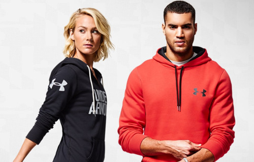
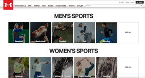 While the Cloudinary technology is meeting Under Armour’s needs to deliver a great user experience, while hosting an increasingly large number of images and scaling to meet the explosive demand for its fitness apps, it’s the close working relationship the two companies have developed that is an added bonus.


 Cloudinary now offers a solution for intelligently finding the optimal responsive image dimensions for each specific image. The responsive breakpoints generation can be done programmatically using a cloud-based API or interactively using a new free open source web tool - the


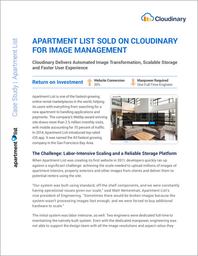


